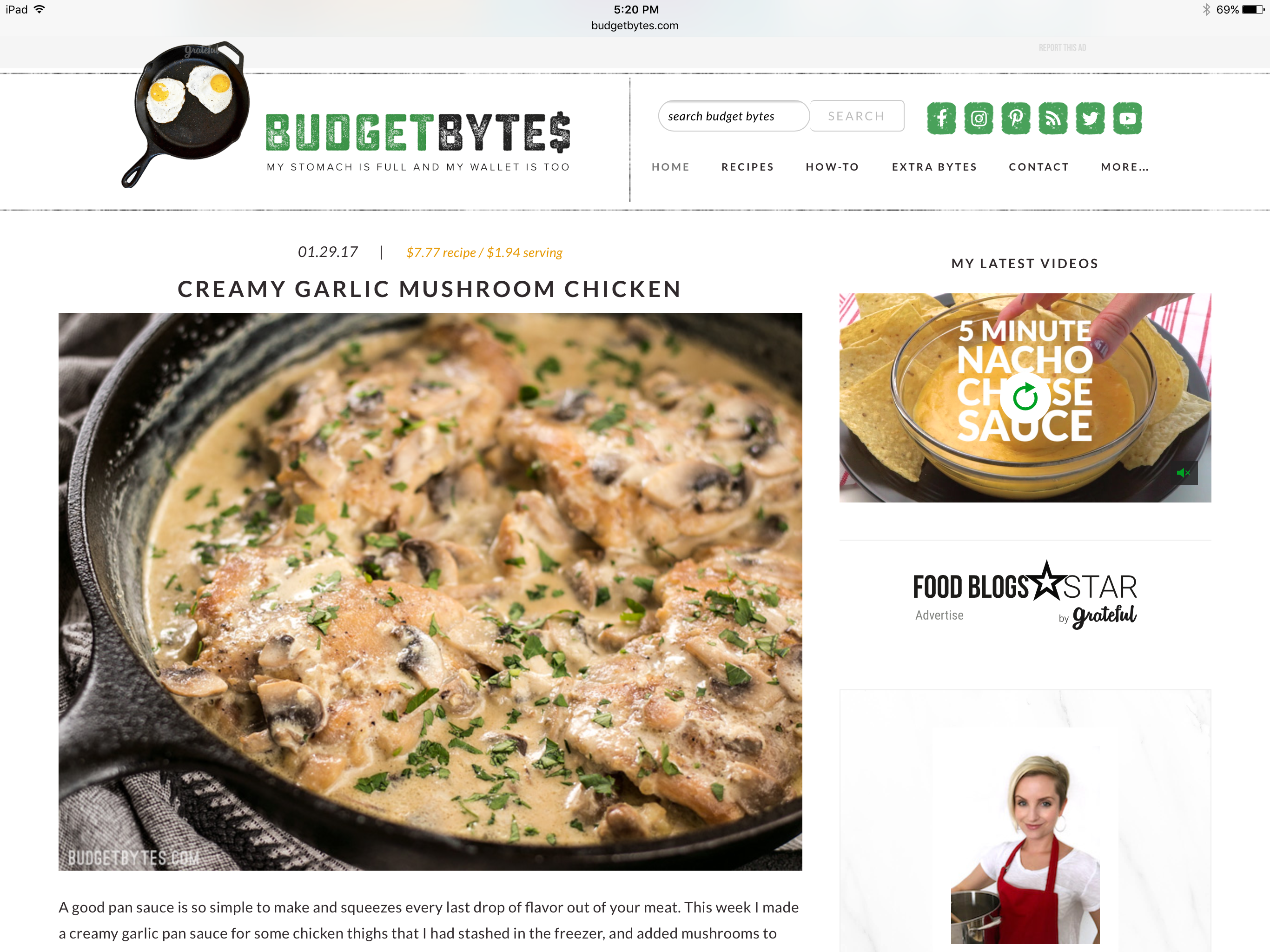
Budget Bytes is a frequently updated website filled with delicious and inexpensive recipes. This website encourages people to smart about their budget, while still allowing good quality and delicious food to be an every day part of life. Budget Bytes is an easy-to-use resource for a wide variety of budget friendly dishes that also covers a variety of diets. This critique is being done on the mobile version of this website, as I use an iPad Pro as my main computing device.
At first glance the discoverability of Budget Bytes seems really nice, everything seems to have a home and it’s put together quite nicely. Within the first few moments on the site the layout might seem a little overwhelming with some of the advertisements, but once you realize the ads versus the content everything comes together nicely. It is extremely easy to find any recipe that has been hosted on the website, if you know the title you can simply search for the recipe and it will come up. 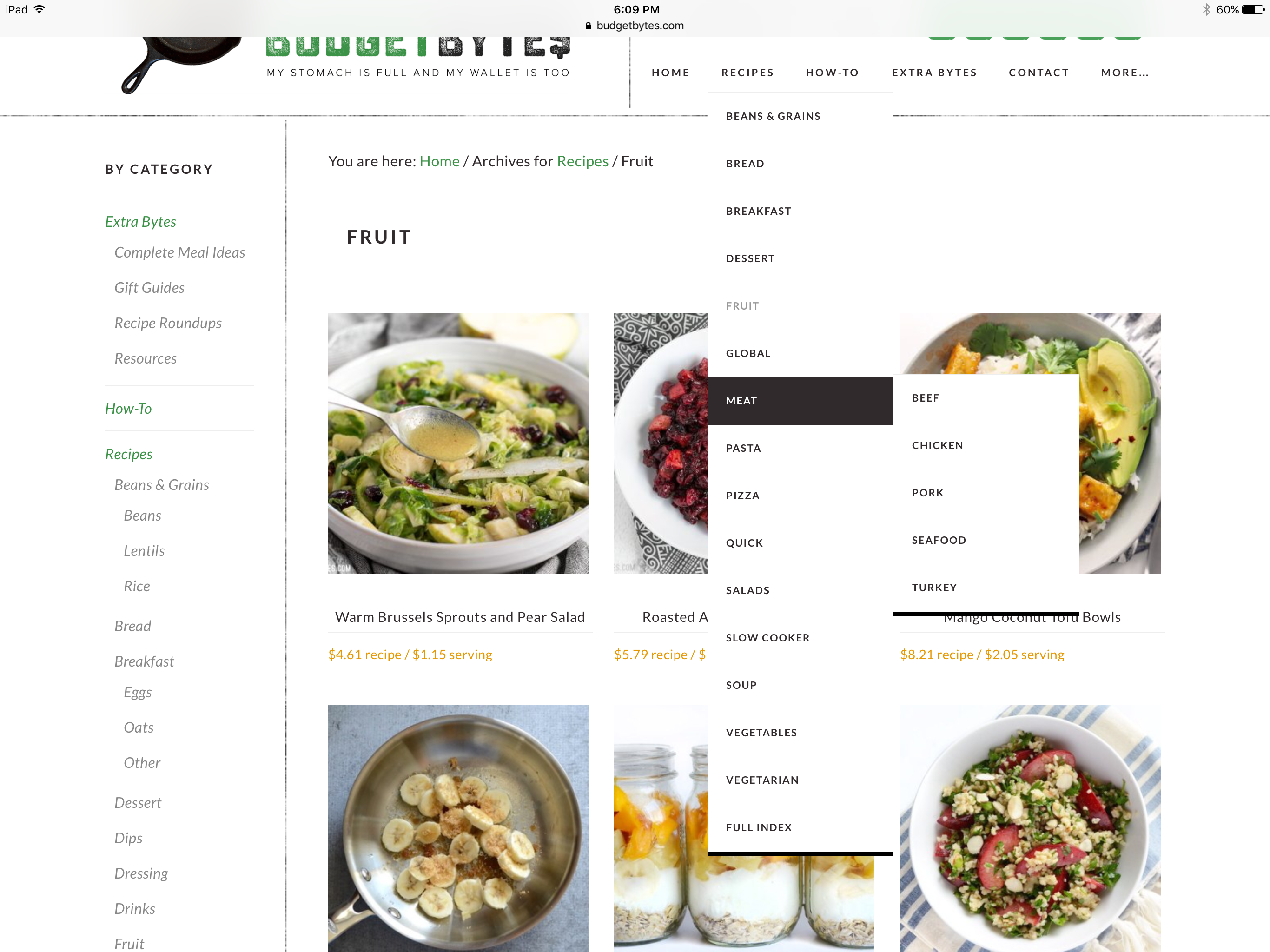 If you only know the main ingredient that was used, the recipes section of the website is actually broken down by main ingredients.
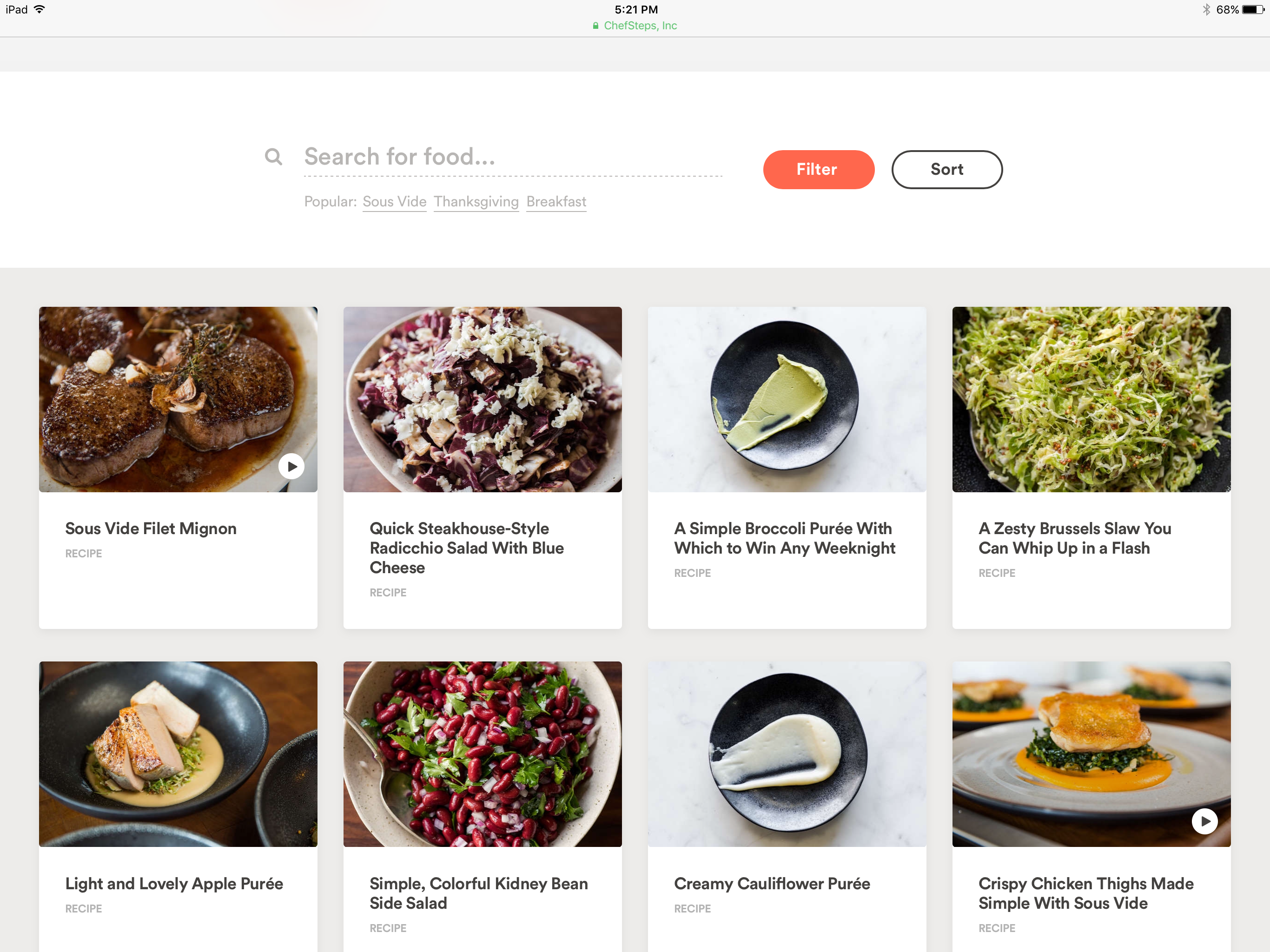
This allows users to simply select ‘chicken’ and find every recipe with chicken in it. Budget Bytes is a blog format so all recipes are listed based on the original post date. The discoverability of this recipe organization is so nice, especially when compared to the recipes section on the website chefsteps.com, which simply lays out all of the recipes onto one page. You can search for an ingredient used in a recipe, to bring up a list of recipes using that ingredient, but there doesn’t seem to be a whole lot of organization behind the search results. The results will usually begin with the searched item and then start to offer a seemingly random selection beyond that.
Playing right alongside the websites discoverability, Budget Bytes has some really great mapping incorporated into it’s design. Almost every single action on the website results in some type of feedback. 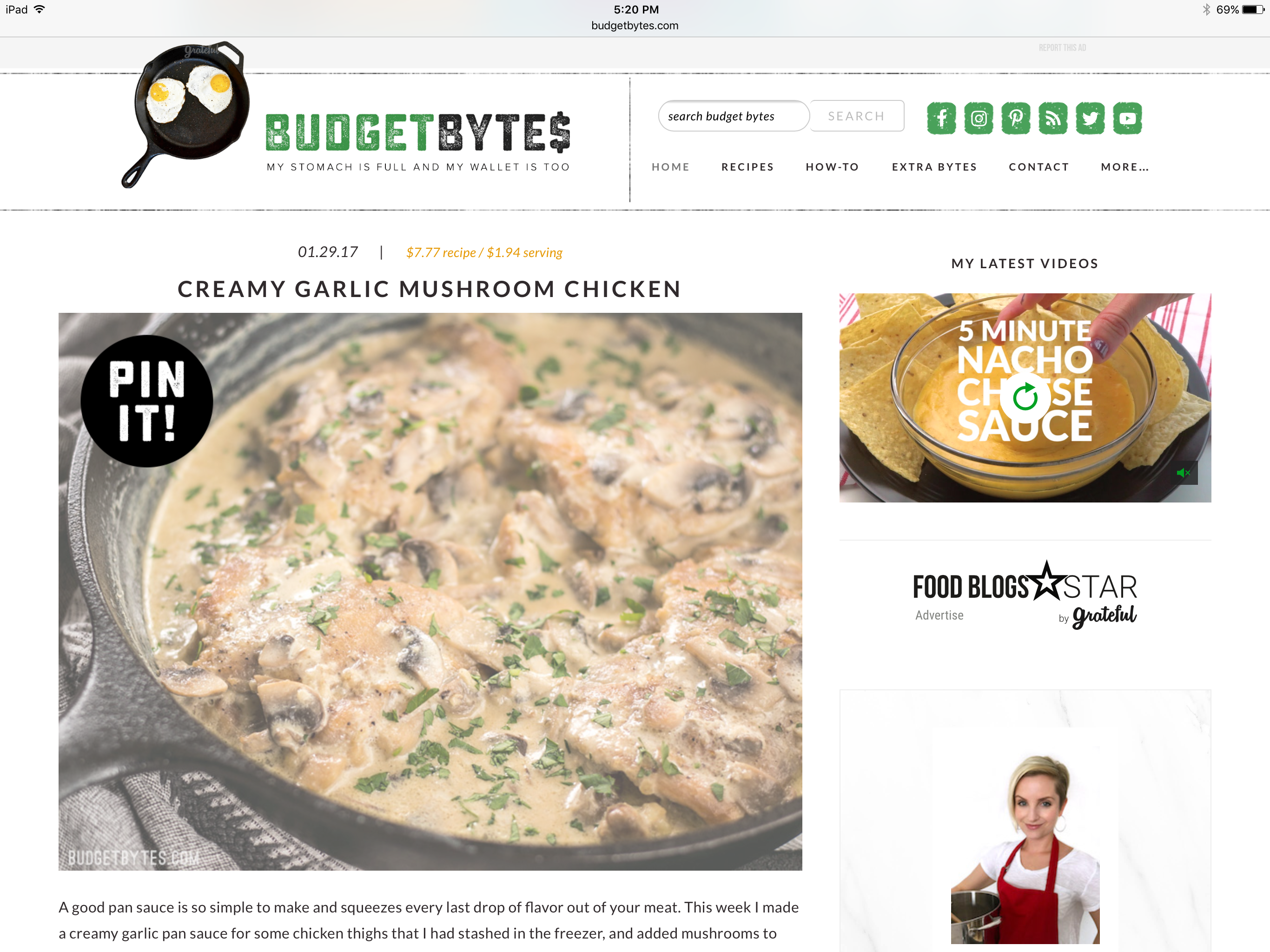 From the main page you are given an introduction to each recipe followed by a ‘read more’ button, once you click that button it changes from black with white text, to white with black text. Also from the main page, if you click on an image for a recipe, that is also being hosted on Pinterest, the image will signify that you can ‘Pin’ that recipe to your Pinterest board. Upon a second click on that image, either the Pinterest website or app is opened, allowing the user to complete that action.
The icons that afford sharing a recipe to another website immediately open the desired app with, for example, a previously constructed tweet to share that recipe with friends. 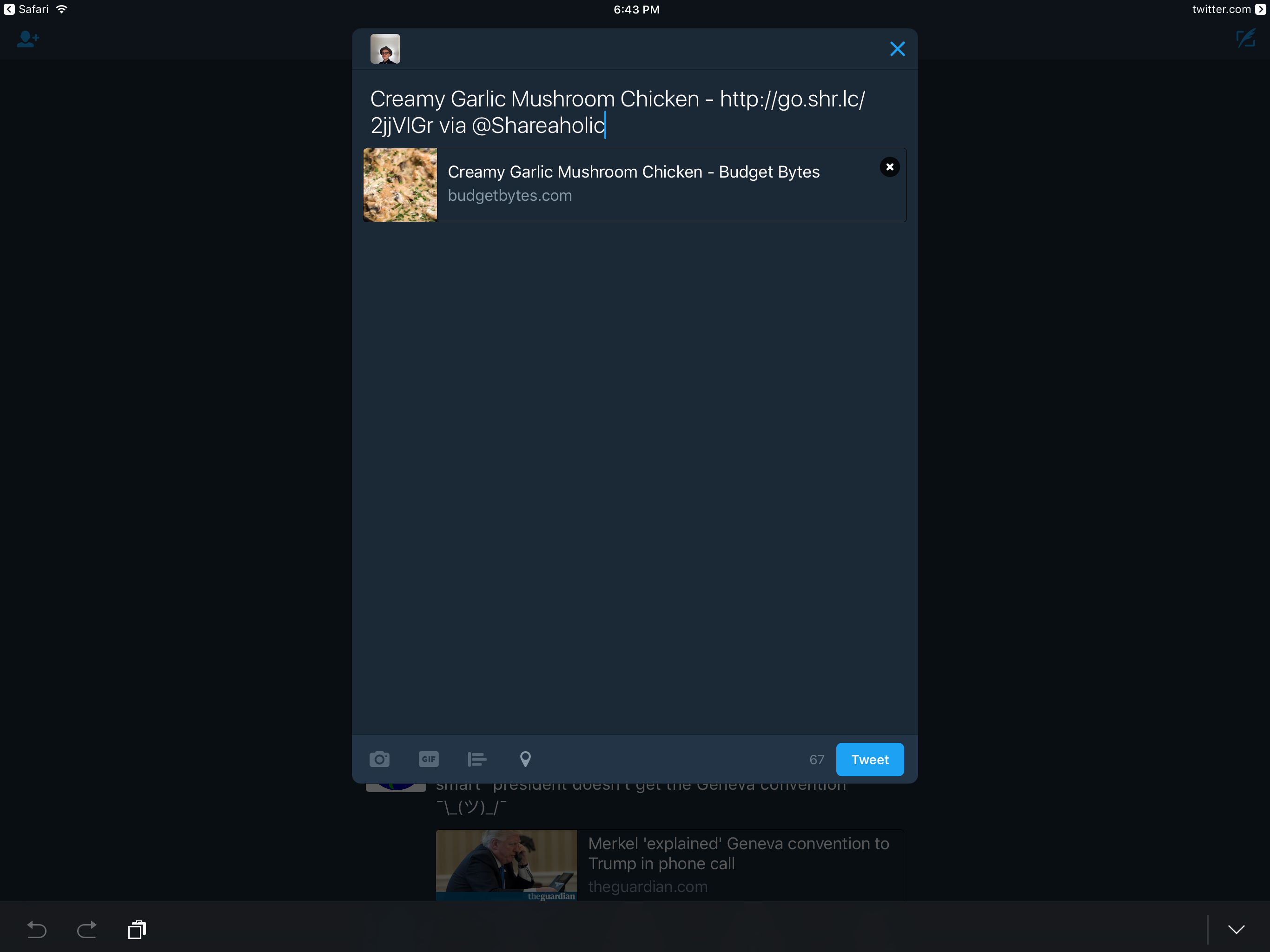 Once you’ve finished sharing and return to Budget Bytes you’re greeted by feedback acknowledging that you’ve shared the recipe and thanking you for doing so. With the exception of a few icons, which appear to simply be dead links to websites no longer sponsored for sharing, every icon on the website affords this action. All icons that afford sharing also signify how many times a recipe has been shared on that platform with a smaller icon with the number of shares.
Budget Bytes also contains a couple physical constraints, the first being navigation through the website itself. Users can only get to a page by searching for something, or clicking a link to physically change move from one page to the next. The size of the screen in which the website is being viewed is also a constraint, on a normally formatted screen the website fits together nicely, leaving everything in place and organized. If that format is changed however, it forces the the layout to change dramatically, causing advertisements and all other content on the right side of the page to the very bottom. The actual content on Budget Bytes creates a semantic constraint, by only showing an image a very small amount of recipe information the content actually affords scrolling down the page to continue reading the entire recipe.