
Calm is an app that aims to reduce anxiety and stress through guided meditations, nature sounds, and sleep stories. A wide range of preferences are accommodated: hurried users can quickly launch a 10-minute “Daily Calm,” while users seeking specificity can pursue 30-day programs centered around a particular theme. Named Apple’s 2017 App of the Year on iPhone, a staggering 5-10 million users have downloaded the app. In a field saturated with meditation apps, what makes Calm so successful? Good design.
In Don Norman’s The Design of Everyday Things (2013 edition), he explains that “good design is actually a lot harder to notice than poor design, in part because good designs fit our needs so well that the design is invisible …” (xi) This critique will assess the usability of the Calm app using the design principles touted in his text.
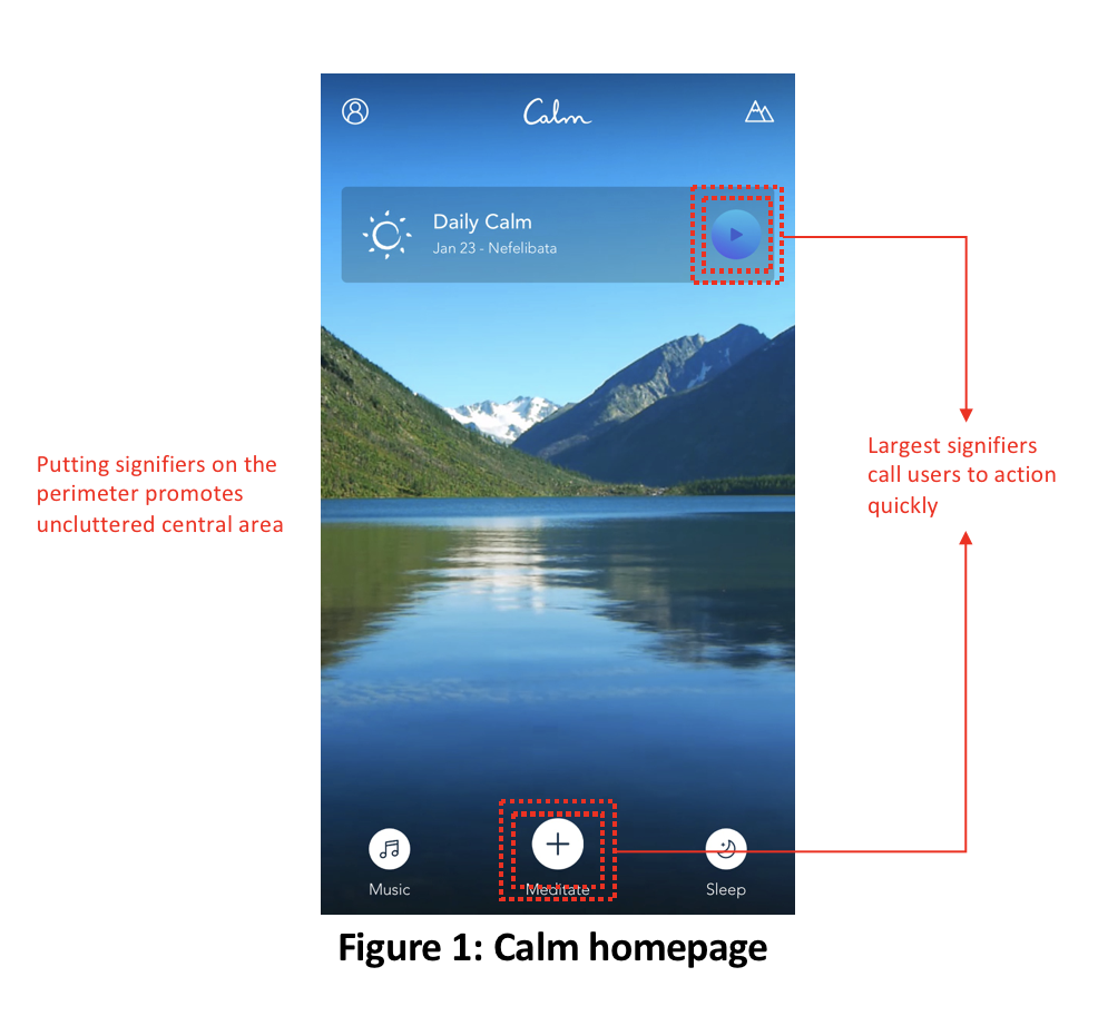
Calm Homepage: Clean Layout & Understandable Signifiers
From the start to end of a user’s experience, Calm minimizes the need for a user to use knowledge in the head. This simple fact significantly reduces mental strain or potential frustrations with forgotten information, such as account details. Users need to enter a username and password only once, after first downloading the app.
At launch, the designer’s conceptual model matches the user’s mental model, meaning that the system image is a well-designed, intuitive one. Users expect to find a calming experience, and one where they can easily begin meditating, as any gulfs in execution would sour the experience (even moreso for users of this app, who are seeking peace and calm). The homepage’s minimalist layout accommodates its users, with well-understood icons as signifiers sitting on the perimeter of the screen, and a peaceful nature image taking residence in the center. Busy users can begin meditating immediately by pressing the play button icon on the “Daily Calm,” a common signifier to beginning a piece of media. Discoverability and understandability are clear throughout the app, with the largest signifier on the home screen being the “+” button with the word “meditate” underneath. The “+” signifies that a menu of options will open, and the app does exactly that. Both the goal and the way to get there are clear; there is no gulf of execution.
Calm Player: Intuitive Controls & Effective Constraints
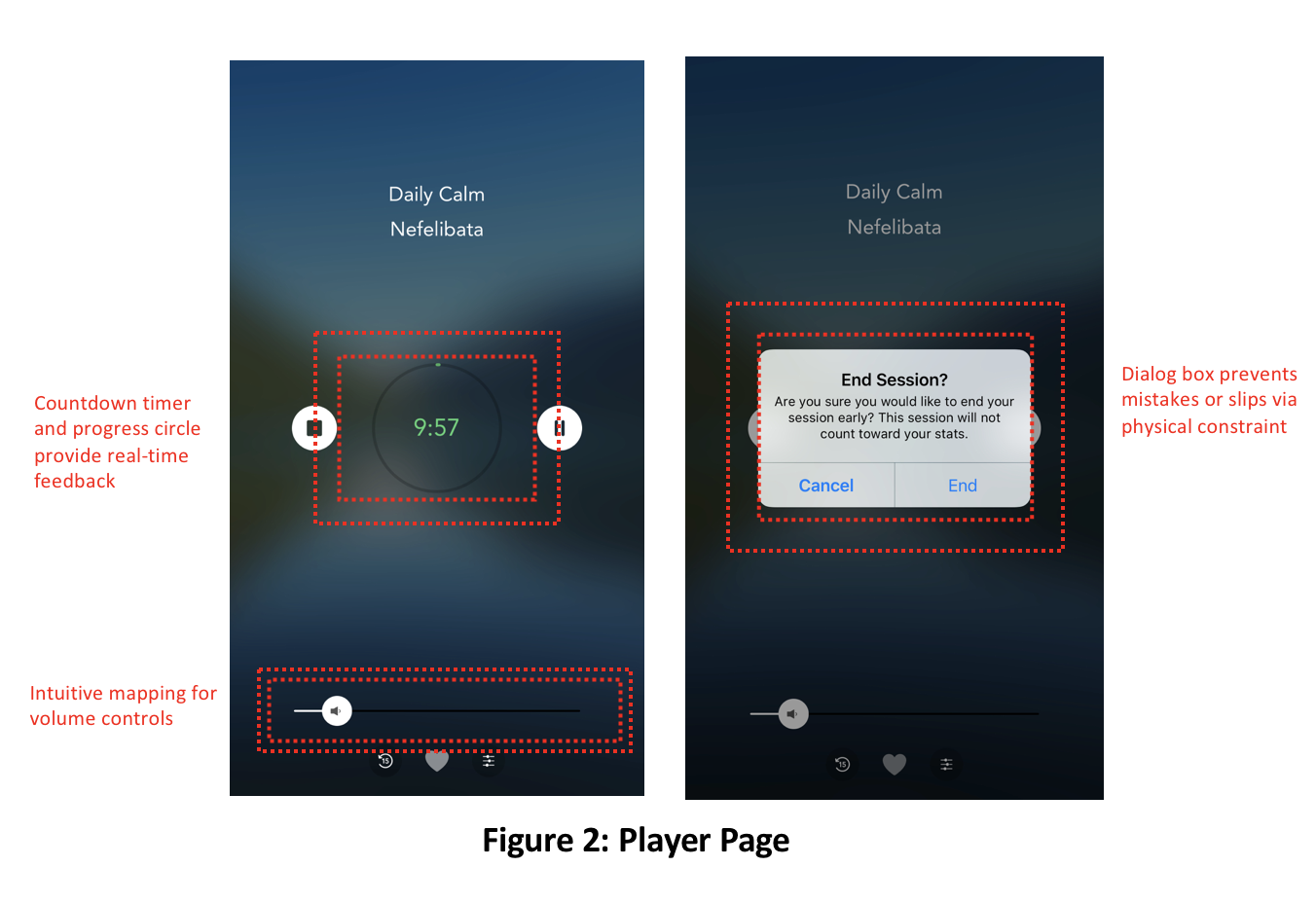
In the player, clean, uncluttered design shows the user essential information: the name of the meditation, a countdown timer, stop/pause controls, and immediate feedback by way of a green circle that progressively grows as the meditation plays. This feedback bridges the gulf of evaluation. For instance, if a user sees that the timer is counting down and the progress circle is filling, but yet they are not hearing the recording, they can eliminate potential reasons for the issue, and check their volume and device settings. To this end, the volume bar on the bottom has clear and intuitive mapping – right to increase, and left to reduce. Lastly, if a user tries to leave before the end of the playback, a dialog box asks whether the user really meant to leave the meditation – a physical constraint designed to eliminate unintentional actions.
Calm Meditation Menus: Exploratory Seeking or Bust
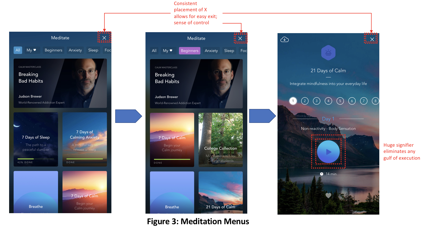
The user enters the meditation menu using the “+” / “meditate” signifier on the home screen. They encounter a scrollbar of themes with which to sort Calm’s library, with even more colorful, descriptive tiles beneath signifying unique programs. When a user selects a theme from the scrollbar, it immediately highlights in purple, providing instantenous feedback to show the selection was made. The ‘X’ signifiers on the top-right of each screen allow a user to escape the current screen at any time, promoting a comforting feeling of control.
When a program tile is finally selected, such as “21 Days of Calm,” the play button signifier is most prevalent, providing great understandability for how to begin. A great example of signifiers working in tandem with mapping are the numbers of days in the program. These are listed horizontally, and begin at a left-indent on the screen, suggesting that the user can scroll right in sequence to see future days, or left to see previous days. Lastly, the currently viewed day provides feedback by way of a white bubble around the current day, providing feedback to the user and an immediate understanding of what day they’re viewing.
Potential Issue & Recommendation:
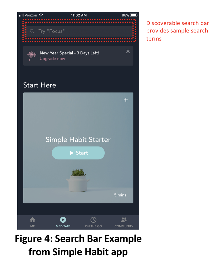
While the meditation menu’s design supports users who prefer exploration, it does not accommodate other information behaviors. Without a search bar in the meditation menu, it is possible that a gulf of execution could occur if a user prefers to search for a theme by keyword instead of exploration.
A recommendation for implementing this feature is below, in Figure 4, from a competing app called Simple Habit. While Simple Habit’s color theme is perhaps too muted, it places search at the top for discoverability, and even includes potential search ideas.
The Consensus
Calm’s brilliant design manifests itself in four key ways:
- Limited knowledge in the head needed
- Uncluttered, clear layout of signifiers
- Understandable signifiers throughout that eliminate gulfs of execution
- Frequent and visible feedback that eliminate gulfs of evaluation
Adding a search bar to the meditation menu would go the extra distance to ensure users with varying information behaviors are accommodated, avoiding any potential gulf of execution. Nonetheless, it is clear to see why Calm is such a beloved app.