Target is a retail chain offering home goods, clothes, electronics, groceries and more. Target mobile application, available for Android as well iOS devices introduces cartwheel in which upon signing up, the user is introduced to features like offers exclusive to target, scan and pay, drive up and order pickup. This design critique reviews the iOS application for Target.
The Target application introduces three key features that enhance the customer experience :
- Search
- Scan
- Cartwheel
SEARCH
The search feature on the initial interface affords looking up for items that the customer foreknows. The constant suggestion in the type bar as well as the availability validation adds up to the customer’s experience. The visibility of the search feature is great since the icon is maximized for discoverability (Figure 1).
The natural mapping of the search bar makes it easier for customers to type in the search bar while navigating though the suggested products.
The enhanced icon of a magnifying glass signifies the search operation and the search is constrained to alphabets and numbers and the items available in the store.
As soon as the product is typed into the search bar, the product or similar products show up indicating the successful operation. Hence, the feedback of this feature is satisfactory.
One extraordinary characteristic of the search feature is the aisle mention (Figure 3) while searching for a product. It affords physical navigability in the store and tells you exactly where a product is in the store if you are unable to find it.

Figure 1: Search icon in the initial interface 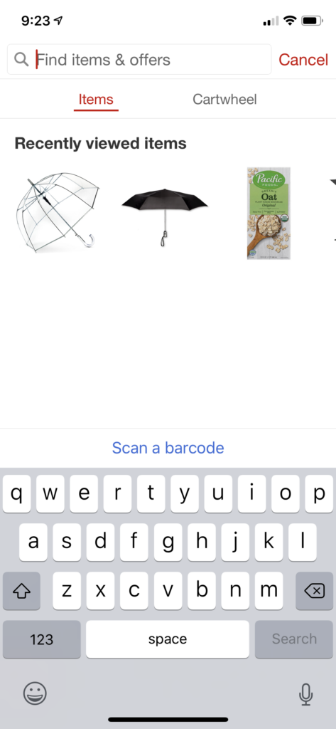
Figure 2: The search bar exposed on the click of search icon 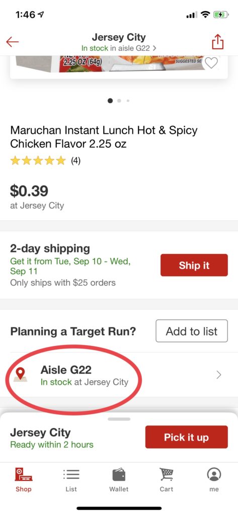
Figure 3: Aisle mention for easier physical navigation in the store
SCAN
The scan feature affords the scanning of a barcode on a product in the actual target stores. It is very convenient to find out the price of a product if it isn’t mentioned on the packaging. It can also be used to check the ingredients and availability of the product.
The visibility of this feature is prominent as well because of the magnified icon on the initial interface (Figure 4).
The natural mapping of the scan feature is ideal since the tapping on the icon takes you to a barcode scanner wherein you can hold the barcode on your product in the given camera space. The rectangular space signifies the barcode operation.
The scan is constrained to images of the barcode of the product to make the experience of the price traversing very convenient.
As soon as the barcode scanner scans the product barcode, the feedback signifies the price of the product along with the description (Figure 5).
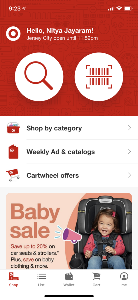
Figure 4: Large visible icon of barcode scanner 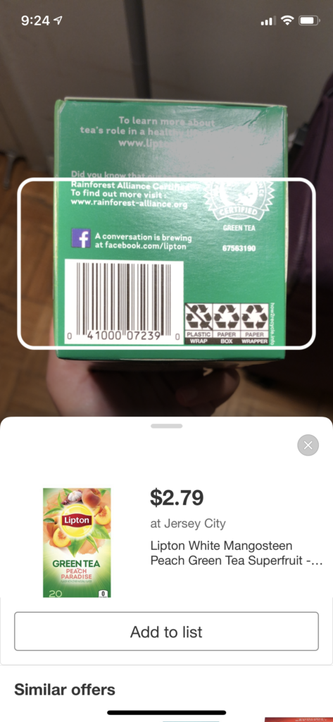
Figure 5: Feedback with the price of the scanned product
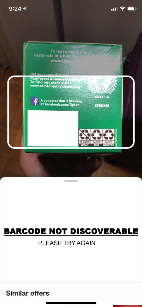
ISSUE 1: If the product doesn’t have a discoverable barcode, the system does not provide a feedback stating the same. Hence, there is a gulf of execution in the feedback of the system.
RECOMMENDATION 1: Provide necessary feedback stating that the product doesn’t have a barcode or the barcode of the product isn’t discoverable (Figure 6). This would bridge the gulf of execution.
CARTWHEEL
The cartwheel feature affords the redeeming of offers and coupons in the Target store. It supports digital wallets such as Apple Pay/Apple Wallet.
It basically consists of three steps : Find offers (which discovers different available offers with a section including recommended personalized offers), Add offers (which can either be initiated by tapping the “+” sign or scanning the barcode of a particular product) and Redeem offers (which redeems the coupons at the register of a target store by scanning the provided barcode at the counter)(Figure 7).
The visibility of this feature is somewhat subtle since it doesn’t have any magnified icons or signifiers to advertise this feature. Even after discovering the feature it is quite complex to understand the functionality of it.
The drive up feature (Figure 8) allows customers to order pick up, the staff member places all the ordered items in the vehicle of the customer when they arrive. This feature is quite prominent and hence the visibility criteria of it is fair.

Figure 7: Cartwheel Interface 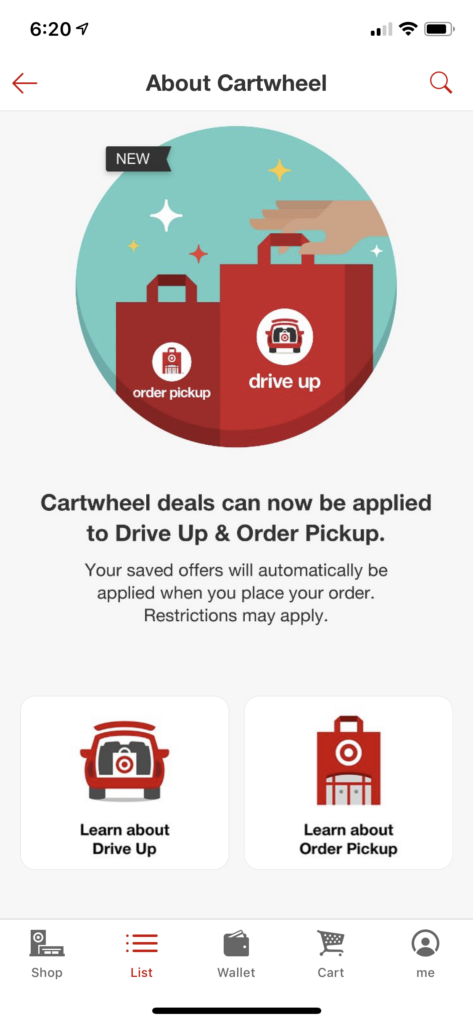
Figure 8: Drive up and Order pickup features
The mapping between the controls and the functions is quite simple, a simple tap leads to either finding new offers, adding offers to the wallet or redeeming offers at the register of the store.
The digital wallet redeems the coupon barcodes at the register but the customer has to log in to their target account and scan the cartwheel coupon barcode (Figure 9) .
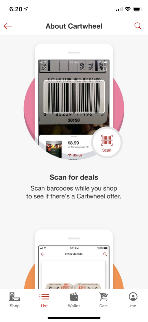
Figure 9: Scanning the product barcode for availing coupons and offers 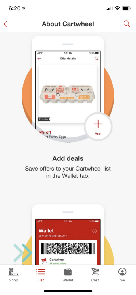
Figure 10: Adding deals to the digital wallet in the cartwheel feature
The customers can then add the scanned deal to the digital wallet (Figure 10). After adding the barcode coupon, the customer can redeem the coupon at the counter while checking out by using the redeem deal feature (Figure 11). The cartwheel feature is constrained to display only the coupons that are available at the time.
As soon as an offer or a coupon is collected on the app, the customer receives a feedback signal in the form of a tick mark stating that the offer has been availed. At the register while checking out, the cartwheel feature can be accessed by signing in and scanning the coupon or offer barcode (Figure 12).
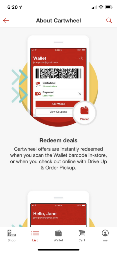
Figure 11: Redeeming the scanned coupon barcode at the checkout register 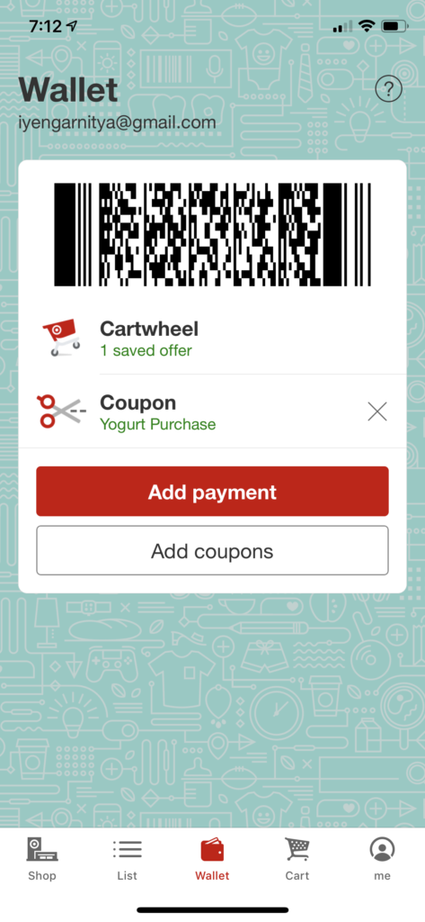
Figure 12: Example of a coupon code to be scanned at the register
ISSUE 1: It can be quite challenging to figure out how the cartwheel feature works if an individual is experiencing the feature for the first time as the signifiers aren’t as efficient. “Easy looking is not necessarily easy to use“, as Donald Norman quotes. The multiple steps, even though quite simple, add up the complexity and leave the user frustrated. This issue presents the gulf of evaluation.
RECOMMENDATION 1: Reduce the steps to redeem the coupon barcode to one. After displaying the available offers, provide an option to directly redeem the coupon instead of having to go through the complex process of scanning, adding and redeeming the coupon (Figure 13). This efficiently bridges the gulf of evaluation.
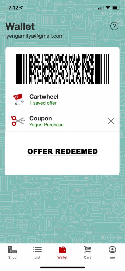
ISSUE 2: The customer does not receive a feedback stating the offer has been redeemed at the register which might be confusing because it leaves the customer ambiguous as to whether the offer has been availed or not.
RECOMMENDATION 2: Notify the customer at the checkout register that their coupon has been redeemed and added to the bill. Show the discounted price on the screen at the checkout register.
In conclusion, Target is a very convenient application that has many strong features and due to the complexity of some features it is possible to get perplexed but as Donald Norman suggests, “To Err is human“. The above mentioned recommendations can certainly help simplify the application to make the customer’s shopping experience more enjoyable.