
Twitter is a free social networking website and application that provides its registered users a platform to post multimedia messages, or tweets within a 280 character limit. Non-registered users can view public profile pages but are unable to interact with accounts. This blog post will focus on three features of Twitter—logging on, the timeline, and interaction.
Logging On
Twitter gives its users a straightforward log in page with only two fields to enter information. The active fields for username and password are easily discoverable by the user, and provided that they have knowledge in the mind, they can enter their personal information to complete the log in process.
The arrangement of the two fields are mapped logically on the screen to direct its users to enter their username first, and their password second. The simplicity of the Twitter log in screen makes use of constraints. With only two, clearly labeled fields to enter information, the user is constrained to the one intended action of logging in.
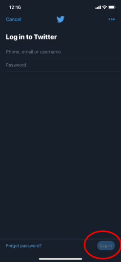
The Log In button circled in Fig 1 affords selection by the user, but more important, it is colored with the signature Twitter blue tone (#1da1f2), and given a label, which act as signifiers for the user. Pressing the Log In button gives the user instant feedback. If their credentials are correct, then they will be taken to their timeline, and if their credentials are not correct, they will be prompted to try logging in again.
Twitter Timeline
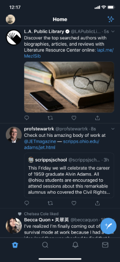
Once logged in, a user sees their timeline, which is organized to show its user a list of tweets from accounts that they follow in order of recency. The timeline affords scrolling, but that requires a certain knowledge of the world on behalf of the user in order to begin seeing the rest of the timeline—the scroll bar is not visible when the screen is inactive as indicated in Fig 2. This represents a problem with discoverability.
Twitter designers could mitigate the discoverability problem by including a down arrow mapped towards the bottom of the timeline to induce scrolling.
When a user with knowledge of the world applies natural mapping to move the timeline down with their finger, the scroll bar becomes discoverable to the right of the screen, and provides immediate visual feedback, moving down the screen as the user scrolls. There are no constraints to the timeline scroll—the user is able to scroll forever, theoretically, reading back in time. The shape of the scroll bar may change as well. A smaller bar signifies a longer timeline, while a bigger bar signifies a shorter timeline.
Elsewhere, the row of icons at the bottom of the screen act as signifiers providing the user mapping in order to use the application properly. The icons are universal and not constrained by language, so provided the user has a knowledge of the world, they are capable of forming an appropriate conceptual model to fit the correct system image.
User Interaction
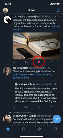
Popularity of tweets is measured in user engagement, and Twitter provides its users three modes of interacting with other users—replying, retweeting, and liking.
Each action is mapped beneath each tweet using a different symbol. A tweet affords some kind of interaction, and a distinct symbol beneath each tweet signifies the different modes by which users can interact. Users are provided visual feedback immediately as demonstrated in Fig 3. The device emits a small vibration when users press one of the symbols as well, which represents another type of feedback.
By using logical mapping, and strong signifiers, the Twitter application bridges the gulf of execution for its users to engage with one another, and by providing visual and touch-based feedback, the gulf of evaluation is bridged as well. By limiting the space between the user’s gulfs of engagement and execution, the design of the Twitter mobile application encourages its users to engage with each other.
Conclusion
There are dozens of other features unique to Twitter that we could explore, but this post is intended to provide brief context for UX principles as they are demonstrated in the Twitter mobile application. The 280 character limit in tweets is a constraint, for example, but we can save that discussion, and more, for another time.