Airbnb, Inc. is an online platform for arranging or offering lodging, homestays, or experiences. It acts as a mediator for hosts and travelers.
The company was conceived after its founders put an air mattress in their living room, effectively turning their apartment into a bed and breakfast, in order to offset the high cost of rent in San Francisco; Airbnb is a shortened version of its original name, AirBedandBreakfast.com.
Introduction
I have personally used this app for years and have also got used to the flow – be it the flaws or good design that stays invisible, according to Norman. Critiquing an app like Airbnb was challenging yet interesting to study, by getting into the shoes of a relatively new user to the app.
_
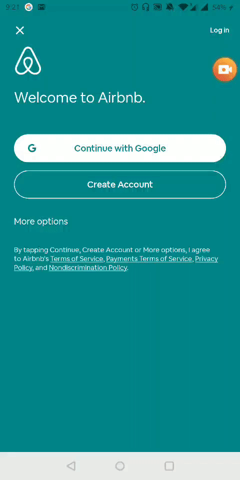
SIGN UP PROCESS
.
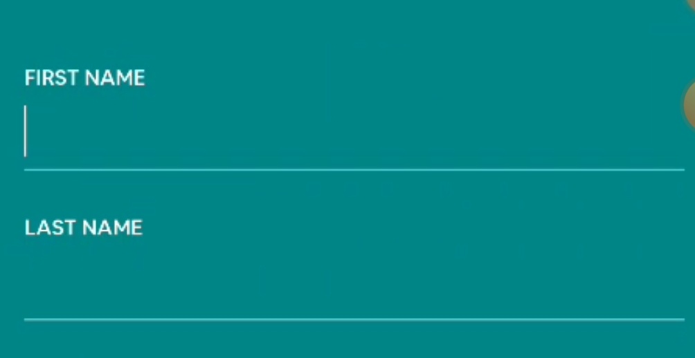
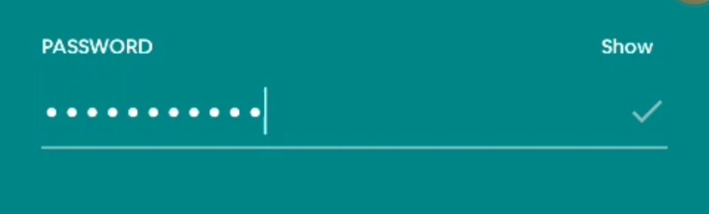
- Signifier, Affordance & Knowledge of the World – The blank line acts as a signifier that signifies the affordance of filling the blank. The label also signifies what must be filled in. It also takes advantage of the knowledge of the world that makes use of the users’ familiarity with the “fill in the blank” concept.
- Feedback & Signifier – On clicking the blank the text cursor appears which acts both as feedback that the line is selected and a signifier that signifies to start typing in.
.
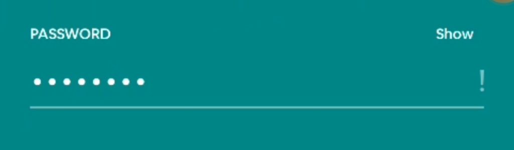
- Feedback – The Feedback on whether the entered password passes the required criteria is showcased by the “!” error symbol or if it passes its shown by the tick mark.
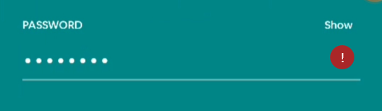
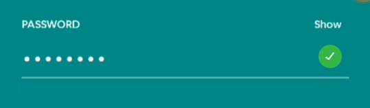
Improvement – The feedback would be even more effective if the error was marked as red and the tick mark as green, which would promptly provide the feedback of green as right and red as wrong.
.
_
BOOK AN EXPERIENCE

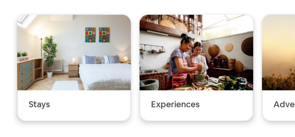
Step 1 – Choose Experience
Step 2 – Choose the category
Step 3 – Select the experience
Step 4 – View Details
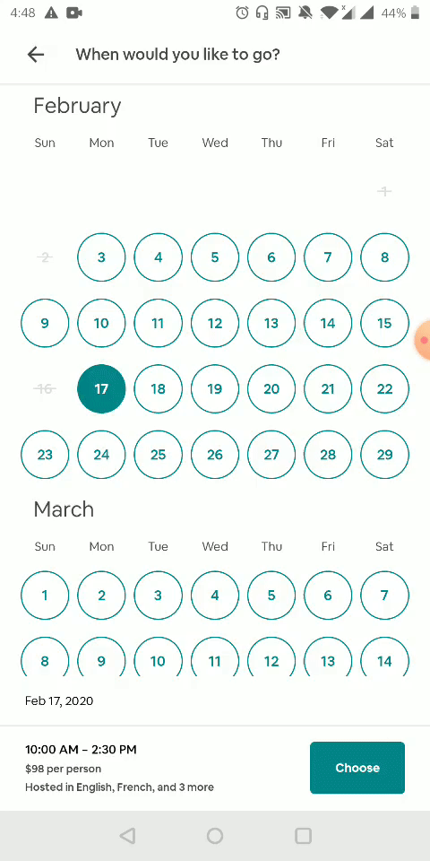
Step 5 – Check Availability
Step 6 – Add Persons
Step 7 – Add Payment
Step 8 – Pay
.
CLASH OF CONCEPTUAL MODEL
- Conceptual Model – On the basis of our conceptual model, we tend to close a pop-up and not tap on the back button. However, in this case, the pop up cannot be closed but only gone back to the previous screen by tapping the “back button”.
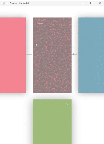
Improvement – The pop-up screen must offer a close button instead of a back button. This would match with our concept of closing a pop-up screen and returning to the screen sliding in the horizontal direction.
.

- Feedback – The booking confirmation screen provides clear feedback to the user that they have successfully booked the experience.
.
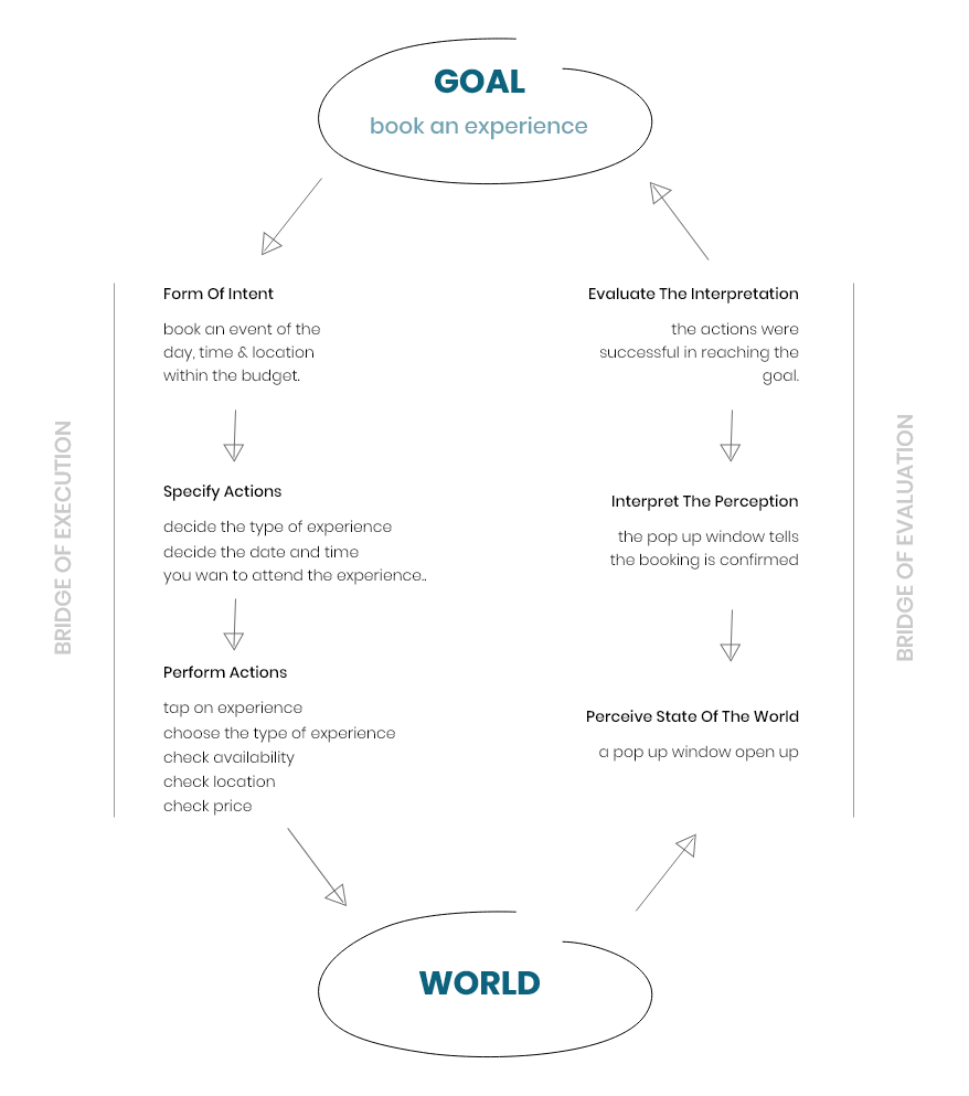
- 7 Stages Of Actions – I analyzed the actions that follow in order to book an experience through the Airbnb app, in the form of Don Norman’s “7 Stages Of Actions”.
.

- Feedback & Signifier – Here, the navigation bar – clearly acts a signifier, with the color variation of the selected one, that signifies what section we are looking at. It also acts a feedback to let the users know that they have successfully selected the particular section.
.
- Affordance – The depth, size, and shape, which imitates the style of cards, suggests pressing as well as movement. Also, the hidden part of a card suggests there could be a possible movement.
- Constraint – The direction of the layout of the particular type of cards let the user know that there is a constraint involved where the users can only move the cards on the line of that particular direction of card layout.
.
Conclusion
Airbnb is used immensely for a variety of purposes, but it has room for improvement on the usability front in some areas. However, once you start playing around with its functions, it is easy to understand and navigate through.