Overview
The IBM Cloud web UI provides insight and management into all of your resources and services running in the IBM Cloud. IBM Cloud is a competitor of similar offerings like Amazon AWS and Microsoft Azure.
Findings
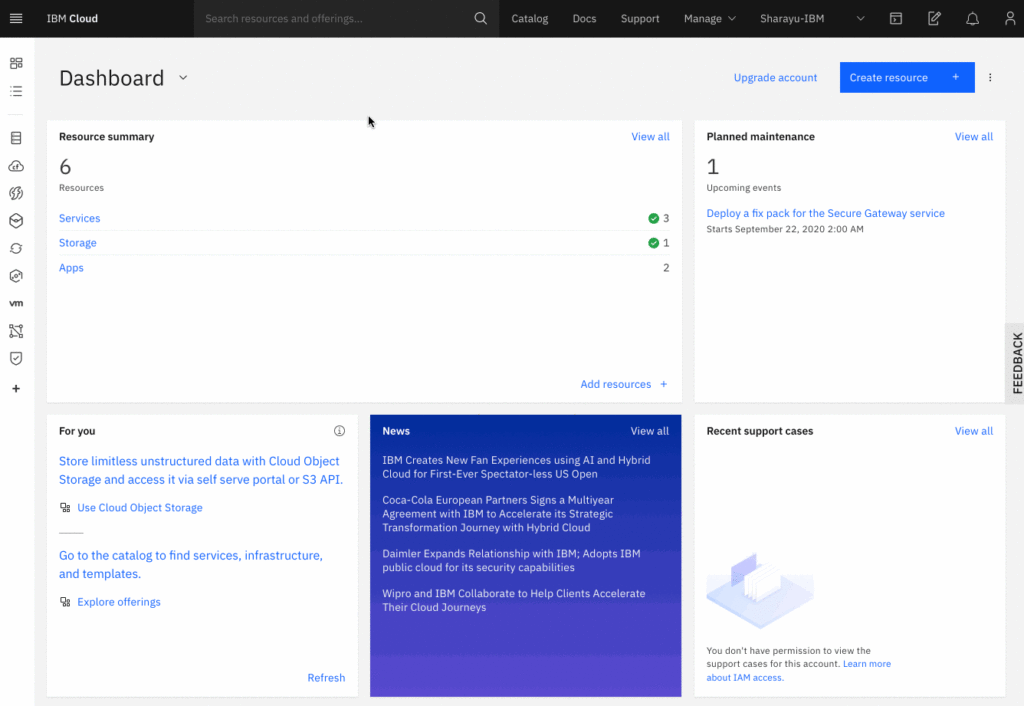
The dashboard seen above is a common entry point for many Cloud management systems; however for Cloud base applications like Amazon Web Service and Microsoft Azure there is no standardization that has risen. Therefore all of the Cloud based management UIs have not followed any standardization and no real world cultural constraints exist to dictate the expectation for users. This will cause the users switching between the different offerings which is common in the IT field to have to figure out each system on each use. The complexity of the systems also avoid being able to rely on short-term or working memory to guide the user; assuming the standard 5-7 items these UIs require an extreme level of knowledge to find the right path from the dashboard and the proper settings and setup to use. While the complexity cannot be changed much due to the world restrictions and the need to compromise the design for supporting this it could find a standardization that would help get the users to the proper place before the need of relying on rehearsing for completing the task.
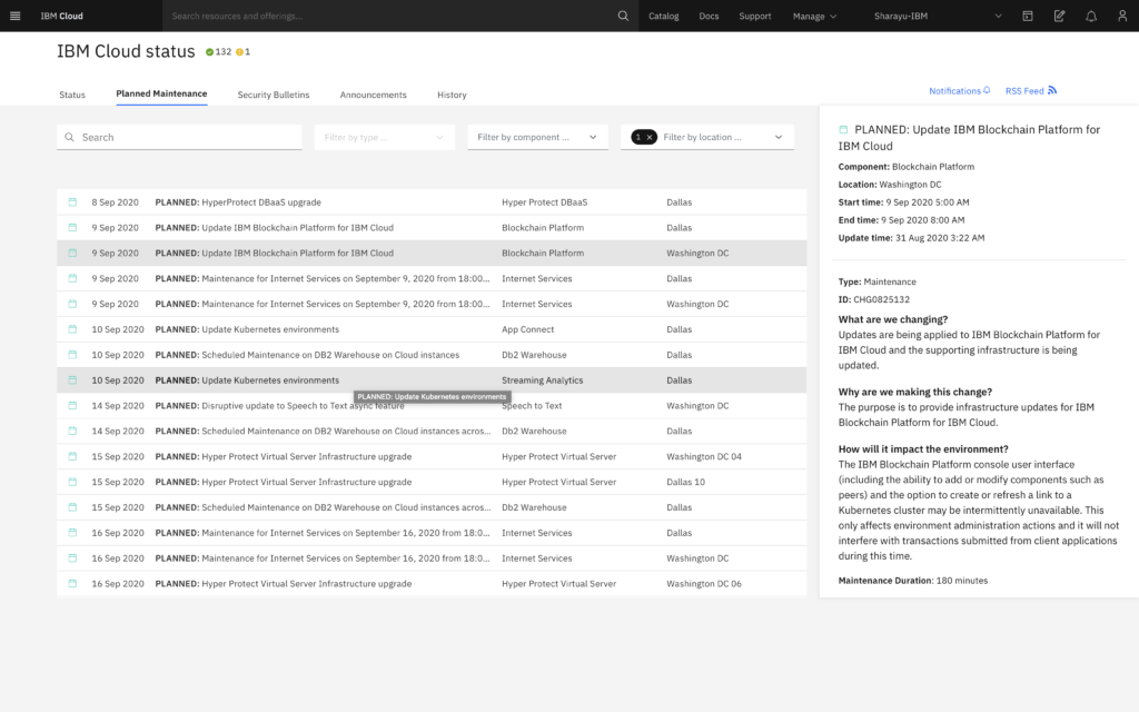
Data tables are used across the application and all have different designs. Data tables are a useful way to show rows of related data and provide ways to manipulate the data. And an affordance is given due to most users having knowledge of table like data already. However, many of the tables use different designs like the one above; where there is no signifier of how to use the table. Clicking an item will change the content of the right panel but this is not clear to a user and has no conceptual model from past software like Microsoft Excel or other tables.
Using a standard table flow that shows clickable rows that can open a modal or slide over panel would be more connecting and show the action of the slide over to the row clicked. Changing the design to connect the panel directly or make it a child (expandable table) might also help keep a connection and provide a similar signifier like that of a drawer system.
Being aimed at power users most of the system does not support basic keyboard shortcuts that a developer or IT professional might expect for flexibility and being efficient while using the application. Stuff like ESC had no use on many of the over screen items like modals or slide over content, and form controls frequently used custom dropdowns that did not allow fast typing of using space bar to open and pressing a character to jump to that select item. Which is a common task for heavy keyboard users (not considering the issues related to accessibility). The submission area being in the summary panel on the right also meant that expectation of form ENTER submission had no effect as the form was broken into pieces and keyboard power users would have to either tab constantly to finally get into that wrapper or just use a mouse. Adding expected keyboard shortcuts for power users would improve expectations from users.
The site also has very little inclusion for users. The site really only works for users using a mouse and a larger screen (wide). The inclusion of keyboard usage, smaller screen or touch devices is buggy across the entire site and has no has heavy reliance on mouse cues for indicating possible actions to users; leaving out touch and keyboard users. Ensuring the design is inclusive for all users regardless of method of interacting should be critical and a top priority.
The site also has a high level of featuritis; by offering an absurd amount of features on many pages even if they are not a common or even related option for that user journey. This is probably being introduced in hopes to push other features and add-on purchases. But instead it over complicates a normal user journey and adds confusion even without adding complexity.
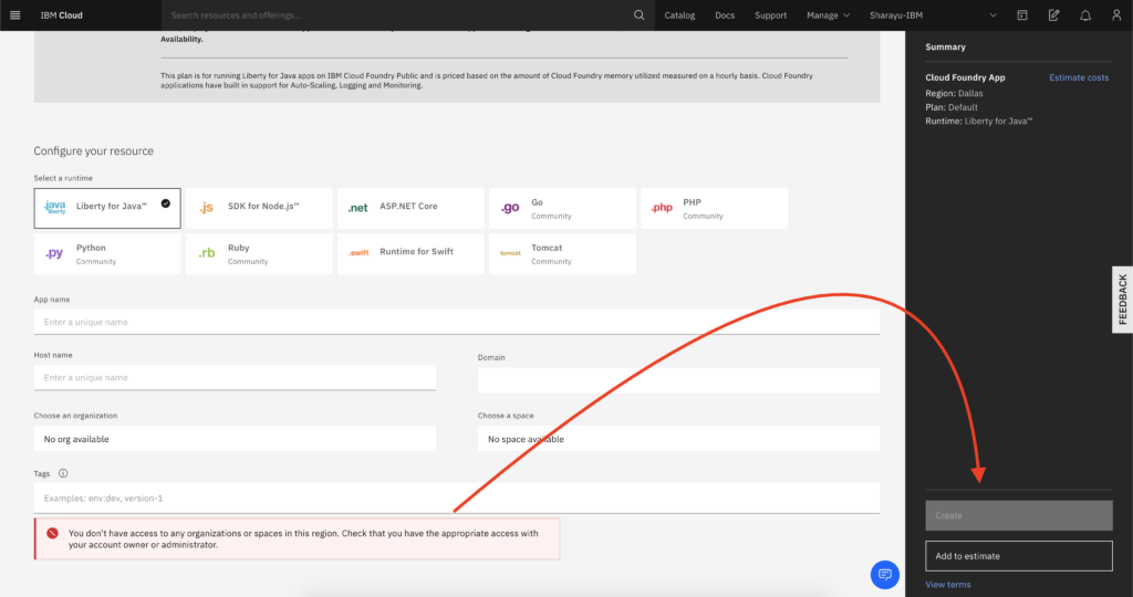
The application also fails to add constraints to block errors and instead allows users to complete tasks even though it will never be possible to complete it. Even when allowed to create the page makes not confirmation to show what will be done and the risk associated with it. For example you could deploy a new app and not understand that the app will replace an existing setup in the account or has high risk of monetary costs and no concept of Undo (even faked time based) is shown in the app.
These errors could be great improved by simply not allowing a user to fill out a form that can never be submitted and placing the reasons at the top in view and including helper text or links to documentation that could help with remedying the problem. The create button should show a full list of all possible side affects and what actions will take place in basic terminology with an option to abort or continue. During the setup process (when creating the instances) an option to cancel and abort the action should be provided for those who wish to undo after the process has started.
Summary
In summary by simply following affordances from longer running cloud management systems like Amazon Web Service the platform could offer more user centric flows and by focusing on user journeys instead of features on features the site could help guide the user and ensure proper constraints to avoid the user getting into error states which is very prominent across pages. It is possible this is a dark pattern attempt to push features for profit. But not knowing the business logic cannot say for sure.