CLIENTS:
Cooper Hewitt Museum
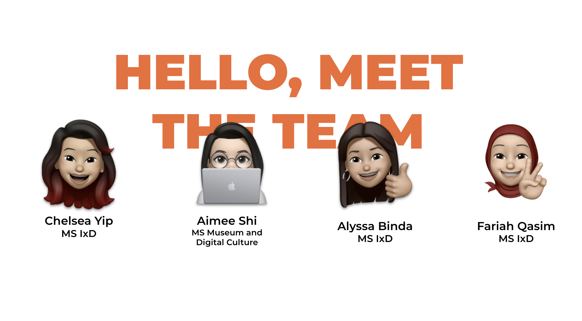
TEAM MEMBERS:
Aimee Shi
Alyssa Binda
Chelsea Yip
Fariah Qasim
PROFESSOR:
Elena Villaespesa
ABOUT THE PROJECT
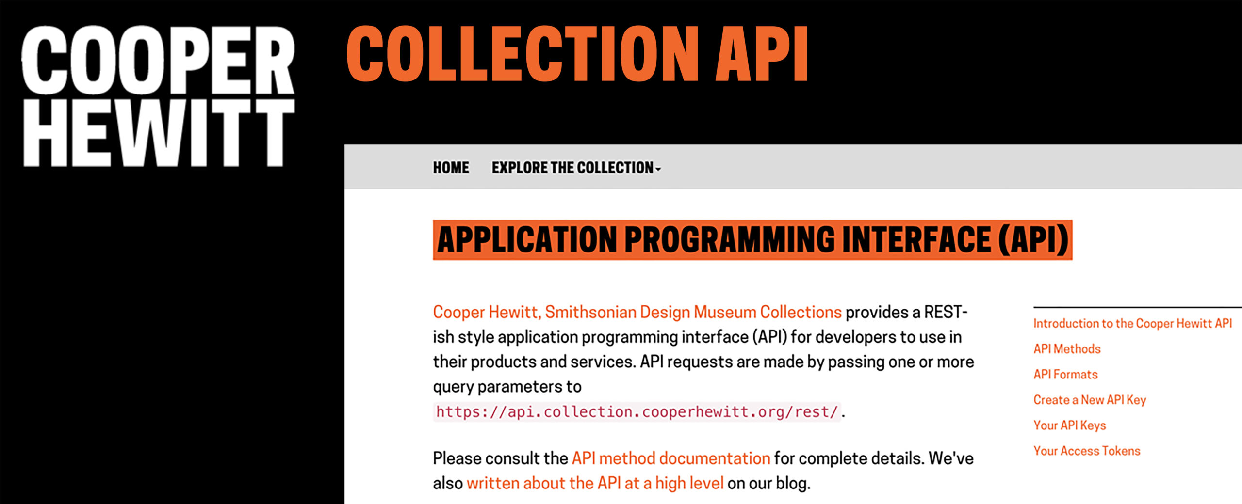
Cooper Hewitt, Smithsonian Design Museum is a design museum that has been bringing the innovative and experimental technology into museum’s collections, knowledge, and resources. Recently Cooper Hewitt aims to renovate their public application programming interface (API) section on their official website. With the brief from Adam Quinn (Digital Product Manager at Cooper Hewitt) and Chad Weinard, the purpose of Cooper Hewitt Museum is to evaluate the usability from users who want to explore API, especially novice users. Through remote user testing via UserzoomGo, our team then identified 4 main findings below and provided recommendations to improve user experience.
MY ROLE IN THIS PROJECT
- Conduct and take notes for user interviews
- Prepare supporting material
- Discuss with teammates about the collecting data from users
- Design mock up and the final report layout
- Compile final report
- Prepare and create the presentation’s look and feel
THE PROCESS
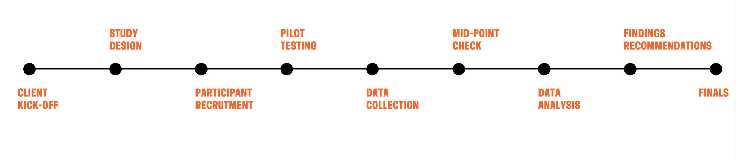
This project is during 8 weeks. It consists of recruiting participants, set up task, recording their on-screen engagements as they complete tasks issued by evaluators, analyzing the collecting data, summarizing the key findings and giving recommendations.
WEEK 1-3
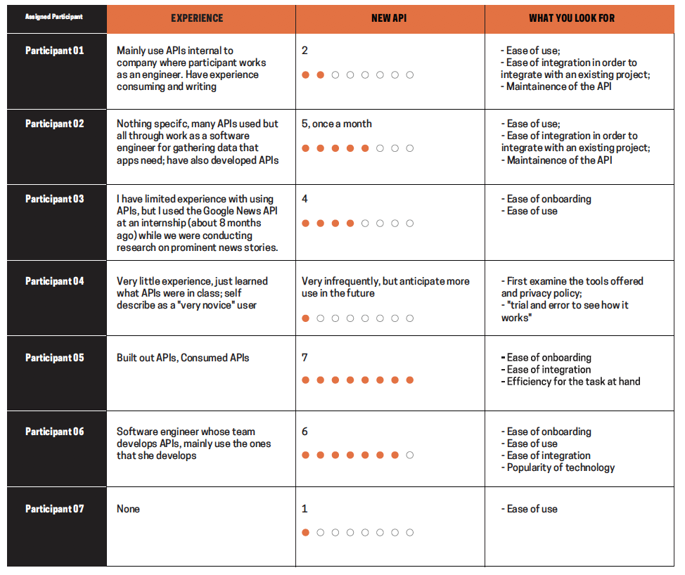
In the first three weeks, our plan included the identification of our target audience through the two types of recruitments and questionnaires. We identified two groups our target potential users:
Novice User VS Experience User
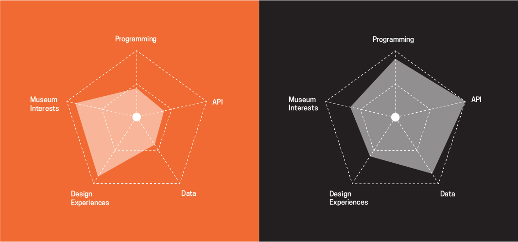
These two groups are based on the respondents from the screen questionnaire. These participants self-evaluated their scales of programming and API experiences. We selected 8 participants with half users who have non-professional programming experience, and half users are software engineers.
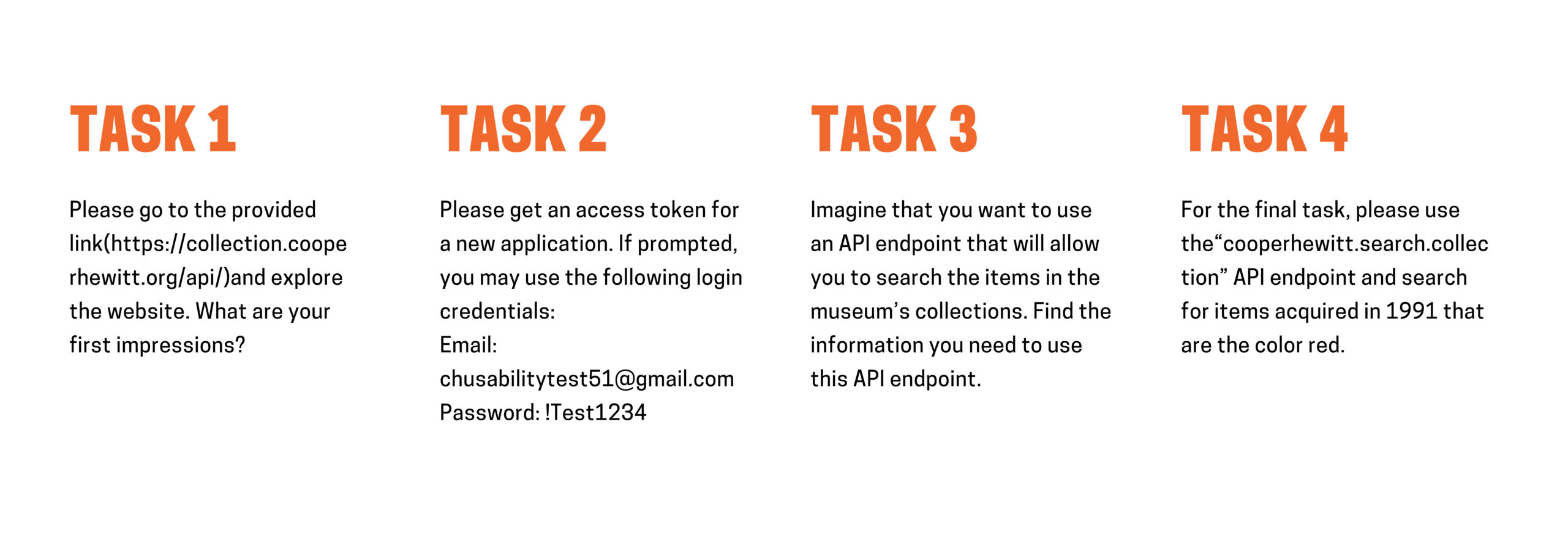
TASKS
Based on the clients goals and participants’ experiences, we created four tasks in order to gain the data. The priority for the users is to complete the tasks.
Week 5-7
In the next three weeks, each of teammates has two participants to do the remote moderated interview. In order to increase our moderating experiences, we also could joined all the testing as note-taker when we had time. During each task, we prepared Pre-test questionnaire and Post-test questionnaire to gather more feedbacks through the virtual moderated interviews.
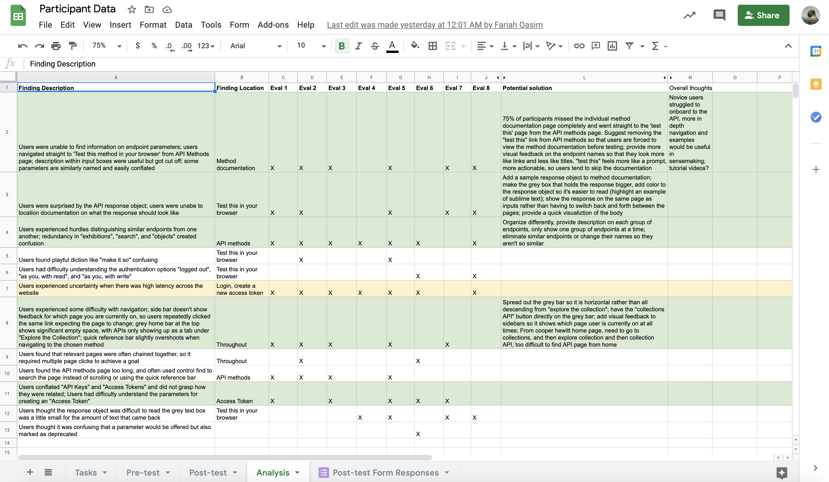
After user testing was complete, our group compiled participant responses, pre-test questionnaire answer, post-test questionnaire answer, notes, and summarized all findings into sharing Google sheets. From these analysis and discussion, we selected the key 4 findings & Recommendations:
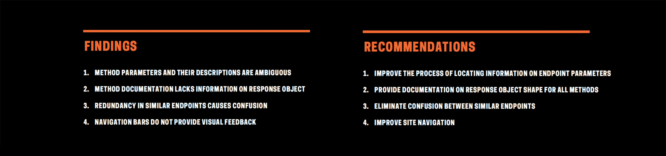
FINDINGS & RECOMMENDATIONS
Participants overall reported positive experiences with the Cooper Hewitt API and its documentation. On the post-test questionnaire, participants unanimously agreed that the website was easy to use (reported as a 4 or above on a 1-7 scale), and 75% of participants reported feeling confident using the interface.
KEY FINDINGS & RECOMMENDATION FOR ME
THE DIFFICULTY OF EXPERIENCING THE TOP LEVEL NAVIGATION AND SIDE-BAR
To analyze motivation when navigating API documentation, participants were asked to describe what they were looking for on the API homepage and what they found confusing about the API menu’s navigation as well as the overall Cooper Hewitt website’s navigation.
A. Navigation from SIDE-BAR to each section
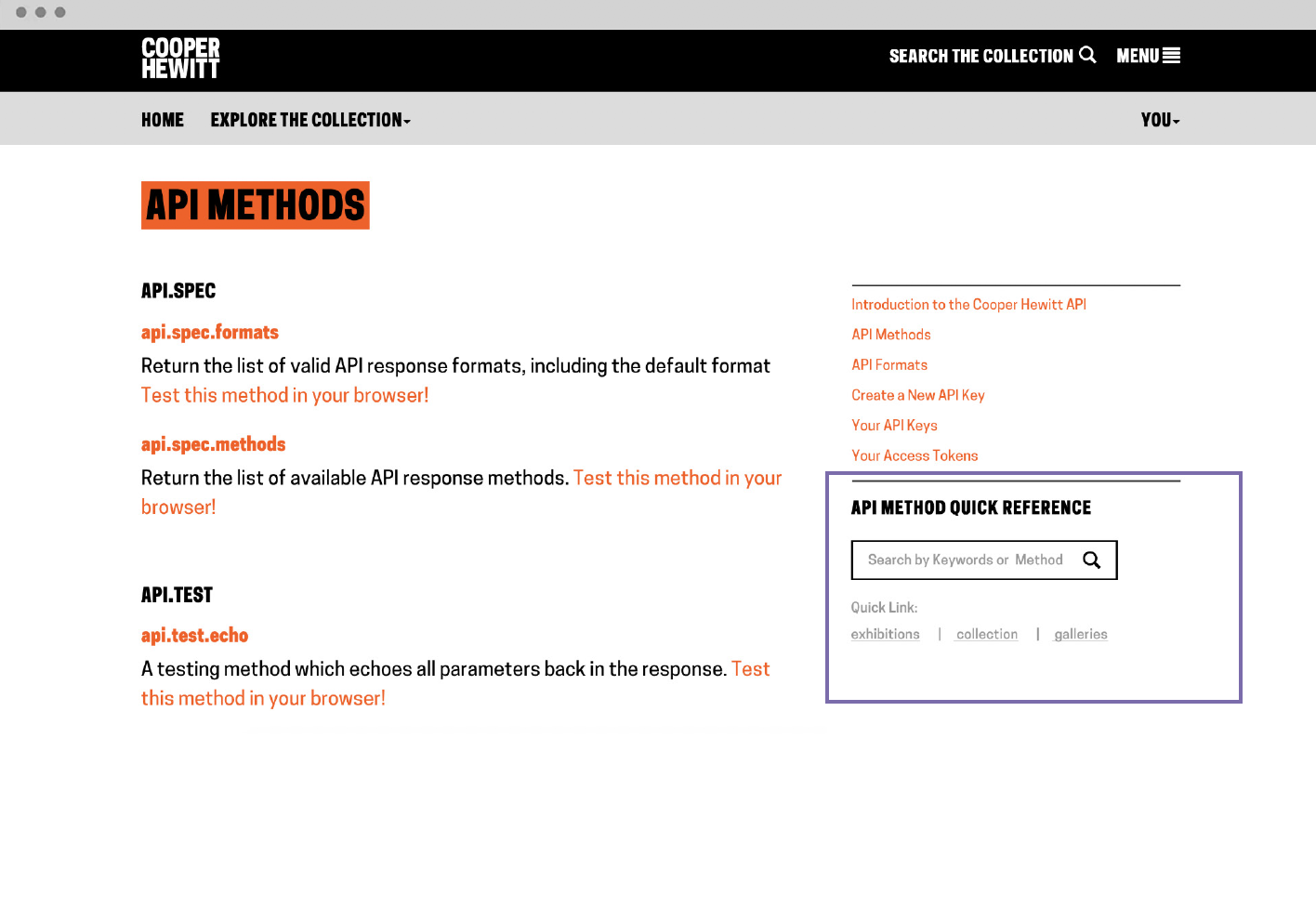
B. Navigation of the API METHOD QUICK REFERENCE
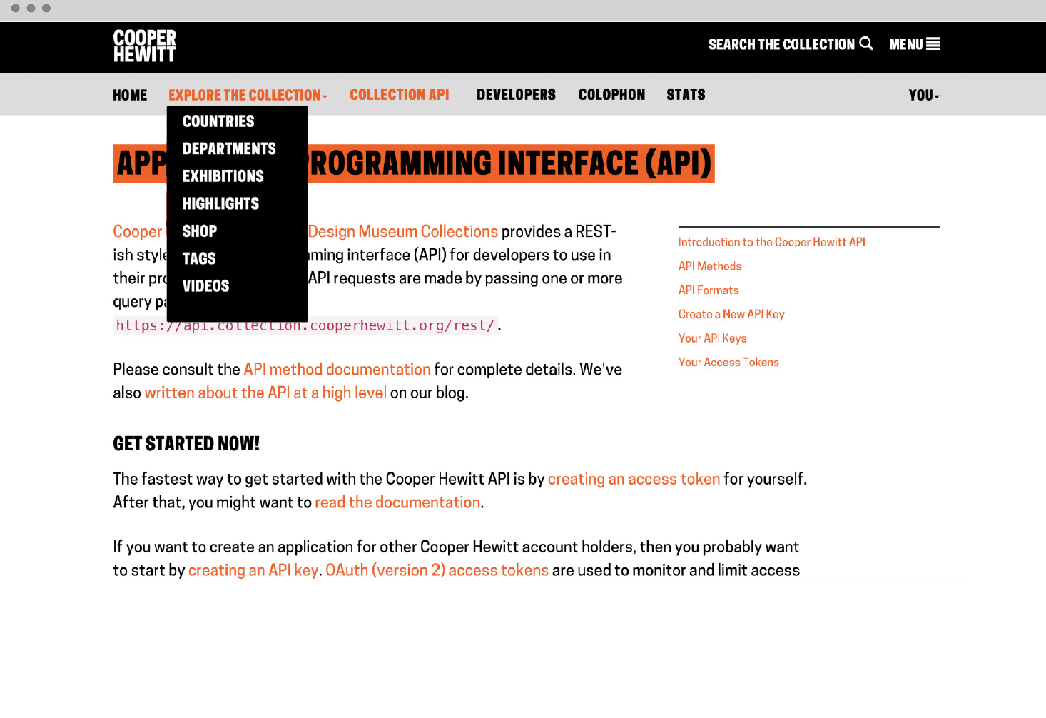
C. Navigation from the Menu icon at the top of page into collection API page
FINDING A
NAVIGATION THROUGH THE SIDE-BAR DOES NOT PROVIDE FEEDBACK
When participants were asked to find more information through the side-bar navigation, it was confusing that they were unable to see the feedback or the information from the side-bar for which page the users are currently on.
RECOMMENDATION
ADD VISUAL FEEDBACK TO SIDEBARS

FINDING B
NAVIGATION OF THE API METHOD QUICK REFERENCE
One experienced user stated, “I like how on the side there is a quick reference section so that you can quickly find something specific that you are looking for.”
Novice API users made comments about the quick reference menu saying things like “there are too many links” or “oh, this is long.”
RECOMMENDATION -1
SIMPLIFY AND IMPROVE THE “API METHOD QUICK REFERENCE”
FINDING C
NAVIGATION FROM THE “MENUS” INTO COLLECTION API PAGE
As far as the navigation experience of the users were concerned, two menus were brought up. Especially, very few participants could find the “Collections API” under the “Explore the collection” grey menu bar.
RECOMMENDATION -2
REVAMP THE “EXPLORE THE COLLECTION” MENU STRUCTURE AND DESIGN
CONCLUSION & NEXT STEPS
To conclude, we presented our findings to the class and clients, a 20 mins presentation via Zoom and communicated with clients for ten minutes in the break room. The clients were happy to see the feedback especially for the novice participants testing. As a beginner of API user, this moderated study, I saw a lot of potential opportunities in the Cooper Hewitt API web experience. We hope we could still continue to join more testing for the museum and make the API innovation website more accessible so that everyone can use it.
This project was also the first time to moderate API, an online programming platform. For the future, as a visual designer, I would look forward to recruiting other participants to seek what kind of visual design in API if API could be visualized.
If you have any questions about this study or are seeking a consultant on a new study, please contact me at qshi2@pratt.edu.