Introduction
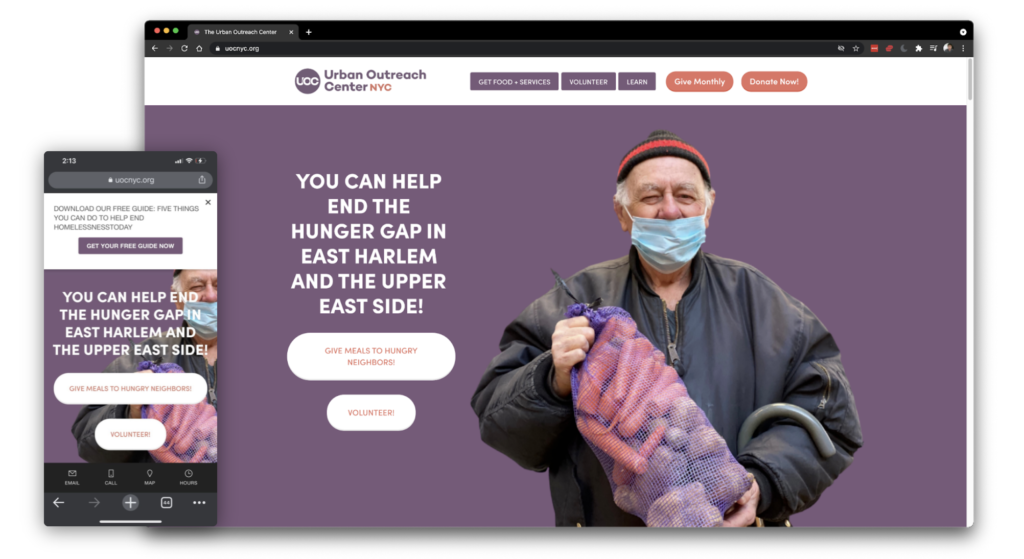
The Urban Outreach Center (UOC) is a non-profit community organization focused on connecting homeless and low-income New Yorkers in East Harlem and the Upper West Side with food and other critical supplies. The UOC helps “nearly 50,000 vulnerable New Yorkers each year to move with dignity out of homelessness and food insecurity toward self-sufficiency.” As a community organization, the Urban Outreach Center is able to make a positive impact through the hard work of volunteers and the generous support of donors. Given the center’s strong volunteer base and current shift away from in-kind donations, this evaluation specifically focuses on the website’s ability to inspire and facilitate monetary contributions.
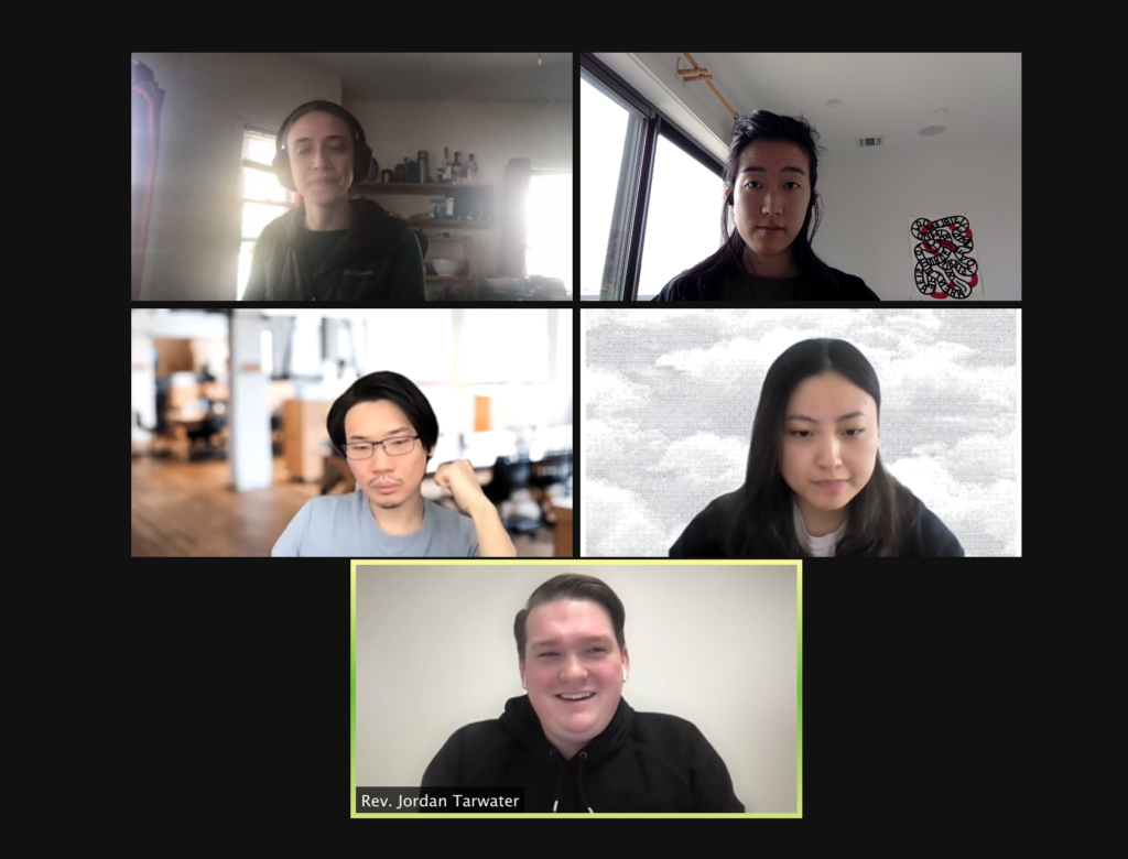
Working in a team of five, with Hilary, Leo, Monica, and Orville, we worked remotely while maintaining a highly collaborative spirit throughout the entire process to bring this usability study and report to come to life.
The Kick-Off
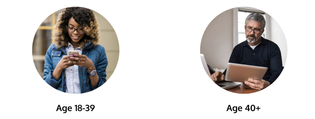
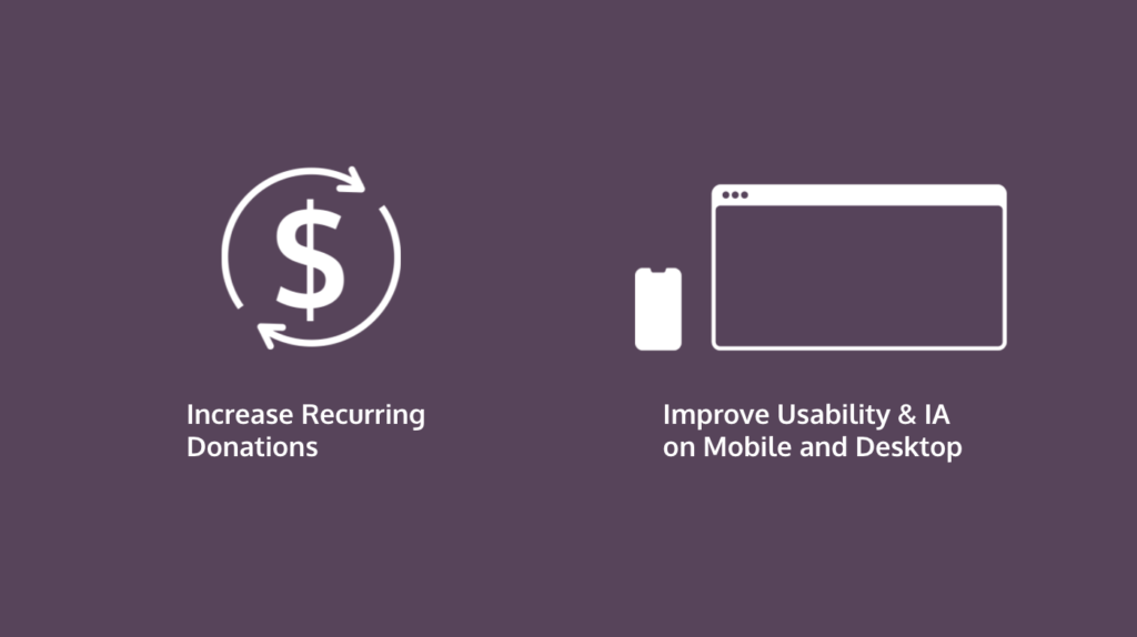
Our research kicked off after the initial meeting with Jordan Tarwater, the Executive Director of UOC, who also designed the UOC using Squarespace. Jordan mentioned that while there are multiple ways for users to get involved – in-kind donations, volunteering, and monetary donations – the center is most interested in exploring how the usability of the website can be improved to increase recurring monetary donations. Another great insight from him is that there tend to older demographic using desktop (40+) that prefers monetary donation, while the younger demographic using mobile (18-39) are more prone to volunteering.
Our Study Goal
After meeting with Jordan, we have identified our study goal and scope of research according to our client’s needs. In our usability study, we will focus our tasks on recurring donations and finding insights to better the user experience of Mobile and Desktop website.
The Process
After prioritizing our study goals and scoping out our targeted demographic, we then went into the research process. Here’s a breakdown of our overall process:
1. Recruitment of participants
2. Design user tasks tailored to our prioritized goal
3. Draft usability study script, set-up instructions, and communication emails
4. Pilot test the study with another member of our class
5. Execute 10 moderated usability study with selected participants
6. Analyze quantitative and qualitative results
Limitations
Because we had online classes throughout the semester, our meetings and working sessions are all done online. We had made it work by using different platforms to achieve a collaborative setting. We met primarily using Zoom, discussed important deadlines and conversations in Slack channels, as well as used the Miro board to input our individual notes taken from participating in each other’s usability study sessions. All of our remote usability studies is done on UserZoom Go with both mobile app and web browser versions.
Zoom meeting with Jordan 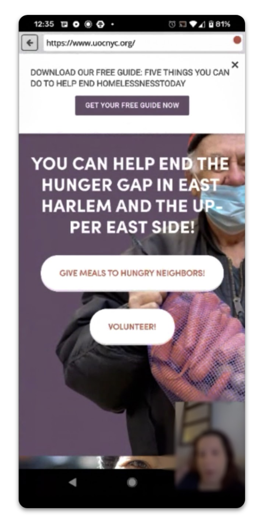
UserZoom with our users 
Our Miro Board for notes
My Role
Our group had a very clear division of labor and everyone was able to participate and contribute to the research process. I was responsible for co-writing the script, emails, consent forms, as well as recruiting surveys. I also ran the pilot test to make sure that everything flows well and is within our ideal time frame. Each of us is assigned with two participants to moderate the usability test using UserZoom Go, as well as to take notes for two other sessions run by other team members. After our studies were done, I was responsible for the writing of one of our recommendations and designing the mockups for all recommendations with detailed annotations.
Findings and Recommendations
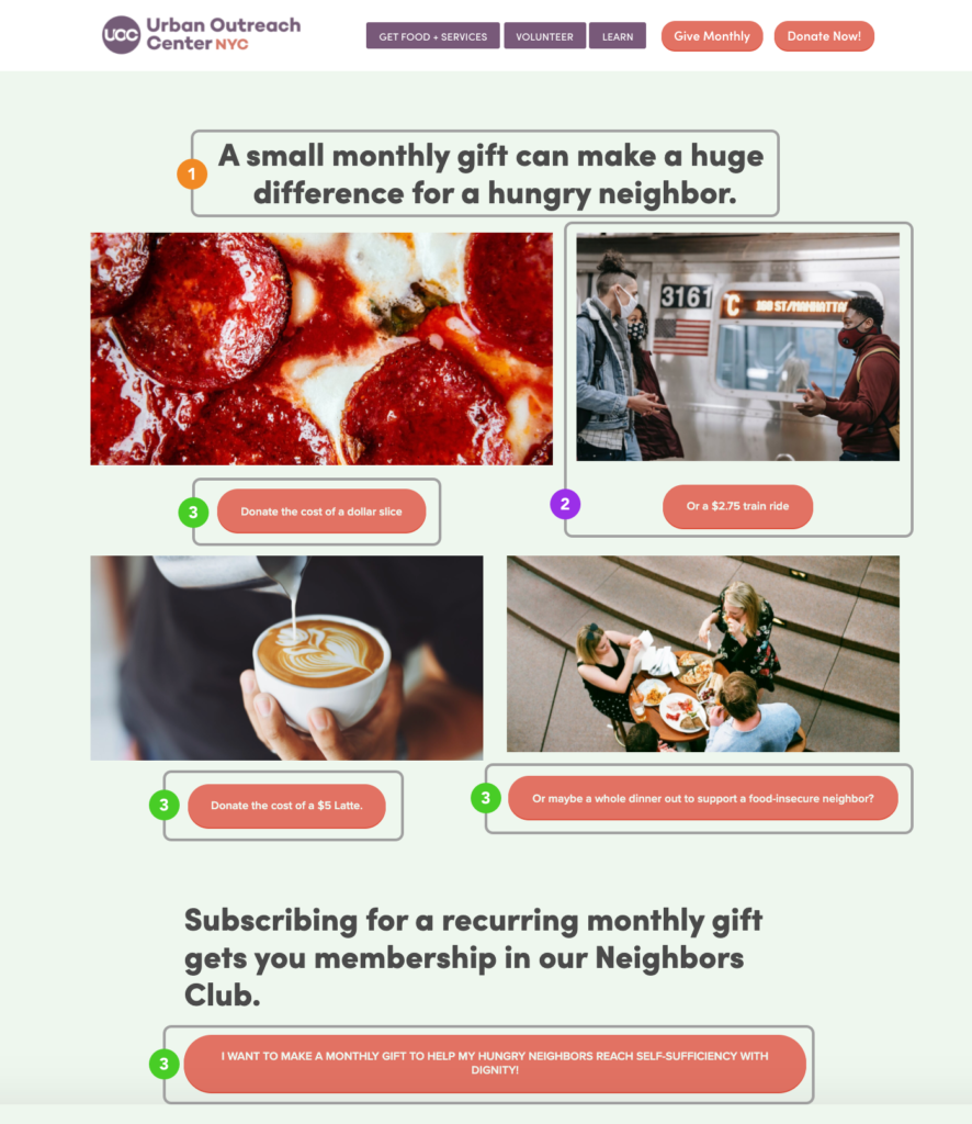
Recommendation 1: Reformat “Give Monthly” page components.
Finding:
Participants were confused if the items in the images represented what was being donated to those in need. Half of the participants (five) however, incorrectly interpreted the pictures of pizza, latte, and the subway ride as descriptions of what would be donated to the Urban Outreach community in need rather than what they as donors could monetarily donate.
Recommendation:
To highlight the impact of monthly donations, the researchers suggested highlighting the most impactful conversion quote “$1 = 5 meals” according to our users, by placing that on top of the page with the header. It is also suggested to rearrange the hierarchy of content to make sure the picture stands out first. By reducing the action button down to only one in the center, it will be a lot more impactful and easier to digest the information for the users.
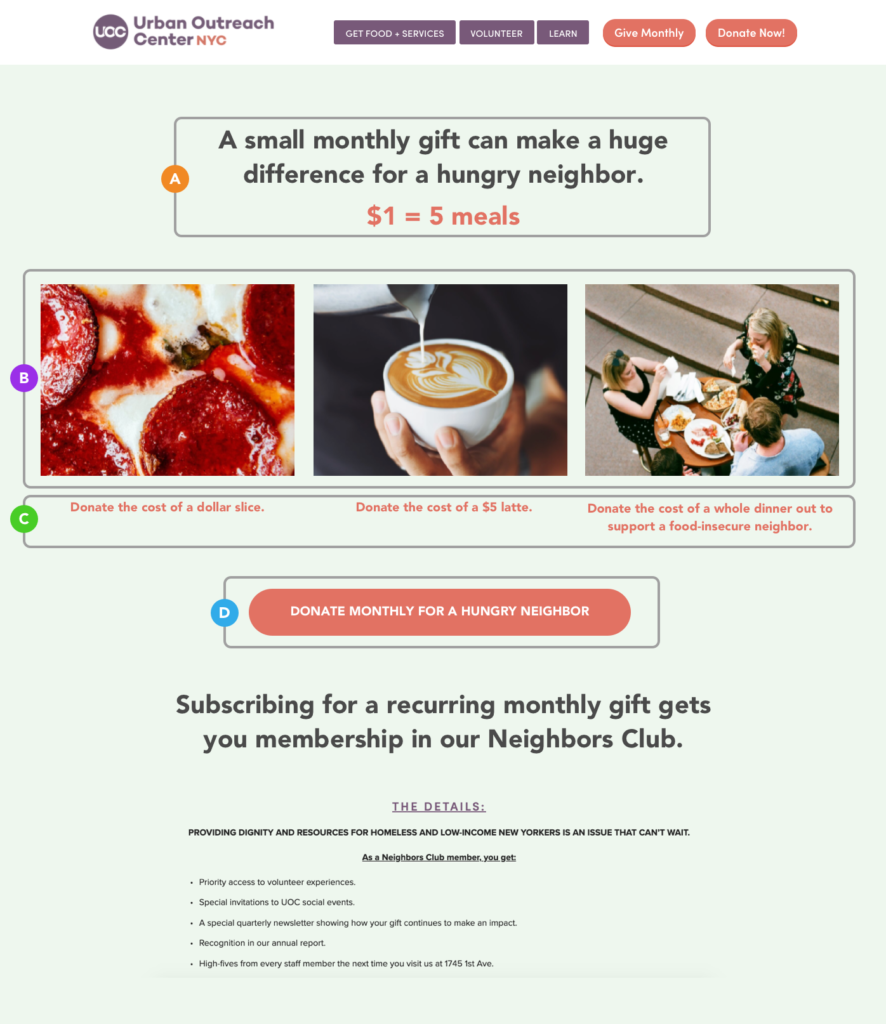
Mockup of recommendations for “Give Monthly” page
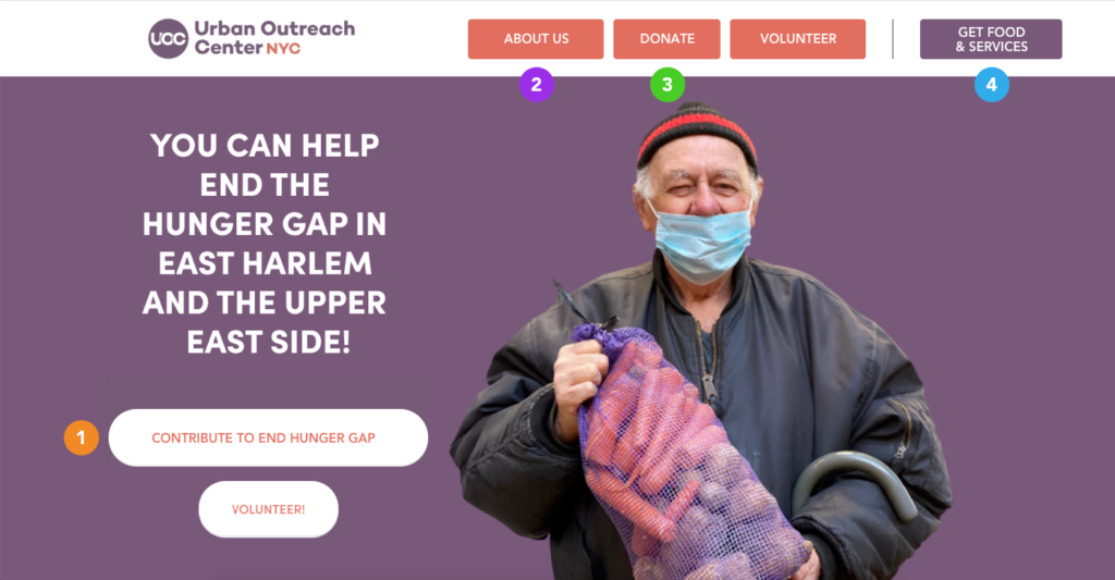
Recommendation 2: Implement an additional navigational menu that users quickly move to differentsections of the page.
Finding:
Participants did not consistently scroll down on the homepage and found that the amount of information on the homepage and the “Give Monthly” page made the information on those pages hard to navigate and digest.
For reference, the homepage consists of roughly 14 screen lengths of content on mobile or 11 screen lengths of content on desktop.
Recommendation:
It is suggested to add an additional navigation bar but the side of the homepage content to not only provide users with an overview of the content and also navigate them to a specific section of the information, preventing the long and endless scroll from happening.
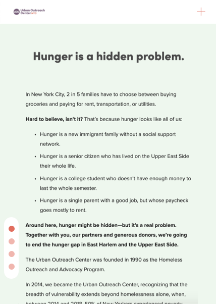
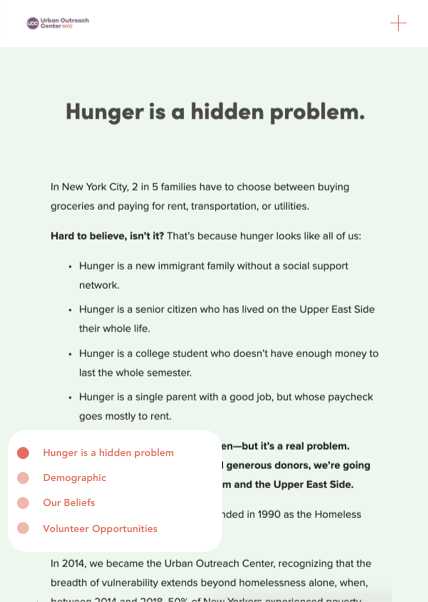
Additional suggestion:
Some of our mobile participants didn’t realize that the homepage was scrollable upon entering, as there is no indicator telling them there is more information provided beneath the 1st screen. We recommend adding a small note with an arrow saying “Scroll Down” as a reminder.
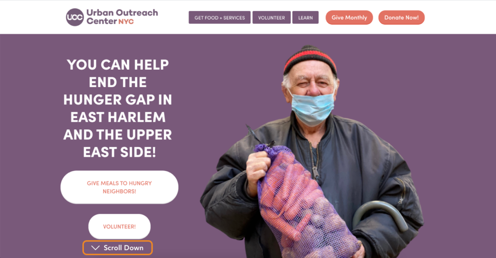
Recommendation 3: Reformat the button labels and information architecture of the menu
Finding:
The labeling and information architecture of homepage navigational buttons confused participants when trying to access specific information. The button saying “Give Meals to …” was misunderstood by one of our users as a volunteer opportunity. The menu bar also has content provided for two different audiences, the people who are looking to provide services, and the people who are accepting services. The current grouping and styling method may be confusing.
“I thought that this (the “Give Meals to Hungry Neighbors”button) means that I can cook actual meals for them.”
—Mobile Participant 2
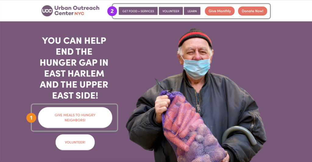
Recommendation:
We made two small changes to the navigation buttons so that is it more straightforward and self-explanatory.
- We relabel the “Give Meals to Hungry Neighbors” button to “Donate” or any wording that is easily understandable as a button that leads to the donation page so that people are welcomed to the homepage with two main options: donate and volunteer, to get engaged with the organization.
- Change the wording of “Learn” to “About Us” and making that a priority. Then, clearly distinguish the content for different audiences (people looking to learn and engage and people looking for services) by grouping and styling the buttons “Learn”, “Donate”, “Volunteer” differently from “Get Food + Services”.
Conclusion
After presenting our report and recommendations to Jordan, he was very happy with the outcome and was excited to put our recommendations into action. He said that some of the things have been bothering him, while the others are issues that he didn’t notice. We were very grateful to take this chance to help out the Urban Outreach Center to reach out to more donators and volunteers to provide more and more service to the community.
Overall for our group, it was a great learning experience, from recruiting participants and battling with spam submissions, to scheduling and moderating the moderated usability study with strangers, they are all things that are brand new for us. My team had worked incredibly organized and was always positive when running into issues. For me personally, it was exciting to actually see the users think out loud and to get to know about how they think and interact with the website. I look forward to using what I learned this semester to full use in the future to better more experiences.