Super Mario Run is a mobile video game released by Nintendo in 2016. In this game, the user controls the main character, Mario, by tapping the screen to jump as he runs through various courses. Being Nintendo’s first venture on iOS, this platform game has received a lot of critical feedback since its launch.
Onboarding
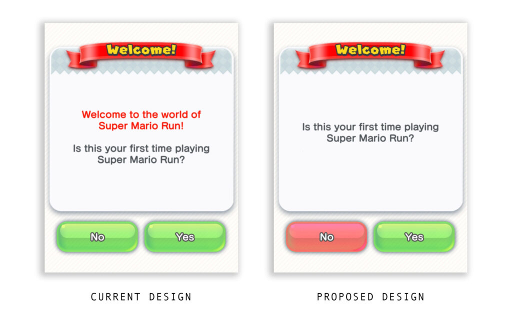
The onboarding of this application begins with a simple question. This screen (Figure 1) has two main calls to action for “No” and “Yes”. Though these both are easily discoverable on the page, there is a lack of distinction between them. This would be a great place to use different colors for each button to signify the difference between the actions.
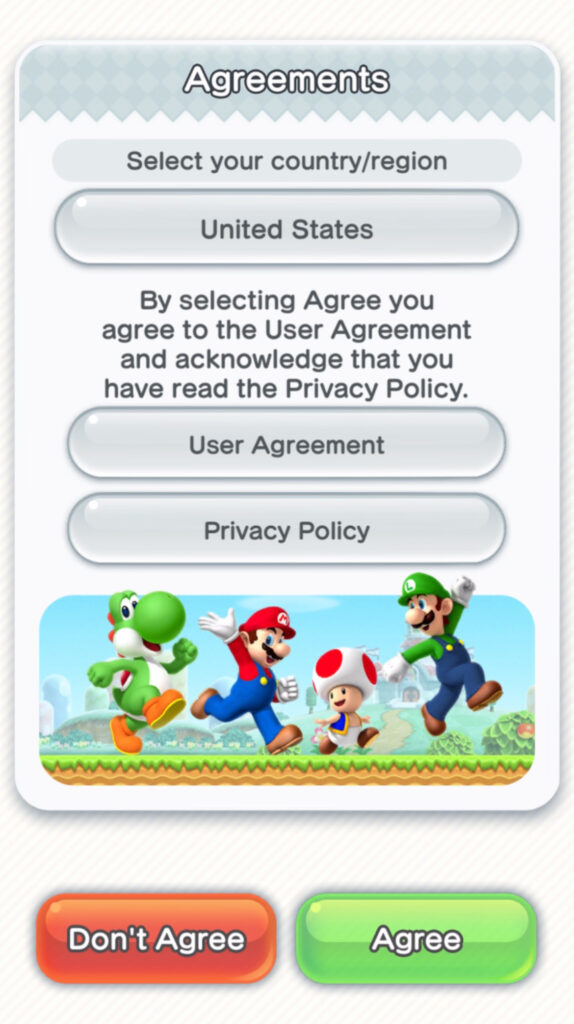
When progressing onto the agreements page (Figure 2), the red coloring of the “Don’t Agree” button clearly signifies the action that the creators do not want you to take. This logical constraint is in place to ensure that users are reading the Privacy Policy prior to playing the game.
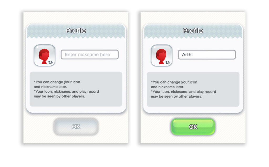
When creating your profile, the screen (Figure 3) affords for a name to be entered, and only when text is inputted does the color of the CTA at the bottom of the page become green, signifying that it is “OK” to continue.
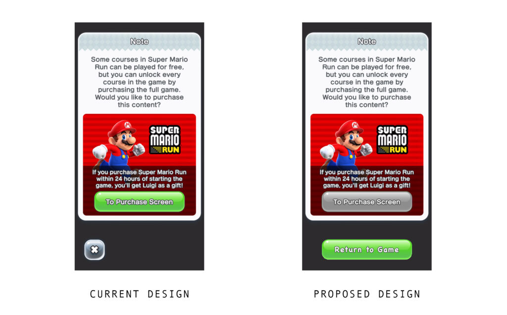
The final screen (Figure 4) of onboarding involves purchasable content. Based on the conceptual model formed about the significance of green buttons in the previous screens, the user will be inclined to click it here too. Since this is taking the user away from the game content, it is misleading. This decision was probably made to increase revenue, but the more ethical approach would be to make the CTA back to the game more prominent.
Tutorial
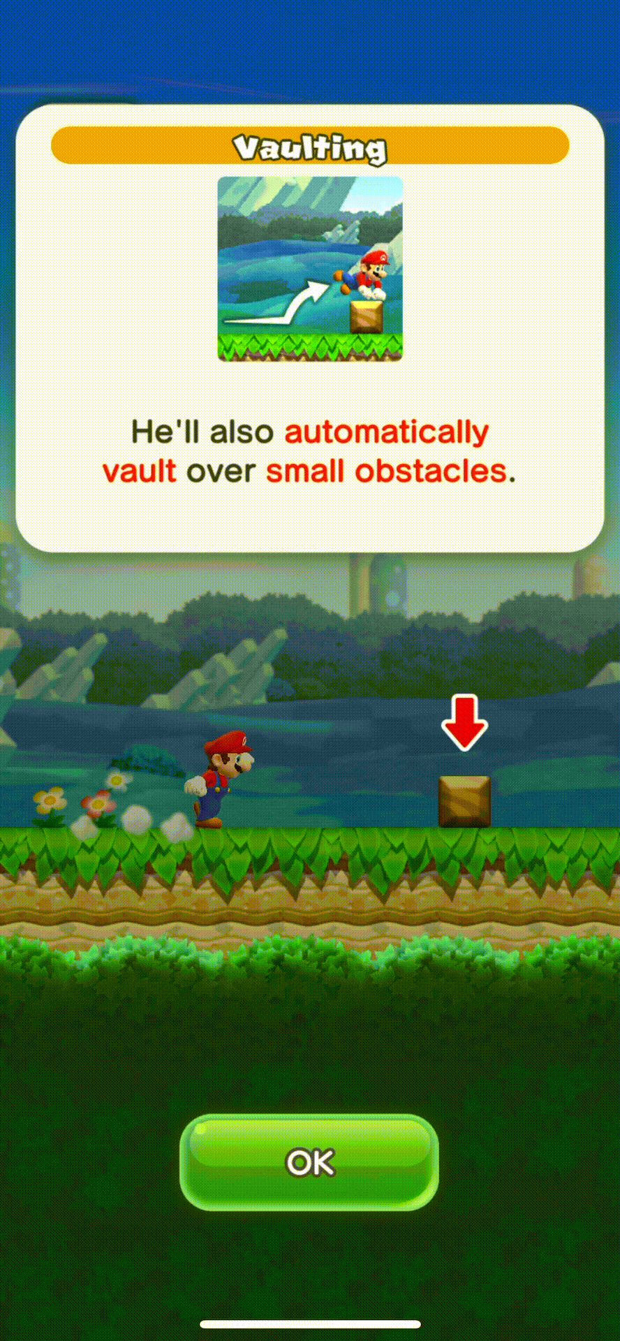
After onboarding, the user is taken through a skippable tutorial (Figure 5) of the gameplay. This play through presents a great system image of what happens, what the player is able to do and how to do it.
When parts of the gameplay are described, the path to proceed is easily discoverable, as there is a pause in the video and a green CTA is displayed prominently on the screen to continue.
There is a logical constraint put before the character when objects or enemies cross his path, and the situations in which this happens afford him to get out of the way.
If a user skips this tutorial, they may lack the procedural knowledge to play the game efficiently- they may assume that Mario would not vault over small objects on his own. Their mental model may not match how the game actually works, and they would be frequently making the mistake of trying to jump over all objects.
Iconography depicting the user’s hand and phone show the causal relationship between the action of tapping the screen and Mario jumping. The user sees immediate feedback when touching the screen, because the character in the game jumps.
The power bar to the left of Mario is a great signifier of how much power is in his jump. The longer you press and hold the screen, the higher his power becomes – this correlation is shown visually as the bar fills with color.
Gameplay
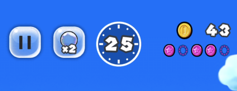
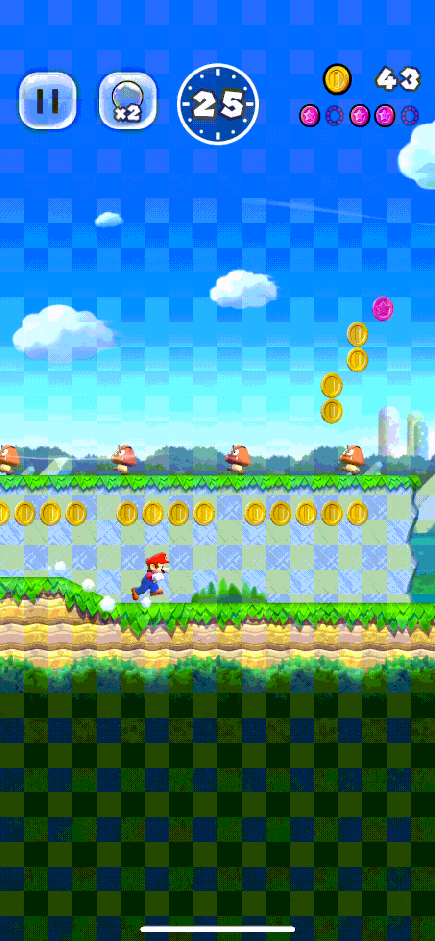
During gameplay, there are much more elements of the game presented. On the heads up display (HUD) (Figure 6) of the game, the user is presented with icons that afford pausing the game and using a bubble alongside indicators of time remaining and coins collected. As time elapses, the counter in the timer decrements – this is an expected natural mapping. A very similar concept occurs as the user collects coins in the game.
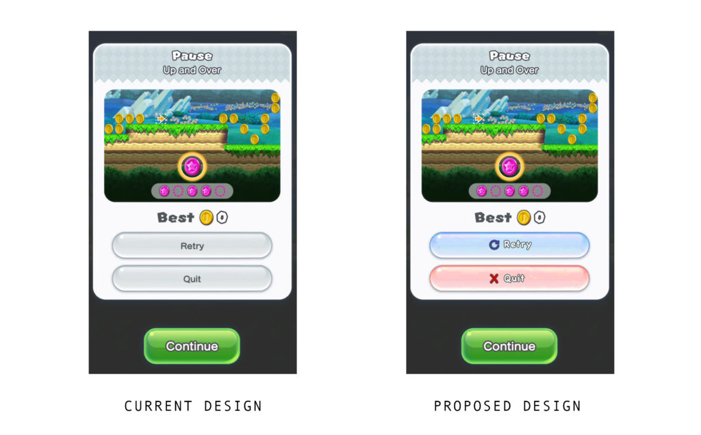
When the user presses the button (Figure 7) to pause the game, there is immediate feedback as a new window with a “Pause” menu is overlayed. Though there is heavy prominence placed on the button to continue, the two secondary CTA are competing in the hierarchy presented here. Displaying the buttons for “Retry” and “Quit” with updated iconography and color (Figure 8) could make them discoverable and prevent potential slips between the buttons.
Conclusion
Nintendo’s first effort in mobile game development is successful, but there are some usability pain points that could be easily alleviated to create a better product overall.