Chapter 1: The Problem
The Client
Our client was Engram. Engram was founded by Priscilla Cancar.

The Evaluators
Our team was comprised of four graduate students enrolled in the Fall 2021 INF0644-03: Usability Theory and Practice course taught by Dr. Elena Villaespesa at the Pratt Institute School of Information in Brooklyn, New York.


The Product
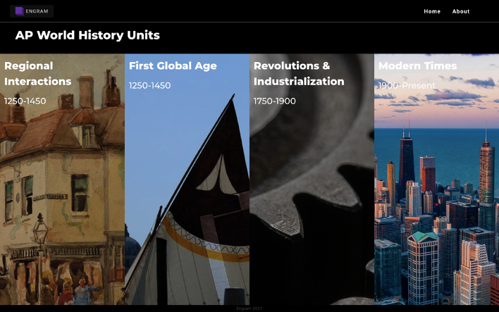
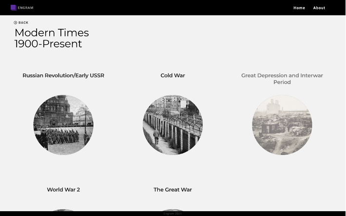
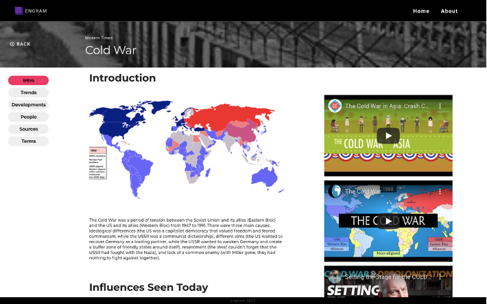
The product we worked with was the Engram website. The Engram website was designed to be an aid for high school students in the AP World History course. Cancar is an alumnus of the course and found a gap in the market for resources to study for the course and prepare for the exam. Engram was created with the intention of filling this gap. Engram organizes its content into topics (Figure 2) and subtopics (Figure 3) according to the AP World History curriculum. Within each of these subtopics is an Intro page; Trends page; Developments page; People page; Sources page; and Terms page (Figure 4). It has an appealing aesthetic and organized composition.
The Goals
The Engram website is still in the beta stage. Our client did not cite any specific areas of concern. We as evaluators set our goals.
- Evaluate overall usability
- Test key pages
- Assess whether the Engram website facilitates the Engram mission
Chapter 2: The Process
The Approach
During Week 1, we created questions to be posed during the client meeting and held the client meeting (Figure 5). I was responsible for drafting the meeting questions, leading the client meeting, and taking the meeting minutes.
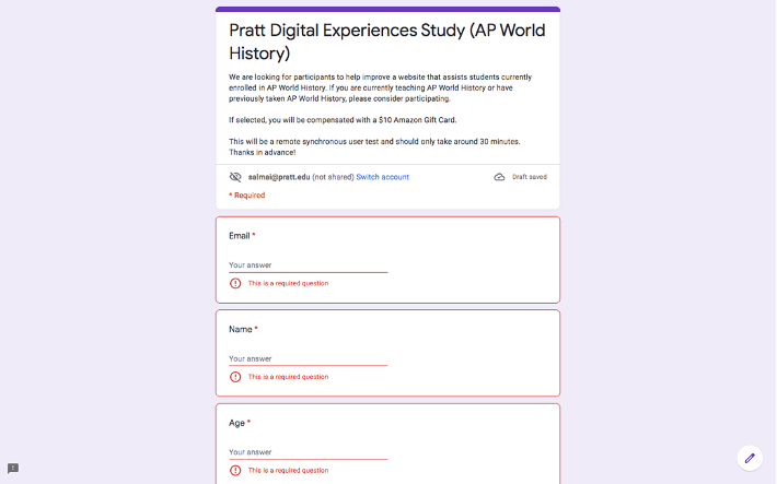
During Week 2, we identified avenues of recruitment; sent recruitment emails; created a survey for tentative participants (Figure 6); and drafted tasks (Please see “The Participants” to learn more about our recruitment strategy.) I was responsible for sustaining communication with the client and drafting recruitment emails.
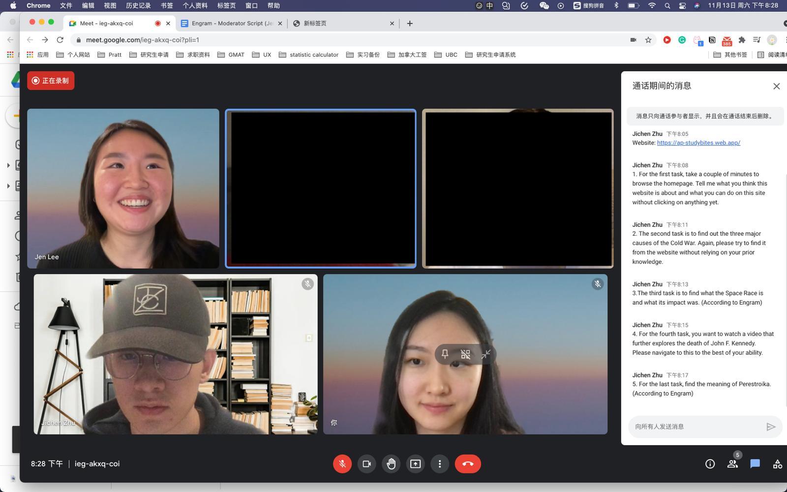
During Week 3, we continued our recruitment efforts; finalized tasks; created and sent consent forms; finalized our script; ran a pilot test; created our schedule; sent confirmation emails; and ran our first testing session (Figure 7) (Please see “The Method” to learn more about our testing method). I was responsible for continued recruitment, the moderation of the pilot test, and the moderation of Test Session 1.
During Week 4, we ran six more testing sessions and began compiling data (Figure 8). I was responsible for the moderation of Test Session 5 as well as notetaking for Test Sessions 2, 6, and 7.
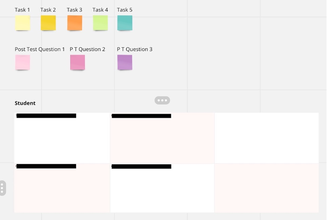
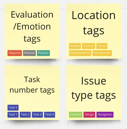
During Week 5, we compiled and consolidated all of our data (Figure 9); assigned and averaged severity ratings; and chose the findings to highlight in our report (Please see “The Findings” for more information on how we prioritized findings). I was responsible for sustaining communication with the client and the compilation, consolidation, and rating of the data of two testing sessions.
Finally, during Week 6, we created our report and presented our findings. I was responsible for leading the presentation, completing the Introduction, Overall Findings, and Conclusion, and editing and finalizing the report and the presentation scripts.
The Method
We utilized remote moderated user testing. Remote moderated user testing is an evaluation method that makes use of screen- share and think-aloud techniques. It necessitates the participation of a moderator. Participants can complete the testing sessions in an accessible and comfortable environment. In turn, this method is cost-effective, time-effective, and convenient for evaluators as well. This method allowed us to guide, observe, and record participant interaction with the product. We prepared tasks, a pre-test questionnaire, and a post-test questionnaire to learn more about the participants and their thoughts. In utilizing this method, I learned that moderation without guidance can be a challenge. I also learned the importance of an encouraging, informative, and present team.
The Participants
We selected eight participants to fit the timeframe and scope of our evaluation. We chose to recruit former AP World History students and current AP World History teachers. Because the target audience is current AP World History students, meaning the target audience is likely under 18, we focused on adjacent audiences as participants. We utilized every participant who volunteered for the study, so the only qualifiers would be fitting one of these roles.
Four participants were current AP World History teachers. They were from various states within the United States, their ages spanned from 32 to 50, and they had anywhere from 1 to 9 years of experience teaching the course.
Four participants were former AP World History students. They were from various states within the United States, their ages spanned from 22 to 30, and they had taken the course between the years of 2008 and 2015.
We recruited participants from the Pratt Institute School of Information listserv, a Facebook group for AP World History teachers, and a database of schools which certain AP courses (Figure 11). I learned that, though there may be some risks associated with recruiting from social media, it is also a great resource to find participants who are knowledgeable and enthusiastic. I also learned that you need to recruit more participants than you need, as some participants will inevitably forget or skip testing sessions.
The Tools
Google Hangout Used to conduct testing sessions – Had no time limit, offered professional format for meeting invitations
Google Docs Used to create schedule and share information – Provided great platform for collaboration
Miro Board Used to compile and consolidate data – Contained multiple options for formatting and organization
Chapter 3: The Results
The Quantitative
- ⅞ of the participants were able to complete all of the tasks successfully.
- The average rating given by students was 5.5/10 and the average rating given by teachers was 7/10 for an overall average of 6.25/10.
- Evaluators identified 19 usability recommendations of various severity ratings. Two of them were given a severity rating of 4/4 and are vital to fix.
The Qualitative
There was a lot of positive commentary as well as constructive criticism. After compiling and consolidating our findings, we assigned and averaged severity rating, and chose the findings to highlight in our evaluation based on the severity rating. Both findings given a severity rating of 4/4 were included, as well as one particularly significant finding given a severity rating of 3/4. The findings pertained to navigation, layout, and interactivity.
“I like the clean visual design of this page!” “I like the “Terms” page a lot!”
“Straightforward.” “I like the idea of providing visuals.” “That was convenient.”
The Findings
A. Navigation
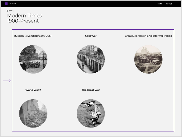
- The content on the historical event selection page does an identifiable order (Figure 12).
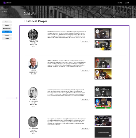
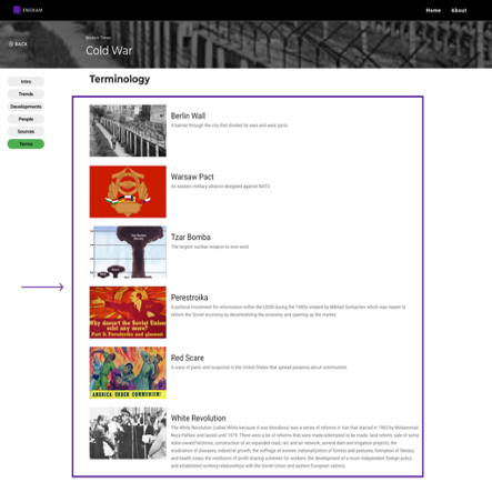
- The content on the “People” page (Figure 13) and “Terms” page do not have an identifiable order (Figure 14).
- There is no search function on the website.
B. Layout
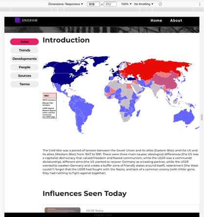
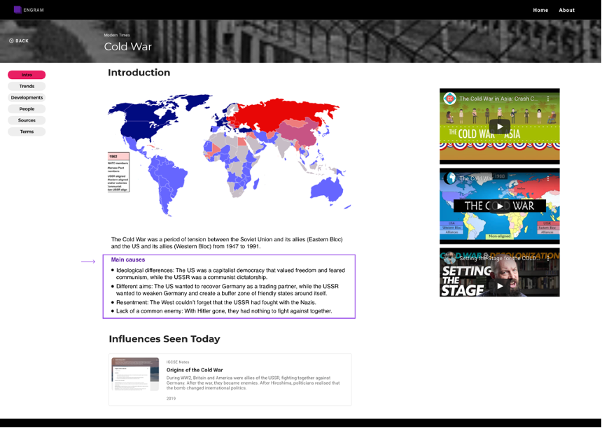
- The structure of the content is unclear (Figure 15).
- There is the potential of inaccessibility for users with weaker eyesight due to font size (Figure 15).
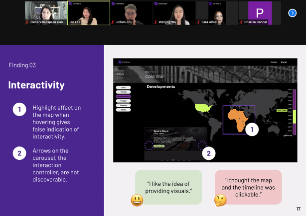
C. Interactivity
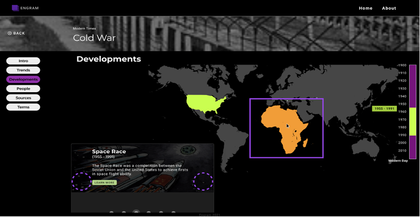
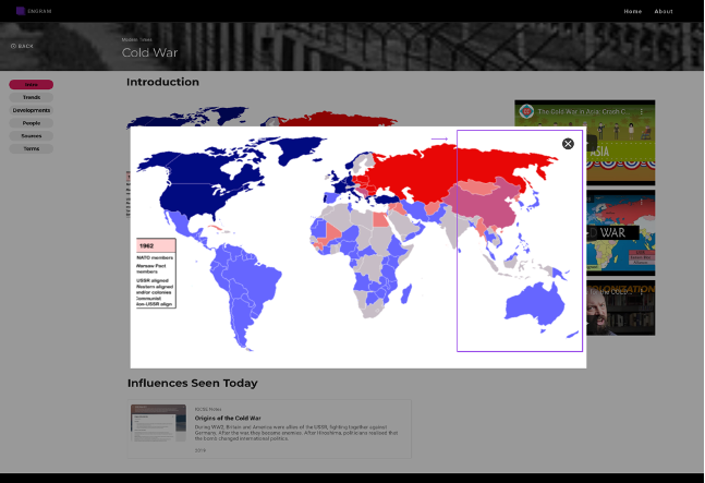
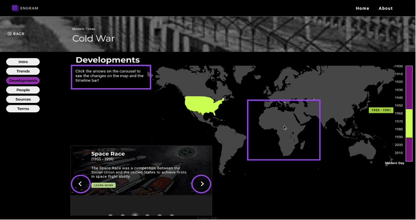
- The highlight effect which takes place on the map when hovering gives a false indication of interactivity (Figure 16).
- The arrows on the carousel, which are the actual source of interactivity, are not discoverable (Figure 16).
The Recommendations
A. Navigation
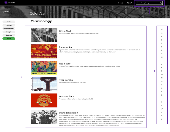
- Arrange the content in alphabetical order on the “People” page and “Terms” page (Figure 17).
- Incorporate a search function (Figure 17).
B. Layout
- Use subheadings and bullet points (Figure 18).
- Increase the font size to 18px (Figure 18).
- Allow for enlargement of images (Figure 19).
C. Interactivity
- Remove highlight effect when hovering on map (Figure 20).
- Make arrows on carousel visible at all times (Figure 20).
- Add a textbox with usage instructions (Figure 20).
Chapter 3: The Results
The Conclusion
We received a lot of encouraging feedback on Engram that showed it was on the right path, as well as helpful feedback, which showed there is room for improvement. We are excited to see how Engram develops, considers its target audience, and draws prospective users.
The Delivery
We gave a presentation to explain and illustrate our findings and recommendations to our client. We used quotes, charts, citations, and mockups as tools for our presentation. She seemed appreciative of and open to our evaluation (Figure 21).
“I could tell a lot of care was put towards considering what the user would want to do.”
“I have been working on this for so long and I think I was too close to it to see this perspective.”
The Next Steps
The tentative next step would be to consider our findings and implement our recommendations. As Engram it still in its beta stage, the completion and launch of the website would be next. Then, perhaps another evaluation could be carried out to further finetune Engram.
The Takeaway
The takeaway would be that remote moderated user tests and usability evaluations in general require planning, cooperation, and follow-through. Beyond that, they can be accomplished with low barriers in terms of audience, price, and time. They can be incredibly great tool to have in your kit for usability.
The End!