The Met website is the go-to place for all art enthusiasts to learn about art and get more information about the museum. We gathered insight into how readers consume content on The Met’s website through eye-tracking and retrospective analysis and provided recommendations to enhance the user experience.
Team members, Tools used, and Timeline
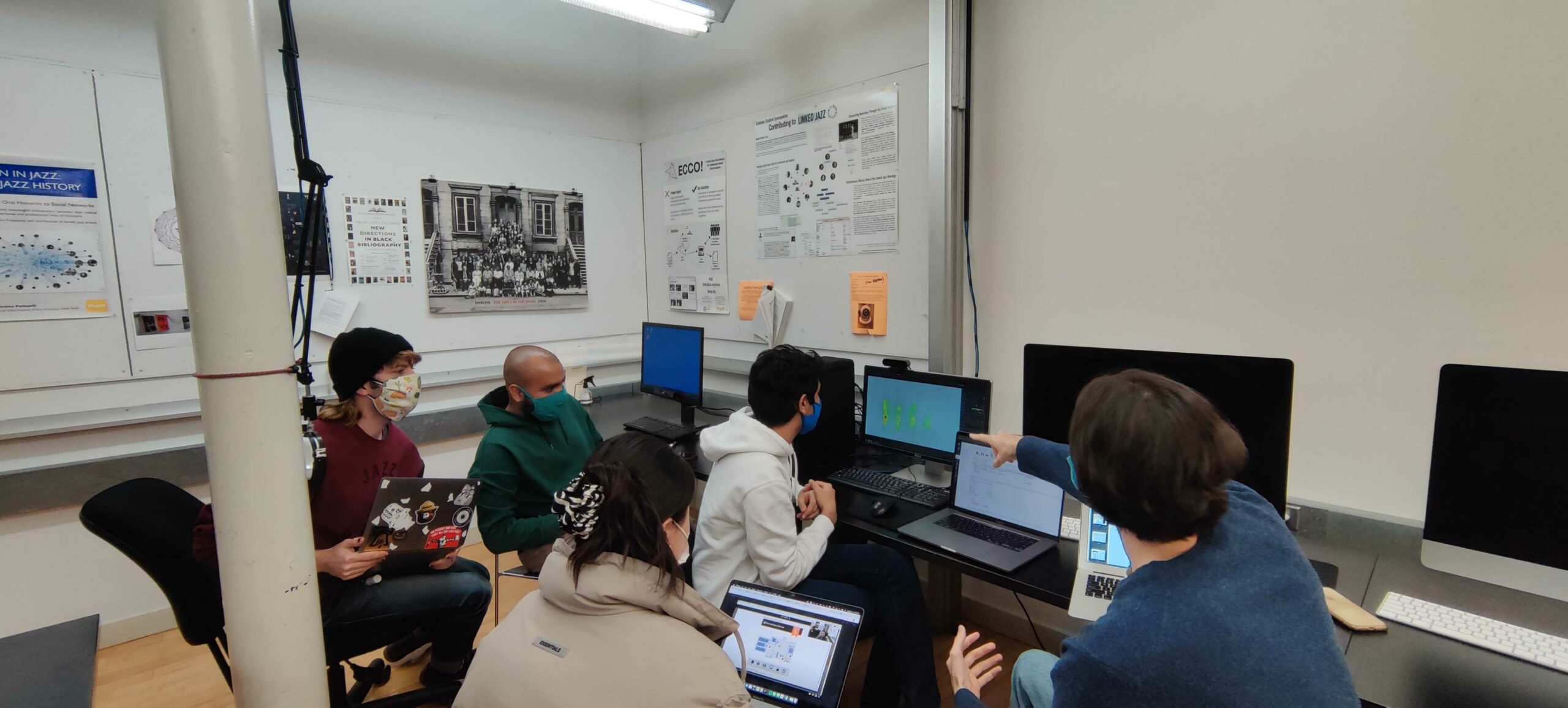
This project was teamwork, and the team members were Chris, Kyle, Mayank, Xiujie, and myself(Raunak). We worked collaboratively from start to end, and we even conducted eye-tracking using the Tobii tool to study on two participants each to gather data. We also did SUS scoring for all the information we collected from our participants to validate the research. In conclusion, each of us provided one possible recommendation to improve the user experience for the readers on The Met’s website.
Defining project scope and the needs of the client
The Met website offers multiple functionalities for its user. For this project, we wanted to limit the scope to do the project within the timeline and gather meaningful insight and work on quality rather than quantity.
We focused on two significant parts of The Met’s website –
Close look articles
The Collection Experience
Close look articles: Close look articles is a very engaging section on The Met’s website. It allows users to see selected artworks in detail and get to know extra information about them. With the close look articles, we wanted to check how readers consume textual and visual content. Through this study, we also wanted to understand how readers prioritize information, do they prefer visual or textual content.
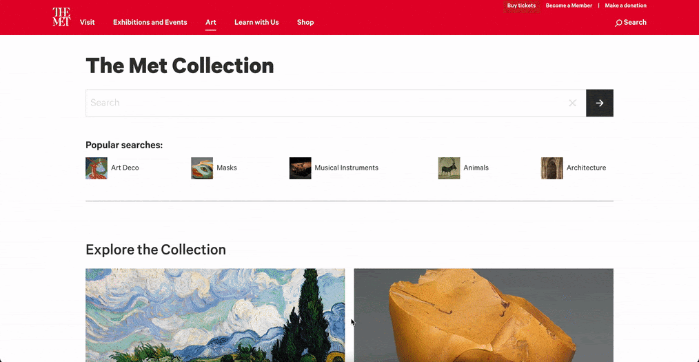
The Collection Experience: The collection experience allows users to find any artwork they want from The Met’s website. It has excellent filter options that will enable the user to filter search options as per their need. Through the collection experience, we wanted to understand how users search for a particular art and its steps. We also needed information on how users engaged with the work of art, its information, and the collection search’s UI elements.
Participants, Tasks and Scenarios
We recruited 10 participants: 7 graduates, 2 undergraduates, and 1 unaffiliated participant. Their range of interest in art is between highly interested and somewhat interested. We conducted a Combination of pre-test, post-test questionnaire, System Usability Scale, and recorded observations to gather insights and collect data.
Close look articles: We asked users to spend some time exploring the Close Look article as they usually would.
The Collection Experience: We asked users to browse through the MET Art Collection page and learn about an artwork that interests them.
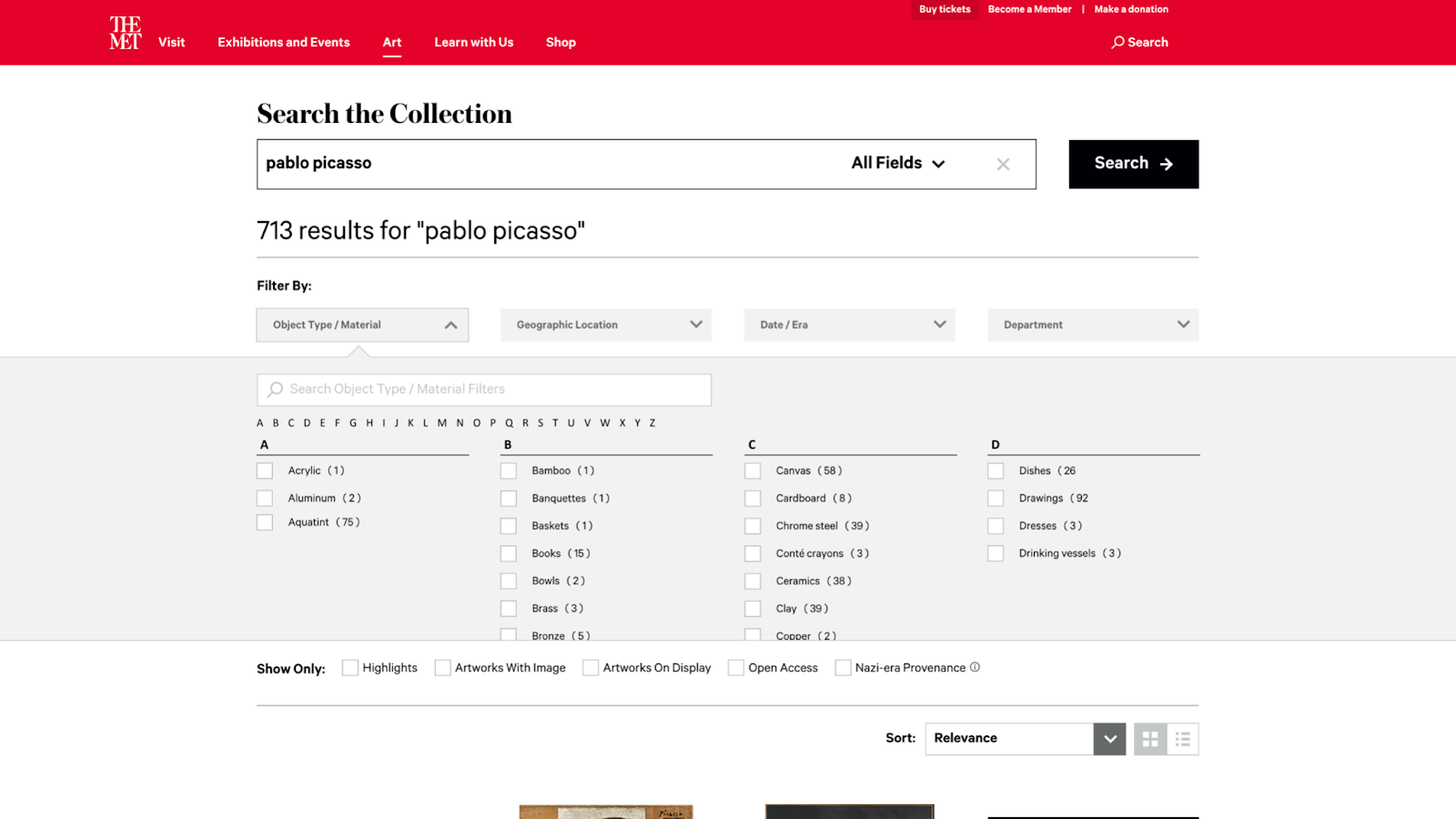
The Collection Experience: Imagine studying Pablo Picasso at school and researching his artwork drawn using Graphite in Cubism style. Search for any artwork in the criteria in the Collection and learn more about it.
Data analysis and SUS score
For this project, we gathered both Quantitative Data and Qualitative Data. For the Quantitative Data Analysis, we used the Areas of Interest (AOI), Time of Interest (TOI), Heatmaps, Fixation points, and Gazeplots. Whereas for the Qualitative Data Analysis, we used Observations Video walkthrough and debrief.
Through User feedback and overall experience, we could also gather a good SUS Score for The Met website. We learned how The Met scored a percentile range of 80-84, which is considered good! The Met also scored a mean SUS score of 78.3, usability score of 77.5, and learnability score of 81.3.
What worked well for close look artciles?
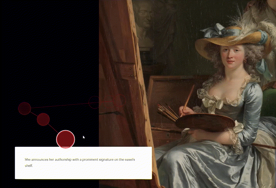
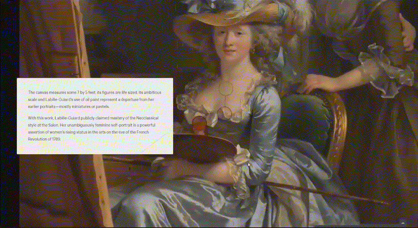
The participants really liked how the image was moving along with the context of the text, and it allowed them to look closely at the artwork with all the details. The Close Look experience guided our users in a simple-to-follow way, encouraging them to learn more about these artworks.
“It was interesting how when the text was referencing a part of the piece…it would kind of zoom in on that. It’s not like you have to look for it, they’re already showing it to you. I like that as well, and it allows for better understanding.”
– Participant A
Having navigation control can enhance the experience of close look articles
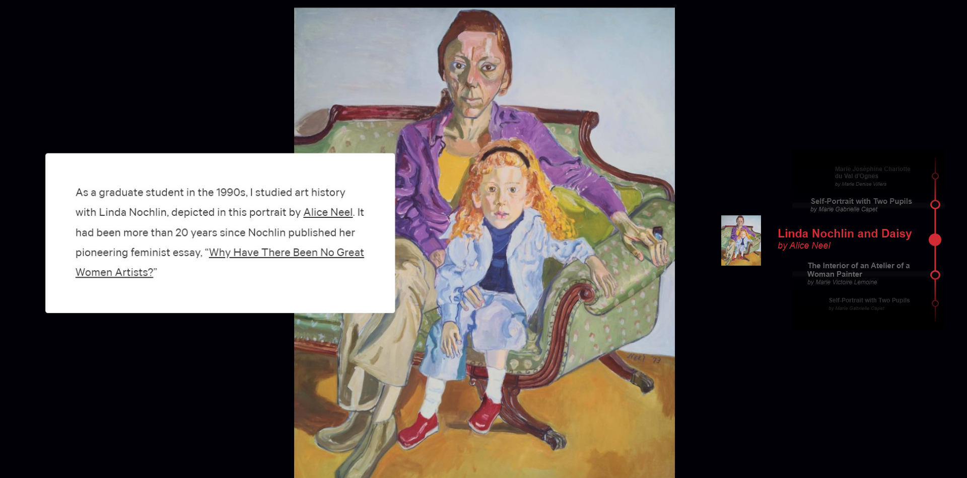
Our research found that most users lost interest after spending some time on close look articles. Initially, the users were very excited to view this section, but since it is a very long scroll, they were demotivated entirely by the end. Since there is no navigation menu on this page, users don’t have an option to quit from here. It also forces them to read through every content on the page to reach the end. These are some things that frustrated our users about Close Look Articles.
“I moved my head here because I was tired of reading. I probably would have paused here had I not been doing this for you guys, and it just felt like a lot of scrolling at this point.”
– Participant O
Recommendation
Providing a navigation menu on the Close Look articles page will allow users to jump to the section they are most interested in. The users also don’t have to read through every content through this.
Providing an engaging interaction and user interface
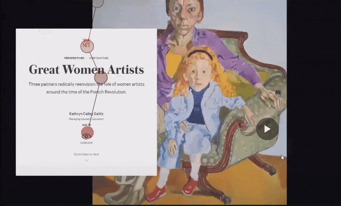
Users were often confused about the landing page of the close look articles. There are so many things in that section that it obscures the users, and there are also unnecessary micro-interactions that add no value to the page. Users were also unaware of how to start reading the article. This could be because there are so many elements on the landing page, which confuses the user. There is also no signifier to inform the user about scroll functionality.
“I barely registered ‘Great Women Artists’ even though it clearly says it there. I may have read it, but it didn’t sink because a lot was going on there.”
– Participant O
Recommendation
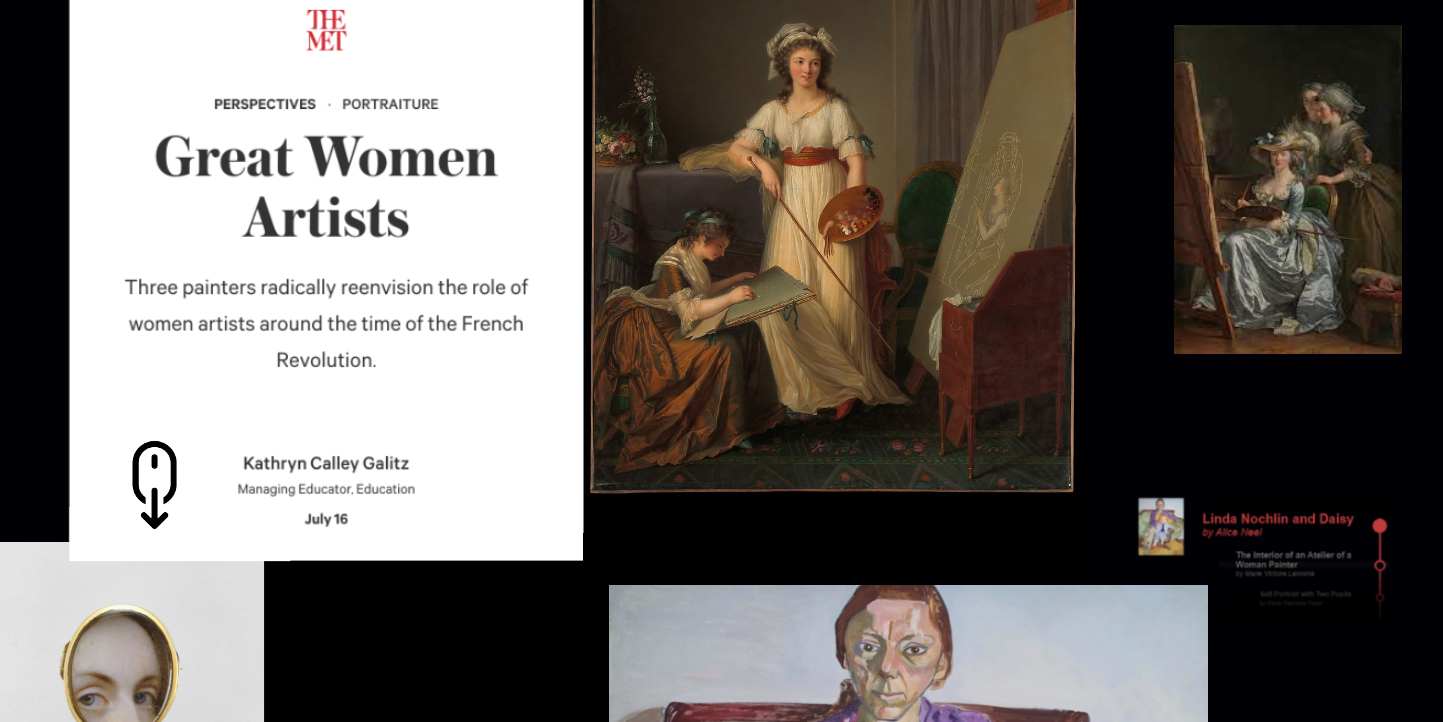
To indicate that the page is meant for scrolling, place content that passes beyond the fold, providing a helpful hint for users. If scope allows, we also recommend adding a parallax effect to the images to make the experience more immersive.
What worked for The Collection Experience?
All the users loved how intricate the filter system was within the collection experience, and it helped users search for artworks with specific details. The search bar came in handy and provided quick access for any particular filters.
“As soon as I started, I used search cause it was easier when searching within a catalog. I tend to do that when websites provide it.”
– Participant S
Enhancing the filter options could yield better results
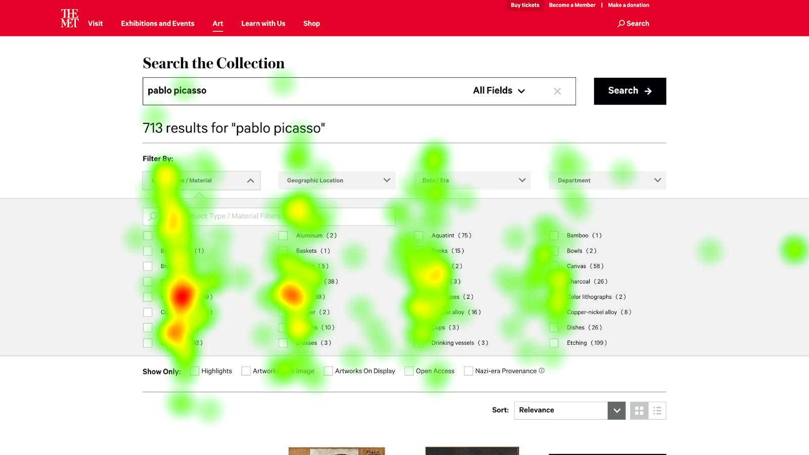
Even though the filters within the collection experience were beneficial, most of the users found them hard to use. There are so many options within any particular filter that it confuses and drains the user. While the user was doing the task, it took them more than enough time to locate the “graphite” material within the filter. Even though there is a convenient search bar within the filters, only 50% of the participants used it. Users were skimming vertically while filters are ordered horizontally.
“I didn’t notice graphite was there. I would imagine going down alphabetically instead of across.”
– Participant A
Recommendation
Arranging filters in vertical alphabetical columns would allow the user to find items they are looking for quickly. In addition to the search bar providing anchor tags that will enable the user to jump to specific alphabets would be helpful.
Adding more filters to the list can help in quicker search results
We also learned that the existing filters were insufficient to improve search options throughout the study. For example, there was no filter when the users were looking for cubism-styled painting! It didn’t inform the user about what cubism looks like, and the user had to make assumptions. The Met can also add an artist filter to look for the artist rather than typing each word quickly!
“I was looking for ‘Artists’ ‘I wanted to see if there was a category for ‘big artists.”
– Participant O
Recommendation
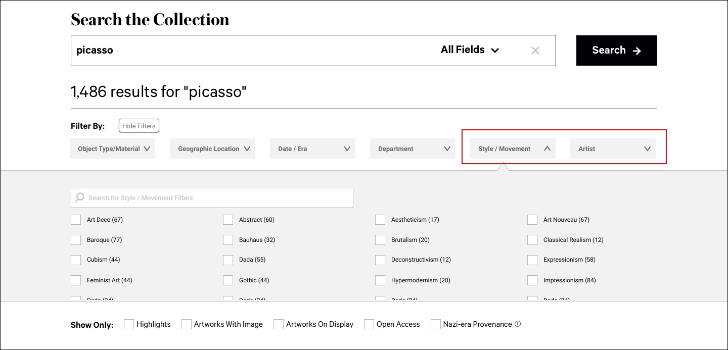
Adding some additional filters can be beneficial for The Met, as it will allow the user to yield the results they want quickly. This function can also be helpful for cases when the user doesn’t know what they are looking for.
What else can be done to enhance The Met’s website experience?
Apart from all the changes mentioned above, a few minor changes can enhance the website.
- Reverse chronological order in Exhibition Date in artwork detail page so that the most recent is at the top.
- Implement navigation buttons for images
- Highlighting the note on the image for zooming in
- Informing users to scroll down on an individual art page
- The leading search bar isn’t very forgiving – one letter mistake in an artist’s name will produce no results
How can these changes impact The Met’s website?
The Met website serves as a great example to find all about an artist or their art. However, there are certain sections on the website that we tested and felt like they need improvements. The recommendations mentioned by us will not only enhance the user experience on The Met website, but they will also help in –
- Providing important information quicker
- Increasing the engagement of the user on the website
- Enabling users to have more control over their actions
Final thoughts by the client and next steps
The client liked the findings and recommendations we provided to them, and they were impressed by the amount of thought and execution that went into this project. They also mentioned their eye-tracking study and how users were trying to click on the image on Close Look Articles. This was something new to us, as we didn’t notice such behavior among our participants. The client also liked how detailed the information was and how it could benefit them.
The client plans to run these new designs for the next steps and get honest user feedback. Based on the future insights, we can understand how successful these recommendations were and what we can make further changes.