
The iOS built-in calendar App supports users to track dates, arrange events, and set reminders. As a built-in App, its apple store rate is only 2.6 out of 5. This article would critique the calendar App based on some concepts discussed in Don Norman’s book- The Design of Everyday Things.
1 – Add an event to the calendar
With the continuous development of software, the calendar nowadays not only records the date but is also being used for event arrangements and reminders. When users open the Calendar App, one main activity is adding an event. Here (as Figure 1 showed) the only way to add an event is by clicking the “+” button on the top right corner. The red icon “+” is a good signifier indicating that it’s clickable and implying the function is adding or creating something. However, the usability could still be improved.
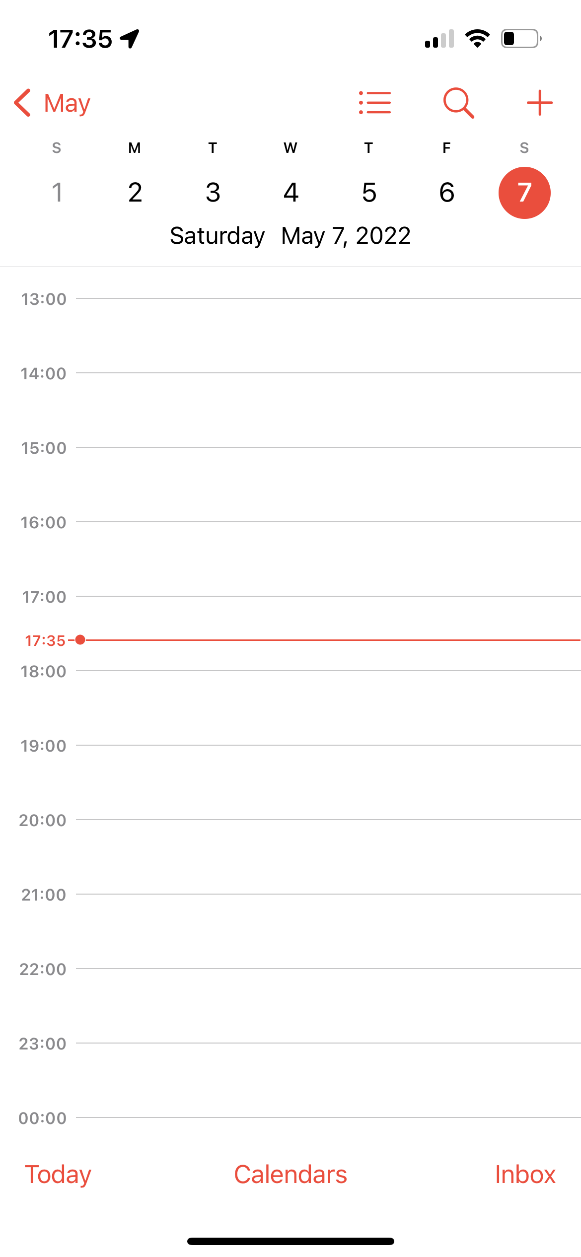
First, the discoverability. The “+” button is not easily discoverable for first-time users. It takes several seconds to locate it. Besides, the design is over-simplified. There are no descriptions of what function each icon represents. It requires users to have pre-knowledge (knowledge in the head) of what those icons will normally perform. Both bring a gulf of evaluation – adding difficulties to discovery and interpretation.
Second, the limited interactions. Clicking the “+” button is the only way to add new events. This didn’t match users’ expectations (or called conceptual models) and would bring frustrations. Instead of using the “+” button, users might also expect to add an event at a specific time by just tapping around the time range. However, when tapping the white calendar space in Figure 1, nothing happened. It’s missing feedback and creates a gulf of execution – a mismatch of users’ intentions and what the system allows them to do.
Solutions
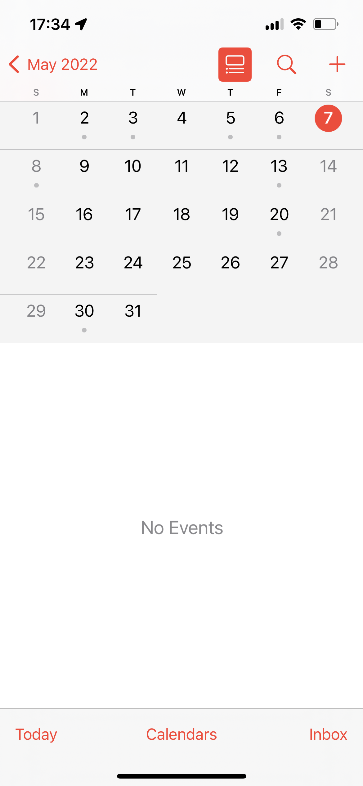
- Make the “+” button more discoverable. For example, make it a floating button in the corner with a noticeable color. Or instead of saying “no events” in the middle of the event section (see Figure 2), put a call-to-action (“+”) button here. To relieve users from interpreting the icons, the design could add tiny descriptions underneath each icon to explain the function, turning the knowledge in the head to be knowledge in the world.
- Allow multiple input methods. To decrease the gulf of execution, the interface should support multiple paths to achieve users’ goals. Therefore, allow multiple input methods, such as adding events by directly tapping the blank calendar space, which has a mapping with the real world (With a traditional physical calendar, people will write down the events in the box of that date). Besides, the design can use a text field for directly typing down the event name and time or enable voice inputs.
2 – Set Up Events
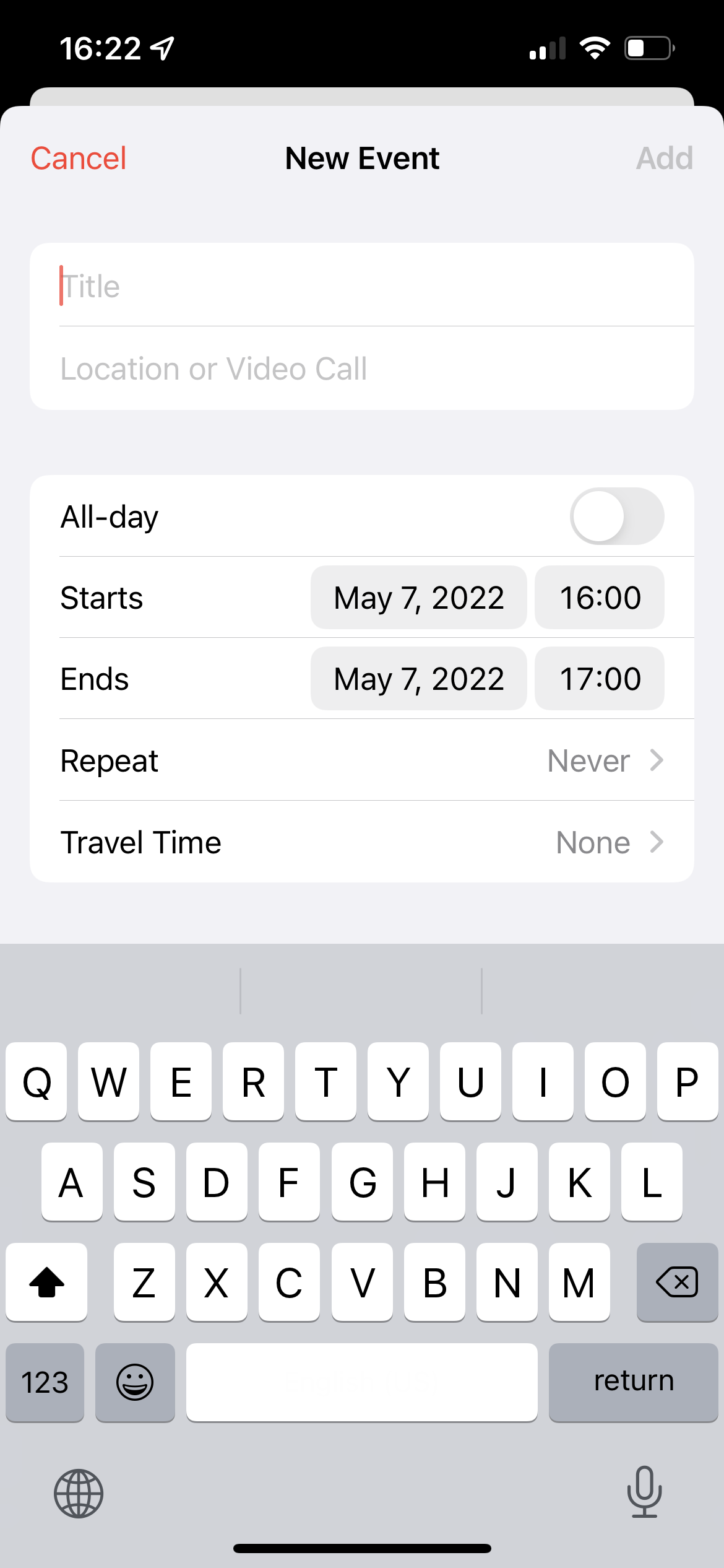
This is the following step after users tap the “+” icon. Here the design has a constraint on the “Add” button. In Figure 3, when there is nothing inputted, the “Add” button is greyed out, indicating that it’s not clickable (a good feedforward). Meanwhile, all the red texts/icons indicate that they’re clickable. This color code has been consistently used throughout the APP which makes it a noticeable signifier.
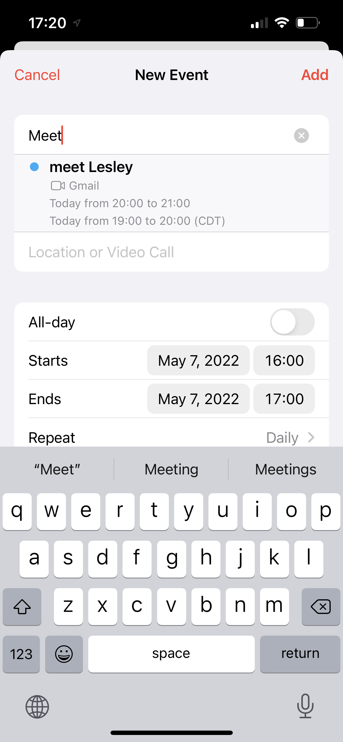
After inputting some words, the app showed some “history events” containing the same keywords to facilitate users’ memory loads by knowledge of the outside world (see Figure 4). If users picked from the list of “history events”, the rest settings, such as the start time & the end time, would be set as the same as the “history event.” This is also known as a feedforward – the app pre-fills the rest settings before users input.
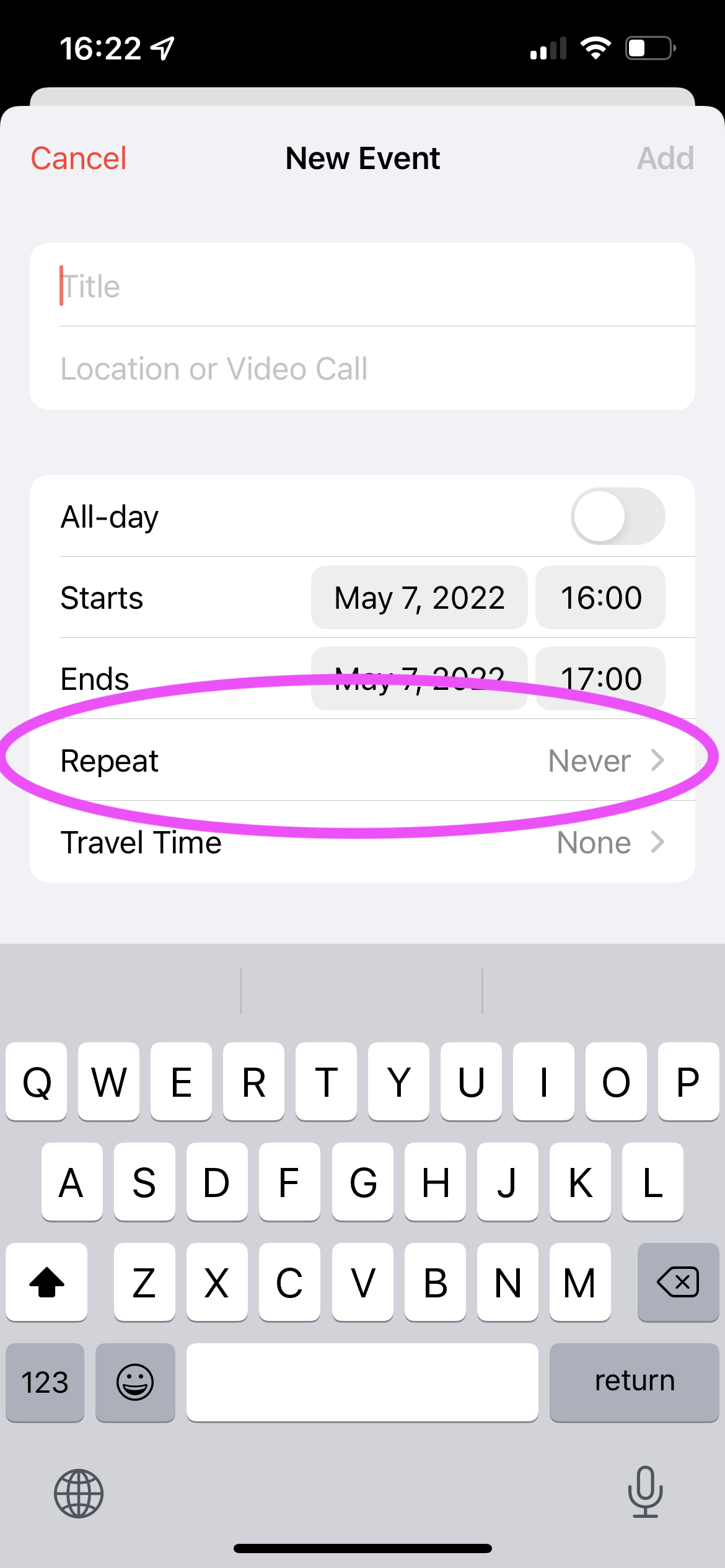
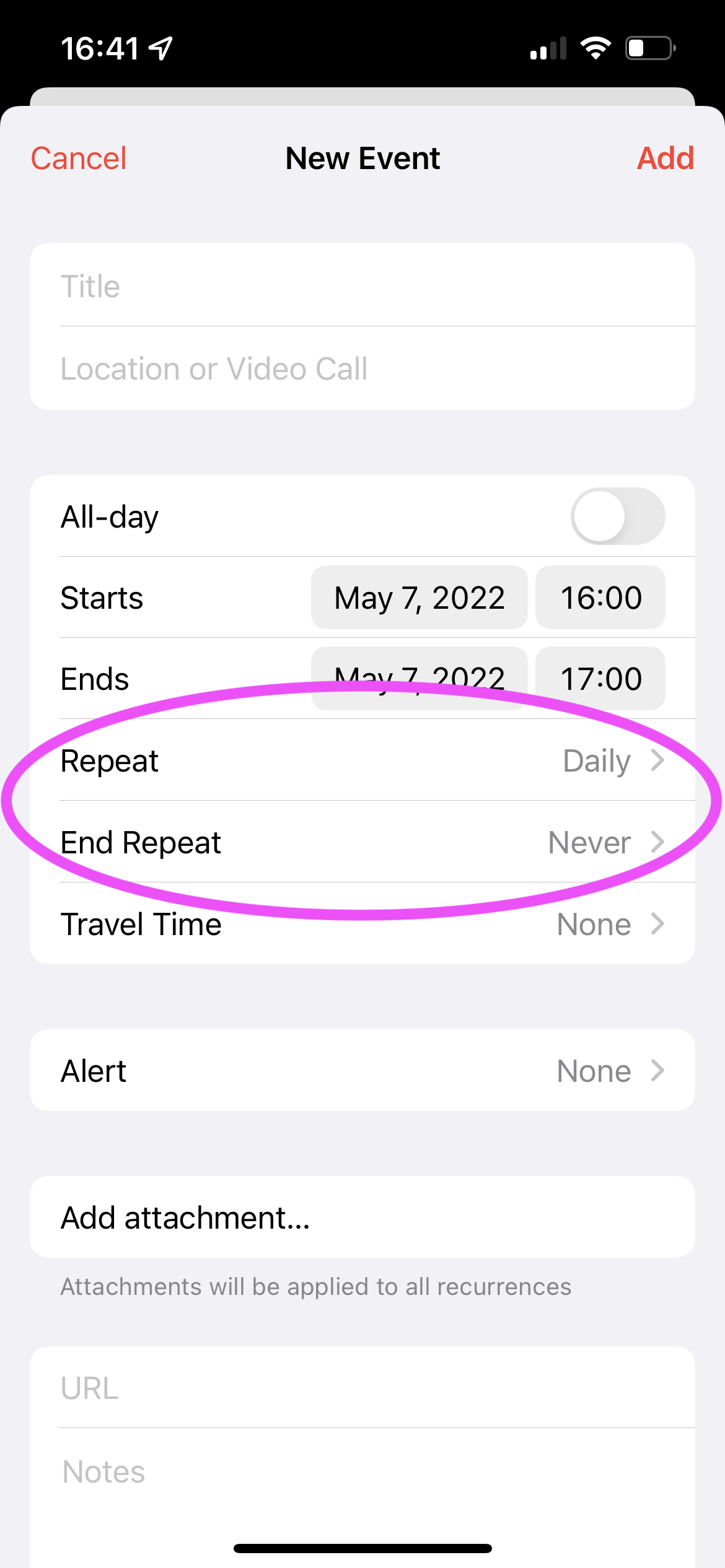
There is another way to set repeated events – where users can also set the repeated frequency of these events (see Figure 5). Besides, users can set an end date for this repeat. However, the “Repeat” and “End Repeat” are two separate tabs (see Figure 6), which are easy to be messed up and missed. The mapping is poor and therefore it increases the gulf of evaluation. Moreover, since these two settings are in separate tabs, it increases the steps users take to achieve the desired results, which increases the gulf of execution.
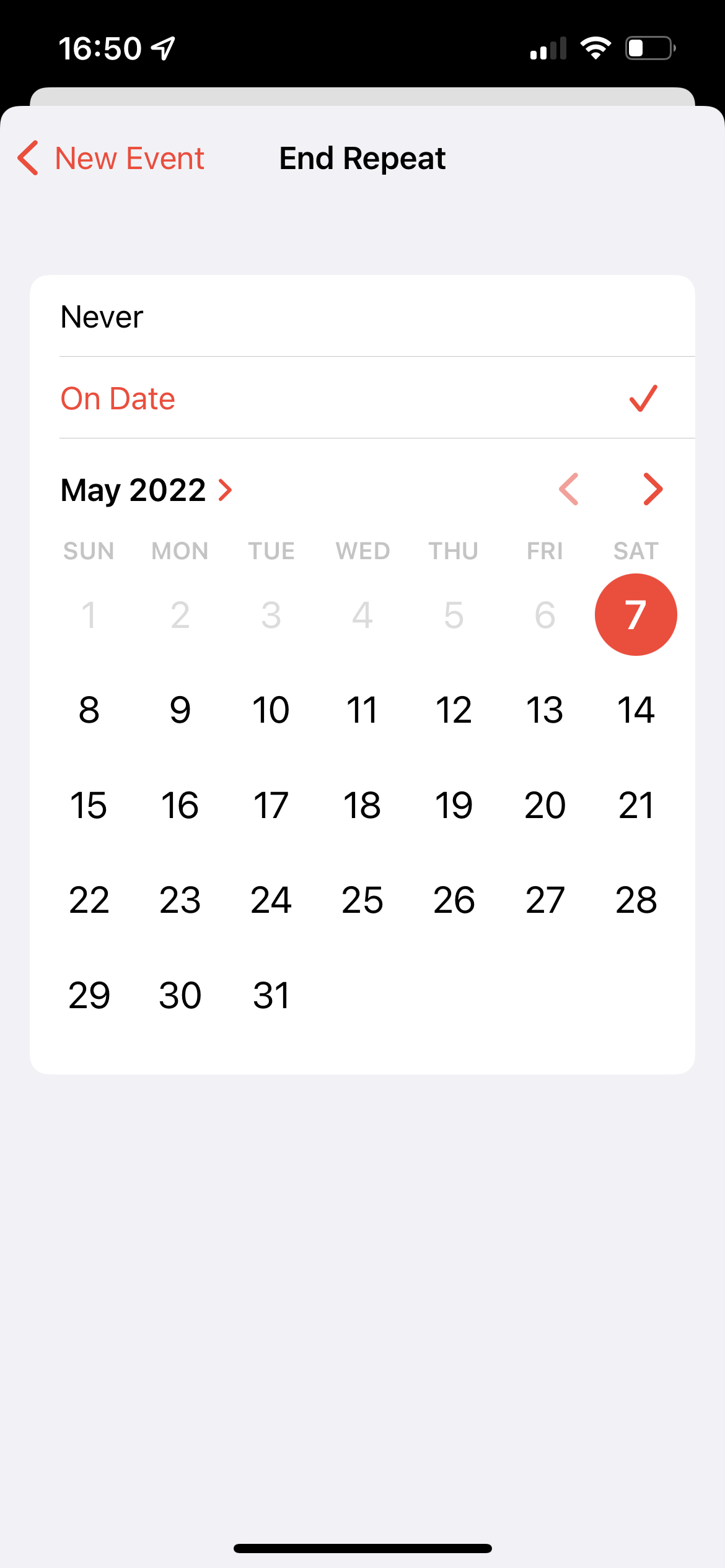
When selecting an end date, there is no feedback and no confirm messages (see Figure 7). Users are not sure if this action has been saved or not. The miss of the state of the system dramatically increases the gulf of evaluation. The good part is that dates, which are no longer available, have been greyed out and are unclickable. This is a good constrain and feedforward, preventing errors occurred in advance.
Solution
- Combine “Repeat” and “End Repeat.” Allow users to complete all settings related to “repeat this event” in one place.
- Add feedback for setting end repeat. There are multiple ways of feedback. For example, the screen can automatically close after users select a date. Or it can have a confirm button on the top right corner. When users click “confirm”, the interface can show a success message popup.
3 – Sync between mobile and desktop
One annoying fact of this APP is that it didn’t automatically sync calendar events between mobile and desktop. If users added events through mobile, they cannot see that on the desktop, which would cause mistakes in the end. In users’ mental model, they see the mobile APP and the desktop version as the same application and expect the sync happens automatically. However, since these two applications live in different OS systems, they didn’t support automatically sync. The mismatch between users’ mental modal and the actual system functions would lead to the gulf of evaluation – users take extra efforts to perceive this state and gulf of execution – users need to manually add the events to sync these two calendars.
The app should consider the situation that users would switch between different devices and therefore, it should support the function of syncing. Or at least there should have some alerts to feedforward users that the data is not synchronized.
Solution
- Data should be synchronized between different devices. Allow users to turn off/on the sync.
- Notify users that their events will only be available on this device (e.g., mobile) and will not be shown on other devices (such as the laptop).