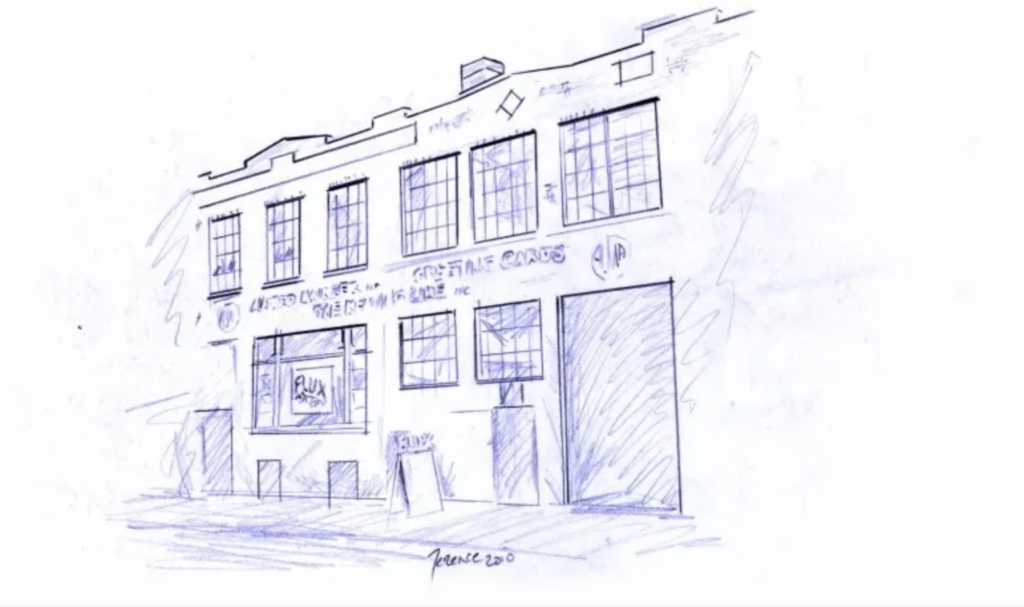
Flux Factory website, a not-for-profit arts organization founded in 1994 that supports emerging artists, aims to redesign the website to improve user navigation and, at the same time, improve the content. To help with this project, we did remote user testing sessions with 10 participants interested in art and who have been to art exhibitions to test the website’s usability. We focused the analysis on four essential sections aligned to the director’s goals in terms of content and exposure he wanted to give to the website. As a result, we identified design and information architecture improvements in the main sections.
The team
ALISSA FIORETTO | ANJALI RAO |
KIRTIKA ARORA | XINYU WANG |
YEEUN CHOI
My Role: User experience researcher
- Conduct two remote user testing and compile data.
- Consolidate findings and recommendations consequently to the analyzed data.
- Present the report and summarise key findings to the client.
MAIN GOAL
The client’s main goal was to improve the information architecture so that the user could understand the organization better.
TASKS
1. First impression: I would like you to begin by exploring the website’s different sections. What do you think Flux Factory offers?
2. On donation: You want to donate $X to Flux Factory. Find information on how to donate.
3. Participate as an artist: You are an artist who wants to participate in one of Flux Factory’s programs. Find information on how to do so.
4. Find event location: You want to attend an event hosted by Flux Factory this weekend. Find the location of an upcoming event.
Starting the remote user testing
TARGET AUDIENCE
The client was interested in engaging the users with the artists that want to participate in residencies/want an exhibit opportunity between NYC and Denmark. We focus on NYC residents interested in going to exhibitions and artists. One limitation in recruiting participants in Denmark is that they did not have the website google analytics updated. The selected participants had to have some interest in art.
Remote user testing
In total, we selected 10 participants to develop the test. Users were asked to share screens and speak out loud while navigating the website during the process.
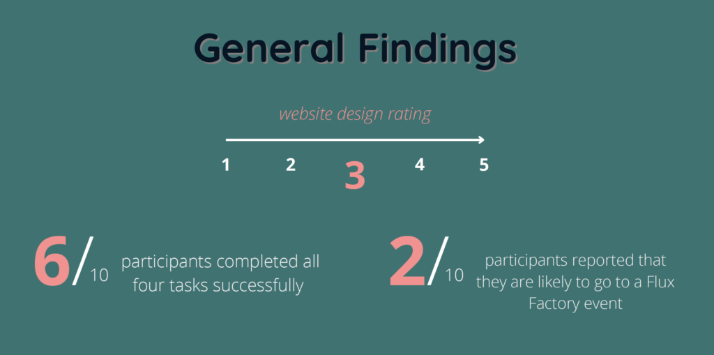
GENERAL FINDINGS
Positive findings
- The website and artwork look interesting.
- The user liked that it was clean and easy to navigate.
- Users liked the way the programs were arranged and found it easy to navigate.
- The user like that the website have a short bio of all the board of director
- with their pictures
Main findings
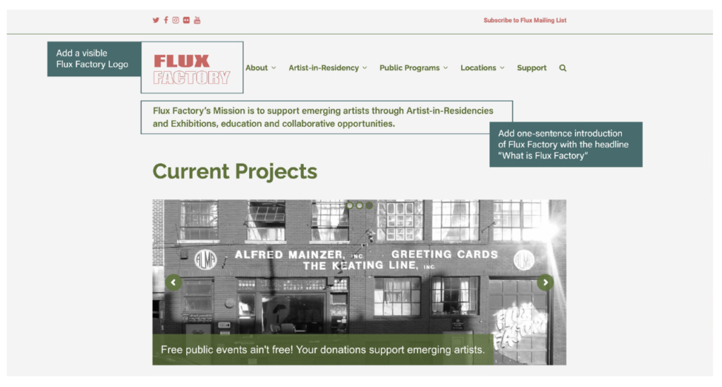
1. “It took me too long to figure out what they are and do”
Here we found no immediate understanding from the majority of the users on what Flux Factory is at first glance. Many users’ impulse is to scroll down from the home page to see if they can find more information. Users had to navigate through diverse sections of the website to have a complete picture of the organization. While listening to the users navigating.
RECOMMENDATION: BRAND IDENTITY
On the homepage, there should be a one-sentence introduction of Flux Factory with the headline “What is Flux Factory” to grab users’ attention. Also, remove necessary information and curate the text, simple and concise. Regarding the design, make the logo visible.
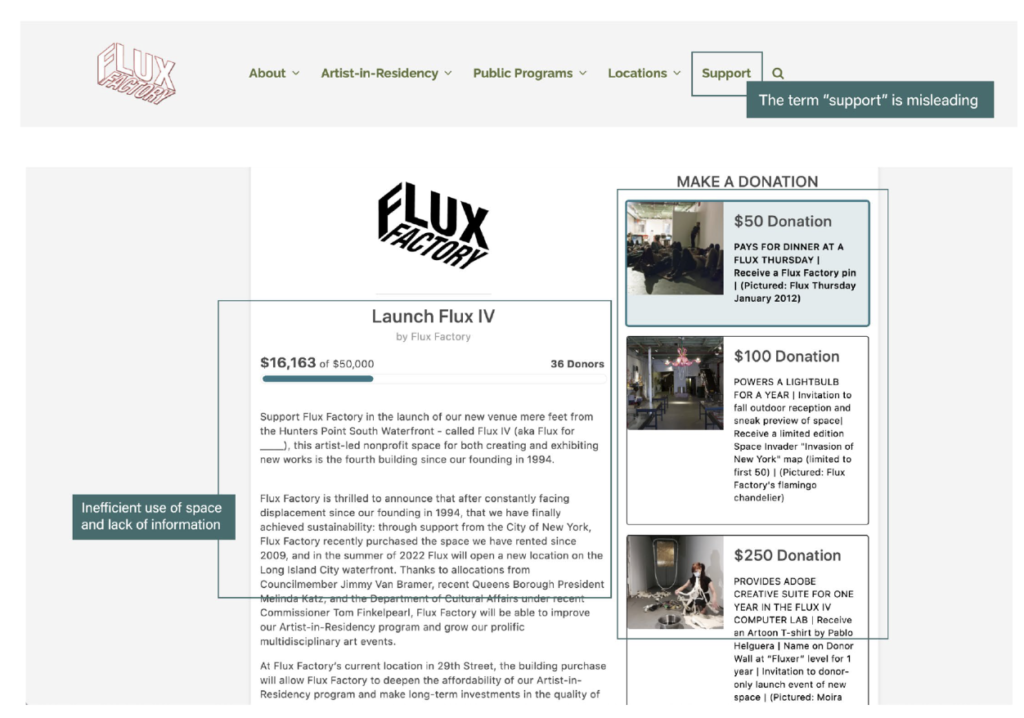
2. “I thought ‘Support’ meant them supporting some problem that we might encounter on viewing the page, instead of supporting them.“
“Current Projects’ confused me, I don’t understand why it is there.”
On the donation task, we found that the term “support” is misleading: many users thought it meant “Customer Support” instead of donations to the Flux Factory organization. Users mention the page “looking cluttered,” them “having to scroll to the bottom to make a custom-amount donation,” and not knowing the exact purpose of the donation.
RECOMMENDATION: IMPROVE THE READABILITY AND DESIGN
We recommended that the navigation architecture be changed slightly first. Instead of saying “Support,” it’s recommended to change this heading into “Support Us”. This section needs to be reorganized as the majority of the website has too much information. This applies also to the Artists in Residency and Current Exhibitions section.
Another recommendation for the readability of the website is to capture the user’s concentration with “What Flux Factory offers for the artist about the artist programs.
Overall conclusion
The four tasks had the same problem: Users do not understand the information clearly.
The characteristic that predominates in this is the extensive text that the user has to read to grasp what they offer. After the user testing, I realized that each section or word was like a piece of a puzzle; once they completed the four tasks, they understood better what they offer and how to navigate easily. The tasks by themselves did not give the answers that the user needed.
On the other hand, after doing the analysis, I realized that the user got lost in each task because they found a new usability problem. Therefore, it was positive to receive feedback on other issues, but at the same time, it was a challenge during the test because users could not focus 100% on a specific task. A great lesson from this work was collecting feedback from the task and other issues found during the navigation and putting them together to make the recommendation more solid.
Feedback from the client
The client was grateful for the report. Some of the findings had not been taken into account, while in others, he was conscious. During the meeting, we discussed each point, and he asked us specific questions about the design and where users made a critic.
I learned that a platform with many usability problems causes the user to go off the rails during the test, being something super positive for the analysis, and it diverts the user’s concentration of the vital section to analyze. Also, moderating the test, I understood that to know exactly how to ask the questions, you have to test it beforehand to see if the order works well and that it requires practice to handle it in a fluid and natural way.

