by Julia Ahmad – September 13, 2022
“Good design is actually a lot harder to notice than poor design, in part because good designs fit our needs so well that the design is invisible, serving us without drawing attention to itself. Bad design, on the other hand, screams out its inadequacies, making itself very noticeable.”
(The design of Everyday Things, 2013)
As a UX/UI designer, and as I gain more experience in the field, I started closely observing mobile applications I use on a daily basis, and one app that drew me the most with both it’s negative and positive aspects is, the Twitter app.
Twitter is a social media platform that gives its users an avenue to connect and share thoughts with their followers or a bigger audience through the use of hashtags. As the application adopted across the time, it has developed a lot of different types of users. The primary user could be anyone looking for a platform that could serve as a news outlet, to entertainment or even a marketing tool for businesses.
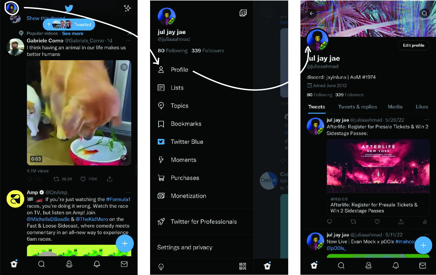
Bar – Navigation System : Exploring Twitter
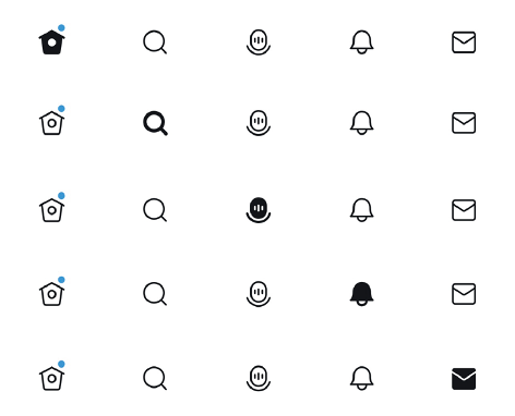
The application offers obvious and key signifiers to the interface making it easily discoverable for its users on how to use and what to do. The five main components indicate where and how to take actions. The signal here is transforming the buttons from strokes to filled when a user takes action. On another hand, this bar navigation also implicates the usage of natural mapping which refers to a design in which the system’s controls represent or correspond to the desired outcomes.
In this case, the controls easily map to the actions that will result, making the twitter system easier to remember/use and also faster to learn. A good UI design will provide good visual feedback and this applies to twitter’s navigation bar: it is visible and understandable, the icons are clickable and change of color applies to each when clicked.
Interacting with a tweet: Like icon
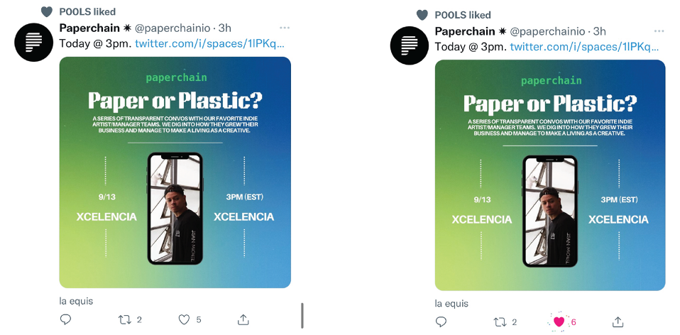
The like icon presents a good visual feedback and signifier during which when a user interacts with it, an animation occurs (feedback mechanism) as well as a change of color of the icon which creates a clear conceptual model helping users quickly understand what these buttons do and could also inform its users that the system is doing something, interacting back with you.
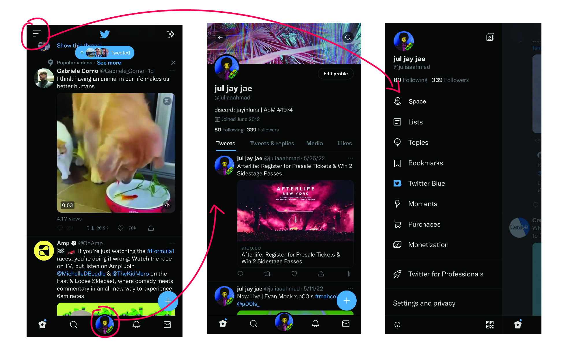
Getting to user’s profile
On a final note, in figure 3, the signifier over here could be misleading to some first-time users, as the basic thought of clicking on the profile picture would directly take the user to its profile, rather in this case, it serves as a button that directs its users to the menu bar. It is not labeled in a way that clearly matches with what the user is trying to do, also showing inadequate feedback in this case.
My suggestion would be to place a hamburger menu at the top replacing the profile picture and having the profile picture centered in the navigation bar, which would mean to place the “space” icon as part of the hamburger menu bar as I don’t see it as important as having the profile picture part of the natural mapping system.
conclusion
Twitter is a powerful platform and continue to immensely serve as a powerful tool for its users around the world. It is a product with a lot of features and very much easy to understand and interact with. It’s usability is understandable, even though it could use minor imporvements in some areas of its platform.