Apple Books is the default ereader provided by the Mac OS and primarily supports ePubs and iBooks. It allows the user to add downloaded books, track reading progress, set daily reading goals, purchase new books and more. Personally, I have been using it to read books and it is my preferred choice for a ereader.
Homepage
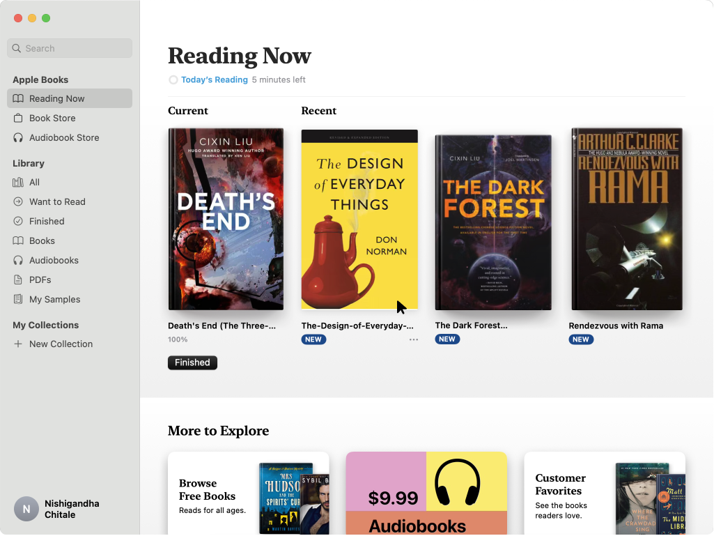
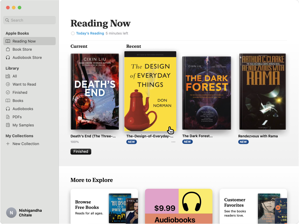
The homepage by default always opens the ‘Reading Now’ tab of the application. The user knows exactly where they are as the background behind ‘Reading Now’ is highlighted and the title of the page also confirms the same . Overall, the app makes effective use of knowledge in the head to name the different sections (Reading Now, Library, Book Store, Want to read etc.)
In ‘Reading Now’ the user can see the books they are currently reading and the page affords further discoverability through scrolling. However, there are no signifiers when the user is trying to open a particular book to continue reading. A simple way to fix this could be to slightly enlarge the book thumbnail and turn the cursor into a pointer (additionally, the shadow under the book can also be manipulated to make it even more clear).
The Reading Experience
The user can click on any of the books and it opens a new window on the page where you last left off. The cover page of the book on the new window gives adequate feedback that the user has opened the book they intended to. The app does a good job of following the 7 stages of action to complete the user’s goal of reading a book. The reading interface builds on the conceptual model of using a real book and also provides constraints to “flip pages” by scrolling left to right or vice versa to mimic real-world behavior. The reader also provides personalization features that allows the user to change the background color, increase font size and change the font type. These features improve the accessibility of the entire experience.

Adding a new book
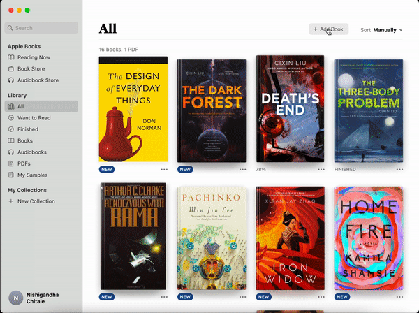
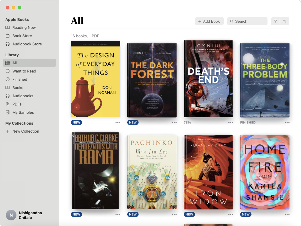
A seasoned user of the app knows that to add a book, you can simply double click on ePub in your folder and it will be automatically added to your Library (dragging and dropping works as well). However, for a novice user, there are no signifiers in the app that will direct them to adding a book. It might frustrate the user and mislead them into thinking that the only way to add books is to purchase them through the Books’ Store. A simple fix to this can be a ‘+ Add Book’ button in the Library section which can open Finder and allow the user to add the books they want.

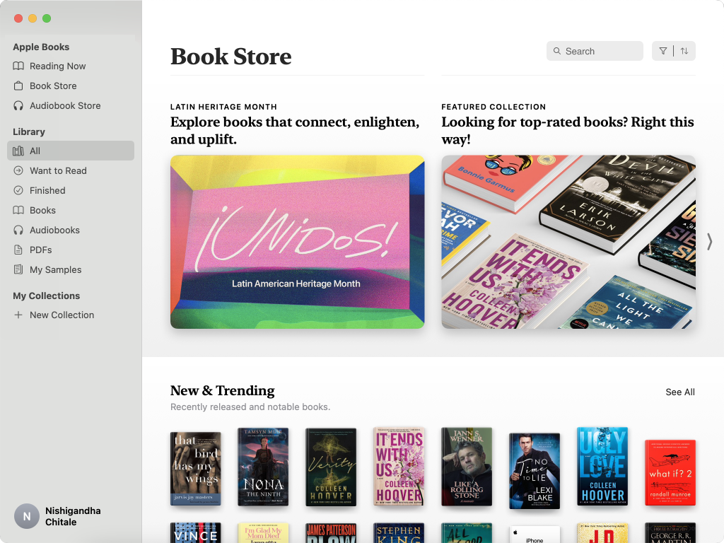
Search
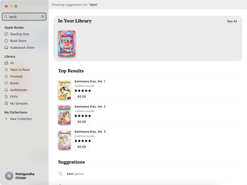
The app provides a global search in the left panel. On clicking the search bar, the interface changes drastically and the user receives feedback that can be very confusing. Also, there is no coherent mapping of the search bar with its results as it is visually divided into two different sections. On entering the keywords, the app gives adequate feedback as the results are clearly categorized into sections starting with the user’s library. Overall, the search experience can be improved by placing it within the context of the page so that it provides clear signifiers of the scope of the search as well as gives visual confirmation by being mapped within the section.
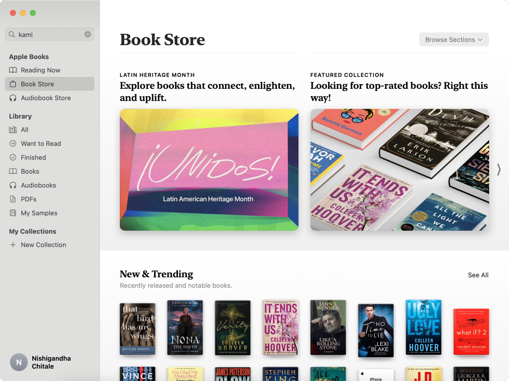
book Store
The Book Store section uses a balance of color and negative space to appeal to the visceral level of the user. The user can browse the top section of highlights and there are clear signifiers that indicate how the user can navigate to find more content. There is a ‘Browse Sections’ button which signifies filtering of the content. The ‘New & Trending’ section allows further discoverability of books that the user might be interested in. However, there is no search within the Store itself (as discussed earlier, there is a single global search). This might cause a gulf of execution where the user might be unsure about planning the next step to find the book they are looking for. A contextual search can create a better experience for the user and help bridge the gulf of execution.