Project Summary
As part of a 4 person team, I worked to analyze the issues with our client’s website and how they might be remedied. With Grassroots Grocery being an organization that focuses on providing fresh produce to community fridges and partner organizations that serve high-need communities in NYC, it is imperative that their website is easy to use and conveys their mission. After a moderated user study, 5 recommendations were put together. These recommendations focus on improving the clarity of the site through further description, consolidation of pages, and more. The client heard our recommendations and told us they would be considered.
Background and Problem
Dan Zauderer, Executive Director of Grassroots Grocery, met with Evelyn Mukherjee, Guillermo Ramirez, Sebastian Hunt, and myself to discuss the goals and ideas he had for the website. He wanted to make sure the volunteer opportunities were clear and identifiable and that users could discern what other ways to get involved there were. He also wanted to ensure that overall readability of the page was up to par, and that aspects such as the mission, goals, ideals, and people involved were clear on the website.
Process
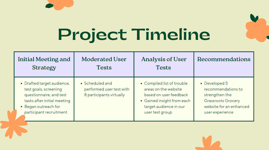
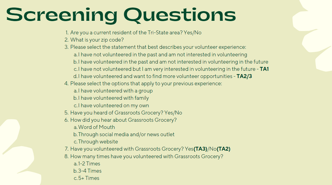
After the initial meeting with Dan, which was held over Zoom, we got to work on identifying the target audience and screening questions. I assisted in the creating of our plan, which included the screening questionnaire pictured below. Once this was setup and reviewed by our professor, we reached out to the Pratt School of Information listservs and other interested parties to find participants. We wanted to make sure we reached a few different target audiences, ranging from people who knew about Grassroots Grocery and had volunteered in the past, to people who like to volunteer and had not heard of Grassroots Grocery. The diversity in user profile was important in order to capture the most workable feedback we could get.
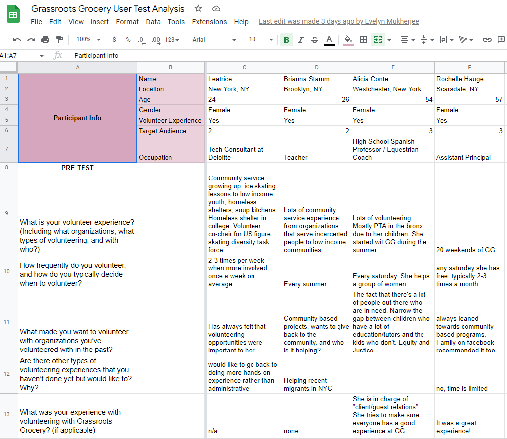
After we had users that fit into all three user profiles, we divided up the work of performing the actual moderated user tests. I did two in one day, with two different demographics, and I led them through the scenario and questions that we had decided on together. This was a pleasant experience, and it helped illuminate some of the issues prevalent on the website. Once these were done, I added the findings to the spreadsheet we were keeping.
We got 8 participants across our three target audiences and there was a wide range of differences in demographics. This made it easy to follow our methodology of performing the tests with a narrative scenario in mind as they browsed the website. We asked the users test questions that aimed to meet the needs of what Dan had mentioned he was looking at. We also got a good glimpse at what users generally felt about the website, as well as where they struggled.

Results
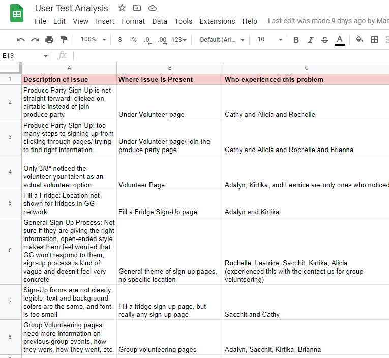
After the user tests were concluded and the above spreadsheet was created, we further compiled them into a master list of issues. Over the span of a few zoom meetings, we created a list of overall issues that the users experienced. This list had the most glaring problems, including the difficulty in signing up for a produce party and the lack of clarity for what exactly these volunteer events entailed.
| Issue/ Issue Theme | Proposed Solutions |
| A potential volunteer needs to navigate across multiple pages in order to discover all available opportunities to volunteer | Create a single page with all volunteer opportunities that users can navigate from, possible using the top menu “Get Involved” button |
| Users do not know where fridges are located | A map of community fridge locations |
| Volunteer opportunities are all listed, but there are very limited details on the event logistics | – Detailed description of how community fridge donations work – Detailed description of how group volunteering events work, including summaries on previous group events hosted with GG – Description of in-person event including location, time, what each volunteer position entails |
| Team, GG grocers, food justice commitee info spread across three pages, creates a barrier for users to learn about each one | About landing page that combines the three groups of people that make GG work, describe how they work together and make each different group clickable so the person can explore the people of each group further |
| There are too many different forms for sign-up that all look similar | Consolidate group volunteering sign up form into one master form with options to select what kind of group you are volunteering with, make produce party sign up on one page instead of having to navigate thru multiple |
These problems had enough overlap with each other that we could consolidate them into these 5 overarching issues. None of these issues were so glaring that it prevented the website from accomplishing its goals, but they could certainly be improved upon. These recommendations were agreed upon as we examined each of the issues and discussed what natural change made sense that would not severely alter the website layout. More in depth explanations of the recommendations can be found here.
Conclusion
The Grassroots Grocery website has a strong skeleton and is more than useable, but suffers from a few issues here and there. The moderated user tests revealed to us that there are sections, such as the Fill a Fridge and Volunteer pages, that could be restructured to better explain to the user the information they are looking for. These recommendations were shared with our client, and we were told they would be added to considerations, as they are looking to revamp the page in the new year.