Introduction
TUNE IN AFFIRMATIONS
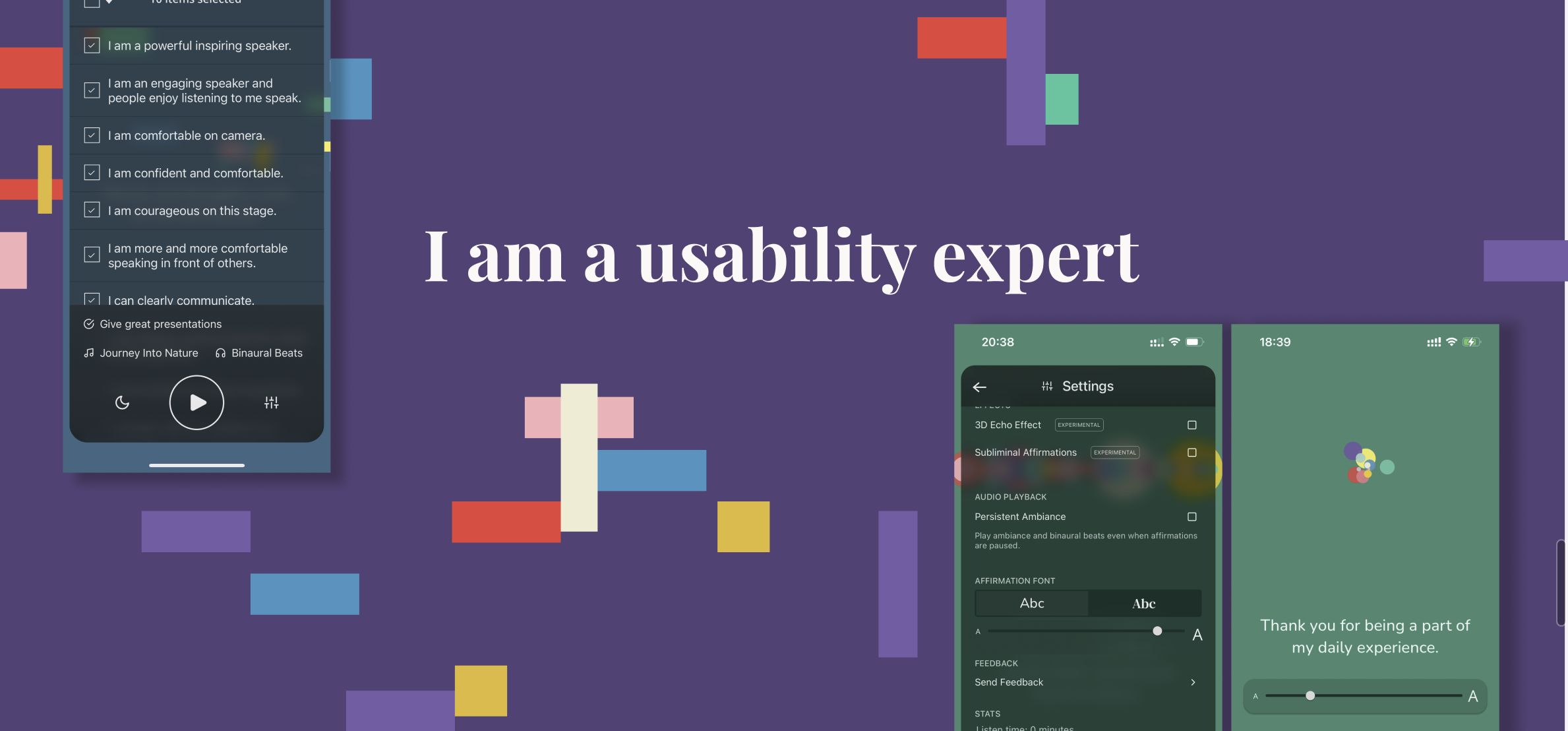
Developed as a passion project by the client, Tune In Affirmations is a customisable positive affirmation iPhone/Ipad app which provides the users with audio content of positive affirmations under distinct ‘focus areas’. The app stands out among its competitors as it allows the users to customise their listening experience under various categories such as adjustments in ambiance, beats, volume controls and much more.
CLIENT : Purr and Meow, Nick Siderakis,
Software Engineer Lead – Google
Entrepreneur
RESEARCH METHODS : Usability tests, screening questionnaire, rainbow sheet
DURATION : 7 weeks
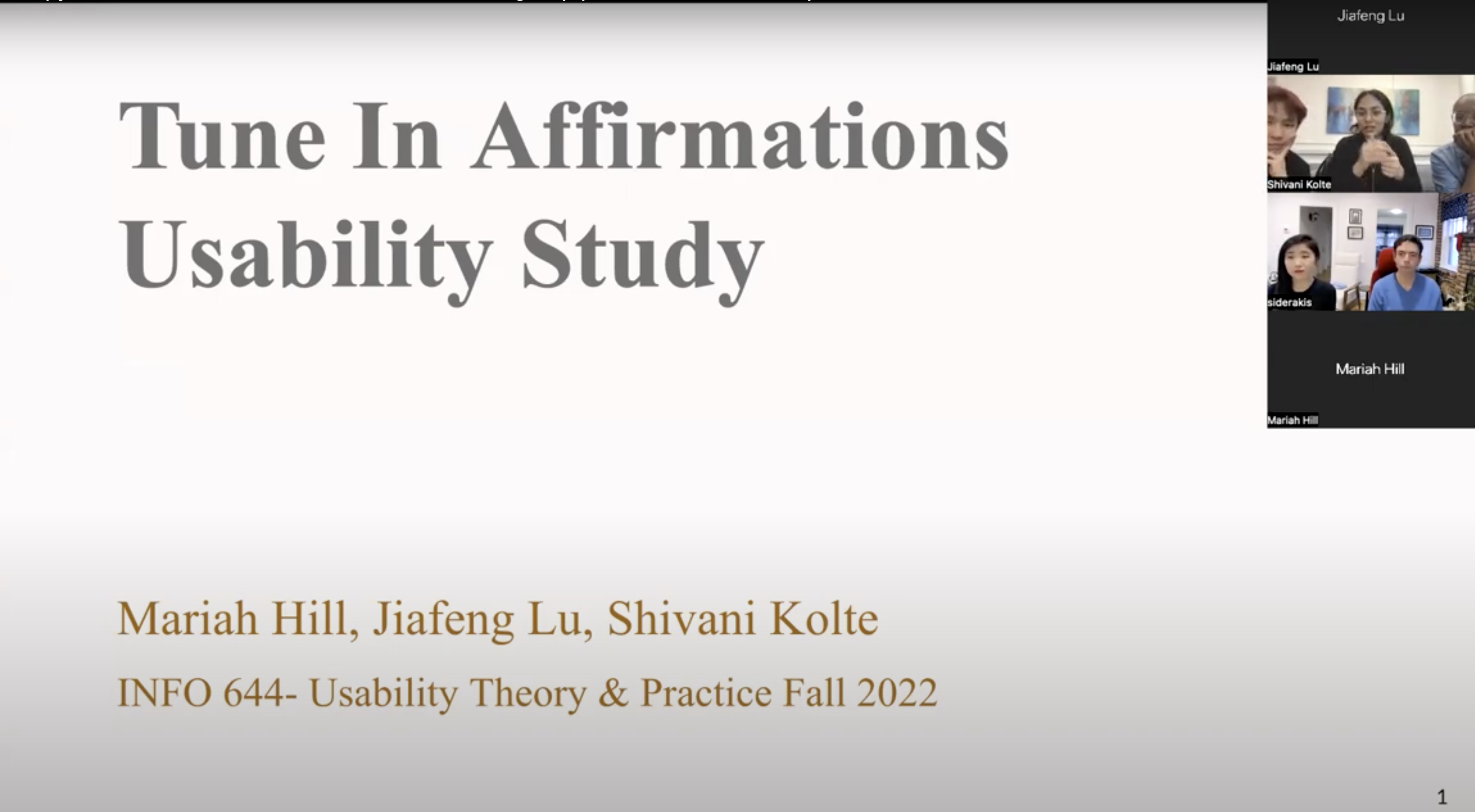
PROJECT TEAM : Jiafeng Lu, Mariah Hill and Shivani Kolte
Overview
This case study explores the usability of the app through the method of ‘Moderated Remote Usability Testing’ after participants are carefully screened to match potential user profiles. The data from these sessions was then analysed by us to recommend solutions to make the app’s customisation features more discoverable and understandable.
My Role
- Managing and communicating with the team to plan out the project according to schedules and priority of tasks.
- Collectively devised a session moderation strategy and materials such as a timed script, pre/post-test questionnaires and remote test set-ups.
- Moderated 2 out of the 6 Usability tests and analysed them in depth for notes on making actionable recommendations.
- Took notes on the Usability tests moderated by my team members.
Kickoff Meeting
After going over the initial brief outlined by the client we decided to map out the scope and goals for the project ahead to set expectations and order of action to be on the same page. For the kickoff meeting, we went prepared with clarity on where our expertise as usability experts would lie and therefore what kind of insights we would be able to provide and decided to get answers on the background of the app for some context, matching expectations with our capabilities, tallying the goals, scope and user profile and the deliverables we would provide.
Takeaways from the Kickoff
- Prioritise testing for the need and discoverability of the unique features of the app such as customisation of affirmations and the listening experience through various options
- Evaluate how users are interacting with the interface and suggest changes to make the toggles and gestures easier to navigate.
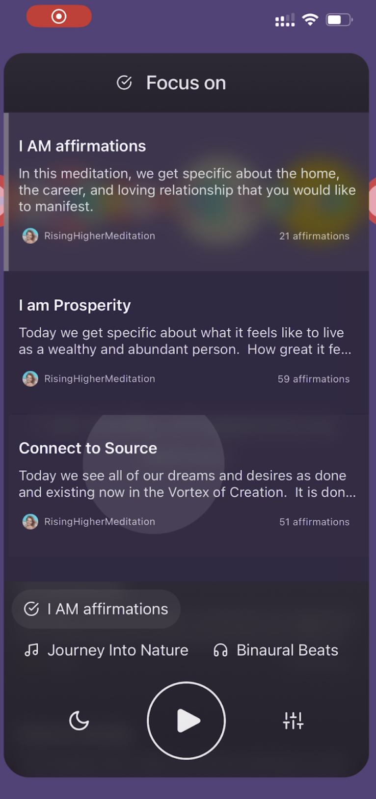
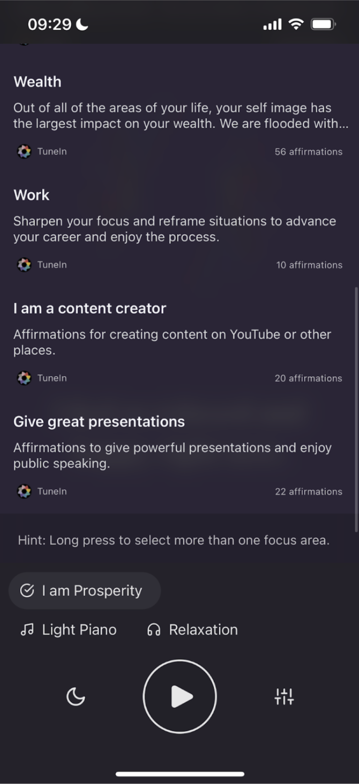
- Understandability of ‘focus areas’ – the label and the affirmation sets within the app.
Methodology to solution
deciding on the method
Once we had understood the issues faced by the client, as a team, we decided that ‘Moderated Remote User Testing‘ would be a method that could help guide our recommendations as we would be able to incorporate first-hand feedback as well as evaluate the app based on our expertise of the subject. This triangulated data would give the client actionable reviews.
Moderated Remote Usability Test
Moderated usability testing is the gold standard of usability research. This methodology allows for the highest assurance of identifying usability issues within a digital interface when compared to other research methods, such as the cognitive walkthrough and heuristic evaluation methods. The method allows for moderators to guide the participants through carefully drafted scenarios and tasks that would help the user navigate the interface in a certain manner without explicitly telling them to do so. A moderated test is beneficial as it not only allows for the recording of failures but also give leeway to understand how and why it might have happened. Another benefit of the moderated test would also be the very human aspect of it in terms of guiding the participant appropriately and helping out whenever needed so that they are comfortable and rich insights are collected.
The method is ideally done in person, but with changing times ‘remote’ testing is picking up, as connecting via video calls has developed to be more intuitive and keeps the participants within the spaces they are comfortable in, taking off some of the pressure and added expenses.
User profile
Another thing that the meeting with the client was helpful with was understanding the app’s potential users and how informed they wanted their feedback data to be. Some factors guiding this were :
- People who have an active interest in wellness.
- People who consume wellness-related content through technology (social media, videos, audiobooks, apps)
– People who use iOS devices (Iphone/Ipad) - People who are medium-highly acquainted with the concept of positive affirmations
- People who prefer to use audio interfaces over text or video.
Screening for the right participants
These factors helped us draft a screening questionnaire for potential participants of the study and receive well-structured answers to prioritise participants who matched the user profile as closely as possible. This questionnaire was shared across various list-serves in Pratt which related to the wellness space.
We received 15 responses and selected two on the basis of closest fits and decided to reach out to personal networks for the rest of our four participants.
Preparation for the usability tests
After reaching out to our potential participants, we were able to recruit for six tests and scheduled them over the duration of two weeks The materials we prepared for the test involved :
- Moderator script
To have a guideline of time-limits and be cognisant of everything to be covered in a conversational and natural flow. - Pre/Post test Questionnaires
Pre Test : To get information on the participant’s background and address them appropriately
Post test : to get feedback on the test and some of their overall thoughts on the test - Scenarios and Tasks
Well drafted scenarios and tasks with clear goals in mind leading the participants to explore in a more focused way. - Forms
Consent form : To verify and double check with the participant that they are in full knowledge of what would happen during the test, consent to it and and are aware that there are no risks associated with it. - Session moderation strategy
Having a strategy on how the team would work collaboratively during each sessions.
Mindfully doing this step helped immensely as we went into the tests well-prepared, any confusion or awkwardness was prevented.
We had a :
– Main Moderator : who would take lead moderating the session and be the first point of contact for the participant
– A Standby Moderator : who would nudge the main moderator in the right direction in case of any hiccups and be aware of the logistics of the test, ready to step in when needed.
– A note taker : who would record the session and take detailed noted on the happenings within.
We came up with 4 tasks and scenarios :
1. Choose a set of affirmations to listen to that will help you gain confidence before your talk and play it
(Goal: do ‘focus area’ titles make sense?)
2. Find a way to adjust the affirmations to focus on specifically speaking in front of a crowd.
(Goal: Are affirmation button and delete affirmation discoverable?)
3. Incorporate additional affirmations into your current listening session that help with this goal and play them.
(Goal: swipe right lead-in, select multiple affirmation categories at once, focus area titles)
4. Adjust the type and volume background track offerings to meet these goals.
(Goal: discoverability of binaural beats and ambiance features)
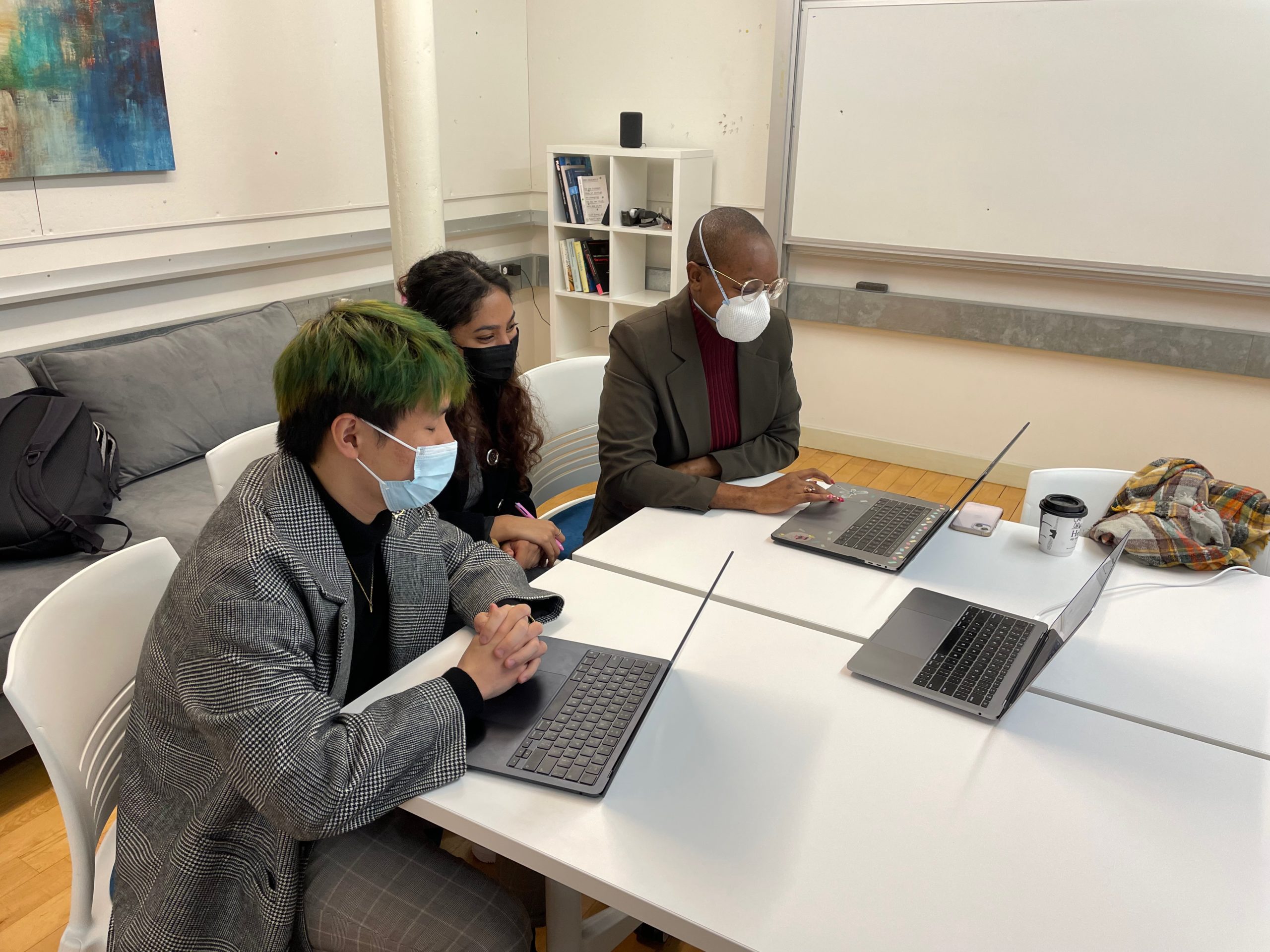
Moderating Sessions
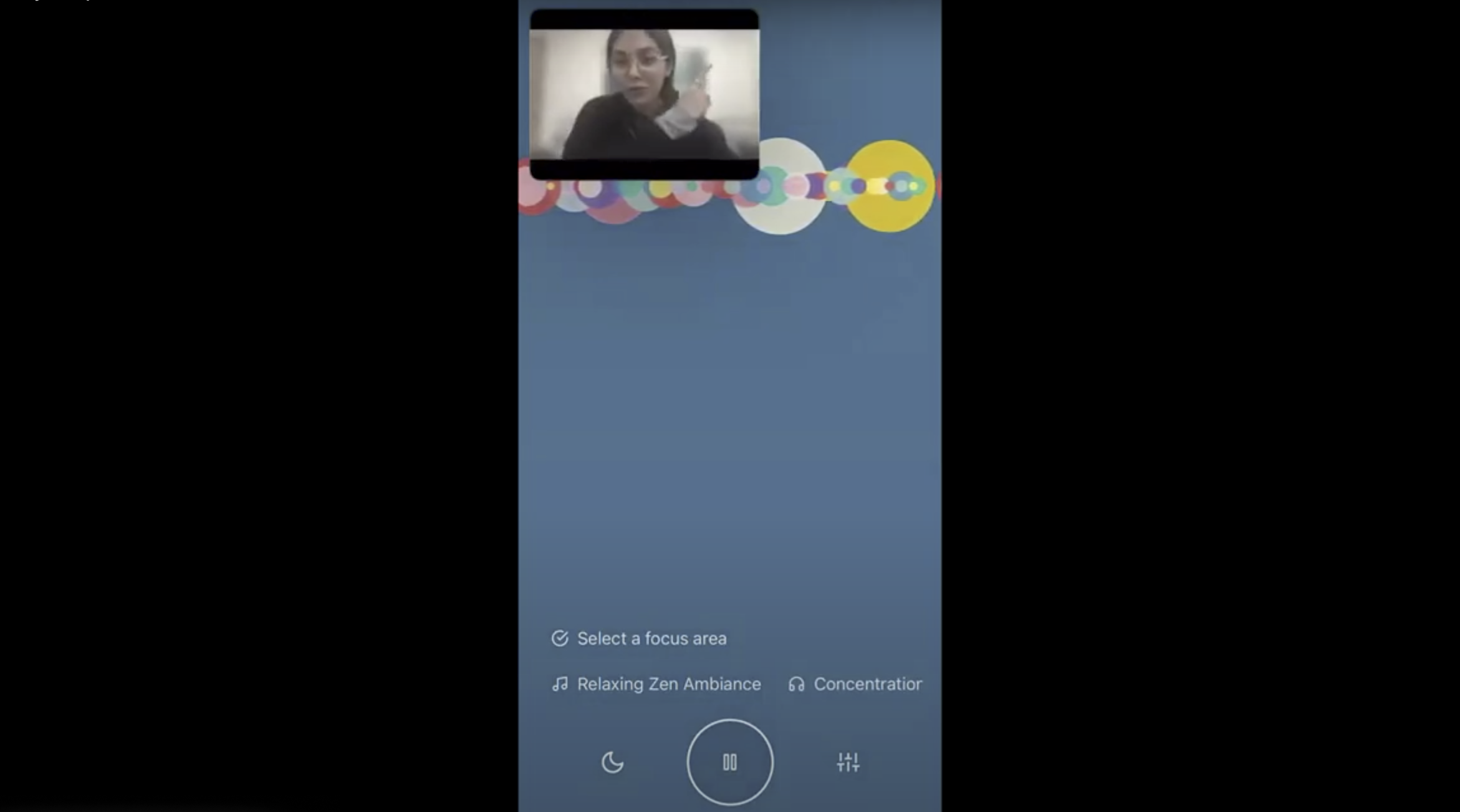
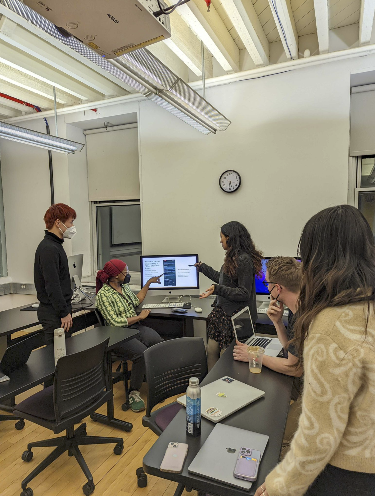
(Fig 2). Peaks into the team moderating sessions
Each of our moderated sessions taught us that people come in with different contexts and understanding that and curating the test to be understandable by all is necessary.
Though we had a thorough script and clearly lined out scenarios and tasks, we encountered situations where the participants didn’t quite understand and got distracted by the features of the app. Though doubtful when we first came across this, we discussed and decided that nudging participants in the right direction in case of distraction would be acceptable in the interest of everyone’s time and the purpose of the test. We all learned to ad-lib quite well with this.
Another great learning from moderating sessions was the nuance of obtaining clear insights by not only prompting participants to think out loud when they forgot but also to ask their reason behind certain mentions of likes and dislikes to better understand perceptions.
Analysis
We calibrated our notes together in one format to be able to notice and analyse findings collaboratively. The data entered into the spreadsheet was based on the notes we each took during sessions moderated by another one of us. Through this, we were able to identify key findings and common issues faced by our participants and make recommendations on the basis of this.
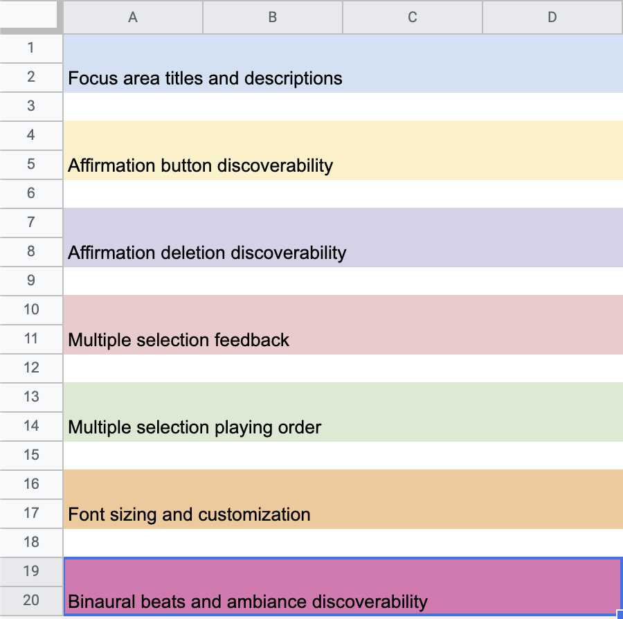
Key Findings and Recommendations
Overview of Problems :
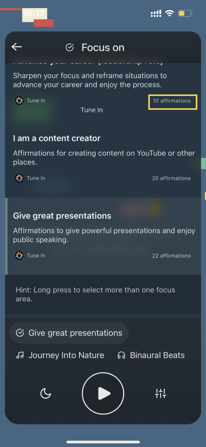
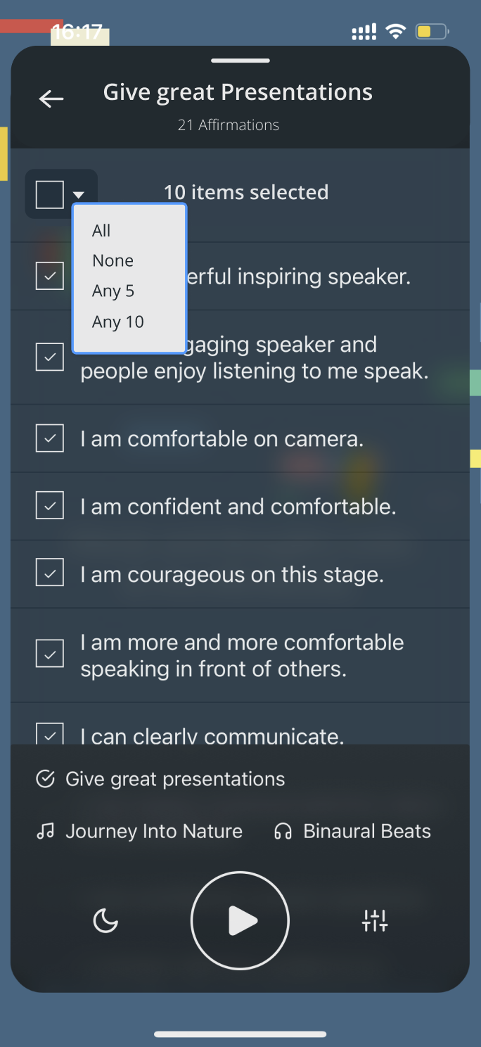
- Problem 1: Lack of discoverability of affirmation features
1.1 Affirmation list (Fig 5)
1.2 Deletion feature(Fig 6) - Problem 2: Lack of multiple focus area selection feedback
2.1 Lack of feedback when selecting multiple focus areas(Fig7)
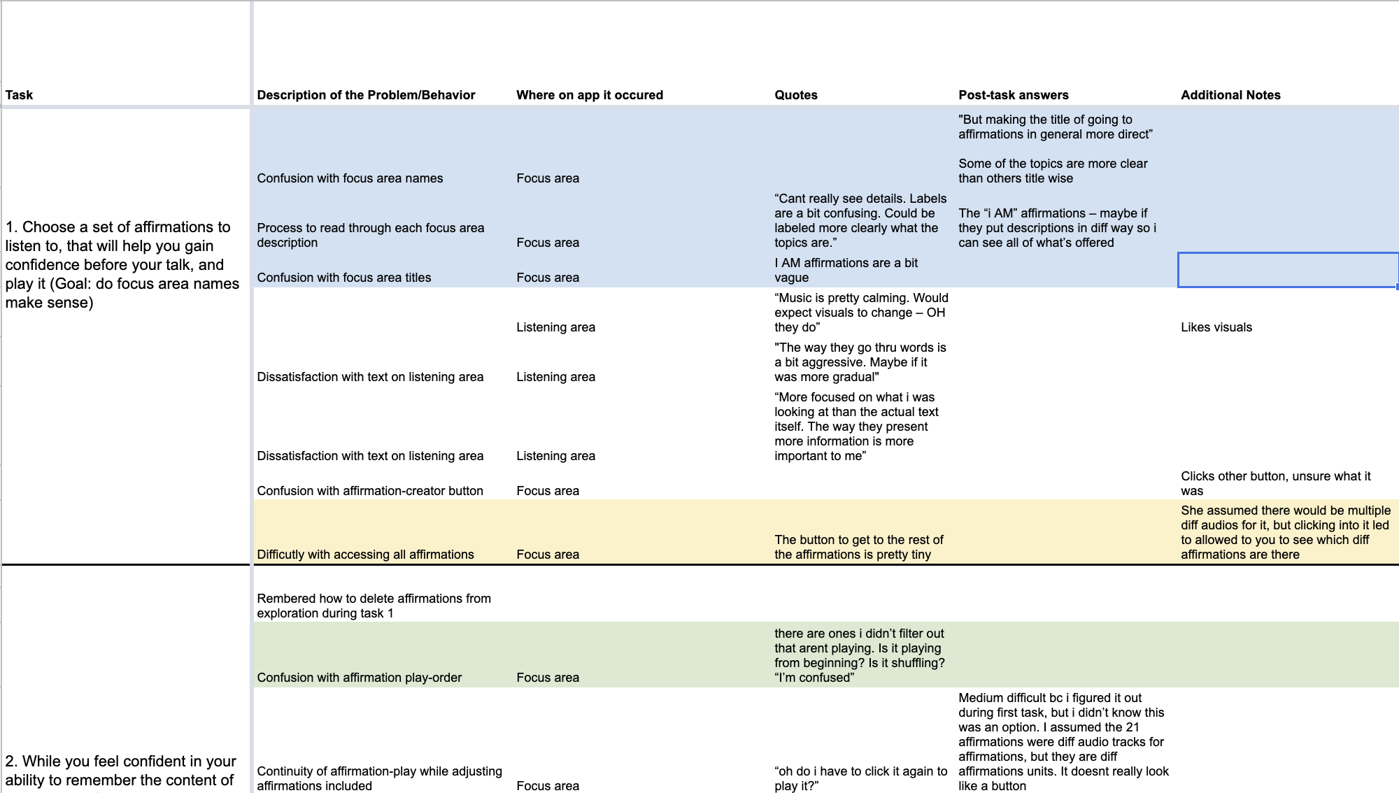
2.2 Confusion around affirmation playing order when multiple focus area are selected(Fig 8) - Problem 3: Understandability of focus area title and focus area description length( Fig 9)
- Problem 4: Settings/Control panel discoverability and accessibility
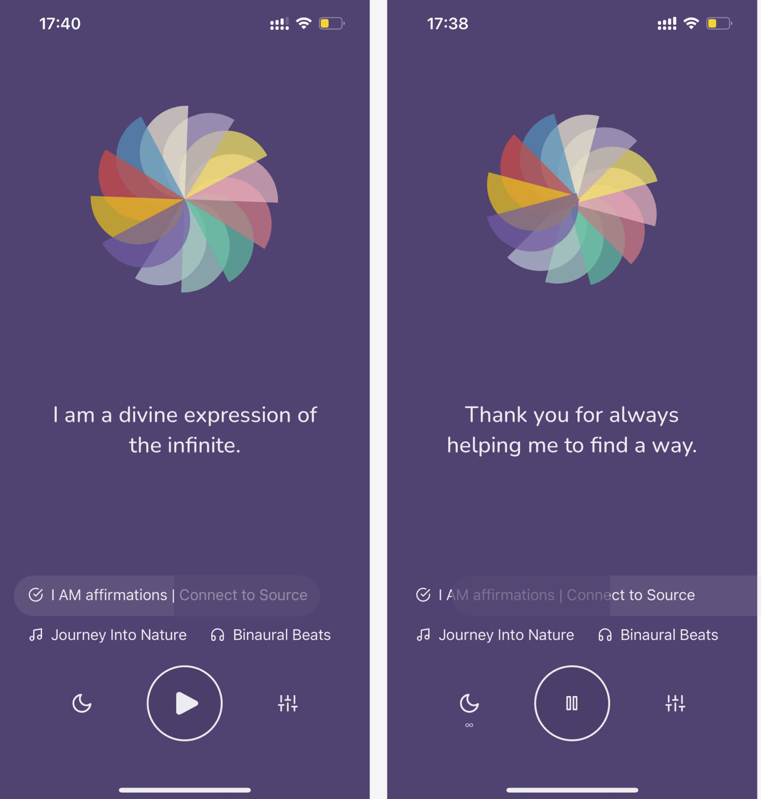
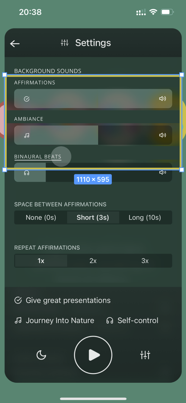
4.1 Lack of Discoverability of ambiance and binaural beats features(Fig 10)
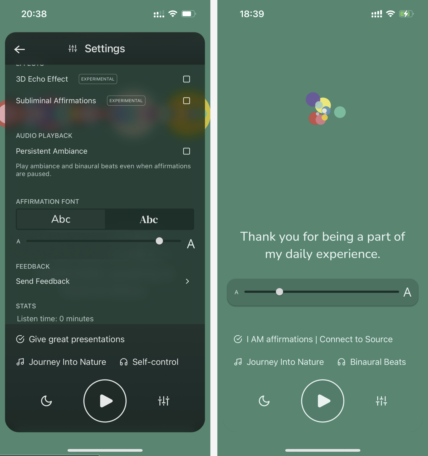
4.2 Font Customization and Accessibility (Fig 11)
Recommendations
Recommendation 1
Improving feedback on the focus area toggles for clear indication of the gestures performed on screen.
Recommendation 2
Matching the users’ mental model with regards to gestures for a better understandability of interface response and visible response on the ‘listening area’ to keep the users informed of their choices of affirmations
the users’ expectation of the multiselection function.
RECOMMENDATION 3
Use of more descriptive titles and shorter (one-line) descriptions of the “focus areas”
RECOMMEDATION 4
Improving the discoverability of features on the control panel by grouping similar information together and matching the natural mapping of similar information.
Improving the accessibility to font customisation through an intuitive sizing bar and more flexible options.
Conclusion
When we presented our recommendations to the clients, they were happy that the positives of the app such as the pleasing visuals and minimal aura were appreciated by the users and that the features gave them flexibility as intended.
Our recommendations to enhance the experience through working on the basic concepts of discoverability and understandability of features and toggles across the app made sense to them as we took them through it step by step.
They were excited to find out more and enthusiastically cleared their doubts for the future of the app based on the user needs presented through the tests.
“Thank you for providing us with this opportunity, this was great! Awesome presentation, great findings, good recommendations too, we’re excited to review your report and findings”
“Thanks so much! Now I have my next few weeks booked implementing all of your suggestions”
Work for the future
If we were to continue working on the app, steps towards giving the app a more connection-based approach through building a positive community responsibly would be the start content-wise. Improving the Ui to be more of a language would also help build a connection in users’ minds and an overall look and feel of the app.
Before making it responsive on the desktop version, it would be helpful to establish the mobile app further to lock down its fundamental features and focus on its unique selling point of customisation through the mobile interface.