Project Overview
The L-CMD Research Foundation was established to urgently translate scientific research into impactful treatments for a rare and fatal form of childhood muscular dystrophy, which currently has no treatment or cure. In order to achieve this mission, the organization must spread awareness about the disease and motivate more users to donate to their cause. In an effort to help the organization reach their goals, this study gathered insight from past and potential donors to assess the usability of the website and uncover motivating factors for making a donation. Based on our findings, we discovered key areas of the website that need improvement: the navigation bar, homepage, research page, and campaign page. Thus, we focused on redesigning these sections of the website to make content more discoverable, understandable, and readable for users.
Our Team

M.S. in Data Analytics and Visualization Advanced Certificate in UX

M.S. in Information Experience Design

M.S. in Information Experience Design
My Role
- Contributed to study design (participant emails, user profiles, tasks, moderator script)
- Sent screening questionnaires, consent form, and email updates to participants
- Shared progress with client
- Moderated 2 user tests, notetaker for 2 user tests
- Graphed participant profiles
- Contributed to data consolidation and analysis
- Annotated screenshots of current website using Figma
- Designed high-fidelity mock-ups on Figma
- Wrote test report
Client: Founder of the L-CMD Research Foundation
Research methods: Remote Moderated User Testing
Design and Study tools: Zoom, Google Forms, Google Sheets, Adobe InDesign, Figma
Duration: 7 weeks (Fall 2022)
Project Roadmap:
Set goals and objectives
During the preparatory phase, the first step was to meet with our client to establish a relationship and identify their desired outcomes with the website as well as their objectives of the study.
- Our client’s goals: to share their story and information about the disease in order to compel current and potential users to donate to their website.
- What our client hoped to learn from this study: areas of the website that need improvement, the overall usability of the website, and how to implement the changes.
Recruit Participants
Target users of the website were characterized using donor data provided by the client, the website’s analytics, and the type of people who engage with the organization’s social media platforms. This information was used to create three user profiles which highlight the background, abilities, and goals that best represent the website’s intended users. These user profiles were sent to the client for the internal recruitment process, and used as a guide to help us find external recruits. In order to participate in the study, users were required to fit at least one of the following user profiles and fulfill at least one of the bullet points within each profile.
User Profile 1
- People who have donated to a nonprofit organization in the past or have an interest in donating to medical research
- Recurring donors of the L-CMD Research Foundation
User Profile 2
- Parents, grandparents, guardians
- Caretakers
- Adults who are expecting children or have lost a child
User Profile 3
- Members and leaders of advocacy groups, research organizations, and medical organizations
- Educators (special education and higher education)
- Person(s) managing genetic diseases
- Supporters of medical research and/or accessibility
Why recruit both internal and external users?
- Recurring donors of the L-CMD Research Foundation (internal recruits) are most representative of the website’s intended users
- It would help us understand whether past users would have overlapping comments with new users
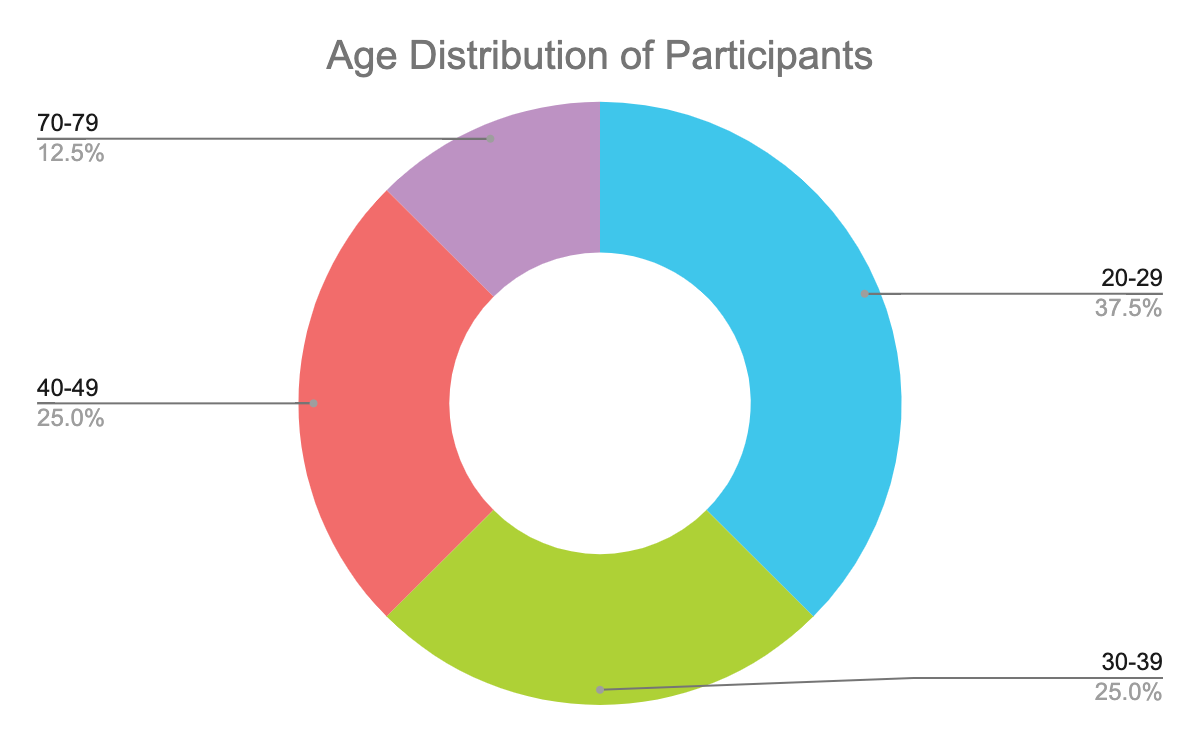
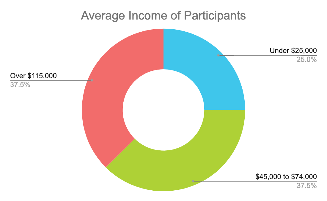
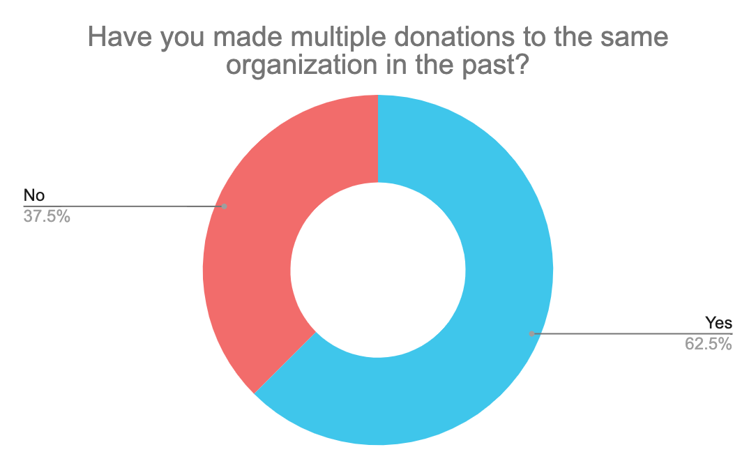
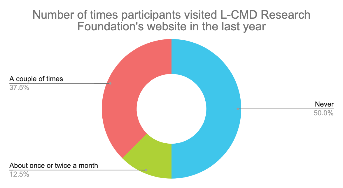
Recruited participants were required to fill out a screening questionnaire, which was used as a guide to qualify and select participants. It also provided the research team with additional demographic information and experiences with donating. A total of 8 individuals participated in the study, 4 of which were internal recruits who have donated to the L-CMD Research Foundation website in the past. The following highlights key data about our participants gathered from their responses to the screening questionnaires:
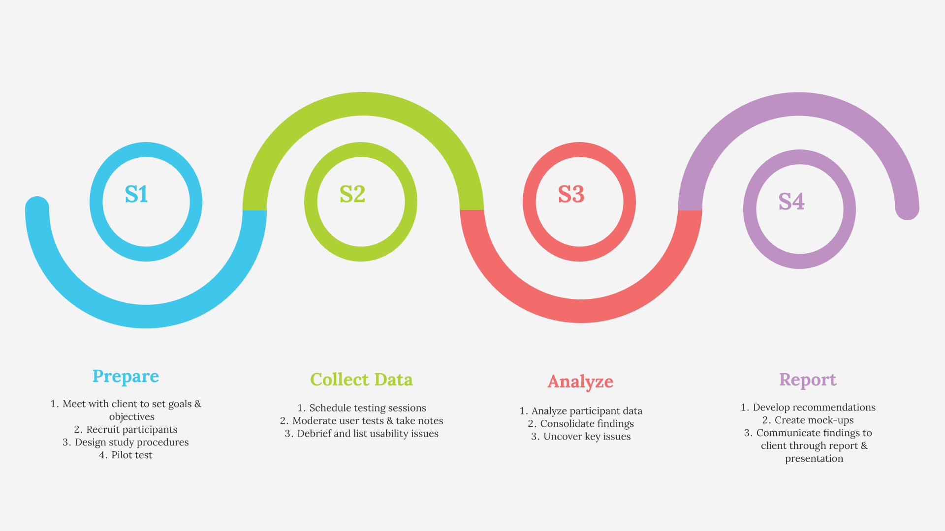
Design and Test Study Procedures: Remote Moderated User Testing
Given the personal and emotional nature of the L-CMD Research Foundation’s goals, our team decided to take a qualitative approach to the study. More specifically, the goal was to gather insights on the users’ thoughts, feelings, and behaviors while navigating through the L-CMD Research Foundation’s website (i.e. motivations to donate to the website) and to uncover usability problems. Thus, we decided to conduct a Remote Moderated User Test.
Why a usability test?
- To uncover issues with the design and usability of the website
- To learn about the users (their background, thoughts, behaviors, and preferences)
- To discover opportunities for improvement
Why a remote test?
- Users were located in different states across the country
- Less expensive and time consuming than in person studies
- Easy to record and save video/audio
Why a moderated user test?
- Allowed us to ask clarifying questions about their thoughts, feelings, and behaviors as they navigate through the website in real time
- To ensure users are thinking out loud and understand the tasks they are requested to complete
During the testing sessions, a team member moderating the session first asked the participants a series of pre-test questions to gather further insight into the users’ background and experiences relating to donations, research, knowledge about the disease, as well as their goals. Then, the participant was asked to complete a series of tasks which aim to uncover usability issues throughout the website. As the participants went through each task we created, they were recorded on a screen-sharing platform (Zoom) and asked to think aloud so we could observe how the participants navigate through the website and take notes.
Task 1:
Upon landing on the homepage, what information can you find about L-CMD?
Task 2:
Starting from the current page, locate the organization’s vision. What do they aim to achieve? What are the organization’s goals?
Task 3:
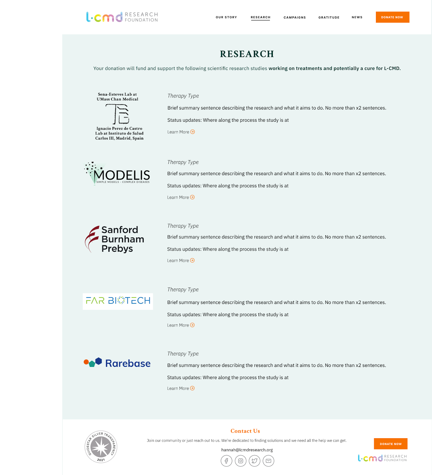
Knowing what the organization’s vision and purpose are, locate the research groups the organization supports. Is there a project that you would like to support?
Task 4:
After finding out more about each of the research projects for L-CMD, you decide you want to help move medical research ahead by donating to the foundation. Is there an active campaign that you can donate to?
Each individual task featured follow-up questions to gain insight on the ease of finding the information, where they expected to find the information, whether the information was what they expected, and what changes they hoped to see (regarding the layout and content).
After completing the tasks, users were asked to complete a post-test questionnaire, which consisted of a series of 10 questions using a reliable tool known as the System Usability Scale (SUS). Users had five response options from Strongly agree to Strongly disagree to measure the overall usability of the website.
Following each testing session, the participant data, including their responses to questionnaires, usability issues encountered while completing the tasks, and overall thoughts, feelings, behaviors, and suggestions, was transferred to a Google spreadsheet.
Analysis
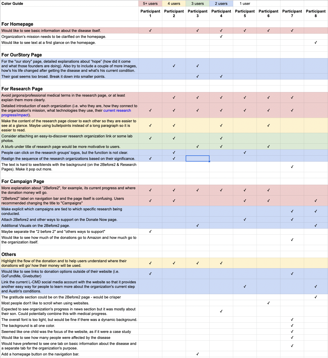
During the analysis phase, we created a separate spreadsheet to organize and consolidate the usability issues participants faced while completing the tasks. More specifically, we created headers for issues faced on specific sections of the website and color coded the usability issues based on the number of users who experienced them. This method helped us easily visualize which issues to prioritize addressing in our recommendations.

Key Findings
Overall, users praised the strong storytelling skills of the L-CMD Research Foundation. They found Austin’s story very moving, stimulating their desire to make a donation. A key observation was that prior users tended to have more positive remarks about the website as a whole compared to new users, which was an expected limitation of our study. However, by asking prior users what they would have thought had they seen the website for the first time, we were able to work around their potential biases and gain more honest feedback about the issues they encountered.
The overall SUS score for the website was calculated to equal 59.0625, which is below average (68) in usability. We also discovered that the website’s core issues revolve around the navigation bar and specific pages of the website: the homepage, research page, and campaign page. By prioritizing our recommendations to address issues on these sections of the website, we believe this would increase the overall SUS score, and therefore the usability, of the website.
Problems & Recommendations
problem #1
- Users had trouble finding active campaigns when completing Task #4
- Users were unclear about the meaning of “2Before2 & Other Support” in the navigation bar
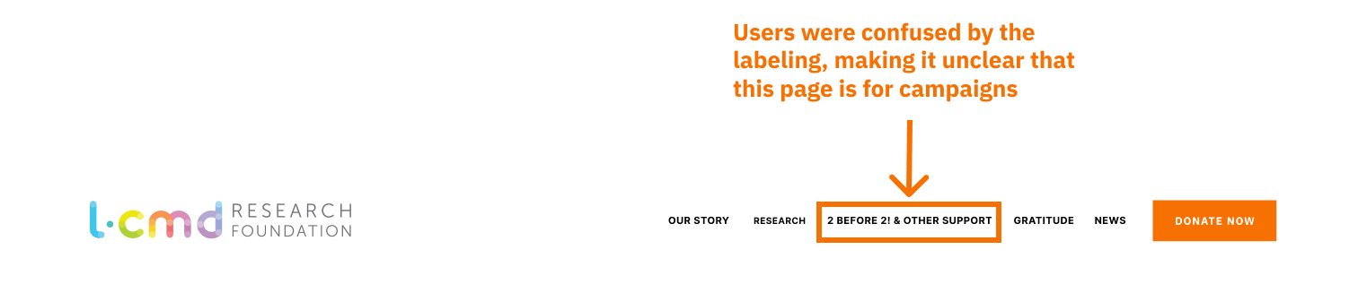
Although the website received an average rating of 4.5/5.0 for easy navigation in our post-test questionnaire, participants did encounter several issues while navigating through the website to find an active campaign. Five out of the eight participants had difficulty understanding and identifying what type of content to expect based on the title “2 Before 2! & Other Support” within the navigation bar. Users would understand the page was intended for a specific campaign only after clicking through the page and reading through the descriptor text. The overall time spent trying to complete Task #4 took around 2-3 times longer than other tasks. One participant stated, “this was definitely the hardest information to find out of all of the tasks.”
Recommendation #1
Consolidate navigation menu items and relabel the “2 Before 2 & Other Support” tab to “Campaigns”
- Renaming “2 Before 2! & Other Support” to “Campaigns” would bring clarity to the type of information available on this page and reduce the time users attempt to guess the information of an unfamiliar page titled “2 Before 2! & Other Support.”
- During the testing sessions, we also observed that older participants had to move closer to the screen to view the menu items. Thus, we also suggest widening the space of the menu items to ease the user’s visual strain while reading the text.

PROBLEM #2
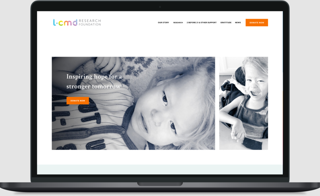
- Half of the users did not scroll below the image on the homepage to find the information introducing the L-CMD Research Foundation
- Upon landing on the homepage, users who have not seen the website before were unclear on what the disease was
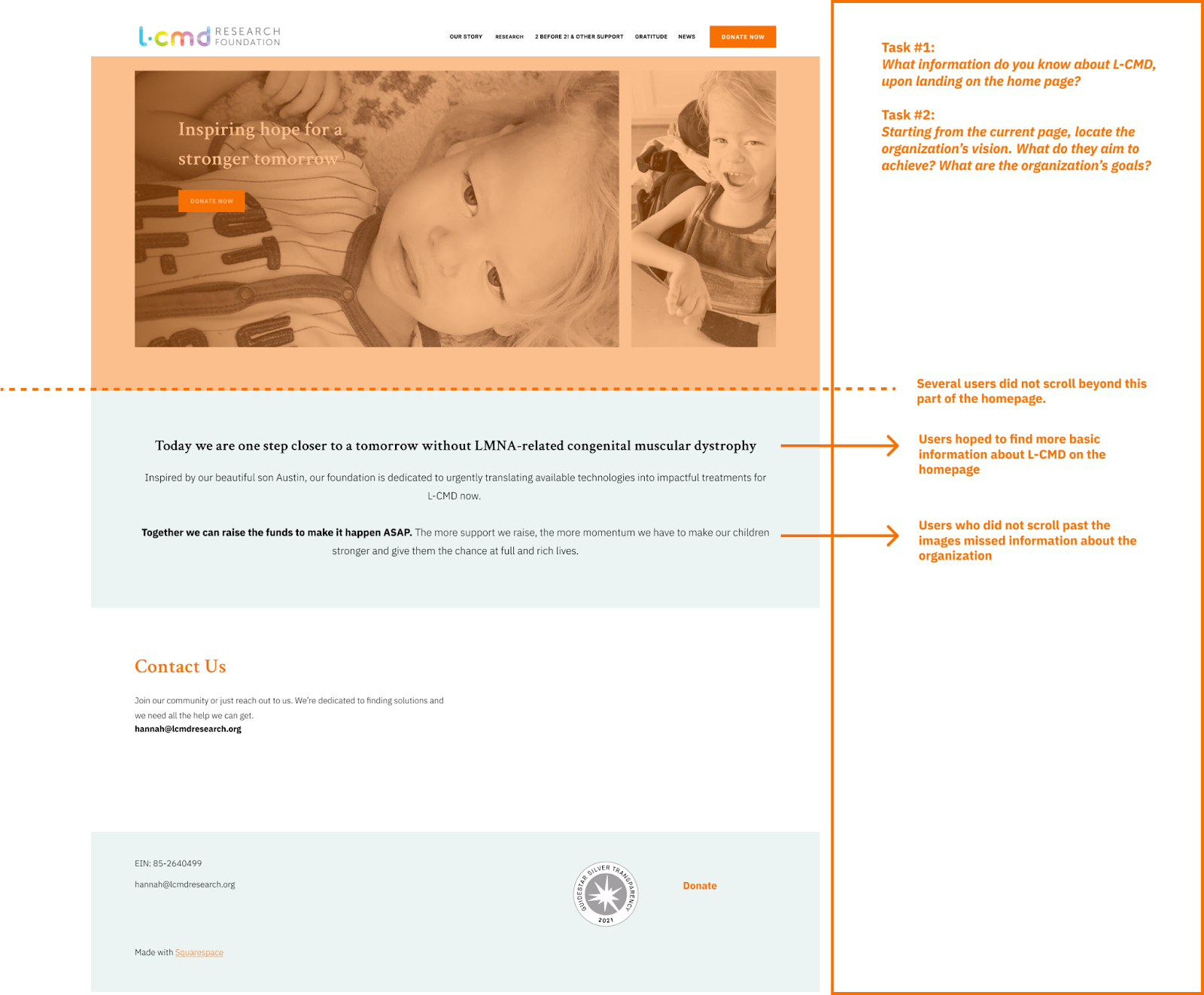
RECOMMENDATION #2:
Redesign the homepage to add emphasis to introductory information on the website
By redesigning the content and layout of the homepage, users would have a more integrated understanding of L-CMD and catch key points of why the site exists at first glance. More specifically, we suggest:
- Shrinking the current image size to help the text pop out more without compelling users to scroll.
- Incorporating the organization’s mission above the image to leave room below the image for key information about the disease itself without requiring users to scroll.
One user mentioned that the current title “Inspiring hope for a stronger tomorrow” was vague, while another user thought it was catchy. Although it is not necessary to change this title, we provided an alternative option to further highlight the organization’s mission.

Problem #3
- Users struggled to decipher content on the “Research Page” due to the confusing medical jargon
- The structure and layout of the content made it difficult for users to read, process, and retain the information to complete Task #3
- Users expected to find more information about the progress of the research studies and how they connected to the organization’s goals
- Users expected to find more information about the research organizations themselves, but the function of clicking on the logos to do so was not discoverable

recommendation #3:
Create a stronger visual hierarchy of the content on the “Research” page to increase the readability and understanding of the research being conducted for L-CMD
- Shrinking the logo sizes would allow more room for the text.
- Highlighting the therapy type at the top, as well as laying out the content in a list format, would allow users to compare the studies more easily without having to scroll back and forth.
- Medical terminology should be explained or omitted to make content easier to understand.
- Adding a “Learn More” hyperlink would make it more discoverable to users that they can find more information about the studies.
- Adding a brief description below the title would make the overarching goal of the research page more clear and address the confusion users faced surrounding the flow of donations on the website.
problem #4
- The layout of the content on the campaign page is not consistent
- Users cannot relate the current “2 Before 2! & Other Support” page as a campaign page
- Users were not aware of the difference between the “Donate Now” page and the “2 Before 2” campaign
After exploring the “Donate Now” page, two users noticed that there were other ways to donate to the L-CMD Research Foundation (GoFundMe, Givebutter, and social media) and hoped to find links to these on the website itself.
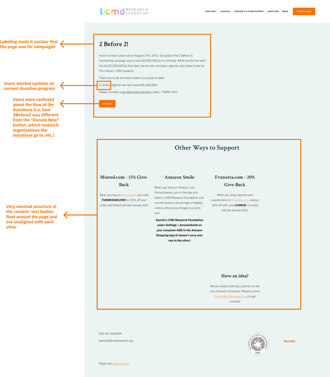
recommendation #4:
Create a visual hierarchy of the content for the relabeled “Campaigns” page and implement key details expected by users
- Adding hyperlinks to make alternative methods of donating more discoverable to users.
- Adding crucial details to support each listed campaign, such as where the donations will go and the current donation progress, would further incentivize users to donate.
- A brief introduction below the page’s title could also help users understand the flow of donations on the website.
- Restructuring the content on the relabelled “Campaign” page in a list format would help create a stronger visual hierarchy of the content, increase the content’s readability, and create more cohesion on the website.

Future Considerations
Our participants gave various personal suggestions throughout the user testing sessions, some of which were incorporated in our recommendations. However, we were unable to address all of them given the limited time frame and our client’s low desire for a major redesign. Provided our client has the capacity to do so in the future, we believe implementing these ideas could further improve the usability of the website and motivate more users to donate.
- Combine the “Gratitude” page with the “Donate Now” page so that when users make donations, they can directly see who supported this organization and thus be more encouraged to donate.
- Create a separate dropdown under the “Donate Now” button which includes details on how to donate using alternative methods such as check, stock, and crypto. This would clear up space on the current “Donate Now” page to reduce the cognitive load on users.
- Simplify the Donate Now Page to utilize for more significant donations.
- Redesign the footer to make it more aesthetically pleasing to users and allow them to access contact information and social media links on whichever page they are currently on, as shown in the following mock-up:

Note: this footer mock-up was incorporated into the mock-ups of the homepage, research page, and campaign page under the Problems & Recommendations section to help the client more easily visualize what it would look like on these pages.
Key Takeaways
The presentation of our findings and recommendations were well received by our client. They agreed with all of the issues our participants faced, making it significantly easier to navigate the discussion. The client specifically enjoyed how our recommendations made the flow of the donations more clear to users. This was a prominent issue they faced while developing the content of the website since the donations were not evenly distributed between each research organization. A particular concern was that our client had limitations in their technical abilities, and were unsure as to how they could implement our recommendations using the Squarespace platform they created their website on. Another issue we faced during in our study was that we had a limited time frame to recruit participants and did not get a response from several of them, and thus our external recruits were restricted to individuals we were acquainted with. However, we made sure to only contact those who fit our user profiles, ensured they were qualified to participate based on our screening questionnaires, and remained professional during the testing sessions.