The Problem
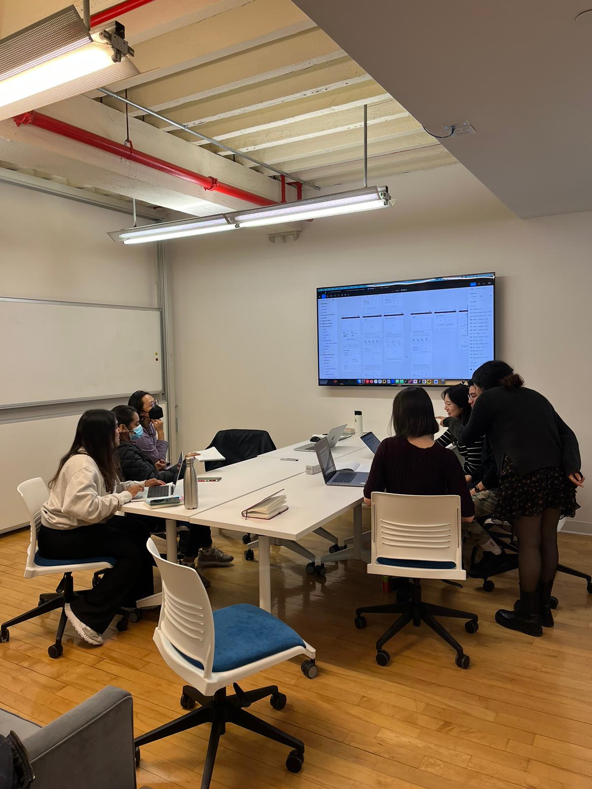
Girlscoutsnyc.org is the official website of the Girl Scouts of the USA’s New York troop. We were assigned to redesign this website by Professor MacDonald most probably due to its confusing design. For this project, I first started off in a three-person team consisting of two IXD graduate students, and myself, a Pratt Data Analytics and Visualization graduate student. Halfway through the project, I then transferred to a new five-person team, which consisted of three IXD graduate students, another Data Analytics and Visualization graduate student, and myself.
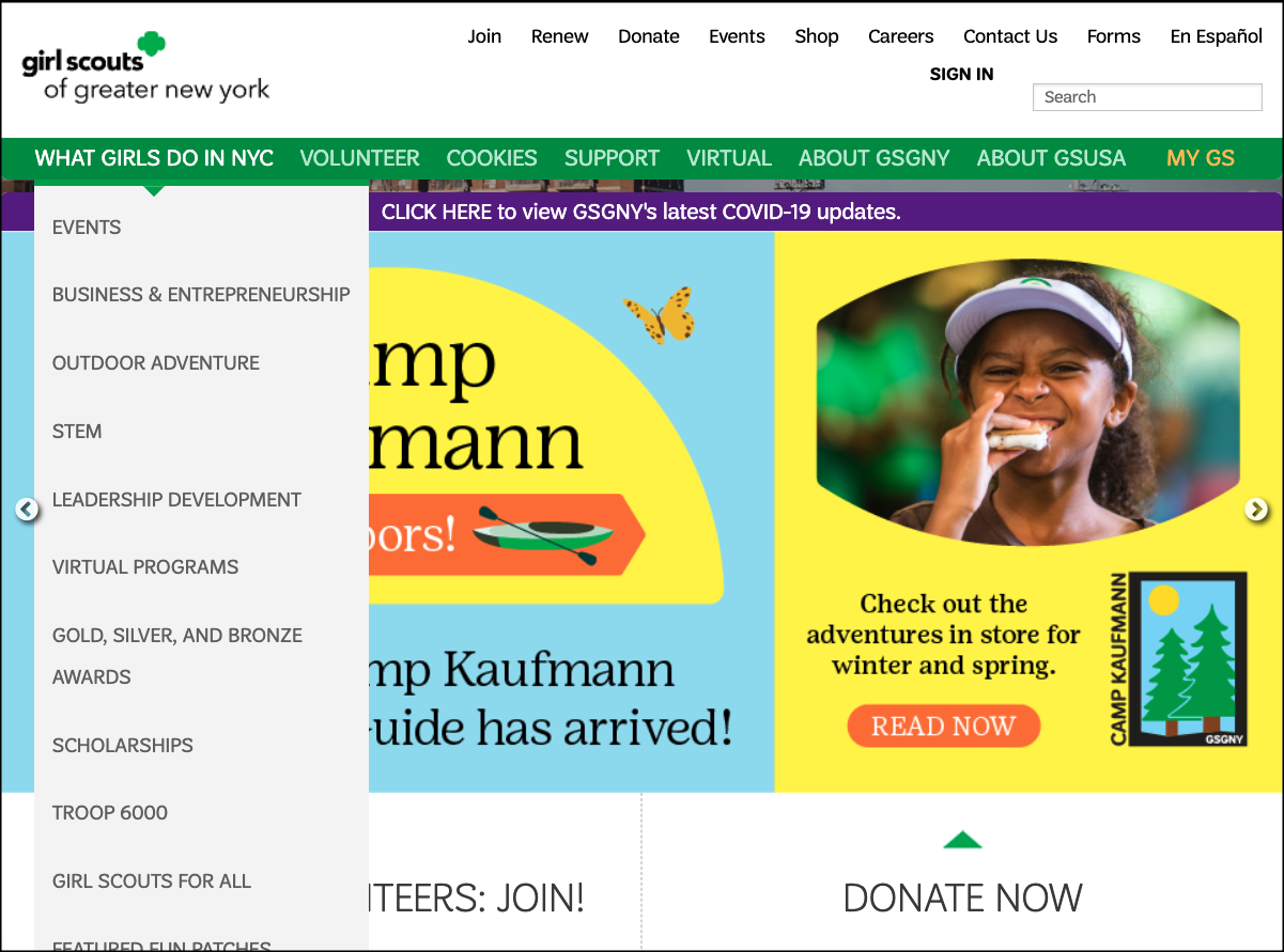
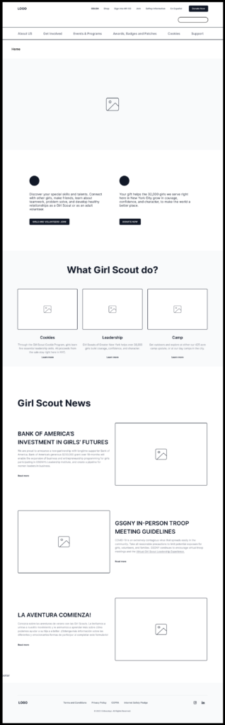
In my first team, upon initial exploration, my team found the website to be overly complicated (Fig. 1) by two menu bars (one of which held many menu options that redundantly existed as sub-menu options), seemingly too many sub-menu options, and ambiguous/confusing labeling. When I transferred to my new team, I found that their analyses had rendered similar observations to my previous one.
Therefore, the overall problem to tackle was to redesign the website in a way that was simpler, more communicative in its labeling, and, therefore, could be navigated more easily.
Throughout this project, I conducted an interview of a parent looking to place his daughter in a youth leadership organization, helped with competitor research, sent out emails for the card-sorting and tree-testing studies, created my version of a low-fidelity prototype, worked on my assigned pages for the medium-fidelity final prototype, and prepared much of the final prototype annotation slide deck.
The Process
This project consisted of five main steps. We worked together to:
- 1) conduct interviews of our specific target audience of parents/guardians looking to get their girls involved in the Girl Scouts
- 2) carry out a card-sorting and tree-testing study to better understand our users’ mental models and propose a revised information architecture for the website
- 3) research the Girl Scouts’ competitors to identify key design insights
- 4) create two low-fidelity prototypes – on both mobile and desktop – supporting two tasks and conduct user tests on them
- 5) create two task-based medium-fidelity digital prototypes on mobile and desktop representing our group’s final redesign proposal
1) Interviews of parents/guardian
After our group identified our target audience as parents/guardians looking to get their girls involved in the Girl Scouts or a similar youth leadership organization, we each interviewed one parent/guardian to understand how they gather information when either looking to enter their child into the organization or after their child had already joined the organization.
After analyzing the information collected from the interviews, the following insights were the most important/recurring takeaways:
- Parents find out about possible youth leadership organizations to place their child(ren) in first via their friends and their children’s friends, then via social media channels (such as Facebook and Instagram) and by doing internet searches
- After completing their research, parents look for a local chapter online to attend an informational meeting
- All parents are interested in being involved in the organization along with their children by shouldering such responsibilities as chaperoning. As a result, they’re concerned about scheduling issues and feel that finding a calendar on a website is helpful
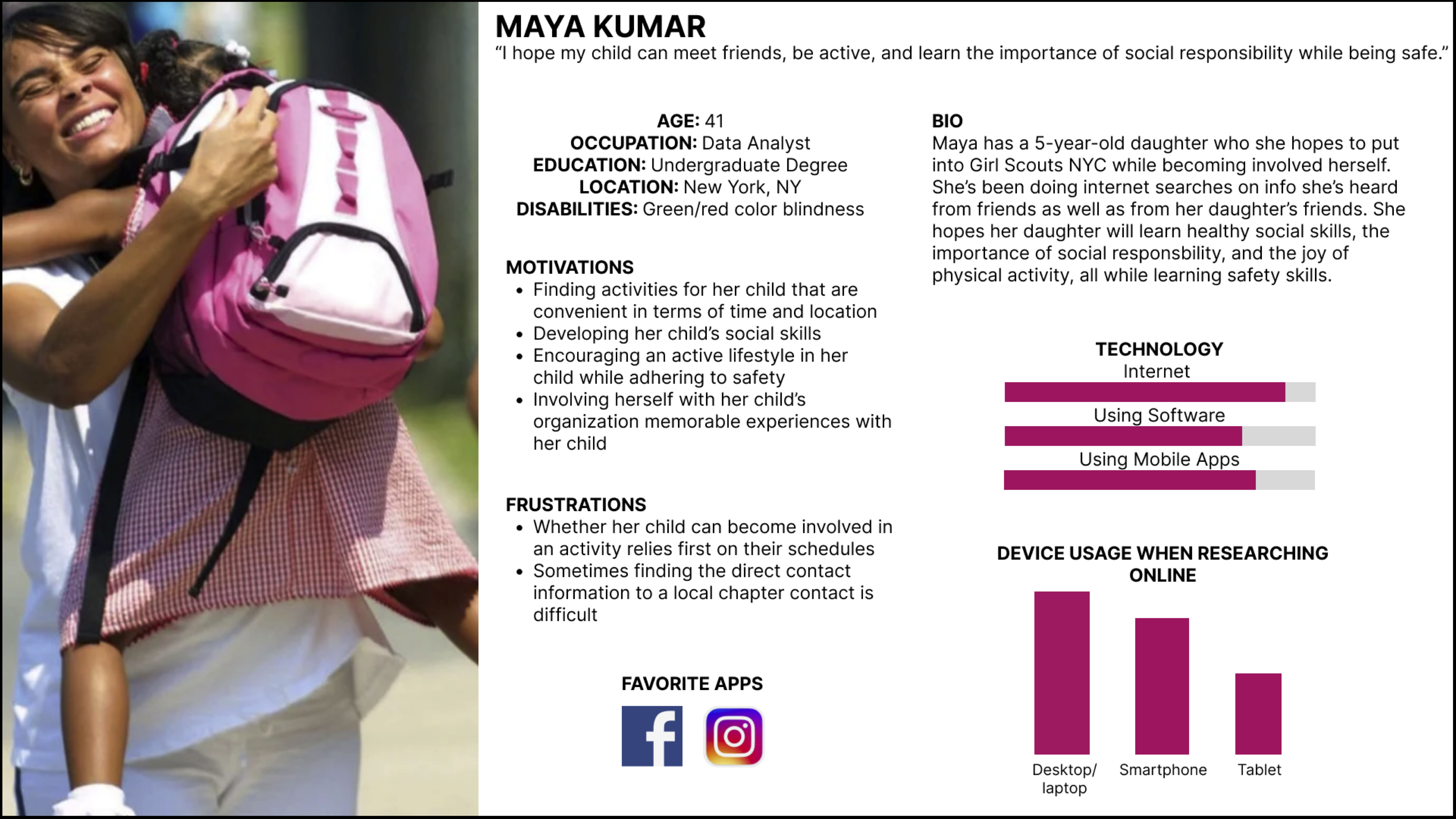
I also created the following persona (Fig. 2) to embody these results in one glance:
2) card-sorting and tree-testing studies
During our card-sorting test, our cards were sorted into 14 different categories, which reflected that people lacked understanding and were unclear about how something should be categorized. One specific example of confusion concerned the ambiguously labeled “Troop 6000,” which is a Girl Scouts program designed specifically to serve girls in the NYC shelter system. Our team ended up relabeling this to “Troop 6000 for NYC Homeless Shelters” in order to minimize confusion.
There were many tasks that users attempted to carry out during our tree-testing study that led us to rename labels as well as get rid of certain sub-menu options that were not pointing users in the right direction while trying to navigate the website. For example, two tasks in our tree-testing study – a) You’re a troop leader looking forward to getting together and discussing an upcoming event with your troop remotely. Locate the resources to help you arrange this, b) You need to ensure the well-being and security of your child’s upcoming Girl Scouts outing. Find the outlined protocols to ensure that your child is safe – showed wide confusion while participants were trying to find “Safety” and “Virtual Meetings,” which we had nested under “Volunteer Resources.” We, therefore, got rid of the “Volunteer Resources” sub-menu option and un-nested the previously mentioned menu options.
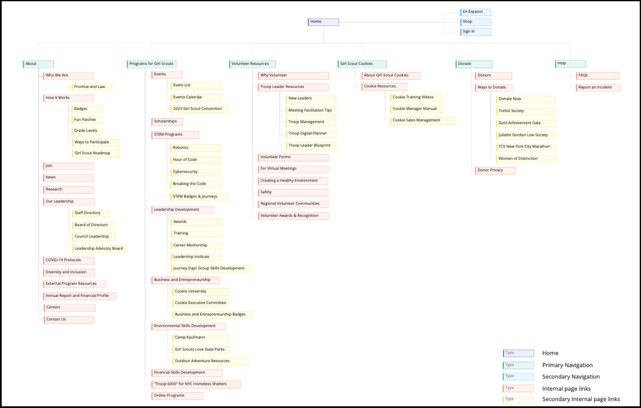
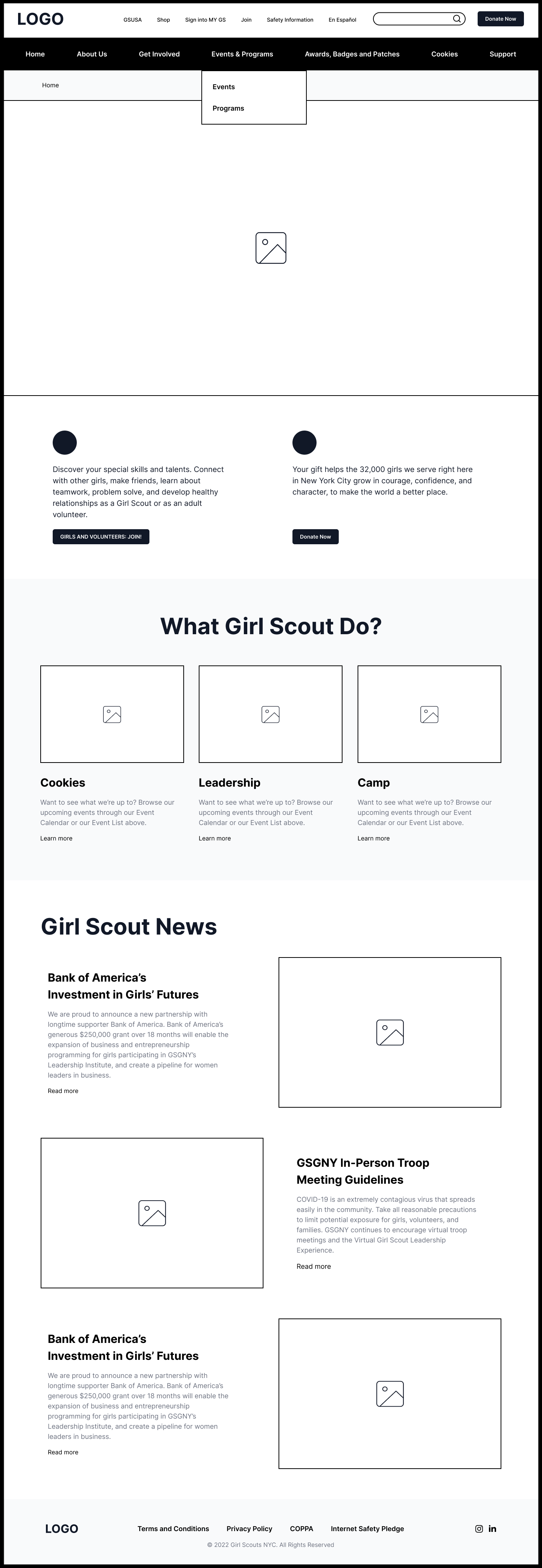
After completing these two studies, our team came up with the following redesigned sitemap (Fig. 3):
3) competitor research
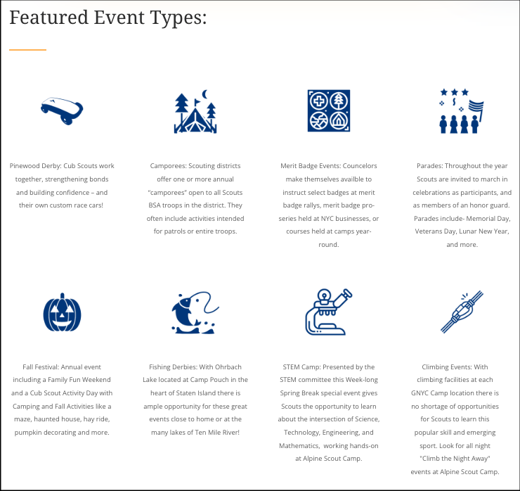
Around this time is when I transferred to the new group. While doing competitor research with this new team, one of the websites we encountered that influenced us was Boy Scouts of America’s nycscouting.org/activities (Fig. 4). We were inspired to duplicate the use of icons from this particular page in order break up text and help the user immediately recognize where they might need to click at a glance:
4) creation of two task-based low-fidelity prototypes followed by User Testing
Then, our team created two low-fidelity prototypes – one on desktop and one on mobile – that supported the following two tasks for users to navigate through:
- 1) Find and register for the Cybersecurity Program.
- 2) Find information for selling cookies online (note to team and not to be shared with the user: they should end up at “Digital Cookie”), and access training videos to sell cookies.
Below is one screenshot of the very first desktop page that the user would start on for the first task (Fig. 5):
Below is a screenshot of the very first mobile page that the user would start on for the second task (Fig. 6):
After the completing five user tests on these two tasks, our team was able to identify these common issues:
- 1) Confusion/uncertainty about where to navigate to due to label ambiguity – such as “Digital Cookie,” lack of explanation of acronyms, such as “STEM”
- 2) On mobile, confusion about where to click due to such issues as no back button, desire for a hover menu due to uncertainty about the meaning of menu options
- 3) On mobile, sub-menus found along the bottom of the page seemed overwhelming/confusing
We decided that moving forward, we should plan to:
- Reword labels for clarity so that users are not forced to click into each option to try to find the correct content.
- Redesign the mobile menu option to minimize confusion.
- Possibly remove the sub-menus at the bottom of the mobile pages or make them more succinct.
5) creation of two task-based medium-fidelity prototypes for final redesign proposal
Keeping in mind the takeaways from the user tests, we created our two task-based medium-fidelity prototypes for our final redesign proposal for both desktop and mobile.
Below is a screenshot of the same desktop page from above that the user would start on for the first task, redesigned (Fig. 7). The full desktop flow for both tasks can be found by clicking on the image.
Below is a screenshot of the same mobile page from above that the user would start on for the second task, redesigned (Fig. 8). The full mobile flow for both tasks can be found by clicking on the image.
Conclusion
By the end, the top eight things our team changed to bring us to our final redesign proposal were that we:
- 1) Consolidated top-level menu options
- 2) Consolidated sub-menus under “Events & Programs”
- 3) Added an explanation of the acronym “STEM”
- 4) Included use of icons for sub-menu options
- 5) Renamed “Digital Cookie” to “Online Sales Tool”
- 6) On mobile, relocated sub-menus originally found at the bottom of page
- 7) Increased the font size of the breadcrumb menu for easier visibility
- 8) Added sub-menus to landing pages
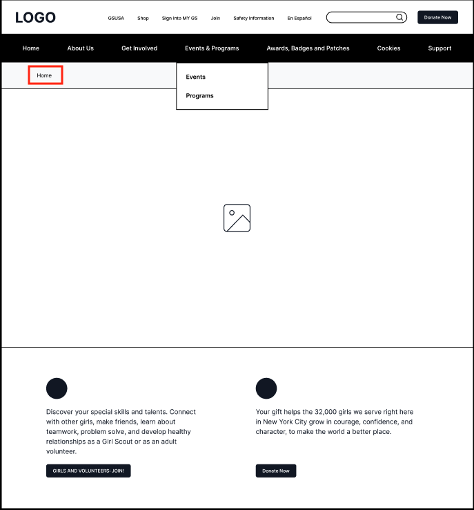
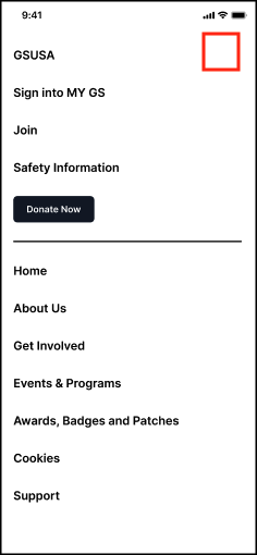
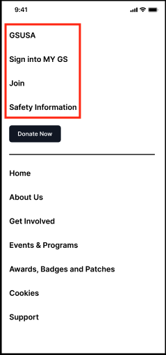
When we presented our final redesign proposal to another group (Fig. 9), their feedback was:
- 1) To get rid of “Home” in the breadcrumb on the Home page (Fig. 10)
- 2) On the mobile menu that appears after you click on the hamburger menu, to add the clickable “x” that closes the window (Fig. 11)
- 3) On the mobile menu that appears when you click on the hamburger menu, to move our secondary menu options of “GSUSA”, “Sign into MY GS,” “Join,” and “Safety Information” below the main menu options (Fig. 12)
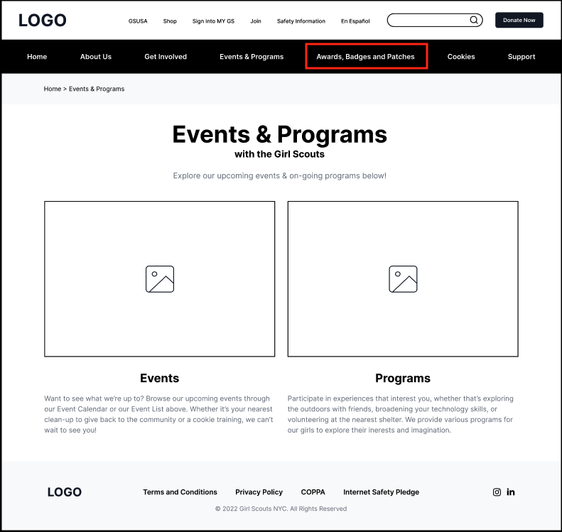
- 4) To edit and change “Awards, Badges and Patches” on the main menu to “Awards, Badges & Patches” or “Awards | Badges | Patches” (Fig. 13)
Takeaways
while many heads are better than one, sometimes it just doesn’t work, and it’s okay to communicate openly with your teammates about that to see what can be done
In my journey through this project, the reality was that when my first three-person group attempted to traverse the horizon of this redesign, there were some issues that made it so that we were unable to proceed productively. I decided to communicate this transparently to my teammates and let them know that I felt we were struggling intensely. Over time, it was clear our painful reality would remain unchanged, and so after some discussion amongst ourselves and with Prof. MacDonald, we split up and each joined a new team.
when it does work, it’s nice to have everyone’s varying abilities unite
Once I was in my new team, it was clear that each of us had a different strength to bring to the table, and it was nice to be able to pass the baton and bounce uncertainties and confusions off one another in order to create something we could all stand behind.