Miro is an online collaborative whiteboard platform founded in 2011. The product enables distributed teams to work effectively, from brainstorming with digital sticky notes to planning and managing agile workflows. In this article, I evaluate Miro’s interface design based on design principles discussed in Don Norman’s book——The Design of Everyday Things.
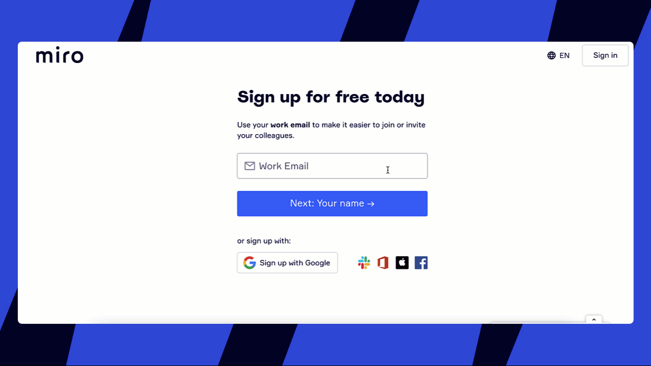
1. Initial sign-up page
The initial page affords the “Sign-Up” behavior by using the Conceptual Model of the conventional “Sign-Up” process, allowing users to access Miro efficiently with their email addresses or third-party accounts directly. It also communicates the results of users entering the input box well. When clicking the input box of “Work Email,” users can receive immediate and informative feedback on the action due to the change in the input box’s border and placeholder text’s position (Gif. 1). Additionally, all the blue “Next step” buttons act as signifiers to effectively inform the step-by-step process, keeping consistency in their shape and color.
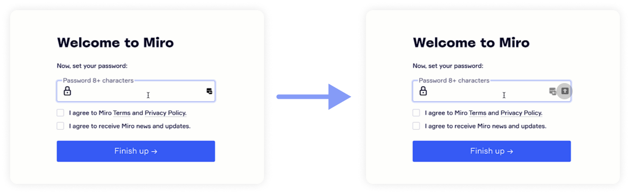
However, the feedback on the action of setting passwords still has some room to improve. It is common for users to press the caps lock key accidentally while entering the password. If the users are unaware of whether the caps lock key is on or off, they might type an incorrect password based on their assumption. Therefore, that might be clearer if the caps lock icon is indicated right after users press it (Fig. 2).
2. Work with the creation toolbar
As users create a Miro board, they can get access to a number of tools for editing on the creation toolbar on the left side of the board. The drawing of each iconic tool follows the knowledge in the world to indicate possible “selecting”, “texting” and other corresponding actions. Each of them does well in discoverability and understandability. Users can easily figure out how the tool can be used when hovering over the icon, because of the instructional text appearing beside it (Fig. 4).
As soon as the select/pan tool is clicked, the mouse turns into a little hand immediately which signifies the arisen “Pan” action. Therefore, the feedback is satisfactory (Fig. 3).
Since the toolbar is stacked with many options, users might be distracted by multiple features to choose from. To avoid the paradox of technology, it is good to hide many options in a subpage. In addition, the design of the search bar on the top follows the concept of natural mapping, which makes it easier for users to type and find suggested tools. It potentially indicates that the search results are constrained by the alphabet (Fig. 4).
It is also typical that new application users are more likely to make mistakes, whereas experts are more likely to make slips. The undo and redo buttons under the toolbar effectively add constraints to block errors (Fig. 4).
3. Work with external linking
The Miro allows users to create an external link for any abject. After users click the object and confirm the behavior of inserting the link to the external website, a little icon will appear on the right corner as feedback on the user’s action. It is also expected to be a signifier to let viewers know its affordance (Fig.5).
Yet, the drawing of the icon is far away from the traditional meaning of “link”, which might not be a good conceptual model. Users who just inserted the link may not understand the icon, and that causes a gulf of evaluation. Moreover, it is hard for viewers to notice the little icon due to its small target size, so viewers may feel confused about where to click to reach external websites. Here is the gulf of execution.
The gulf can be bridged by transforming the shape of the link icon to adopt users’ conceptual model and enlarging its target size (Fig. 6).
Conclusion
In general, Miro is currently one of the world’s most popular online collaborative products. Most of its feature is very helpful in creating a more effortless and smoother working experience, but more improvements are expected to create better user experiences.