The Infatuation is a New York-based restaurant recommendation iOS application and website known for its witty and unpretentious restaurant reviews and guides. Content on the platform is written and created by a team of trained reviewers whose goal is to deliver trustworthy recommendations to its users on local eateries with a comedic flare.
Initial Log-In Process
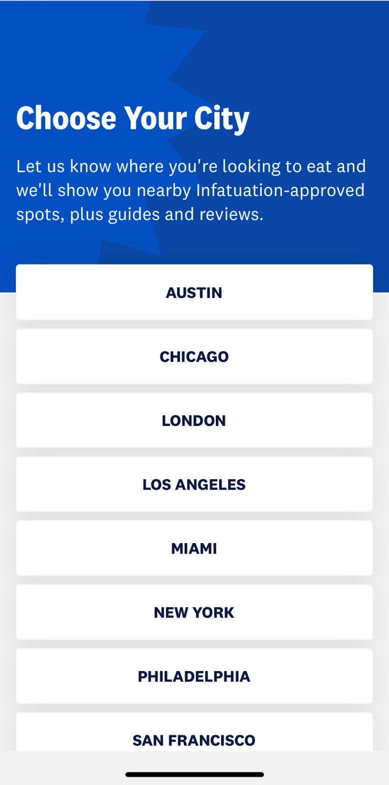
Figure 1
The first page users see when they open up the application for the first time is a prompt to “Choose Your City” positioned above a brief description of the intent behind this action and a list of cities included in the platform (Figure 1). Right out of the gate, the product begins to lay out a conceptual model by asking its users to select the location they want to receive recommendations for, informing them that this is a localized review product.
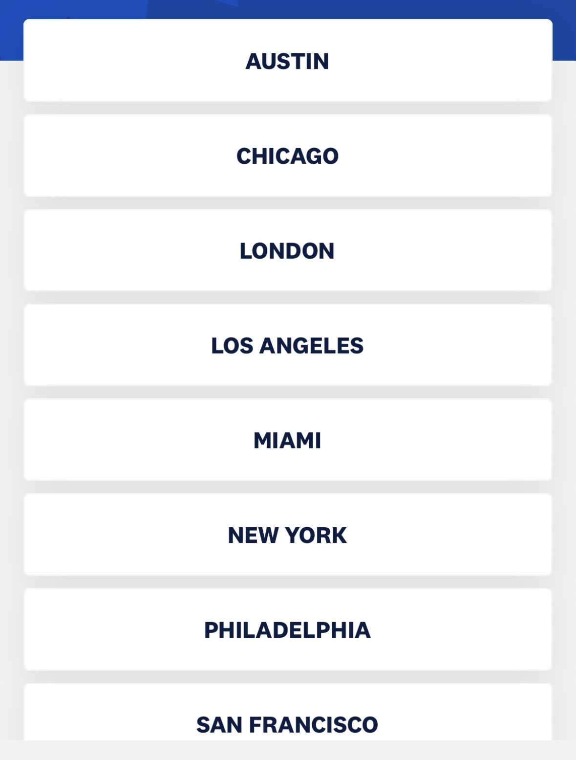
This page is also effective at cultivating the discoverability of all of the cities that are included within the product because they are all listed on this page (Figure 2). Each button that contains a city’s name acts as signifier and informs the user that clicking there will afford having restaurant information displayed to them for that particular city.
“Find Places” Page
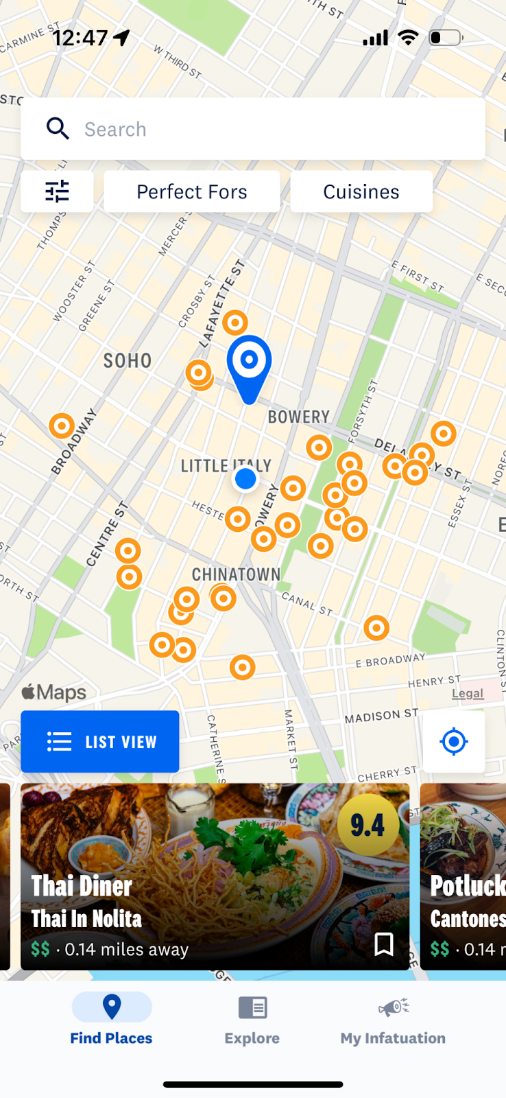
Figure 3
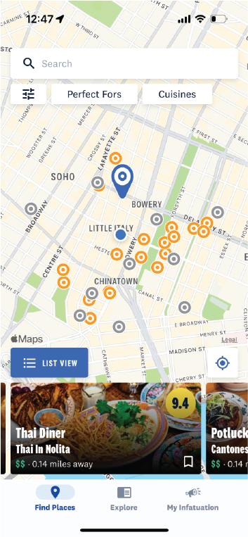
Once the user is logged in, they are brought to this page that shows them a map of their current location populated with various icons. Here is an interesting and quite literal example of natural mapping. The locations of the restaurants are made discoverable by signified orange circle icons on a geographically accurate map relative to the user’s location. Feedback is demonstrated to the user when they click on one of the orange circle icons and it is replaced with a large blue location pin and a box with the restaurant’s information is presented at the bottom of the screen (Figure 3). Unfortunately though as a frequent user, I constantly have to harness my knowledge in the head to remember which orange circle icons I have clicked on before in a given session. I enjoy making sure I’ve read through all of the restaurant reviews in a given area and oftentimes I find myself repeatedly clicking on the same icon because I forget what restaurant it was affiliated with.
Potential Solution:
One suggestion I have to remedy this would be to change the color of the signifier (the circular orange icon) if a user has already read through that review (Figure 4). This will instill a visceral response within the user that the different colored icons mean different things. Gray icons would signify to the user that they have already read through that review and orange icons would signify reviews yet to be read.
Saving Restaurants to “My Lists”
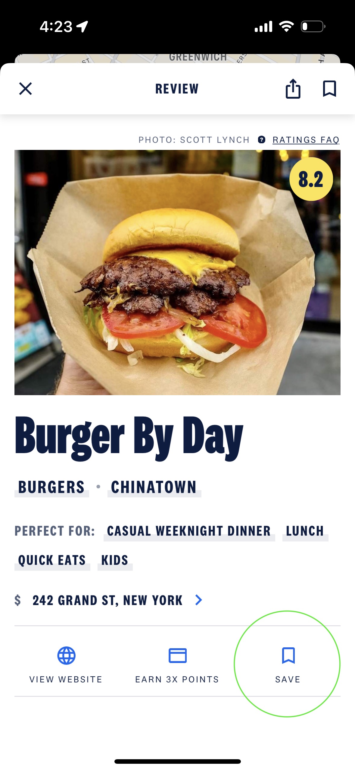
Something that I consider to be good design within The Infatuation application is the process of saving restaurants to a list. On both the restaurant icons and on the review pages, is the universal “save” icon that signifies to the user that they can store the reviews they want in one place (Figure 5). Personally growing up with technology, this icon serves as an example of knowledge in the world since it’s utilized in numerous popular products to signify the act of saving and I immediately recognize it as the save button.
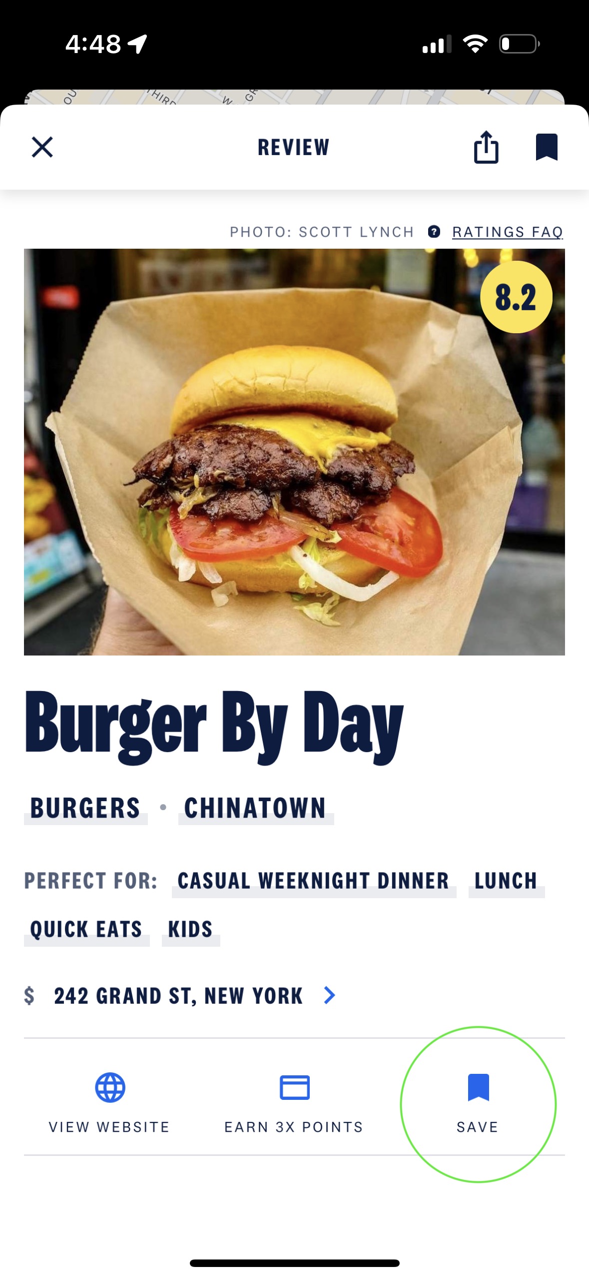
When a user clicks on this icon, it changes from an outline to a solid, providing the user with feedback that the restaurant has been saved (Figure 6).
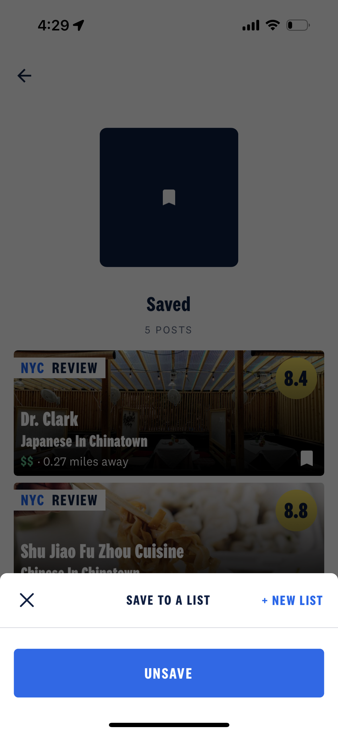
Occasionally, I will make an action-based slip and click on the icon twice instead of once. Instead of living in fear that you will accidentally unsave a restaurant you’ve been dying to go to, the user is met with a confirmation box to double-check that this is the action the user truly intended to take (Figure 7). By including constraints to block errors in the product, you can help your users have a more positive user experience.