
Toddle is an all-in-one platform that simplifies curriculum planning, project and portfolio management, assessment and reporting, and online learning. It provides a comprehensive suite of tools to help educators and administrators manage the curriculum development process. It offers customizable solutions for different curriculum frameworks, enabling educators to create tailored learning experiences for their students.
The website designed by Toddle is a great example of good design that follows many of the design principles outlined by Don Norman in his book Design of Everyday Things. The website is aesthetically pleasing and has a clear and logical structure that makes it easy to navigate and find the desired content. The website also includes visual cues that guide the user to the right place and help them understand the context of the page. Additionally, the website is responsive, making it accessible across multiple devices, and has easily readable typefaces. All of these components come together to create a visually appealing and user-friendly website, following the main design principles by Norman.
In this blog, we will explore how Toddle has employed various design principles to make the website user-friendly. We will look at how Toddle has used color, typography, layout, imagery, and navigation strategies to create a cohesive and intuitive platform for its users. Finally, we will go through a few aspects that can be improved from their existing design.
Website Structure
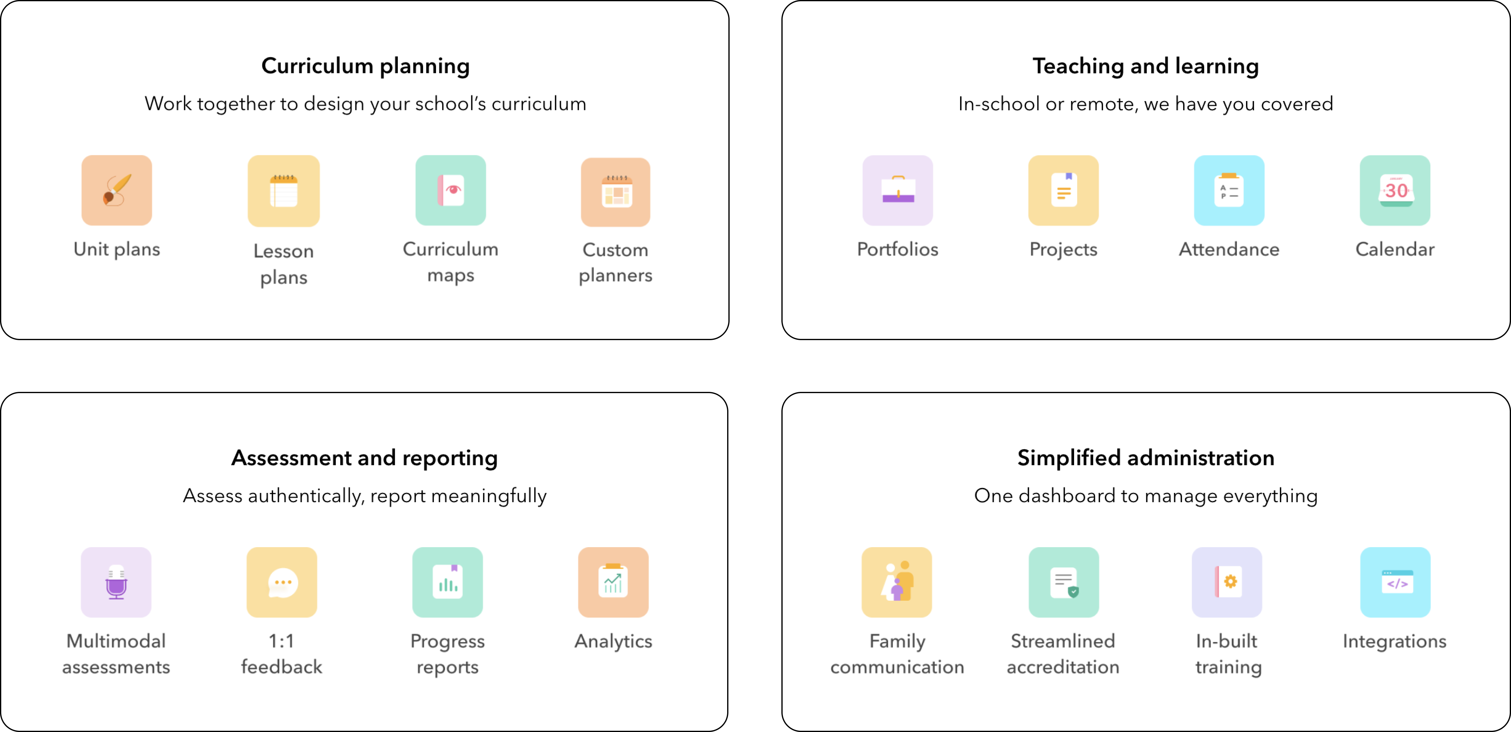
They have adopted a minimalistic style across the entire website. This phrase describes a website design approach that uses fewer words, and more icons and images, to convey information. Rather than using large blocks of text to explain various sections of the website, the site’s creators have chosen to use simpler visuals to help users more easily understand the content.
They have crafted each fold meticulously, making it simple to discover the details each fold is providing. The information blocks were designed in such a way that they helped emphasize the main points of the features they are offering and make it easier for users to access and understand. Additionally, the team ensured that the color schemes and typography used throughout the website were differentiating each block of information from one another.
Starting from the first fold itself the first two lines illustrate all of the capabilities Toddle affords in a Nutshell, ranging from teaching and learning, curriculum planning, and aesthetic assessments to student engagement and family communication.
Features
The design has mapped all the features that the platform is offering with respect to its type which signifies under which features belong in each category, allowing customers to easily access the features they need.
Navigation
Starting with the Navigation bar, I believe they have done an excellent job of grouping sub-options inside the specific menu. This makes it simple for users to discover the information they are looking for or relate to. The tags “New!” and “We’re hiring” afford useful supplementary information to the users. The “New!” tag lets users know that the particular event has just been released and is available for viewing. The “We’re hiring” tag alerts users that the company has job openings, and they are seeking new employees.
When a user clicks on any option on a website, they are taken to the intended page with information relating to the option they clicked on. The underline often referred to as a “ref”, stays at the selected page to give the user feedback as to which page they are currently on.
Demo Form
In the demo form, the designers have included various types of input elements and added placeholder text tailored to each input element to help users understand what type of information is expected. The inputs have also been constrained so that the user only enters specific types of data, making the form easier to use. This helps guide the user and make sure that the information entered is accurate and valid.
The phone number field has been designed to provide a better user experience by signifying the correct formatting of the number for each selected country in the placeholder text. Additionally, the field restricts the users from entering any alphanumeric characters by using constraints like type=number to restrict them from making any action-based slips. The field gives feedback to the user if the phone number is valid or not.
Toddle Learn – Design Issues and Solutions
Toddle Learn is a platform to connect educators around the world to share their expertise and experiences related to teaching and learning. It also offers blogs, resources, webinars and events that offer participants with live discussions and expert advice.
Despite the fact that Toddle has given its users an excellent conceptual model, there are certain areas that could be improved to keep the gulf of execution as small as possible.
Blog Structure and Navigation
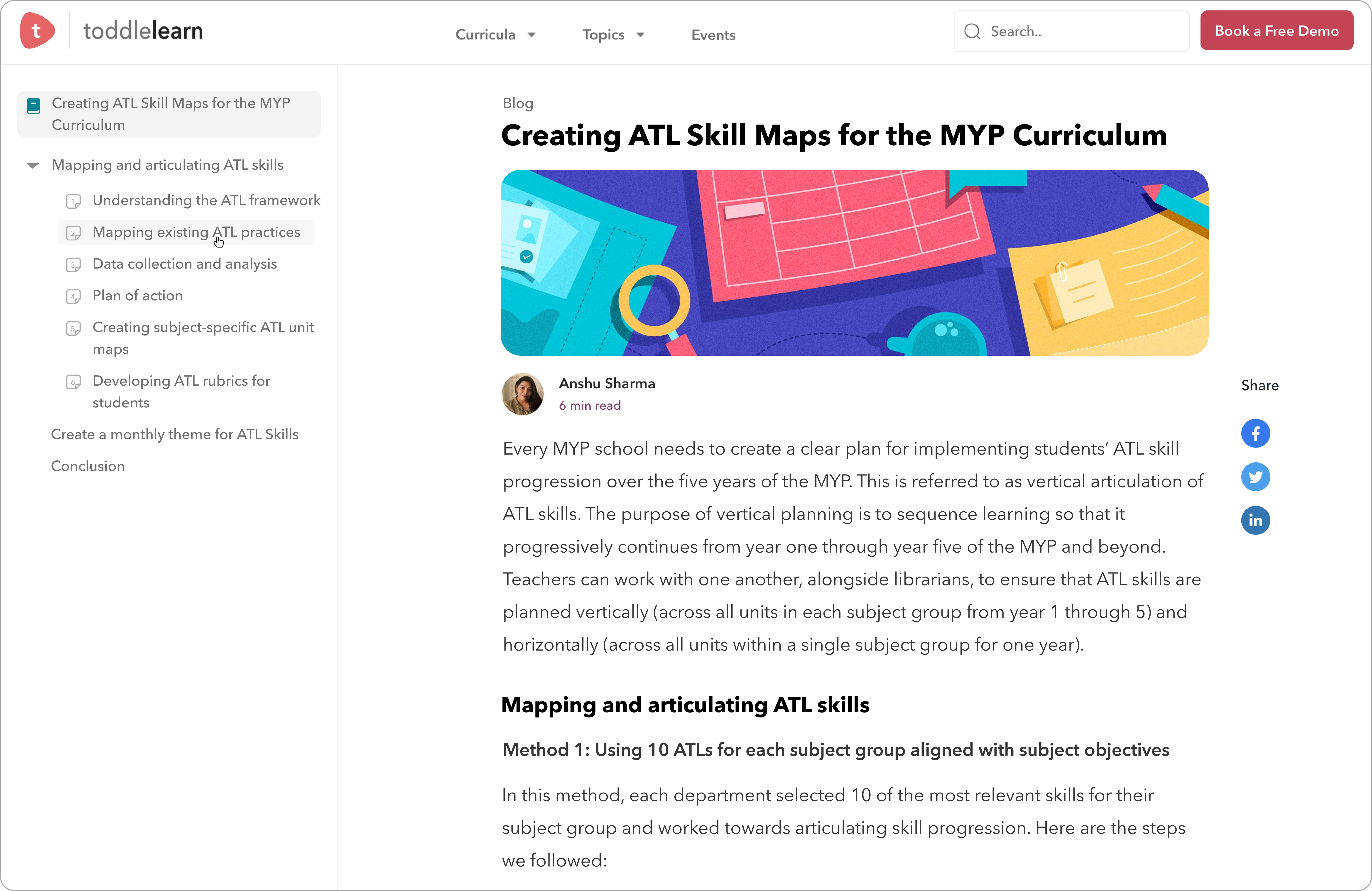
Take, for example, the following blog. The length of the blog is very long, which can make it difficult for users to keep track of how much they have covered or to scroll back and forth to read a specific section.
To address this issue, users could be provided with a list of topics covered, which would assist them in discovering all of the topics covered by the blog. When users click on a specific section, the blog will provide feedback by redirecting them to that section.
Multilingual Support to minimize filters and provide a better user experience
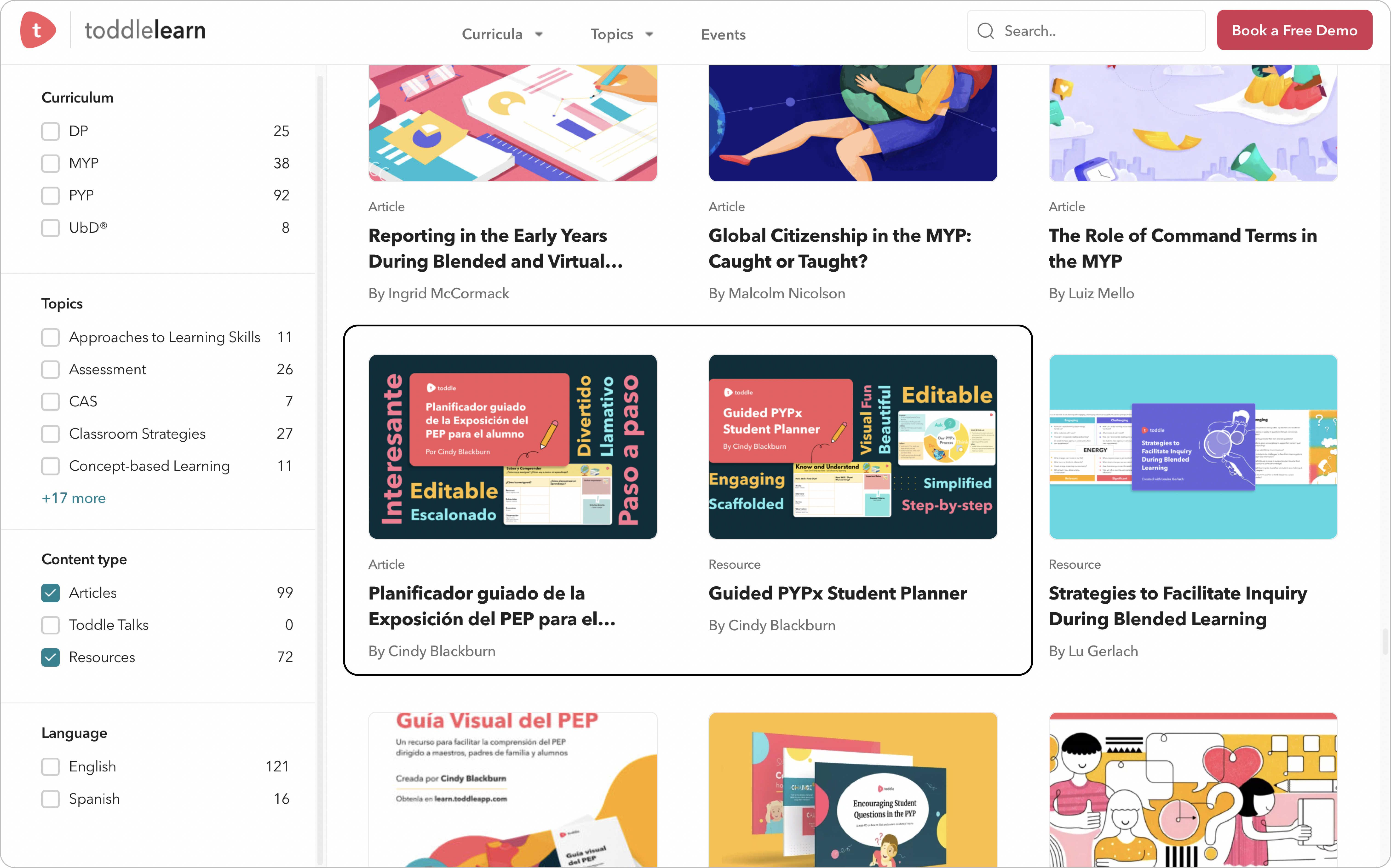
On the filtration page, they have given analogous resources and articles in various languages; yet, they have specified those items and articles in distinct sets, which presents an inaccurate aggregate count of resources/articles and multiple copies of the same resources/articles in the list, leading to a confusing encounter for the user and therefore, a poor design. Such ambiguous information can lead users to make mistakes.
To address this issue, a multilingual dropdown option could be added either to the resources and articles on the website or to the navigation bar, allowing users to select the language of their choice. This would provide them with feedback by allowing the website and content such as resources, articles, and webinars to all be in their chosen language.
Conclusion
Toddle is a design platform that provides users with an easy-to-use interface and intuitive design. While the platform exhibits clear mapping, consistent signifiers, and legible design elements, there is room to further improve the platform’s usability, creating an environment that is simple to understand and even easier to navigate. With modifications in a few areas, the platform could make it more effortless for users to understand its concepts and features.