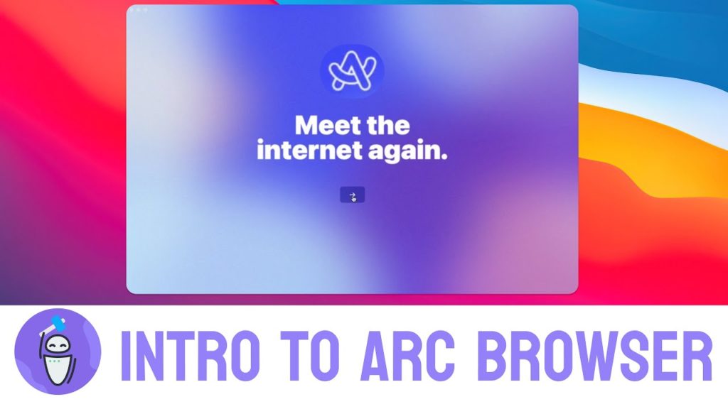
Arc- The Conceptual Model

Arc is a new-age browser built by ‘The Browser Company’. Browsers are our gateway to the internet. The mental model that one approaches using this browser with is as follows.
- You expect to explore or fetch various websites using their URLs.
- You expect to have the ability to open multiple tabs where the ‘ +’ icon is the signifier for addition of a new tab.
- You expect to bookmark/ favourite some pages that you frequently use
- You expect the ability to copy or copy and share a URL
Arc sets these achievable goals for the user, but promises to be more than a browser. Arc affords functionality of not just a browser but also a workspace, a sort of Operating system (OS)for your work since most of our work is online.
Arc – Execution Process
They have done a great job setting up a system image using a pre-existing conceptual model and constant tool-tips and instructions to help a user. I used this and the principles highlighted in Don-Norman’s “Design of Everyday Things” to perform my Design critique.
I performed some actions that I would in a normal browser and some that I do in my OS such as making visuals for this report.
What Follows Norman’s norms
As you open the Arc browser one looks at it with a conceptual model of a browser already in mind. You know that the ‘Gulf of Execution’ needs no bridging and actions to be taken are quite clear.

New Tab
The first action performed is opening a new tab and typing in a URL. Here while we get to the gulf of evaluation our expectation is re-calibrated. Our conceptual model tells us that tabs open at the top and our behavioural reaction is to look up. But the perception and interpretation aided by the ‘+’ sign as a signifiers help us act as per the external knowledge and bridge the execution-evaluation gap.
Existing Affordance meets signifier and we are easily able to discover the ‘+’ icon on the left, navigate to a search bar that is clearly marked with signifiers and give us feedback once the URL is opened.
Url copy and Screenshot
To copy a Url we typically head to the URL bar. For a screenshot we would just use our device’s operating system and use Cmd+Shift+4 or Ctrl+PrtScr.
Arc uses the same premise up until execution but as your cursor reaches the URL bar you see a linkage and camera icon appear with text. The icons with their semantic constraints and natural mapping to the outcome expected, and the well-placed signifiers help users easily achieve the goal of copying and taking screenshots.
What Norman would call abnormal
Adding Favourites and Bookmarks

One of the problems that a user with arc faces is that our perception of the system image is broken here. One can bookmark a page by dragging it to the top but there is no way of gaining this knowledge through the current design. The affordances of a typical URL bar also suggest that a bookmark should be an action close-by but our interpretation is challenged. As a suggestion to improve the design Arc can incorporate a blinking faded ‘+’ button next to the bookmark and a connected tooltip on URL hover that suggests what action can be expected on dragging the URL.
Opening the library icon

The Library icon is a shortcut that leads to screenshots, downloads and other desktop-linked functionality. The icon given its cultural and semantic constraints and lack of signifiers does very little to help the user figure functionality out. A suggestion to improve design could be a hover menu that shows these options clearly with corresponding labels.
New Boost

As one explores the browser and clicks the ‘+’ button at the bottom one notice a new action labelled ‘New Boost’. As a user when I click on this, one realises that this is not the outcome expected, there is no visible way to go back from this slip. The browser has introduced new icons upon random hover, one of which might help you exit the situation but it isn’t discoverable . The suggestion here would be to incorporate a visible ‘X’ for anyone to exit.
Conclusion upon Reflection

There are more nuances that can be critiqued in detail but to conclude I have assigned a value for each of my reactions as a User and as a reflection I would say my experience was positive and I would recommend this product to others.