Introduction
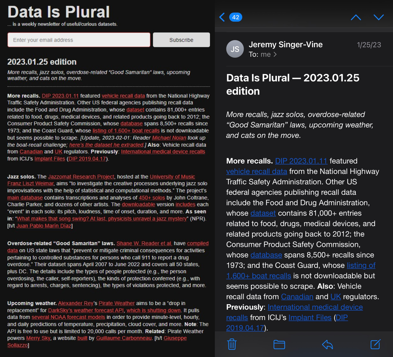
Data Is Plural is a website and a newsletter service published by Jeremy Singer-Vine that introduces interesting and novel datasets (and data visualizations corresponding to them) to the users. Subscripted users would receive emails about the new editions on a weekly basis and the website is accessible to all users.
This critique analyzes both the website and email push of Data Is Plural with the design principles proposed by Don Norman and Jakob’s usability heuristics.
Who are the targeted users?
It is always helpful to figure the targeted user group out inn advance. Although data is plural doesn’t specify to whom the website is built for. We can find out from some clues in it details. The dataset descriptions usually use plain language that mainly introduce the dataset’s author(s) and source, with fundamental statistics such as sample size and number of factors. The majority of the description is about the dataset’s original research’s purpose. The form is very standard and efficient for quick reading and people from all levels of education background can follow along the content to satisfy different demands from getting to know the news in a data angel for the general public to finding new research topics for data related practitioners. Thus, in this critique, we assume its target users are the general public.
A Compact Homepage
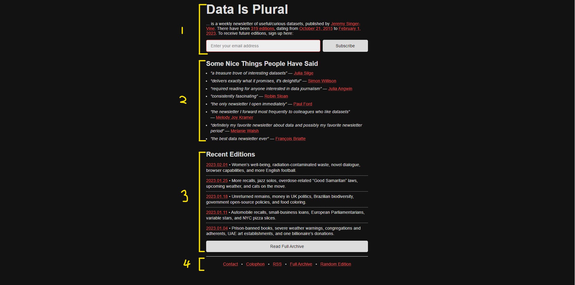
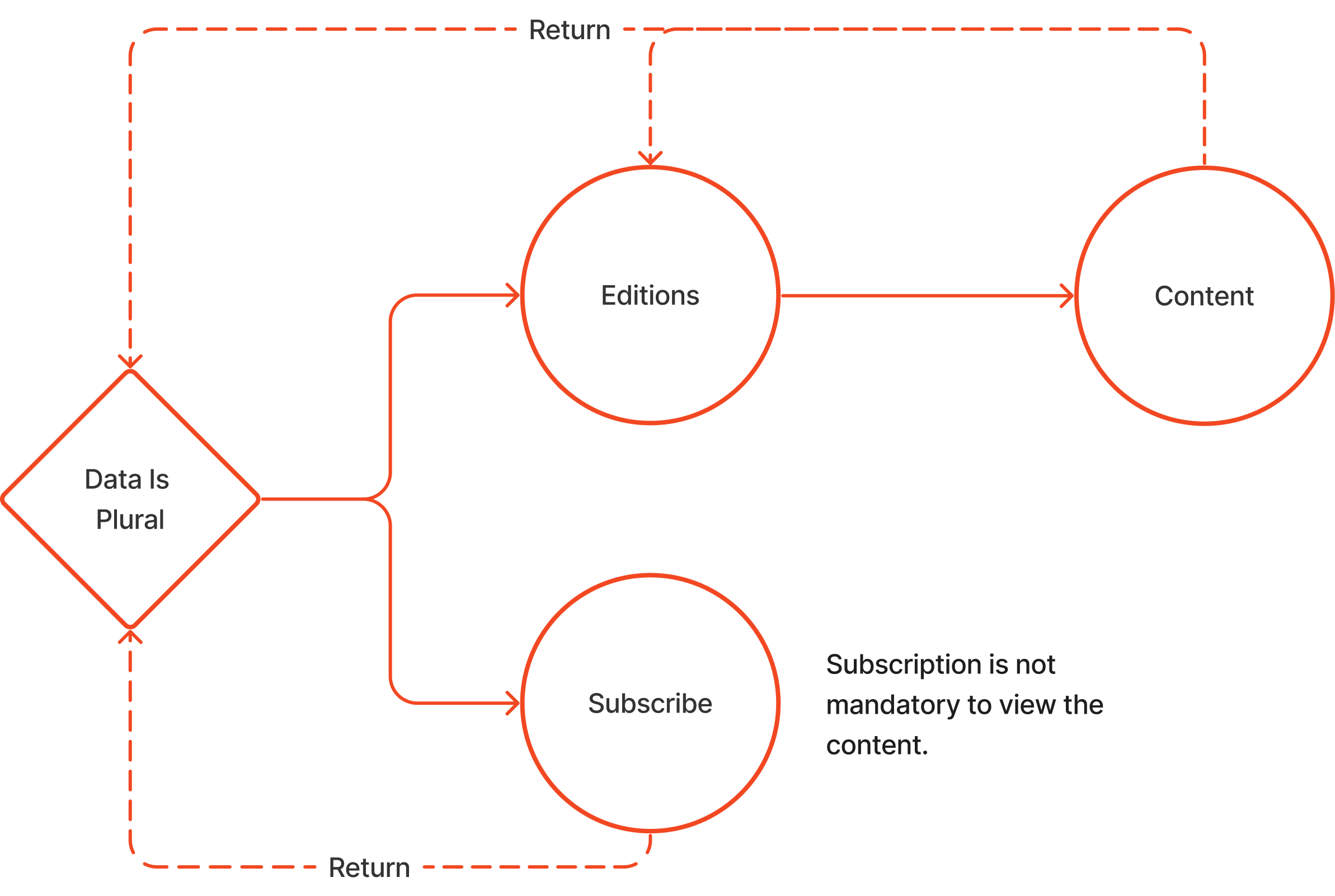
We can roughly divides the homepage into four sections.
- General description of the website and newsletter service, and textbox call for subscribe.
- Testimony, reviews of the service by other data analysts/journalists.
- Recent Editions, shortcuts to the five most recent editions, with highly summarized keyworks about the topics.
- Website Functions, hyperlinks to other functions the website provides, letting users to explore more about the author and the website, and also can access to the full archive.
It is noticeable the homepage is designed for mobile device use in the first place as the layout is very compact and uses clear heading to separate the sections. The interface is clean and simple, every element on this page contains right, relevant information for users to navigate through the website and to locate interested information. It is a good practice to the Jakob’s eighth heuristic of minimalist design.
Error Proof Subscription