Google Keep is a free note-taking service launched by Google in March 2013. It allows users to take quick notes like grocery lists, categorize them with custom labels, add reminders, share it with others and organize all notes at one place. Google Keep is available on Android and iOS as a mobile application and on web browsers.
The Overview
Google Keep’s design follows a good conceptual model leading users to an understanding and a sense of control. For example, on the landing screen, a “plus” icon is placed at the bottom of the screen along with other action icons that both signifies and bridges the gulf of execution on how to create a new note. This critique analyses the design aspects of Google Keep based on the usability concepts mentioned in The Design of Everyday Things – a book by Don Norman.
1. Adding custom labels
Google Keep allows users to create new labels and organize notes under multiple labels. The landing screen shows a list of all the notes and each “Note” is styled with a border. Hence the card style of the notes signifies the affordances of long pressing. Once the user long presses the card, the user gets the feedback that the card is selected by highlighting its border and showing more action icons on top of the screen. The “label” icon is discoverable due to its mapping unlike the “delete” icon which is hidden in the “more” menu.
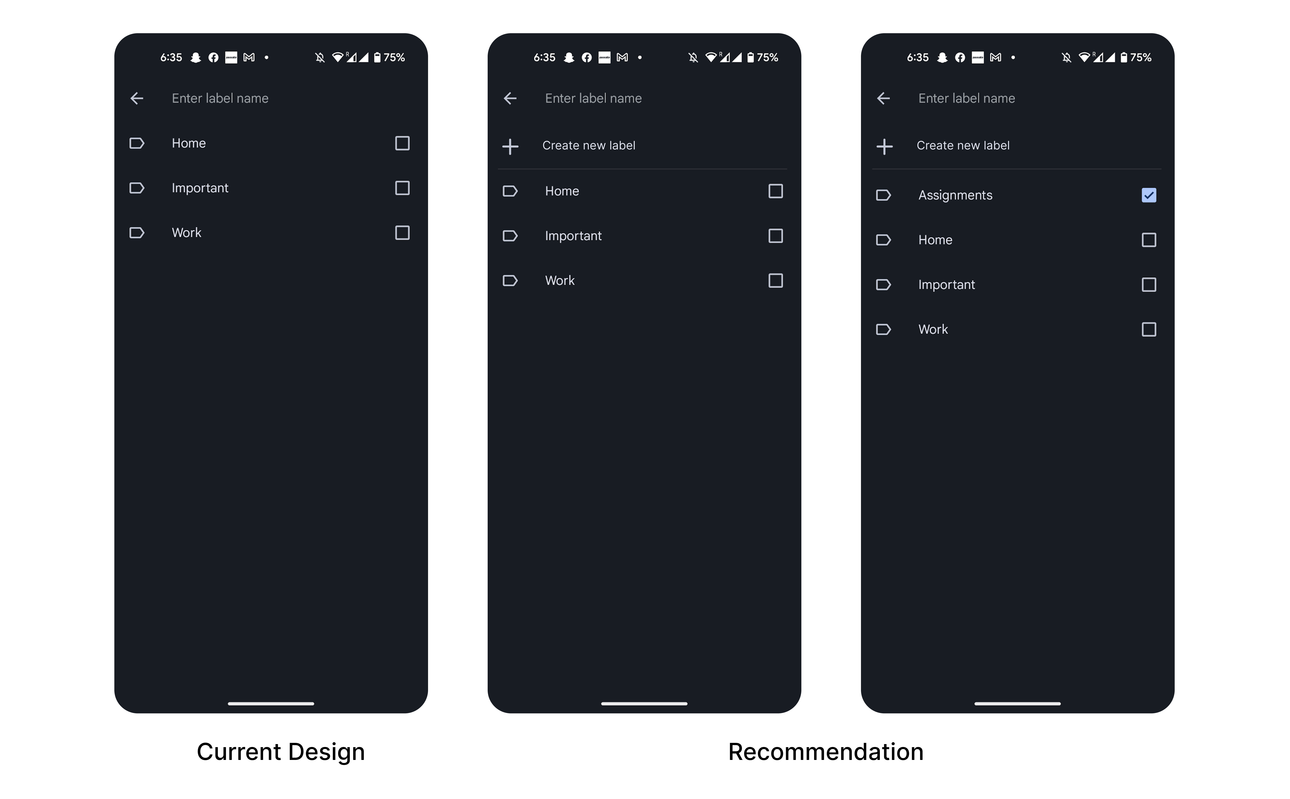
However, there are two ways in which a user can “Create a label”. One is via the hamburger menu, which allows users to create/ edit labels. The other is when a note is selected, labels icon > Enter label name “Assignments” > Create “Assignments”. The second way follows a better conceptual model, however it doesn’t provide signifiers for creating a new label. Hence, making the action less discoverable.
To enhance the discoverability, I recommend adding “Create a label” with the icon — in support of the typical knowledge in the head for the Android users (Figure 2). This bridges the gulf of execution, hence guiding the users by the procedural knowledge.
2. Organise notes using color coding
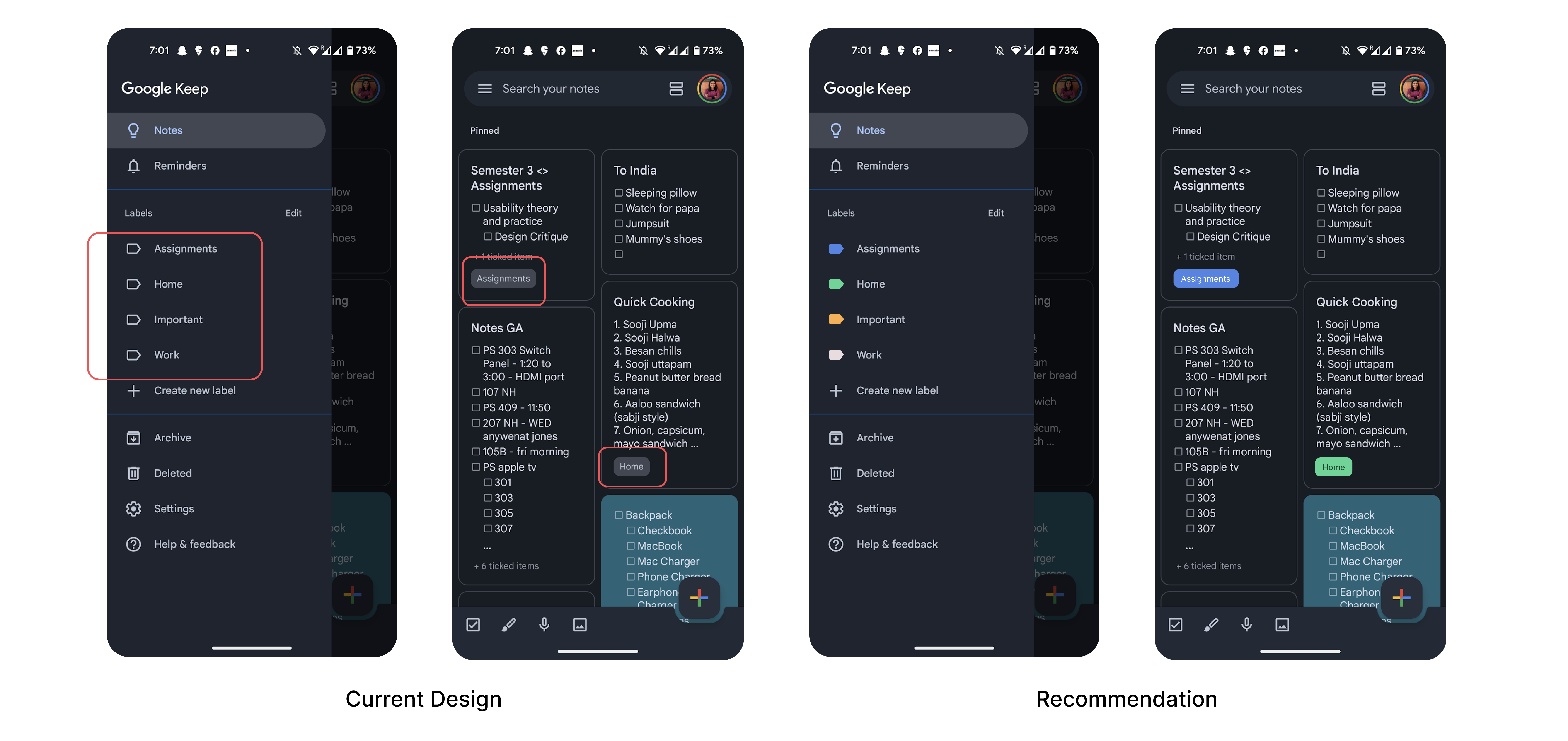
On adding a label to a note, a small tag appears on the bottom of the note preview as a signifier. A user can add multiple labels on a note.
However, there are a few improvements that can be made in the signifying and discoverability of the categorized notes under different labels. All the different labels appear in the same style without any differentiation which might affect the visceral response of the users in identifying notes under different labels. To make the user experience consistent with Gmail, these labels can be color coded as Gmail allows (Figure 3). Hence, making a clear distinction between the different tags will enhance the discoverability of same categorised notes supporting the users with knowledge in the head and the world as an Android user.
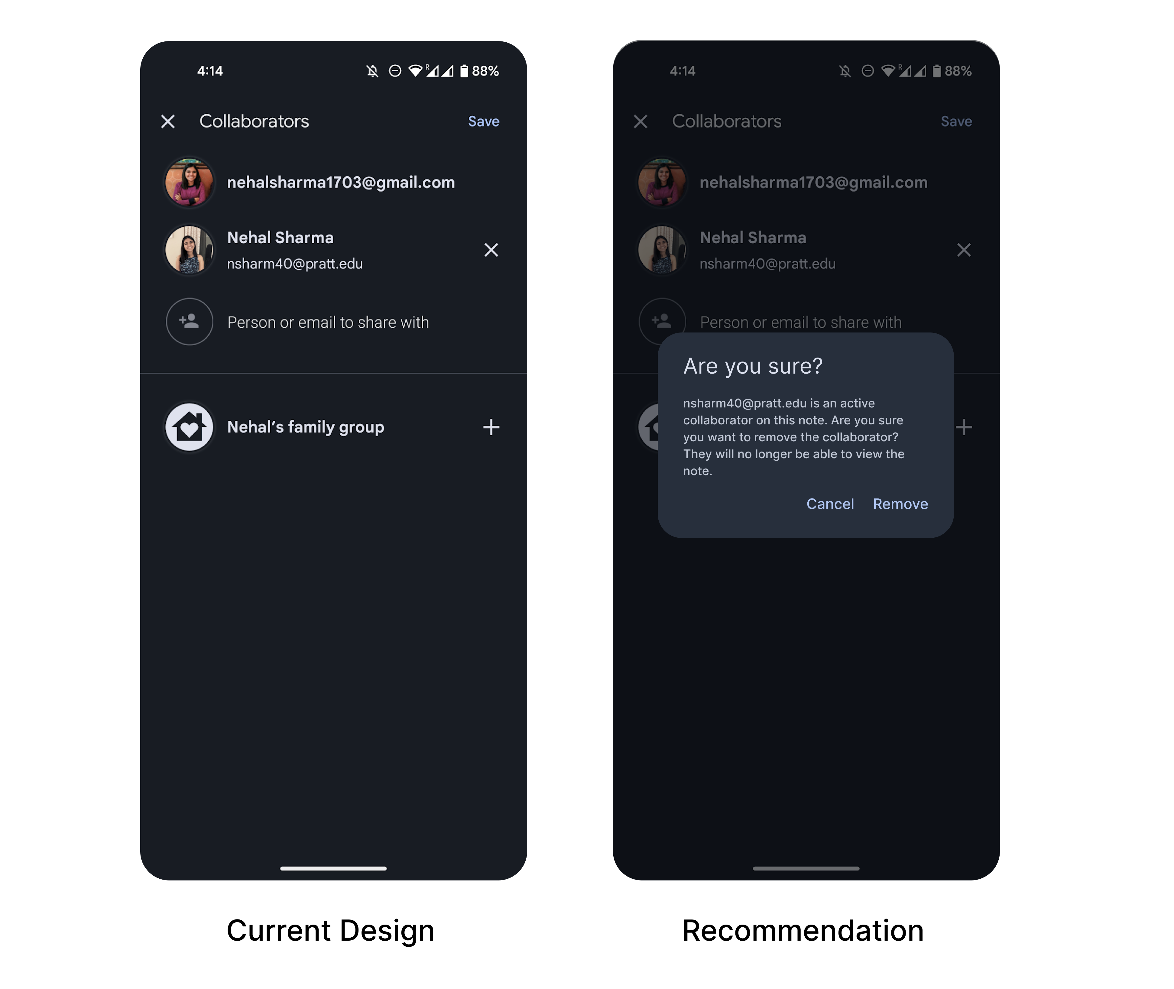
3. Remove collaborators from notes
Google Keep allows users to add collaborators on a note. The user needs to tap on the three vertical dots at the bottom of the screen. This is a both semantic and logical constraint as “adding collaborators” is not the primary functionality that Google Keep focuses on. It is easily discoverable under the three dots due to the knowledge in the world for the Android users.
However, there’s a scope of improvement in the action of removing the collaborators from the note. The app does give feedback with a pop-up text “Collaborators will be updated” indicating that the changes have been made but the messaging could be improved by saying “Collaborator removed. They will be updated”. Moreover, there’s a scope of action-based slip while removing the collaborators due to the small proximity of two counteractive actions of “adding a collaborator” and the X for “removing a collaborator”. A good error prevention practice here could be an error message pop-up to confirm if this was an intended action (Figure 4).
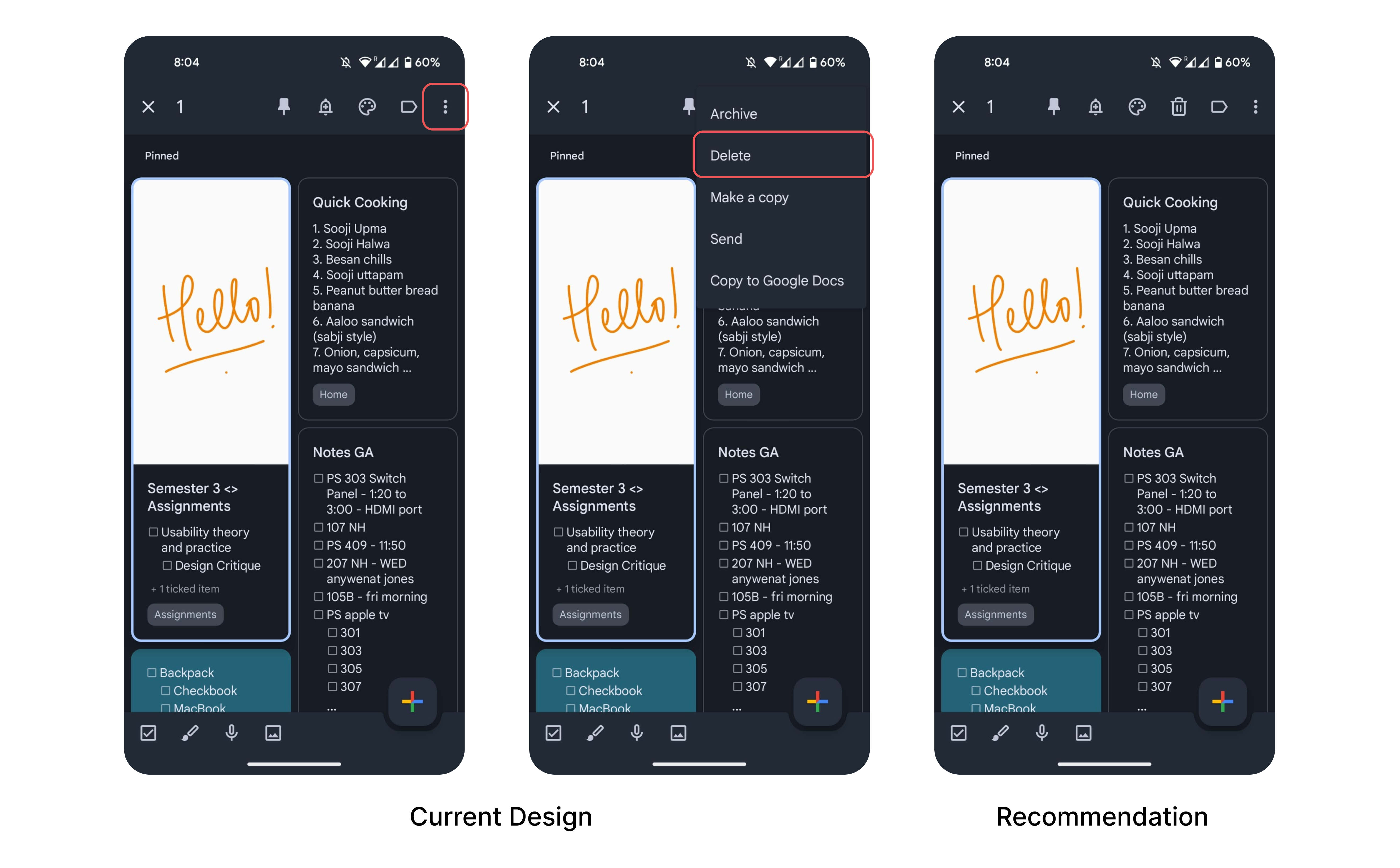
4. Delete a note
Deleting a note here hinders the behavioral processing and falls under the gulf of execution. The mapping of the delete icon contradicts with the knowledge in the user’s head of finding the “delete” icon in the action menu. To enhance the discoverability and mapping of the “delete” action, I recommend placing the icon in the primary action menu (Figure 5).