
Groupon is an e-commerce marketplace that allows users to purchase deals and discounts for various products and services. This application allows users to browse for deals by location and purchase them in a variety of categories such as food, beauty, travel, and more. It has been able to solve customer problems by offering a variety of solutions like discounts and deals, convenient access and diverse offerings, ultimately enhancing the customer experience and satisfaction with the platform.
Groupon targets a wide range of users from tech savvy customers to budget conscious customers. I have personally been a user of this app and had good as well as some bad experiences that I would share along with some proposed solutions. Though this service has both mobile and web applications, I’ll be talking about the mobile app in depth using Don Norman’s principles of design and the seven stages of action from “The Design of Everyday Things” .
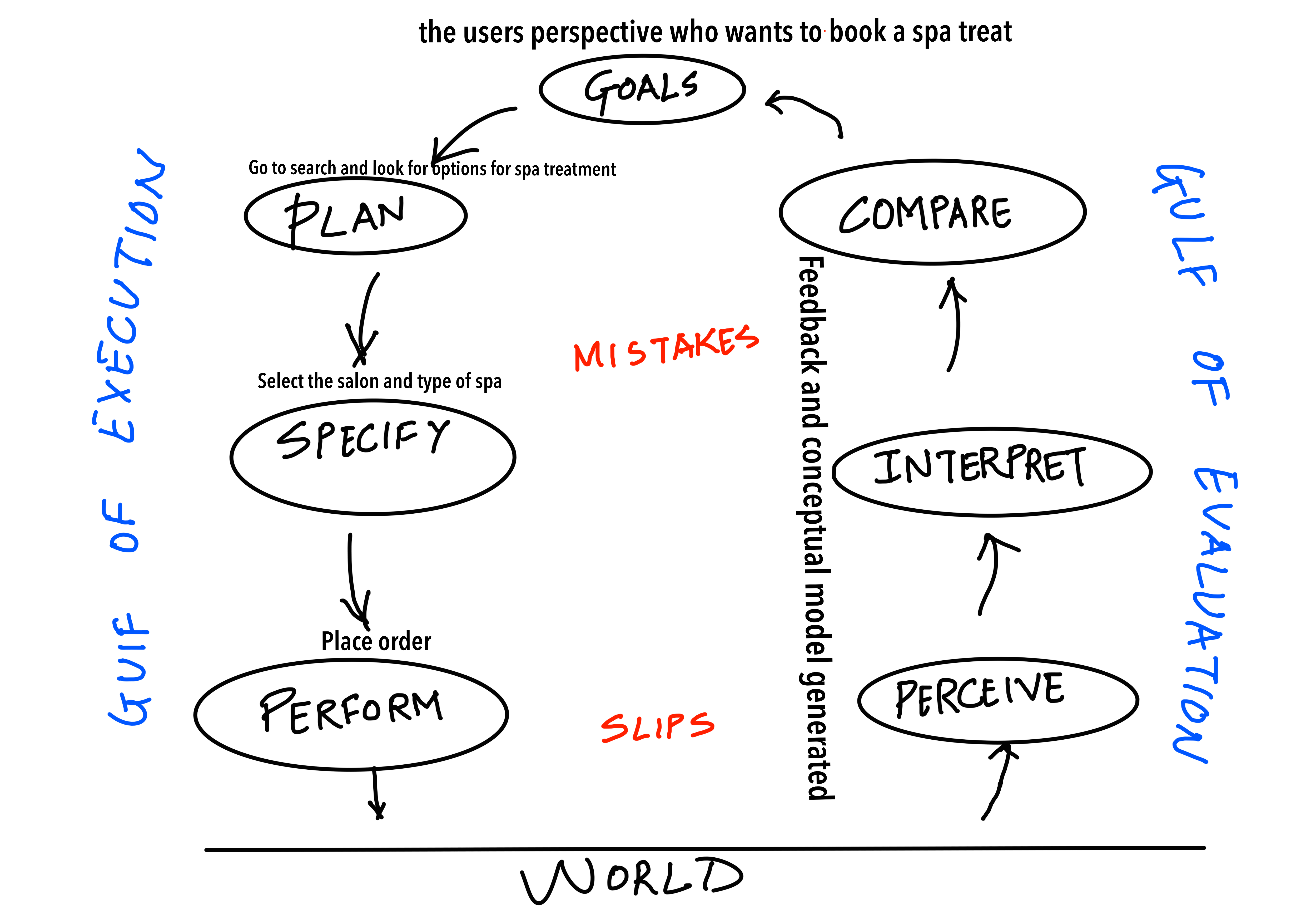
GULF OF EXECUTION
1. GOAL
From user’s perspective who wants to book a Spa treatment
To make the interface familiar to the user, the app is designed using the concepts of both, knowledge in the world and in the head, therefore making tasks easier for the user. Starting from the homepage, the icons used in the navigation bar for Featured, Categories, Notifications, Saved and My stuff, are all signifiers leading to good discoverability and understanding about that particular tab. The shopping cart on the right also signifies shopping which is an example of a skeuomorphic design element, meaning the icons or buttons mimic their real-world counterparts. The location tab at the top proves to be a useful constraint which lets you add your precise location in which you are looking to get that particular service. The app does a good job of mapping the user’s actions, such as browsing and purchasing deals, to the appropriate response. (Below Image)
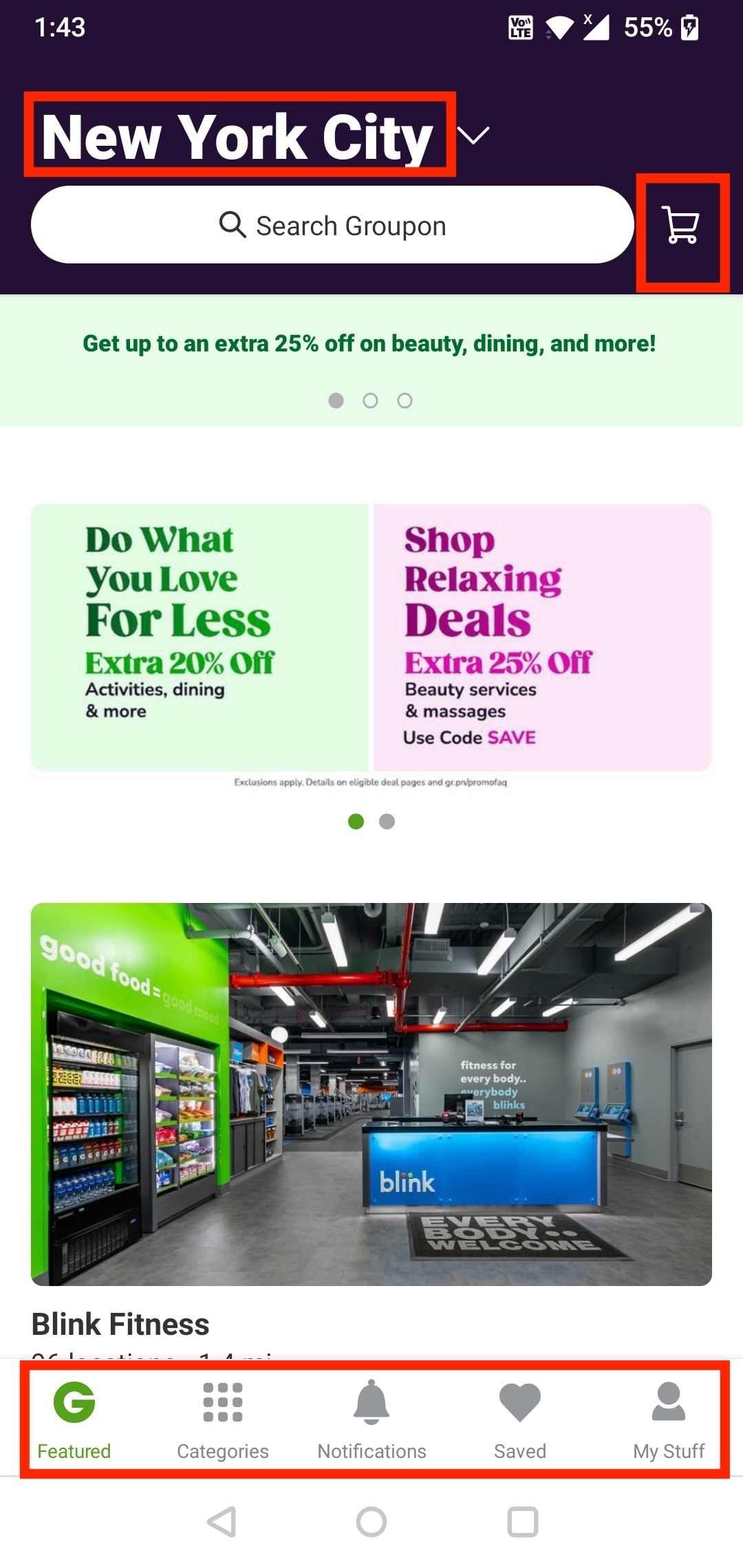
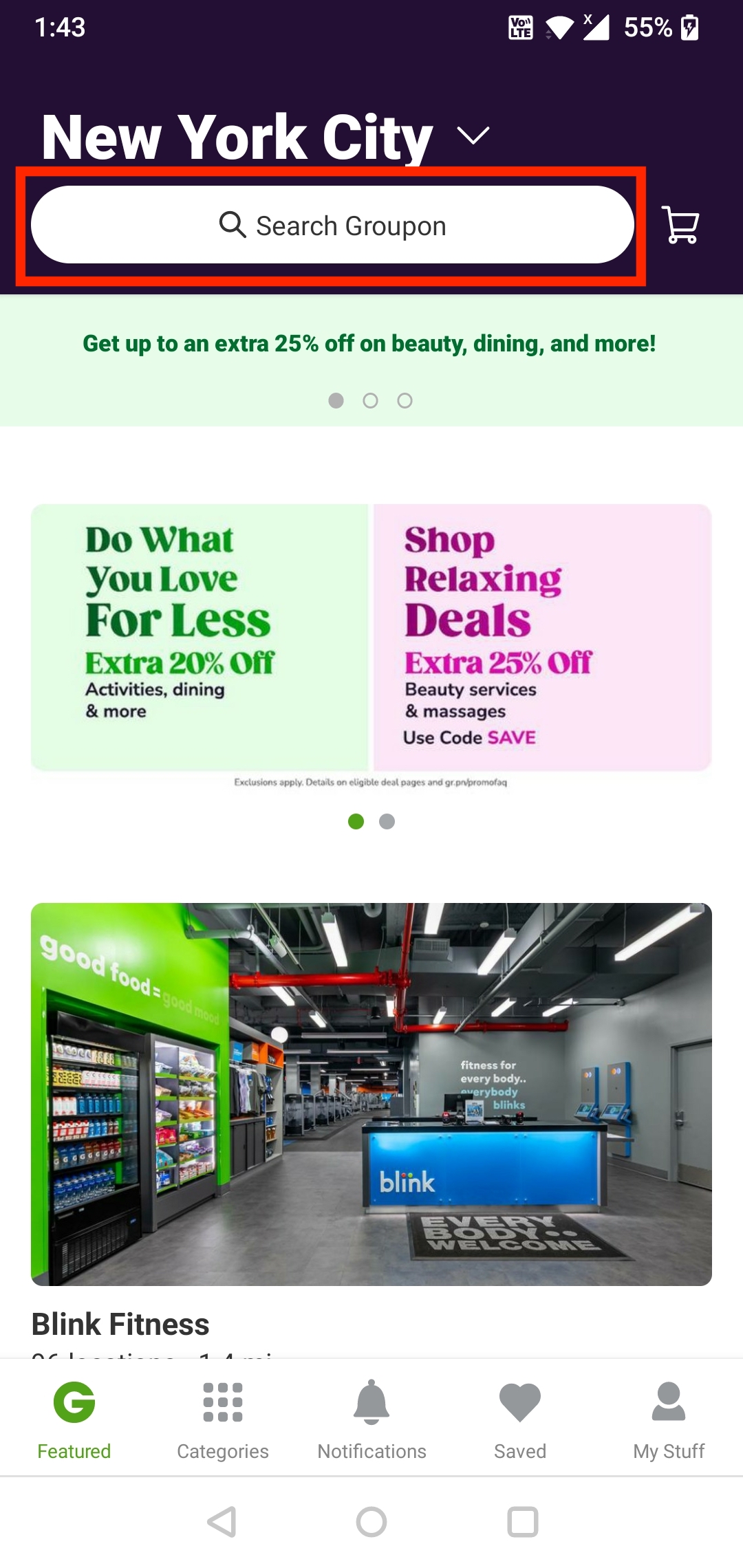
Even though the search tab itself is an affordance, the app could benefit from providing an additional affordance such as a submit button next to the search box. Despite the fact that search can be easily triggered by hitting enter from the mobile keypad, some users may still look for a more traditional button. (Below)
2. PLAN
Go to search and look for options for spa treatment
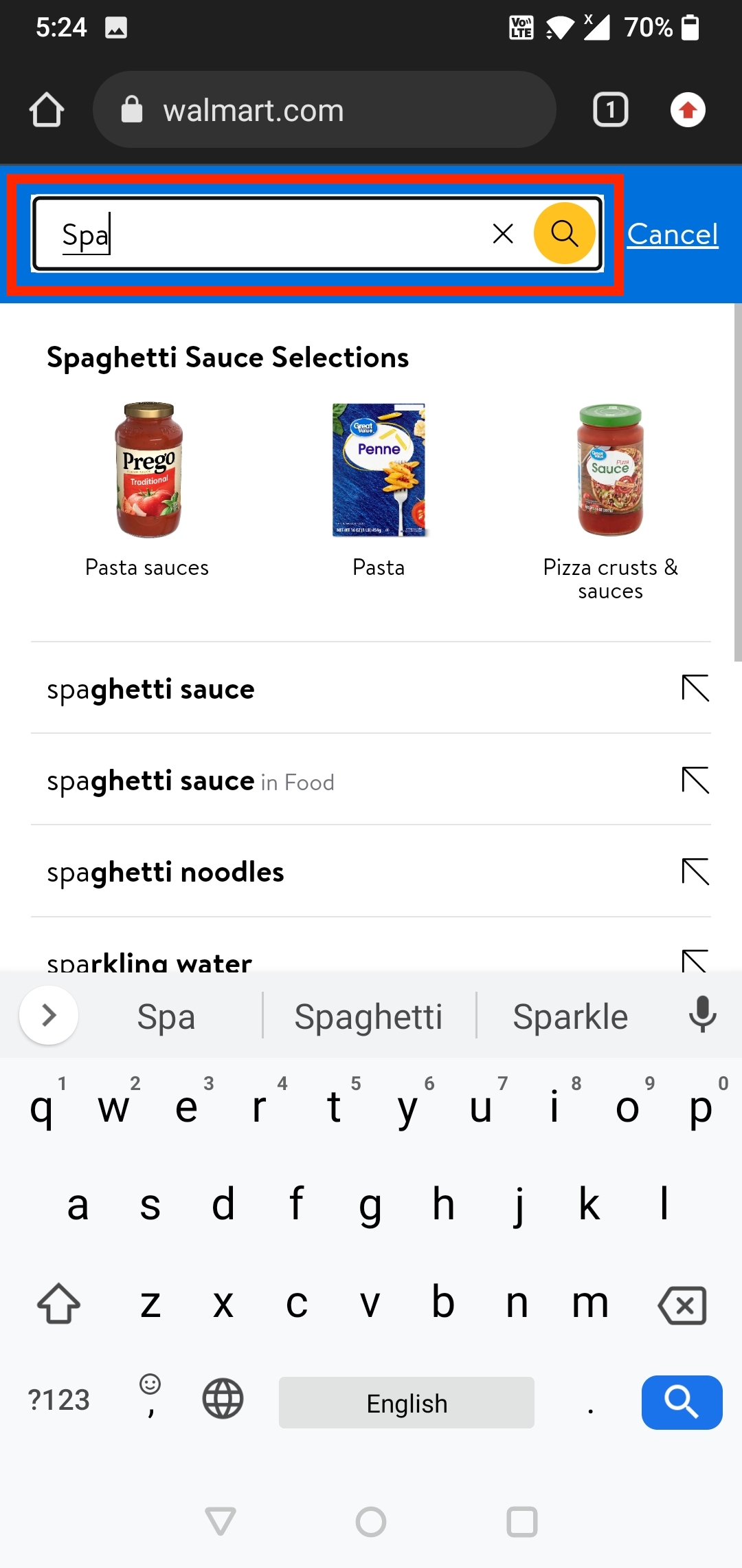
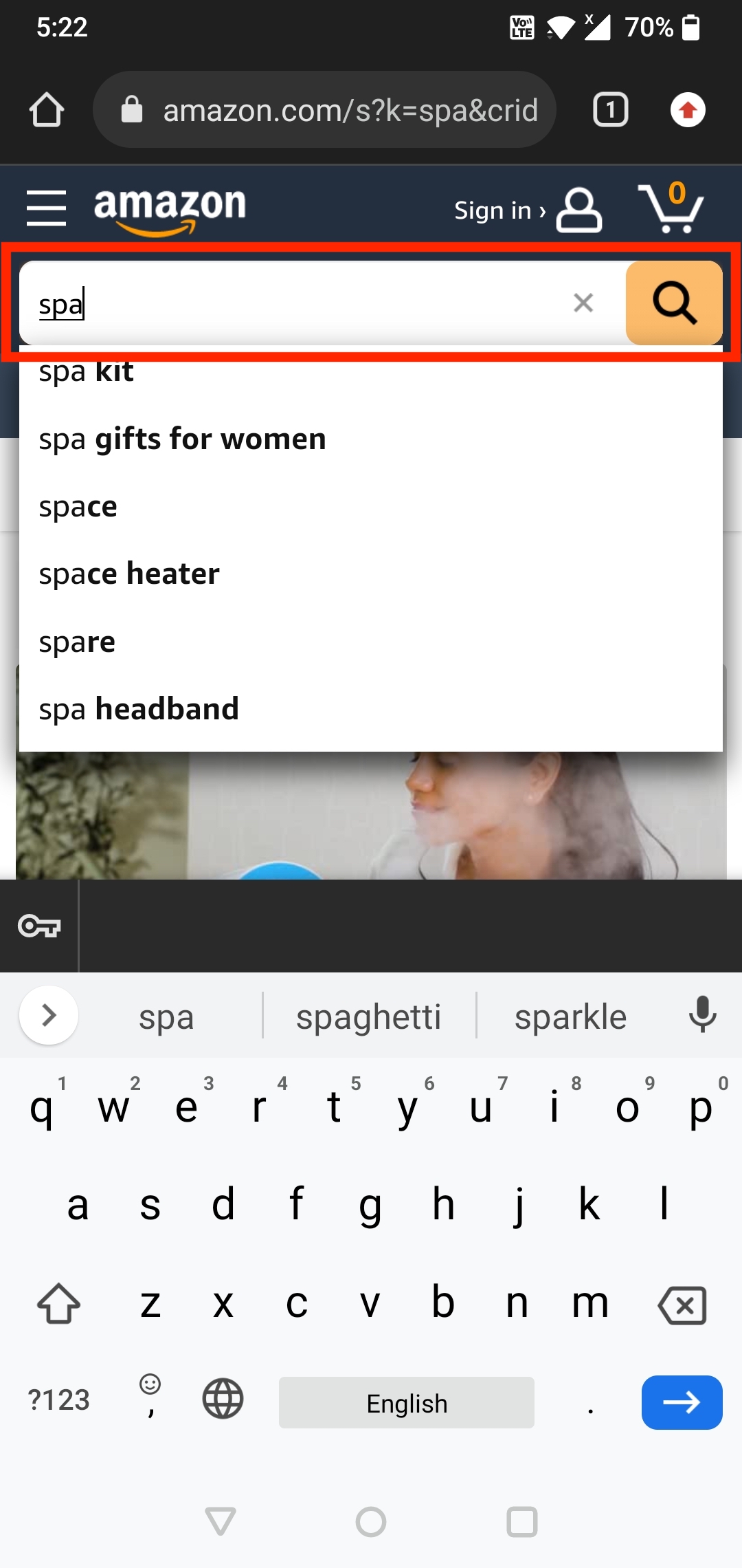
When the user searches for “Spa” in the search bar, they see a list of salons with spa services, locations of the centers and filters that can be applied. These filters act as affordances to help in narrowing down to a manageable number as per the user’s needs to avoid too much information. Once the users have selected the filters, they should receive feedback to understand that their choices have been applied. Groupon shows this by highlighting the selected filters and adjusting the list accordingly. Once these filters are applied, the user selects the service as per their needs. There is also a back arrow icon on the left that acts as a signifier for the user to go back to the previous page in case they want to look for other options. (Below Image)
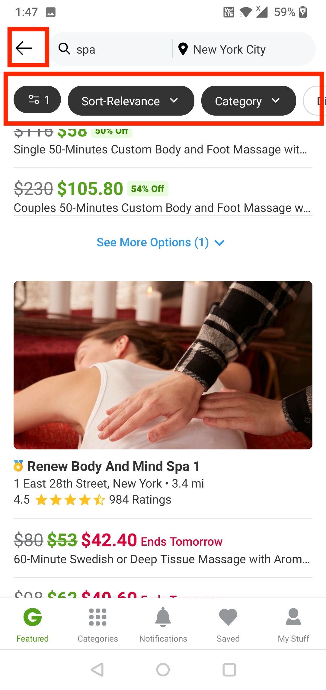
Most commonly when finding the “Spa” treatment options(or anything particular) in the Search bar or when choosing the highest discounted services, users have a visceral response. When the users go through the list of services, they start scrolling, leading to the behavioral level responding, but later the users expect feedback for reassurance. At this point the Groupon interface fails to use a visual signifier like a scroll bar indicator that shows whether the visible portion of the content is near the beginning, middle, or end. Its height hints at the total quantity of scrollable content in the view; the shorter the indicator, the more content there is to scroll. Without this feedback, the user may get a feeling of lack of control, which can be unsettling. (Below Image)
3. SPECIFY
Select the Salon and type of spa treatment
After scrolling, the user selects the Spa center they are interested in and goes through all the different options and deals available. On this page, there are signifier icons for Save, Share, cart and back. If the user wants to save the deal, they may click on the “heart” icon, and a feedback “Added to saved deals” appears immediately. Furthermore, as the user clicks on the service they are interested in, there is a feedback with a radio button, meaning that service is selected which is a good sign. Also by clicking “Apply” on the discount code, there is a clear and instant feedback. These feedbacks make the user more confident in using the app. Next, if the user wants to see images of the services they offer, there is a clear signifier that shows the number of images but the interface lacks the signifier for the user to understand that they have to swipe in order to see these images.(Below Image)
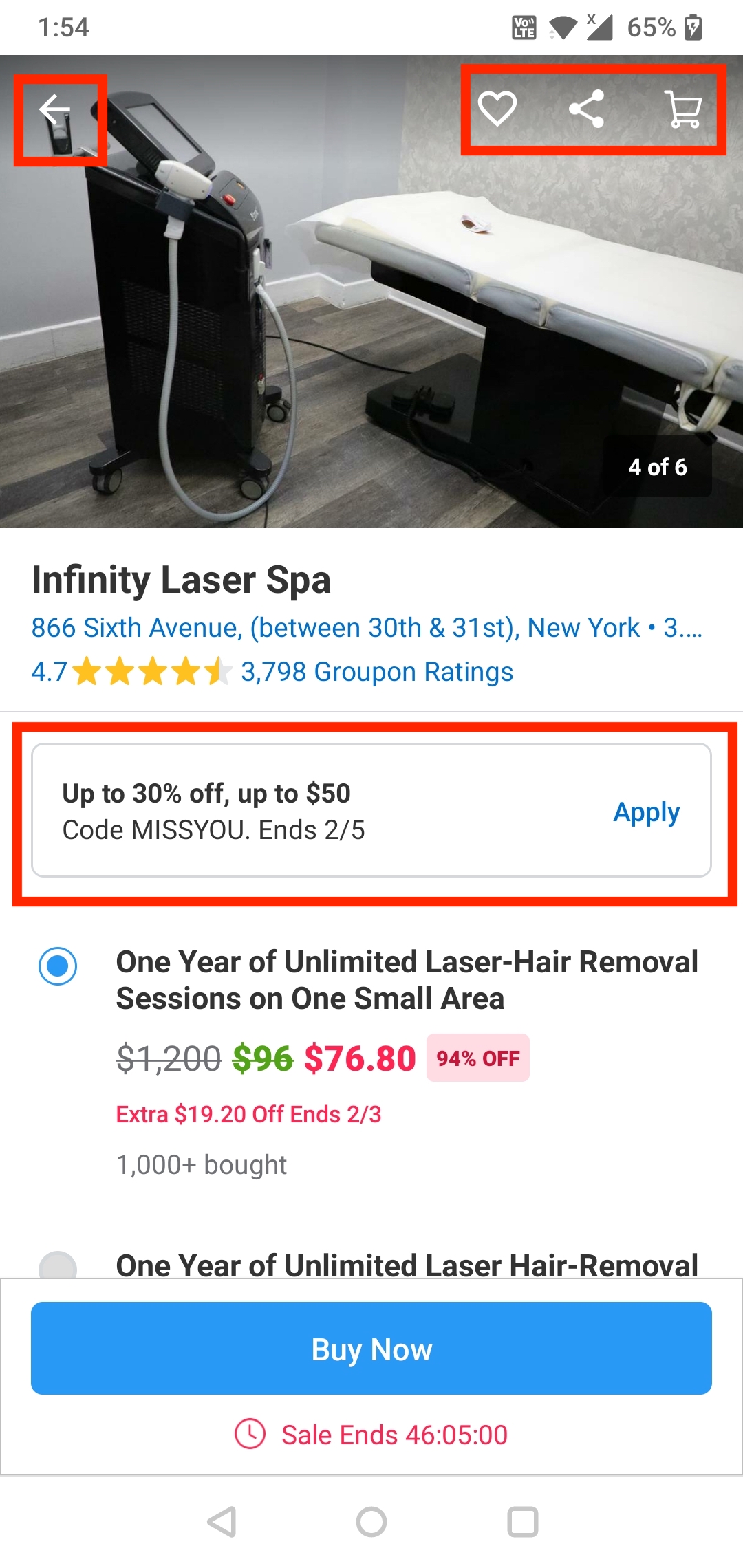
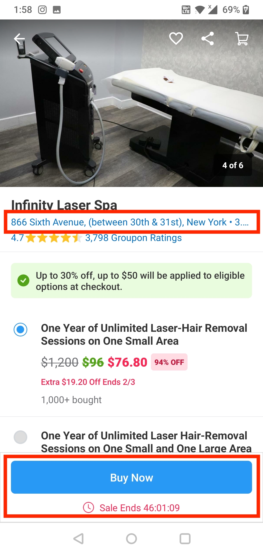
The page also has affordances like mentioning the different locations and distance to the spa center(link) and if clicked, scrolls down to give more options on connecting with them like maps, contact and a link to their website. Though not everyone using the app would know that it is a link, which is a downside to the interface! After selecting the service, the user selects, “Buy Now”, a button which is a clear signifier for the user to move ahead and buy along with a signifier(time) to the availability of the discounted deal. (Below Image)
4. PERFORM
Place order
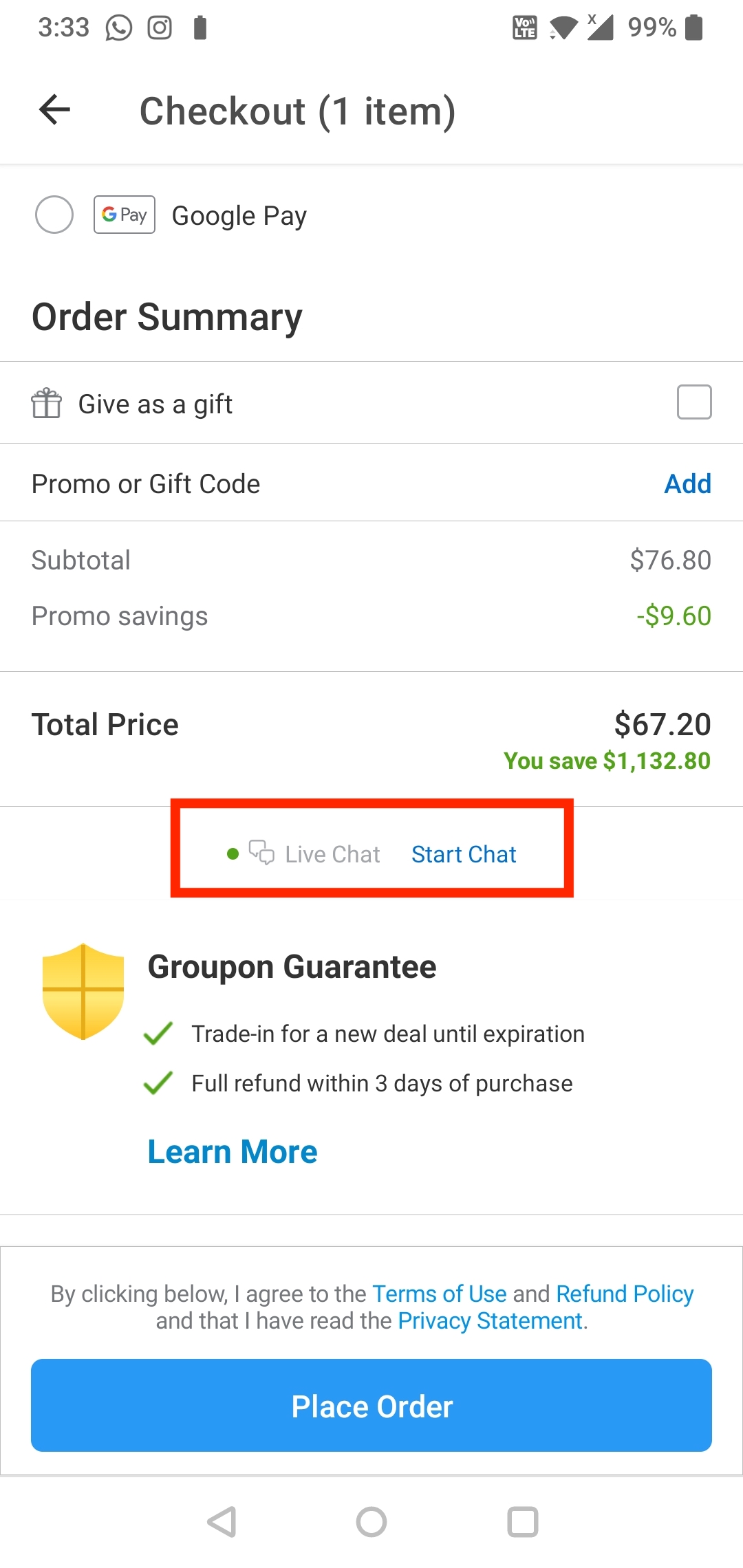
Now on the checkout page, the discount code applied is clearly highlighted in green and is reflected in the order summary below. Once the user has selected the service needed and added the payment method, they can place the order by clicking on “Place Order” which is significant because it is a button. After the order is placed, the user gets feedback that the order is placed and also gets an email on the registered account. (Below Image)
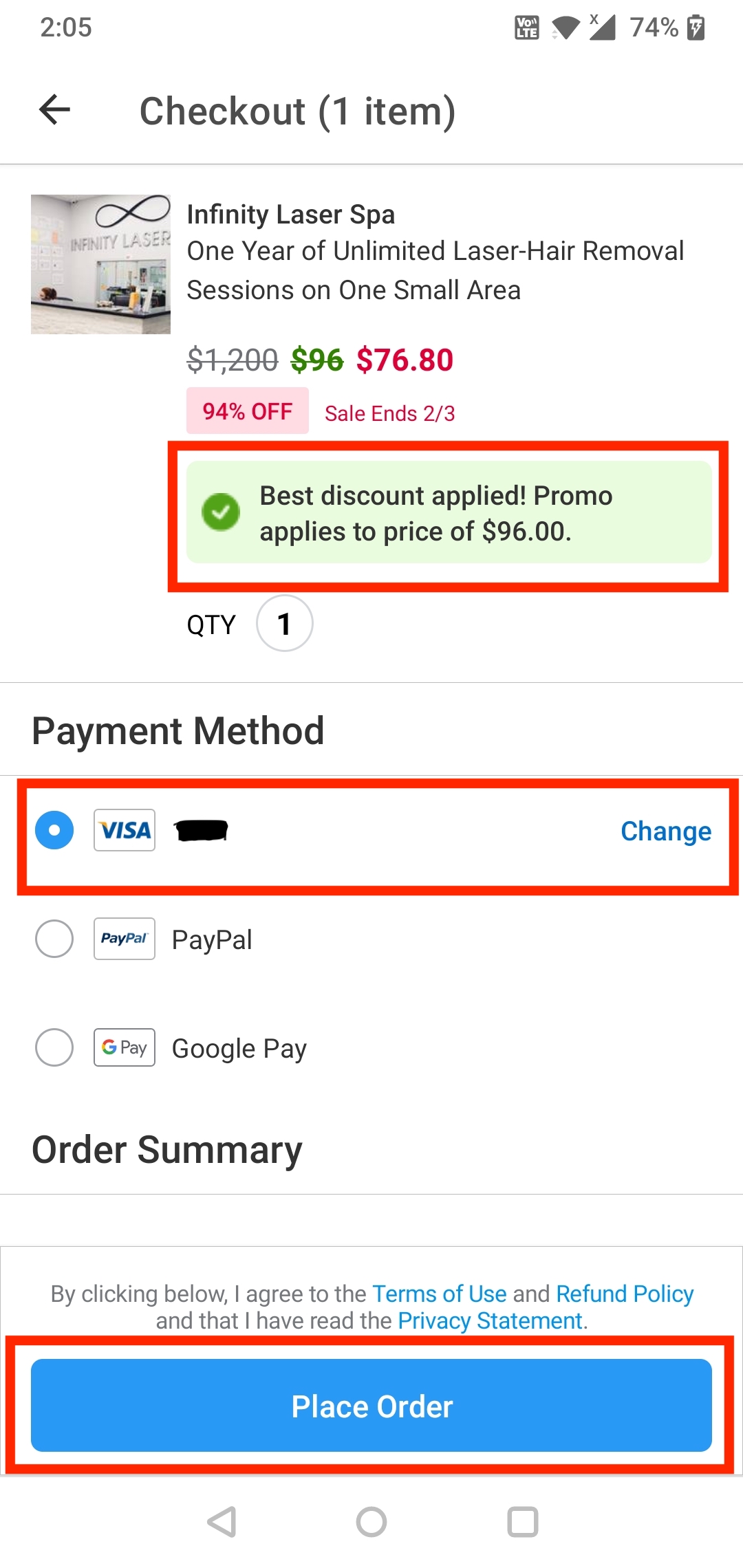
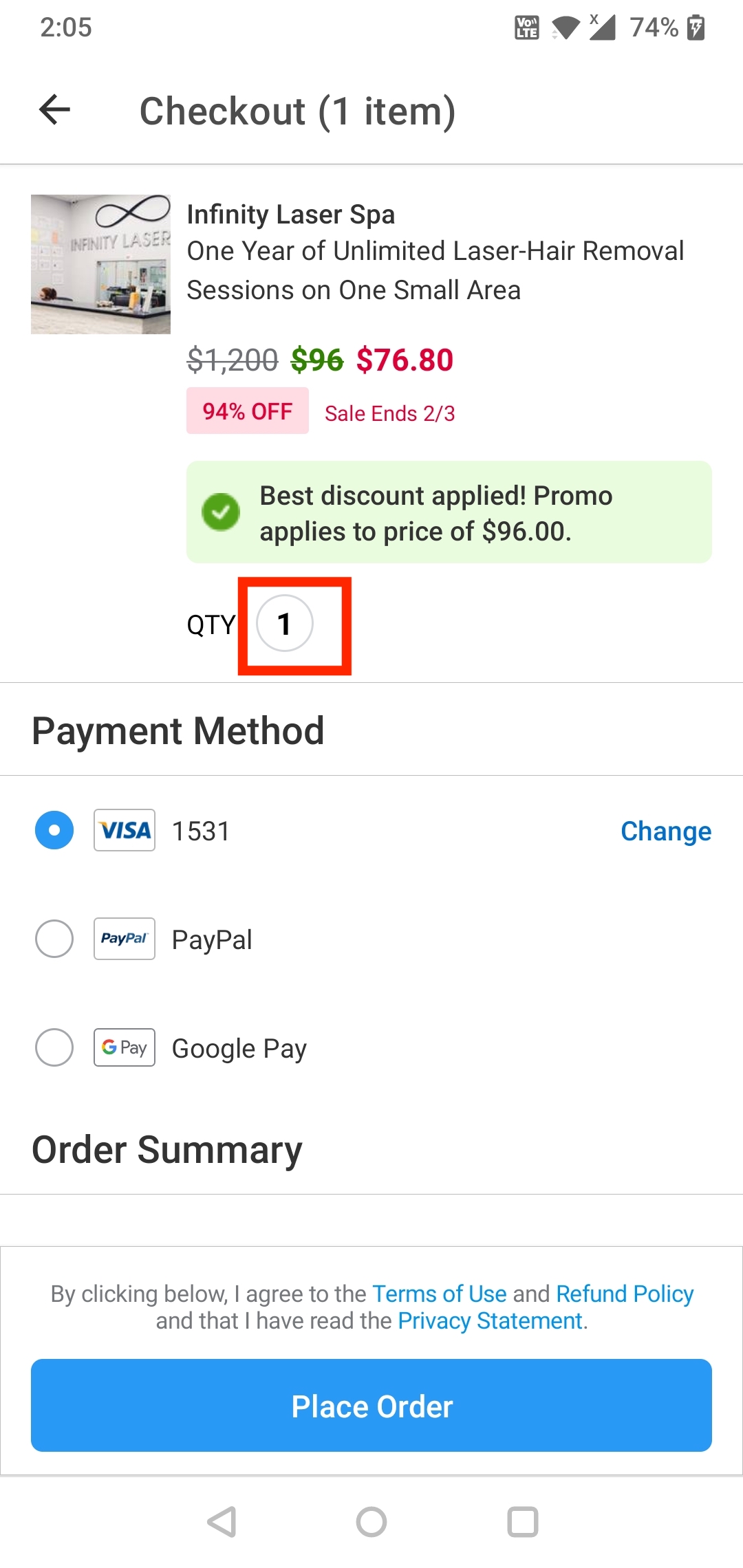
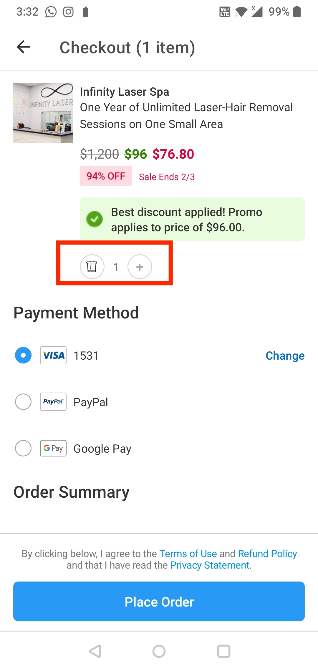
But if the user decides to delete the order before placing it, where do you think the user would click? Is there any button to delete the service selected? Wow! Now this is one of the times where the user might fall prey to learned helplessness, leading them to not buy the service. Multiple such scenarios would lead them to find alternative options. Nevertheless let me show you the hidden delete button. If you click on the Qty selected, you get an icon for delete. The interface is poorly designed and needs to be replaced with an icon or delete button that is clearly visible on the screen for easy access. They could also add the “Save for later” icon/button for the user to come back to it later. (Below Image)
An added affordance on this page is the live chat link, but it is an action-based slip because the designer wanted to create a live chat link but instead created two, which leads to confusion for the user. Both the links lead you to the same page, so one is more streamlined than two. (Below)
GULF OF EVALUATION
Now that we have the Gulf of Execution worked out, let’s talk about the Gulf of Evaluation. The major design elements that help bridge the Gulf of Evaluation are feedback and a good conceptual model. The Groupon app has great signifiers like icons, buttons that are perceivable and provide valuable communication, affordances like the search tab, filters and live chat options, constraints for searching in a specified location and displaying relevant deals and feedback like the filter buttons highlighting and the navigation tabs when selected change color to green. Since most of these design elements are present, it is obvious that the app has a good conceptual model.
CONCLUSION
While a few bad experiences can lead to a major fall back for an app in this competitive world, there are opportunities for improvement in areas such as functionality, personalized experience, and feedback which can be worked on by taking incremental innovation into consideration.