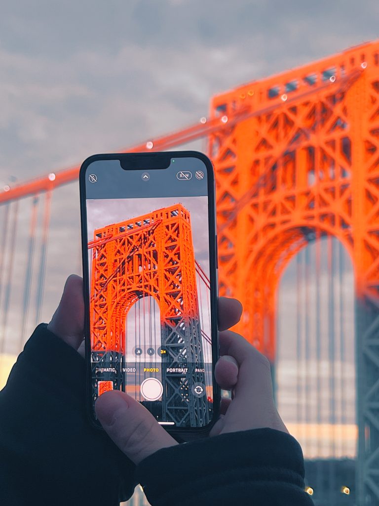
The iPhone camera has helped revolutionize photography: snapping a picture has never been easier, and any user can be an amateur photographer thanks to the high quality camera hardware. Well-aligned with Apple’s characteristically elegant UI, the iOS camera interface is deceptively simple. Despite the camera’s impressive power and functionality, the interface falls short of making every feature intuitive.
Modes
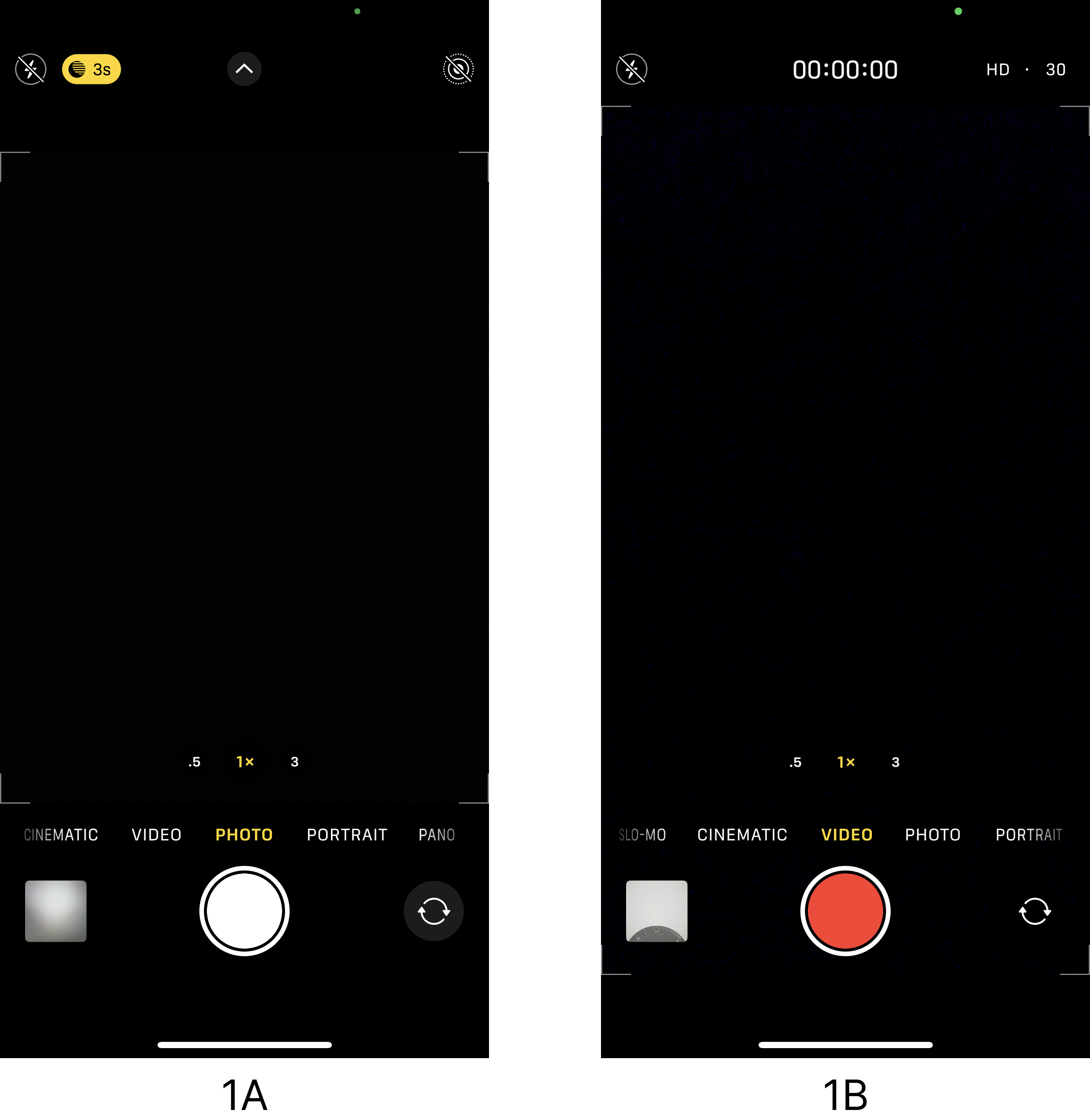
The iPhone camera allows users to capture their environments with the use of several modes (Time-Lapse, Slo-Mo, Cinematic, Video, Photo, Portrait, and Pano). Although modes are known to engender errors, they are successfully utilized on the iOS camera interface. Modes other than the current are discoverable, and the present state is prominently displayed in yellow above the shutter button (Figure 1a). The interface also changes depending on the mode to further indicate its capabilities; for example, the shutter button for videos is red rather than the white used for photographs to signify the recording function, and the frame edges move to signify the space that can be captured (Figure 1b).
Photography Settings
Amateur photographers likely won’t have knowledge in the head to conceptualize all the capabilities of the iPhone camera, so it is essential to provide users with enough information to understand what is possible. The photography settings appear above the shutter button in a horizontally scrollable list, which appropriately affords horizontal scrolling due to its continuity beyond the screen boundaries (Figure 2a). The settings themselves are also designed to look like buttons, with circular dark-gray areas and icons signifying where to tap.
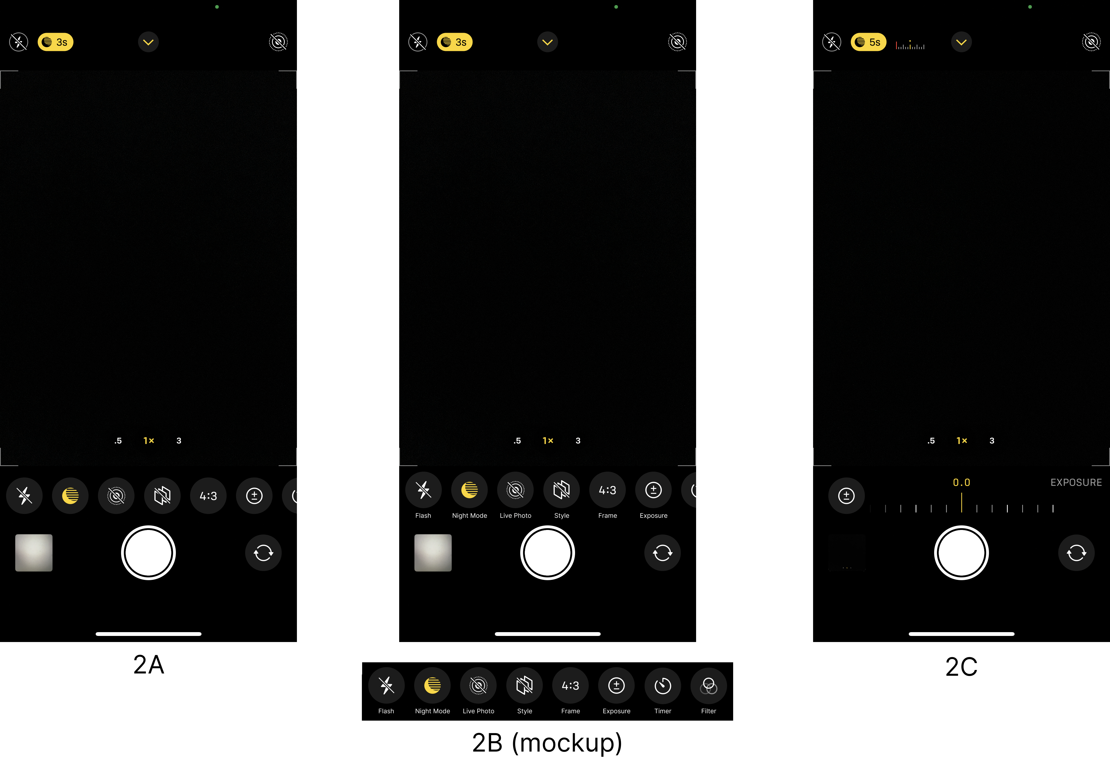
The signifiers are, however, less successful in conveying the meaning of each setting. There are too many settings and corresponding icons to maintain as knowledge in the head, even for familiarized users; labels for the settings (Flash, Night Mode, Live Photo, Style, Frame, Exposure, Timer, Filters) would help reinforce them as knowledge in the world and make them quickly recognizable, rather than forcing users to rely on memory (Figure 2b).
Once tapped, the result of the action is shown through adequate feedback of further controls being displayed (Figure 2c). Active settings are displayed with yellow-gold icons rather than the default white, another successful application of modes where the current state is clearly indicated (Figures 2a and 2b).
Accessing the Settings
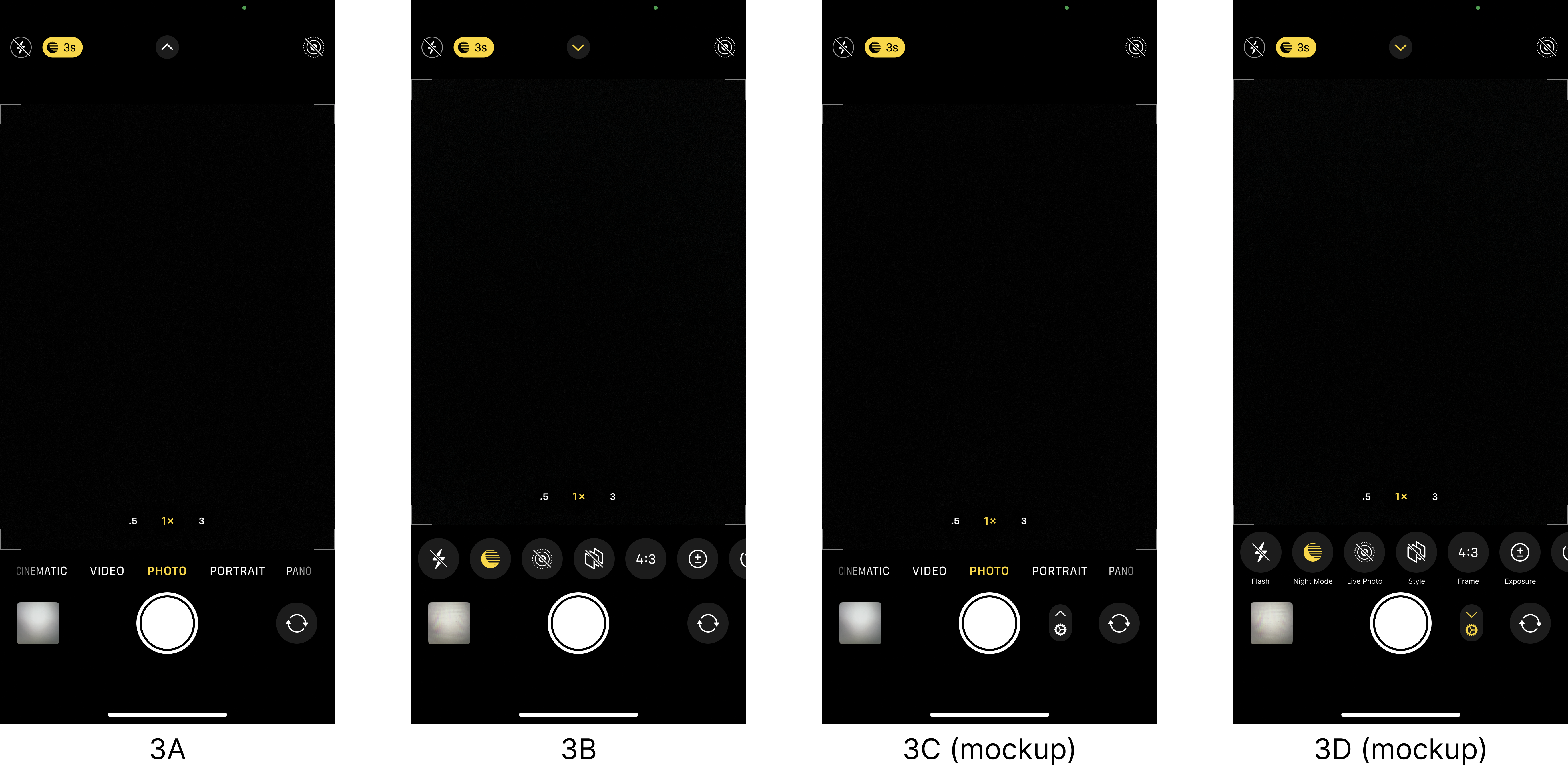
Despite the inclusion of numerous customizable settings for the iPhone camera, the iOS interface keeps them well-hidden, violating the design principle of discoverability. To reveal the photography settings, a small button at the top of the screen must be tapped (Figure 3a). The button features an up arrow, which maps to the camera frame’s direction of movement that occurs as a result of the action. Yet this feedback does not make it clear what the button controls, because it’s proximity to the revealed settings is not intuitive (Figure 3b). The gulfs of execution and evaluation are not bridged, as the signifiers that hint at the button’s function are lacking and the feedback of revealed settings is nowhere near the button itself. To better signify and map the button to its function, the button could be placed closer to the settings which it controls, and feature a more familiar signifier (Figures 3c and 3d).
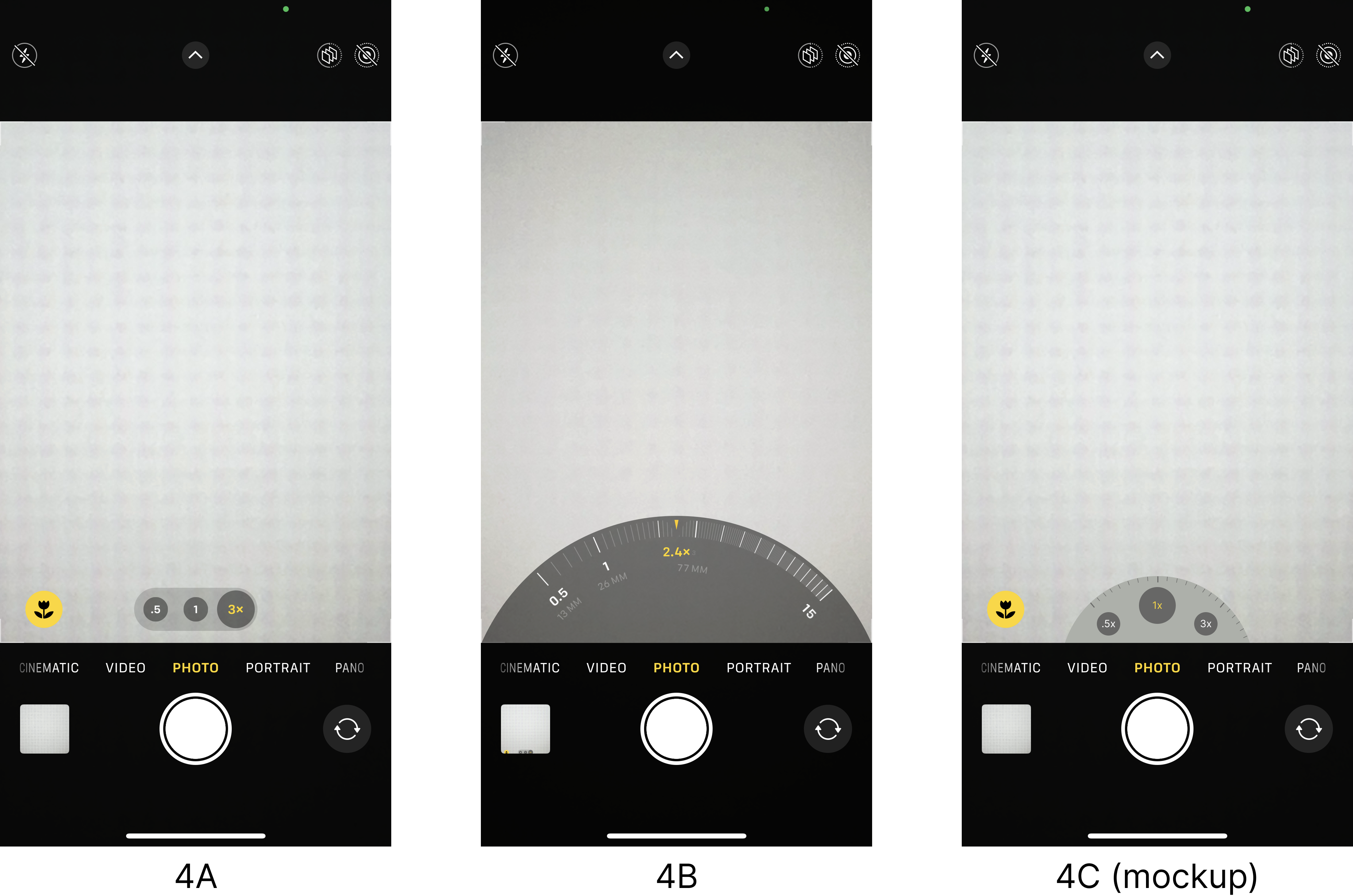
Zoom
The zoom settings appear above the modes and within the boundaries of the frame, but only a few are discoverable as presets. These are signified as buttons through shading and their circular shapes, with feedback from their selection displaying the zoom text in yellow and enlarging the button (Figure 4a). Magnifications between and beyond the presets are available through a familiar pinch-to-zoom action, but this does not afford a high level of precision. For precise zoom settings, users can touch and hold a preset and then scroll left or right to an exact magnification. This action clearly displays feedback in the form of a radially scrollable zoom ring and a display that zooms in or out accordingly (Figure 4b). The interface does not signify this radial mapping, adopted from physical camera controls, that increases zoom clockwise and decreases it counterclockwise. To make this functionality more apparent, a semicircular shape could replace the horizontal arrangement of the presets, with markers signifying where the zoom continues beyond the presets (Figure 4c).
The iPhone camera and its interface have inspired creativity in millions of users, but the usability of its settings could benefit from some improvements, making the camera even more powerful in its ease and understandability.