
Introduction
Libby is an app that performs as a digital library. Users can connect their library card to borrow ebooks, audiobooks, magazines, etc. It can be used across multiple devices, transfers to a Kindle e-reader, and allows for offline reading. Libby provides easy access to books at no cost.
Navigation Bar
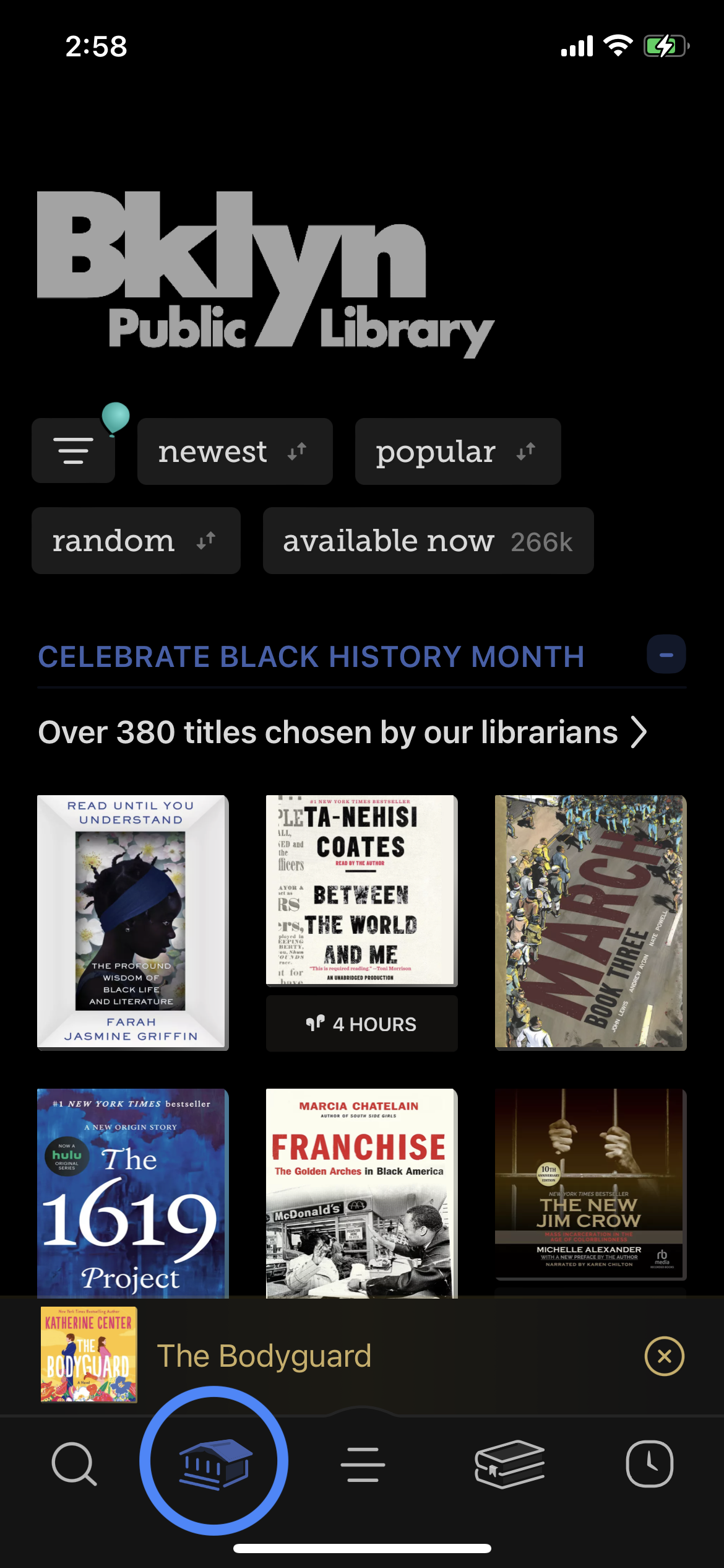
The navigation bar features five icons and is meant to lead the user to its respective page. I would argue that the signifiers in this attribute do not clearly convey its associated meaning.
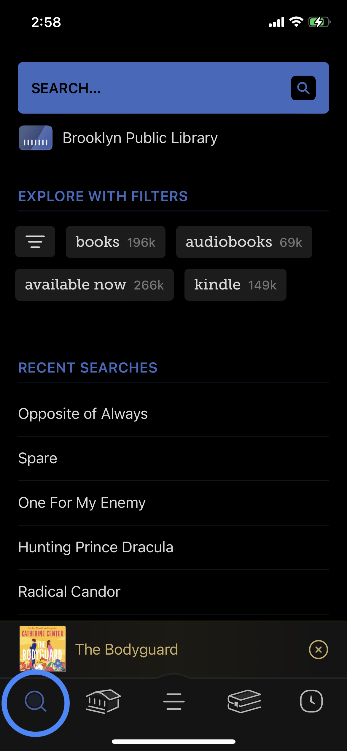
The building icon leads to a browsing section. Semantic constraints suggest that the usual place for a browsing section in an app would be where the search icon is. The designers of the app make the assumption that the user would expect the building icon to represent a browsing section. However, a user can misinterpret that as a section to find a physical local library if the digital library doesn’t have a specific book. Furthermore, the icon with three lines leads to a section where settings and library card information. A user can easily misinterpret that as a hamburger menu that would provide menu options.
My recommendation for the building icon would be to remove it completely and place that content where the “Recent Searches” are in the search page. “Recent Searches” can appear when the user is actively using the search bar. Then, with the hamburger menu icon, I would recommend putting a gear icon, as that is a common signifier used in digital interfaces for settings and information (i.e. Gear in IOS signifies setting and personal information). This would follow Norman’s distinction between “complexity” and “complicated” to avoid confusion.
“Timeline”
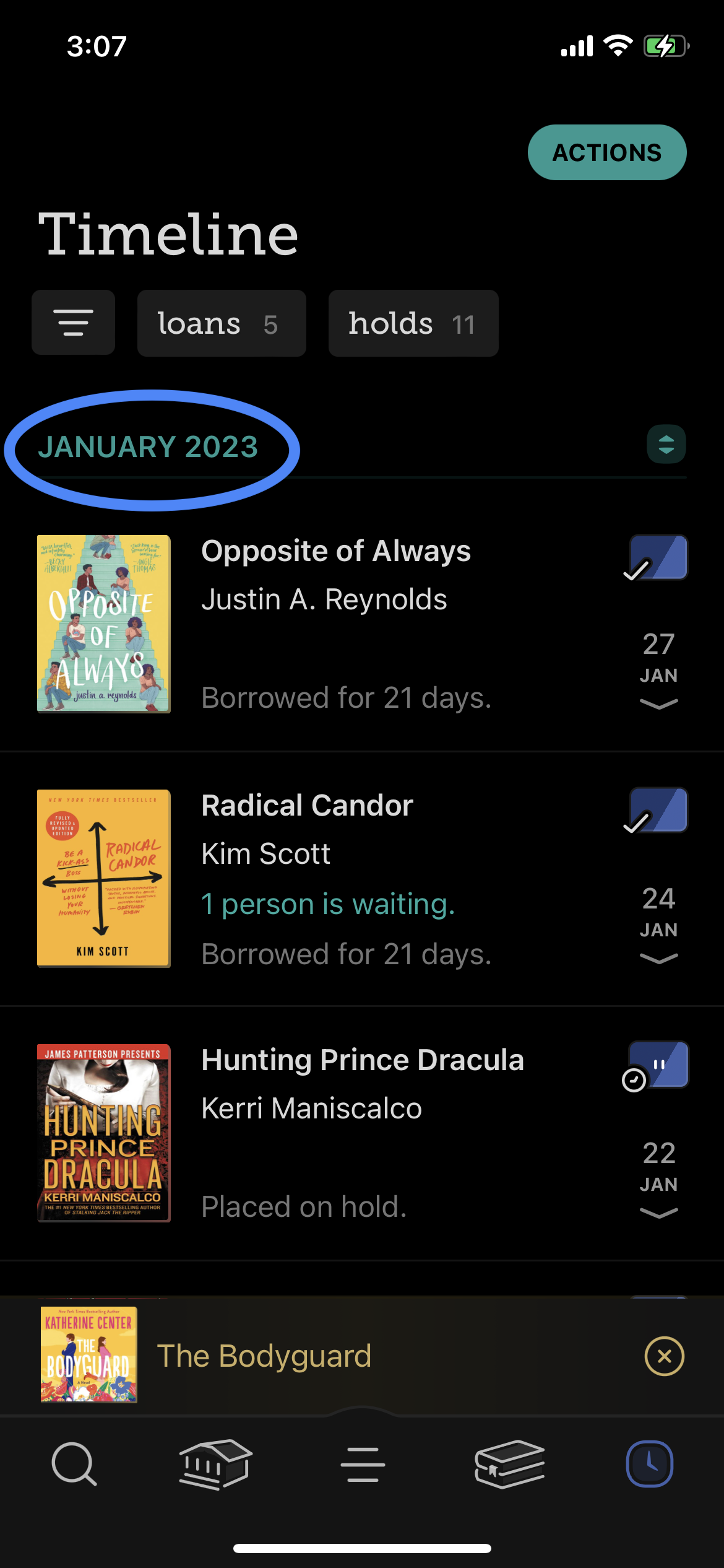
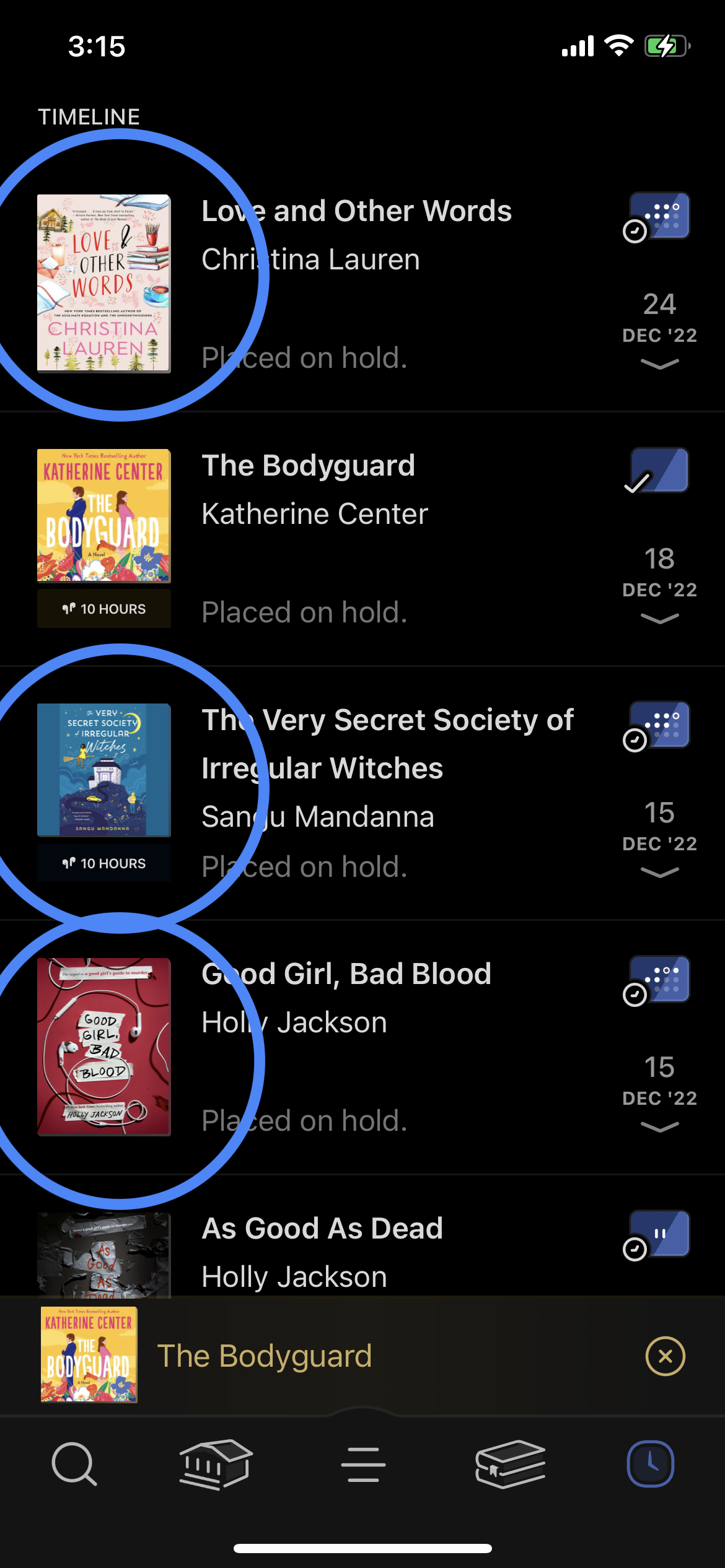
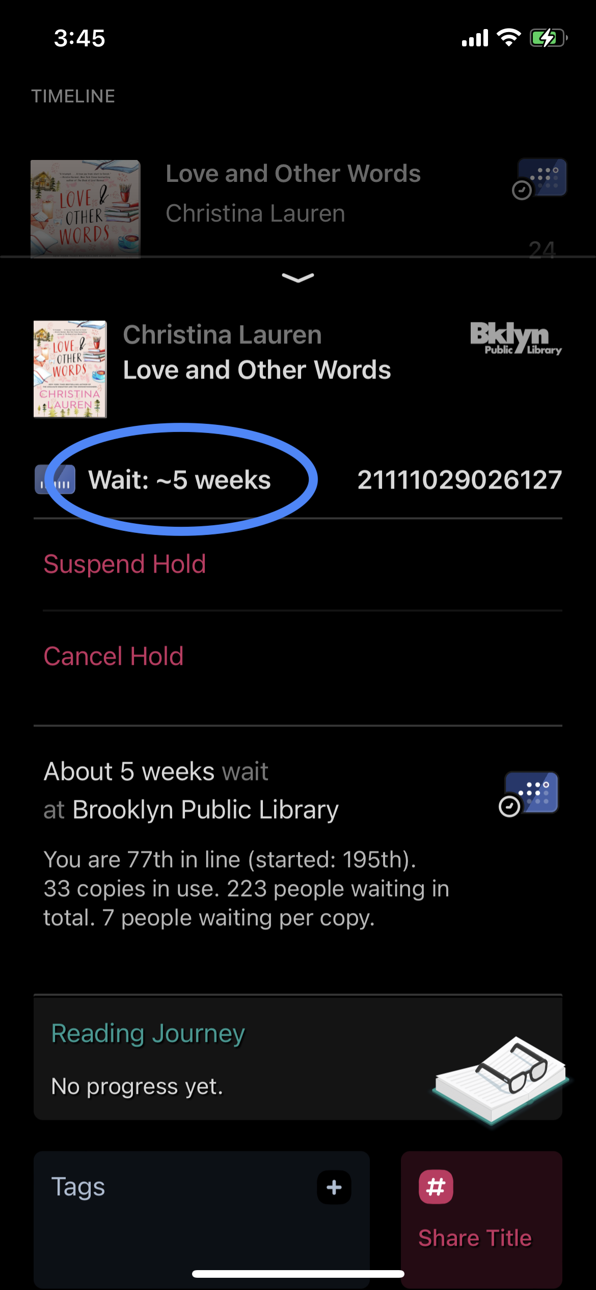
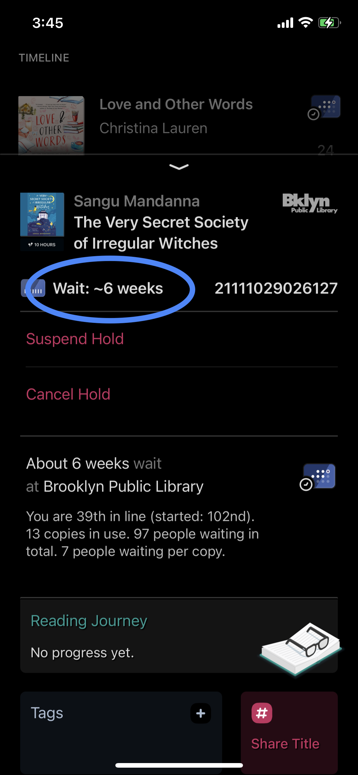
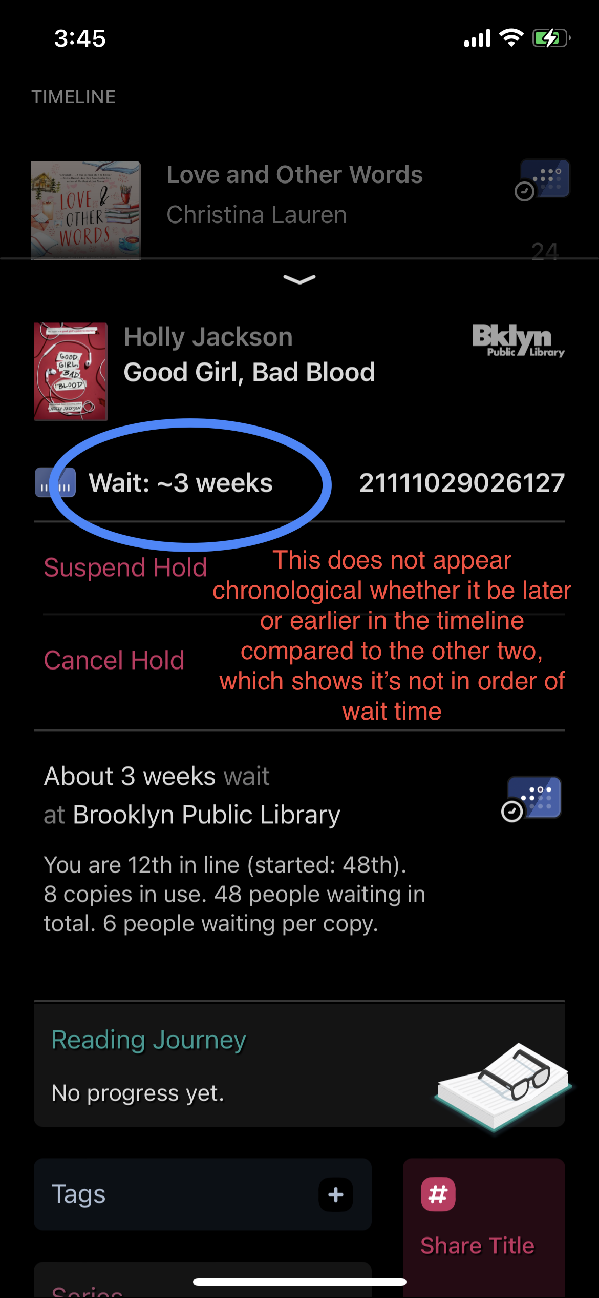
In “Timeline”, the previous and current loans and the holds of a user is presented. As a “Timeline” section, a user might expect “loans” placed to be in chronological order and “holds” in order of wait time. This page chooses to apply the first order to both. Even when using filters to display only “holds”, those are not in order of wait time. Keeping track of when you placed it is not as useful as the wait time to receive the books. This places a memory load on the user to remember when a hold will be released for each book. I believe the context of the page is violating discoverability and understanding.
To prevent memory-lapse slips of users forgetting to receive their holds by minimizing the number of steps to see when the hold will be released, I recommend having options “Order by request date” and “Order by wait time” in the “Actions” tab to reorganize the shelf for whichever filter is chosen. If it’s on the home page where users can see everything, they can sort that out by the current timeline model, or the alternate model of presenting which holds are yet to be released, which are currently being loaned, and which have been returned, in chronological order in their respective categories. Another option is to have the wait time presented next to the book instead of having to tap on it, which would also minimize adding more to the “Actions” tab, but I believe the testing and iteration stage of what Norman calls the Iterative Cycle of Human Centered Design would aid in seeing which works best for users.
Shelf
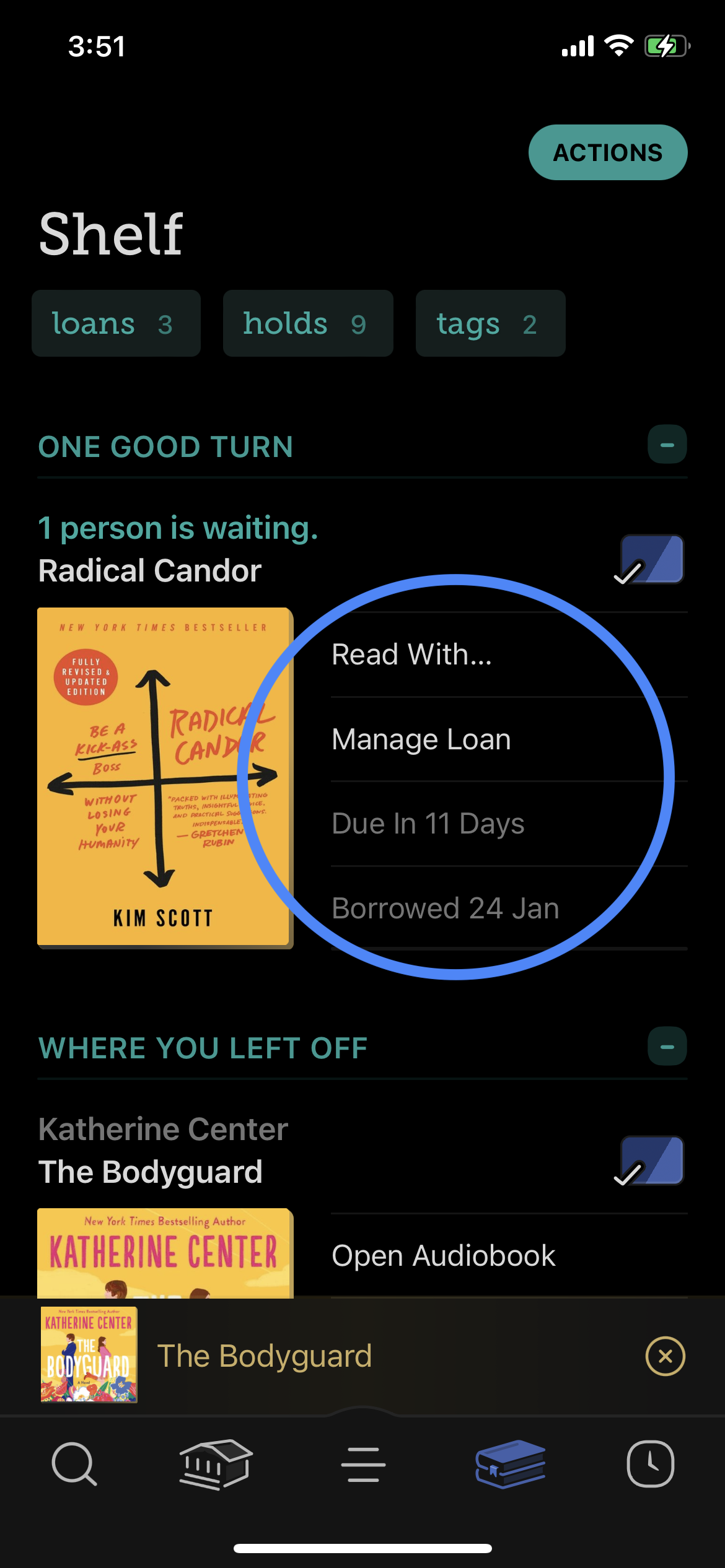
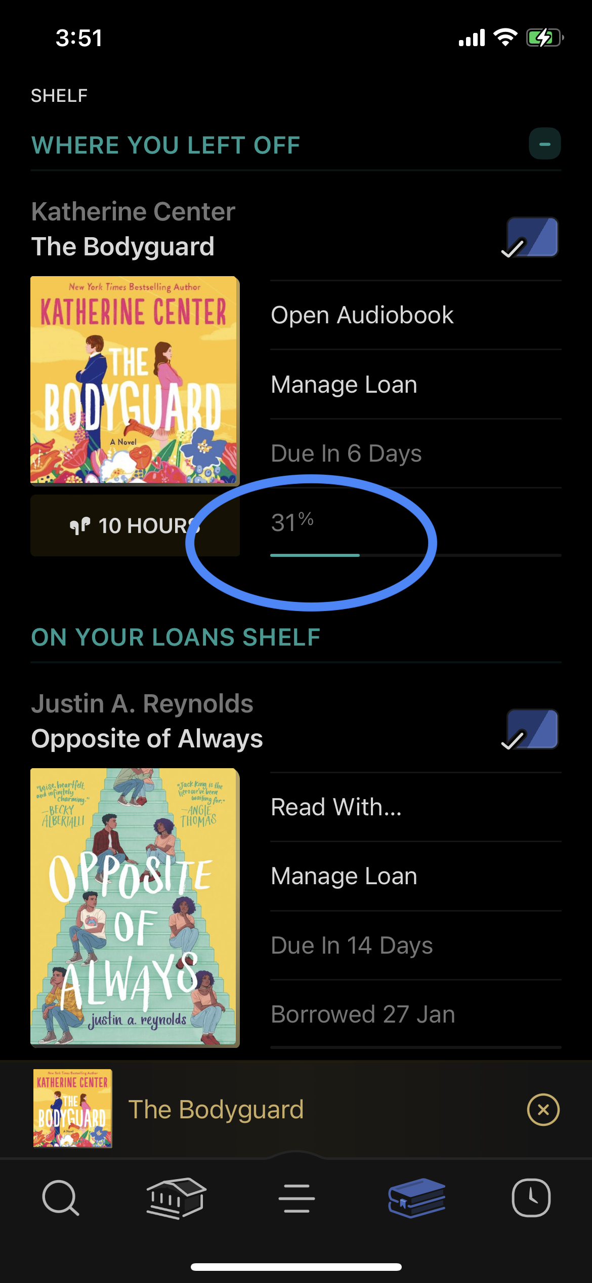
To note a positive attribute of the app, the “Shelf” section is well presented. It gives all relevant information in one go and keeps track of reading progress. If I were to make a recommendation, I would have it in order of due date, so that a reader is aware of the book they need to finish first at the top of the screen before it goes to the next person, which would solve memory-lapse slips too. Overall however, I believe this page follows Norman’s concept of prospective memory better in the way the previous attribute does not due to its more explicit display of a relevant date to the service.
Conclusion
Considering the Libby app is a few years old, there is certainly room for improvement. In following Norman’s principles and concepts, Libby could improve in quality for users.