Netflix is a US-based streaming service that offers online streaming from a library of films and television series, including those produced in-house. Users can subscribe for monthly access to the service, allowing them to watch content on multiple devices.
With regard to streaming services, Netflix stands out as having without a doubt the best user experience, which has sparked intense debates among other fans of streaming about whether usability or content should take precedence.
It is also one of the explanations for how Netflix has managed to keep its position as the industry leader while facing stiffer competition every year. No matter how many other businesses launch their own streaming services, when we envision coming home from a long day at work and relaxing in front of the TV, Netflix is still the first name that comes to mind.
Netflix has a good user experience where the platform uses data and algorithms to recommend content based on each user’s preferences and viewing history, providing a customized and personalised experience. The UI is clean and straightforward, visibility making it easy to find and access different sections of the platform. It is designed with the user in mind, using clear language, simple and clear mapping between the controls and the actions they perform, and familiar affordances.
Netflix continually updates its platform and adds new content, providing users with a fresh and constantly evolving experience. Talking about the new update recently, the homescreen of Netflix has changed drastically.
Home Screen
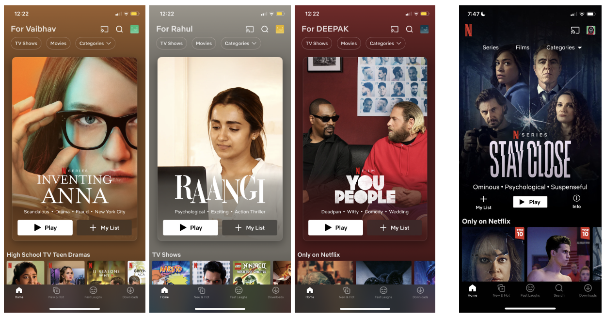
The new homescreen mentions the name of the user, categories as filters and a card in place of banner for the advertised content.
Limitations: However the dark theme of Netflix is anyways less preferred for visually impaired users, the changing of background colour of the app with respect to the highlighted content which, if taken accessibility into account, is highly questionable.
As can be seen, the former search bar has moved to the top navigation bar giving it a better position preference.
Recommendations: Instead of auto-detect background color, the app must provide a preference for light and dark theme modes for better accessibility. For accessibility purposes, Netflix should also consider adding an audio search option.
The bottom navigation bar has changed a number of times for user testing. New features such as “New & Hot”, “Coming soon”, “downloads” and the latest feature “Fast Laughs” have been practiced in the user testings.
Personal point of view – I actually liked the option of “More” as hamburger button in the bottom nav bar which allowed easy access to all the features from one screen.
The info icon has also been removed expecting the users to click on cards for more information.
Profile
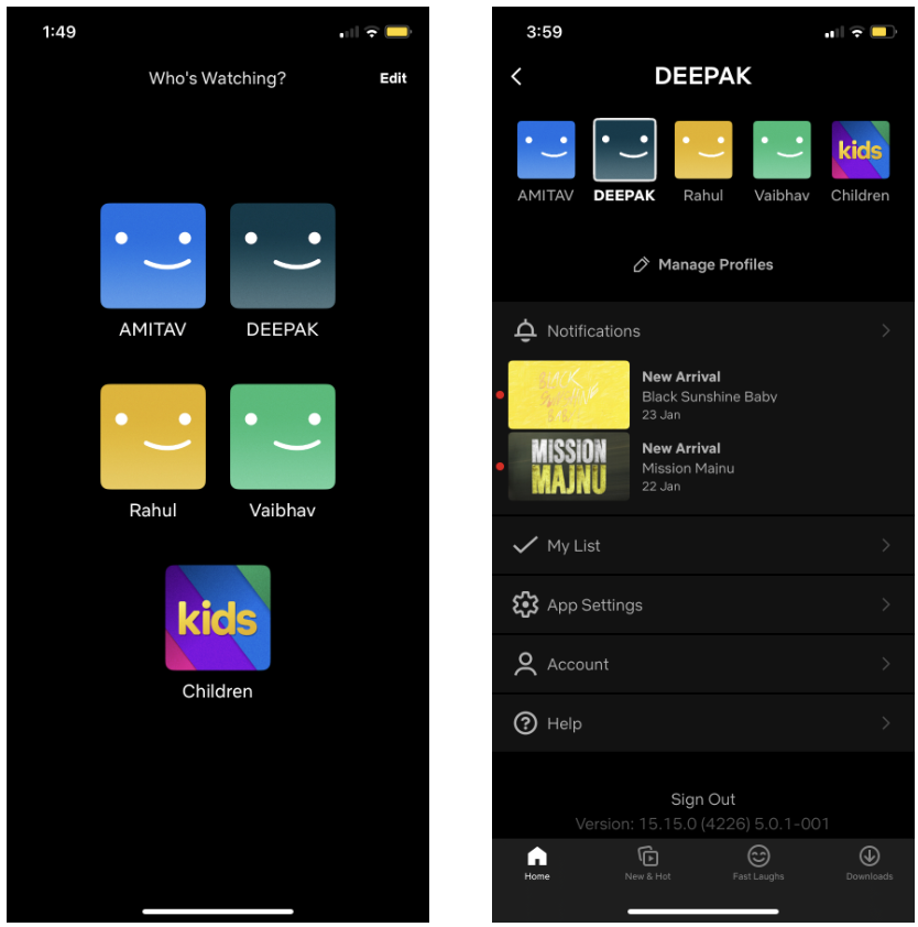
The profile icon has settings and other account/app functions.
Limitations:
- Login does not remember user profile preference which can cause accidental selection of different profiles further disturbing the algorithm for user preferences.
- If the app notifications are off on the mobile, opening the app does not show any sign of new notifications as wee. When there is no evidence that you have been notified on the app, the point of the placing notification in profile is moot.
- The “My List” option is one of the categories on the home page, but we must travel to the profile to find it precisely. This function is great for saving content for later, but if you save too much, there is no way to manage or filter it.
Recommendations:
- Allow the users to stay logged in with preferred user profile. A default setting for profile preference in settings or first time login can eliminate this error.
- A “bell icon” as in previous updates of Netflix app is useful for such notifications. Or, one can follow the red dot theory on profile to highlight the new notifications.
- A filter option to filter out the listed options on “My List” is recommended for the best use of this feature.
Users can now disable autoplay in the app settings after the latest update which is a constraint that most of the users prefer.
Comparing with Amazon Prime Video
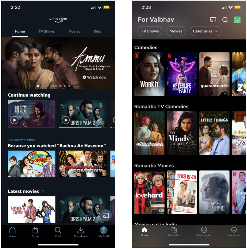
The Netflix app’s main section is made up of images of various movies and TV shows in portrait style, in contrast to other similar apps like Amazon Prime Video, which display content in landscape mode. By doing this, the app appears less like a video that could animate and more like a display with posters, which relieves users’ scrolling burden.
The following are two features of Amazon Prime Video that Netflix should implement:
- IMDb ratings: Users like verified content and Amazon credits it’s content with IMDb ratings. Netflix users have to verify the ratings from google if they wish to watch higher quality content.
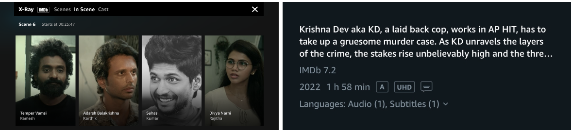
- X-Ray feature: Probably Amazon Prime Video has patented it’s X-Ray feature, but it is a pretty useful feature when users want to familiarise themselves with the actors and features of the content they are viewing. Hence, Netflix should come up with a competitor to the X-Ray feature.
Conclusion
Netflix’s mission states that it is a passion brand that specializes in movie and TV series entertainment and seeks to provide consumers with freedom, flexibility, and pleasure. We could see that Netflix’s goal is being pursued via its intelligent recommendation system, search feature, viewing experience, and overall visual aesthetic.
There is still room for development, though. Due to its limited user control, the suggestion mechanism is not flexible enough. Users experience inconvenience due to a lack of cues, such as iOS’s search advice and ability to distinguish between a huge number of search results. The watching process appears to be too clunky, as evidenced by the preview’s lack of feedback, My List’s awkward placement, and several uncomfortable watching and continuous changing of central tab page experiences. This will affect how free users feel. In terms of the visual portion, there can occasionally be a tension between the enjoyment that Netflix frequently offers and a streamless experience that customers might desire.