The New York Times Cooking app is meant to help users find new recipes organically, search for specific recipes, and collect and return to favorite recipes through the NYT interface. The app also features certain recipes based on time of year, occasion, and even craving that a cook might have.
Preparation/Ingredients Toggle
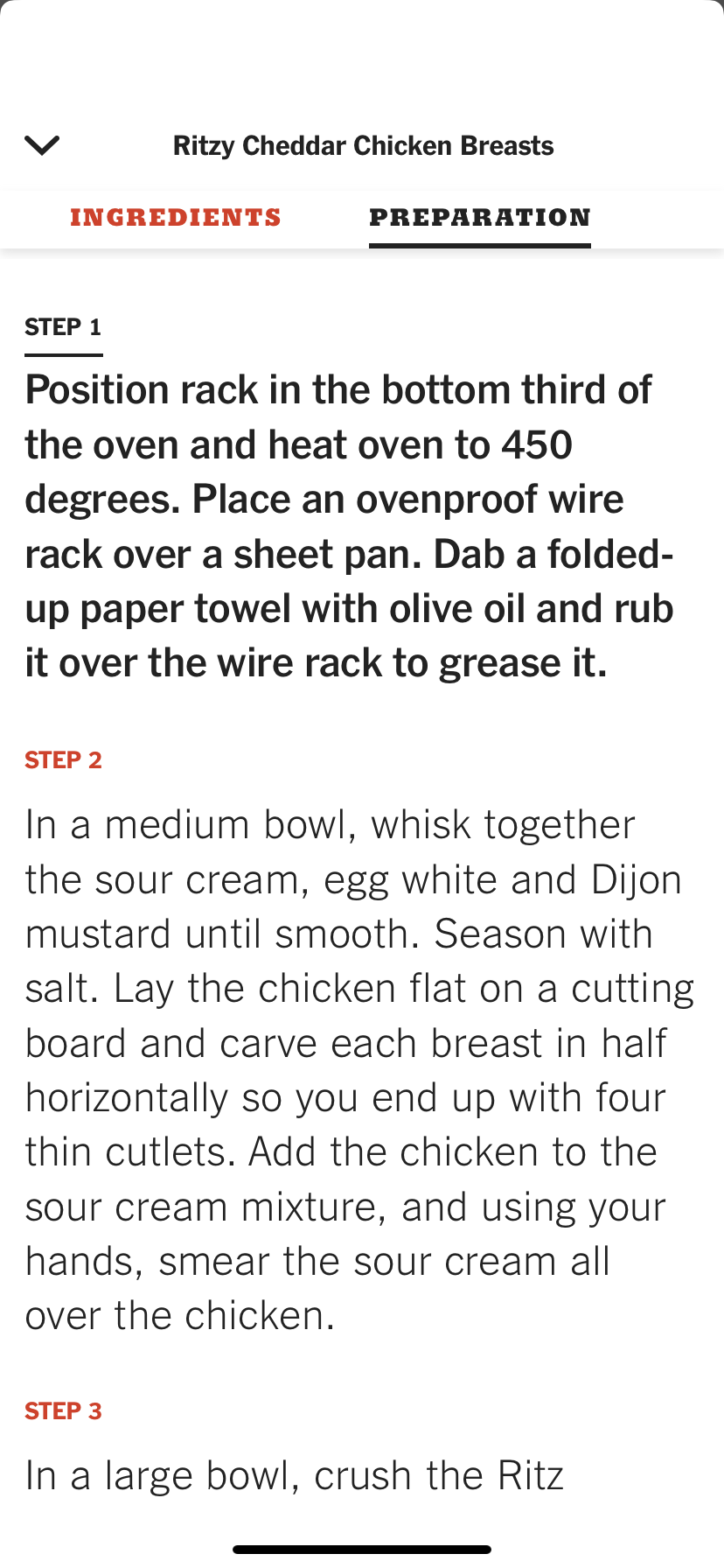
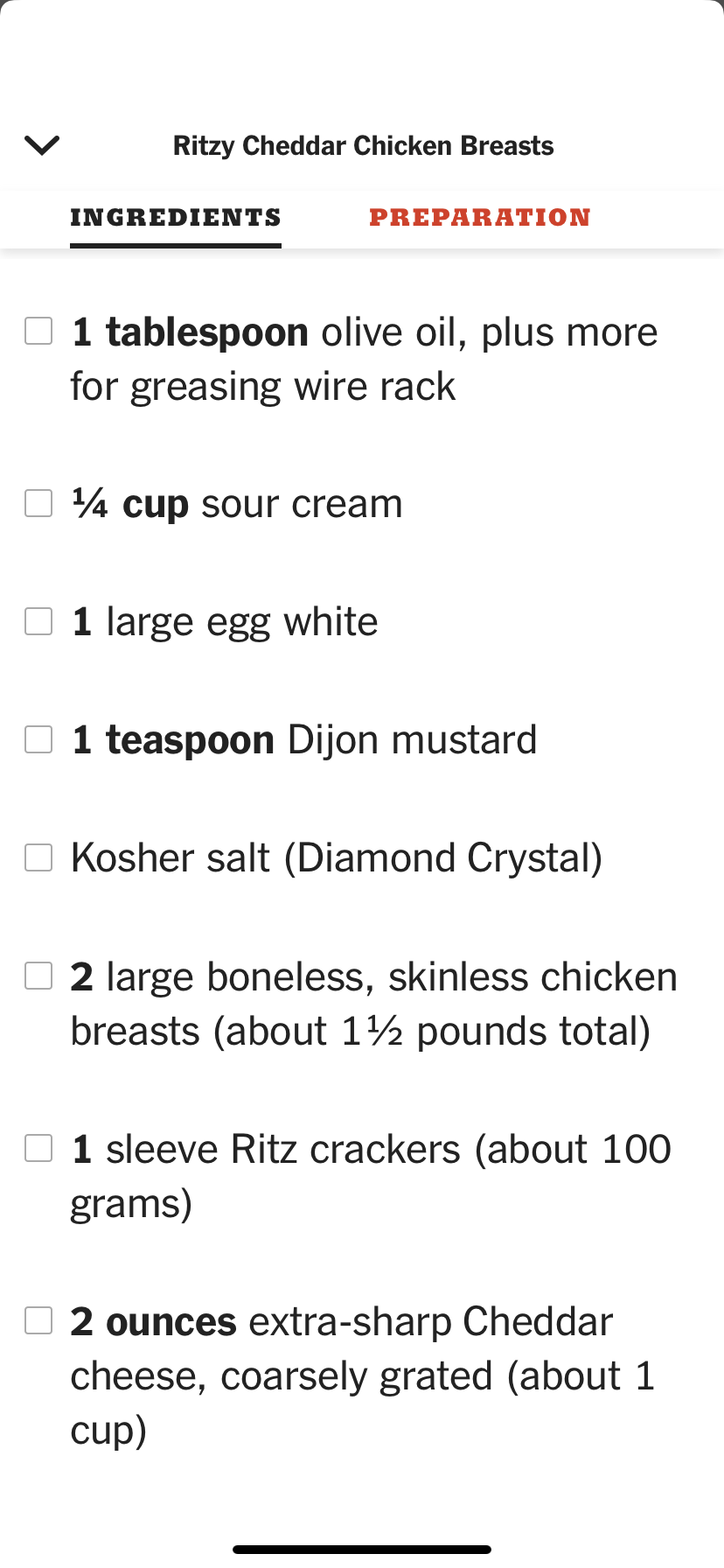
Once a user decides to start cooking a recipe, they open up a window that allows them to toggle between ingredients and the preparation steps. However, in the actual practice of cooking a recipe, this relies upon the idea that Norman discusses of knowledge in the head. At first use, it can be frustrating, because when reading the instructions for the actual recipe, the measurements for ingredients aren’t included. This can lead to a successful and uninterrupted execution of the task if the user has pre-measured all of their ingredients, but if they haven’t, they will have to toggle back and forth between the ingredients page and the preparation page, assuming they aren’t able to keep the measurements for each ingredient stored in their head after reading through them once. Further, I think that this issue could lead to what Norman discusses as slips and the user blaming themself for potentially getting measurements wrong. After using the app a couple of times, the user might learn to pre-measure the ingredients, but this depends on how frequently the user is turning to the NYT cooking app.
My suggestion here would be that the toggle can remain the same for people who do prefer to measure out their ingredients ahead of time, but the ingredient quantities could also be included in the preparation notes.
Accessing Grocery List
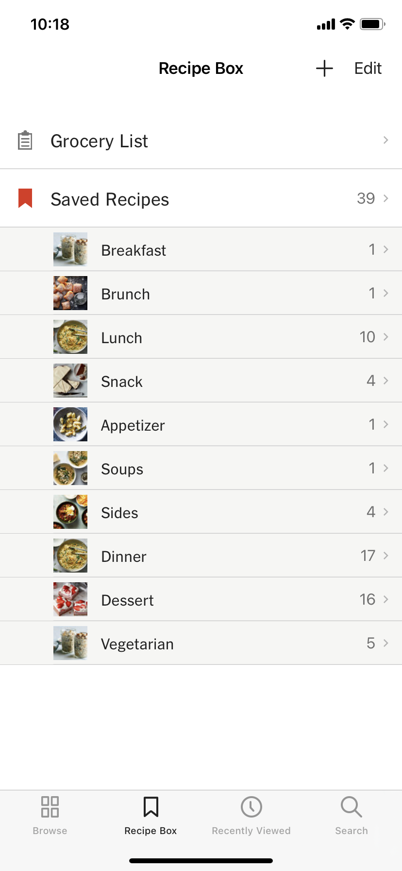
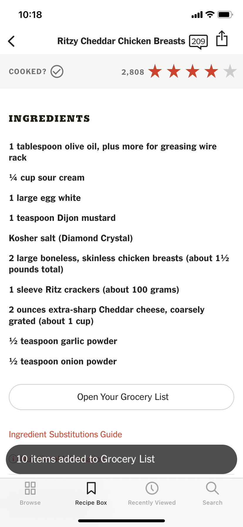
When in a recipe, the user has the option to add ingredients to their grocery list. This action demonstrates a great implementation of Norman’s principle of feedback, in that the user immediately sees a pop-up noting that the items have been added to the grocery list. However, the problem results in the next step, when the user realizes that it is not easy or intuitive to locate the grocery list within the app. It turns out after some searching that the grocery list is located in the recipe box, as shown above. However, I would say this contradicts Norman’s principle of mapping as there is no indicator for the recipe box on the main navigation bar at the bottom of the app, nor is it immediately clear under which of these categories it would fit. The user is only able to find it by trial and error. My suggestion would be to either add a fifth option at the navigation bar for the recipe box, or to make the pop-up that notes the ingredients have been added to the Grocery List a link that takes the user to the grocery list and also indicates where the grocery list is located within the app.
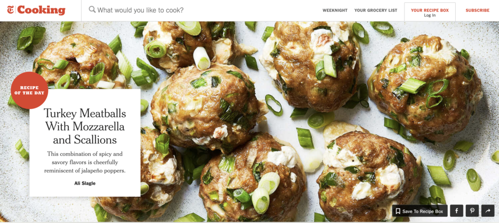
Search Function
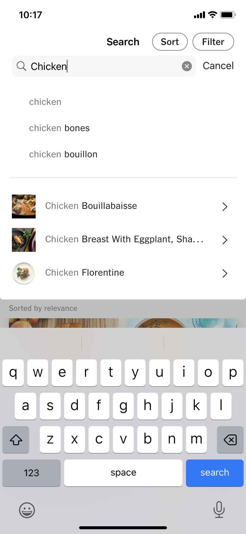
The search function is a primary way to find new recipes and specific types of recipes on the NYT Cooking app. However, I would call on Norman’s discussion of complexity is good, confusion is bad, where he uses an unfamiliar kitchen as a reference to this search function. Although I think this is a less extreme version of what he describes, where a kitchen has a lot going on, but it is not overwhelming so long as you are familiar with it, I would say this search function is similar. A user typically expects a search function to allow them to search for something in this case, like “chicken” perhaps with the help of an intuitive search engine, like Google that might guess the end of the search. However, here the addition of the intuitive search, plus the immediate option to sort and filter, and the further option to click on what appears to be recipes makes for a little bit of an information overload. It is also possible that the user wants to search chicken florentine, but wants to see all recipe options that the NYT Cooking app has to offer and might select that option not realizing that they will be taken to one specific recipe. I believe this also speaks to Norman’s principle of consistency, as there are a few different signals being delivered in this one step. My suggestion would be to offer a simple search function, and then an additional option to click on suggested recipes that takes the user to a new pages to eliminate confusion.