
StreetEasy is an app which allows users to browse NYC real estate for sale and rent. It provides free map and photo search of rentals, condos, co-ops, lofts, and single family homes in New York City.
Loading Screen
Upon opening the application, the user is shown a simple animated version of the StreetEasy logo. While this may not adhere to the more common imagery associated with loading screens, the minimal, looping nature of the animation still successfully appeals to the user’s “knowledge in the head”, especially that of cultural constraints and conventions. During the 2-3 seconds the application takes to load up, this screen clearly signifies to the user that the app is loading and will be available for use shortly.
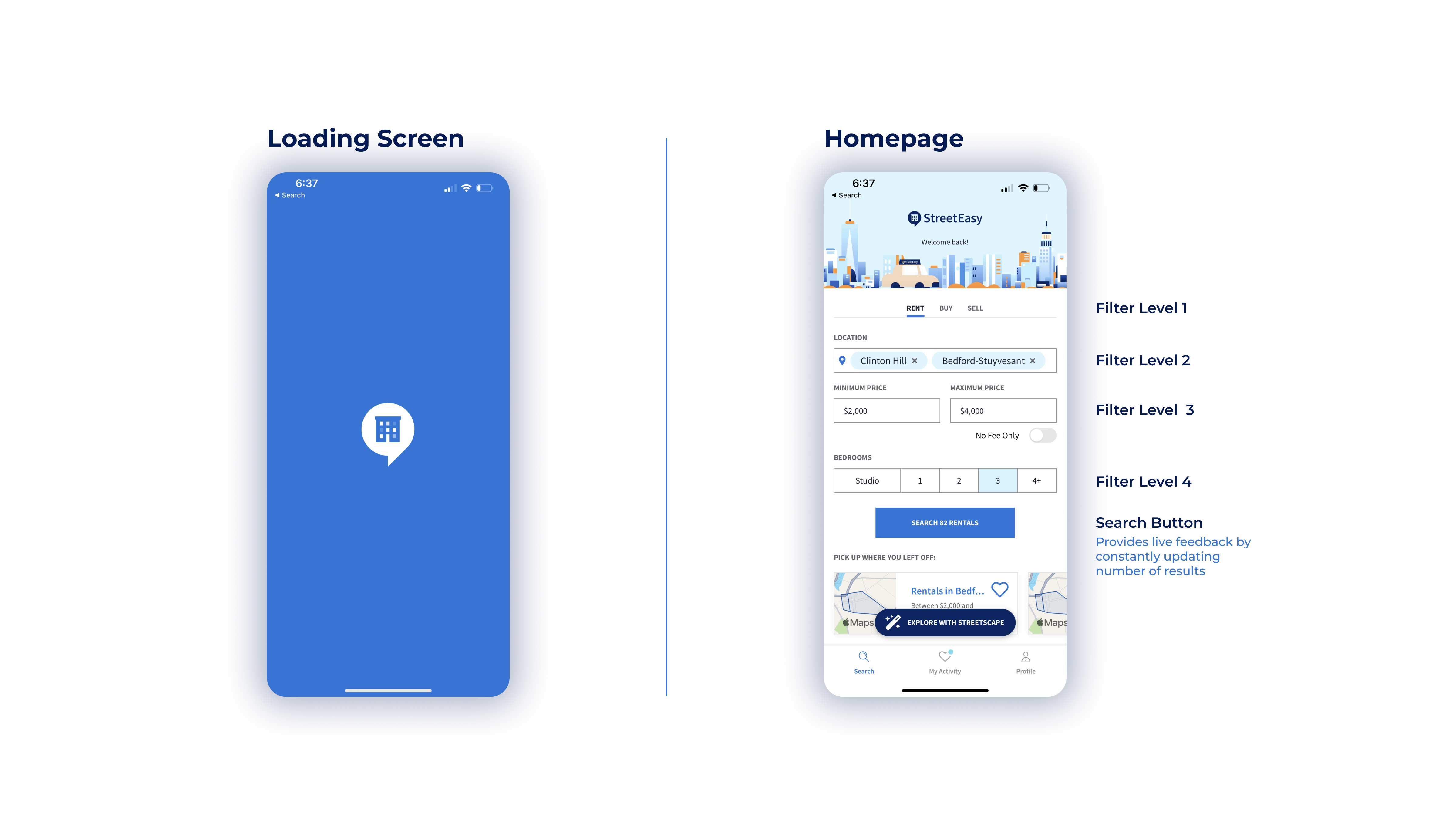
Homepage
The app interface is essentially designed to be a singular filter which users can adjust to aid in their search for housing options. The constraint of having no other options but to use a filter to narrow down the user’s search allows them to find a suitable property quickly and efficiently. The items in the filter are ordered by parameters that would have logical precedence to the user, and the icons and language used are clear and concise, favoring both discoverability and understandability.
Rental Search Process
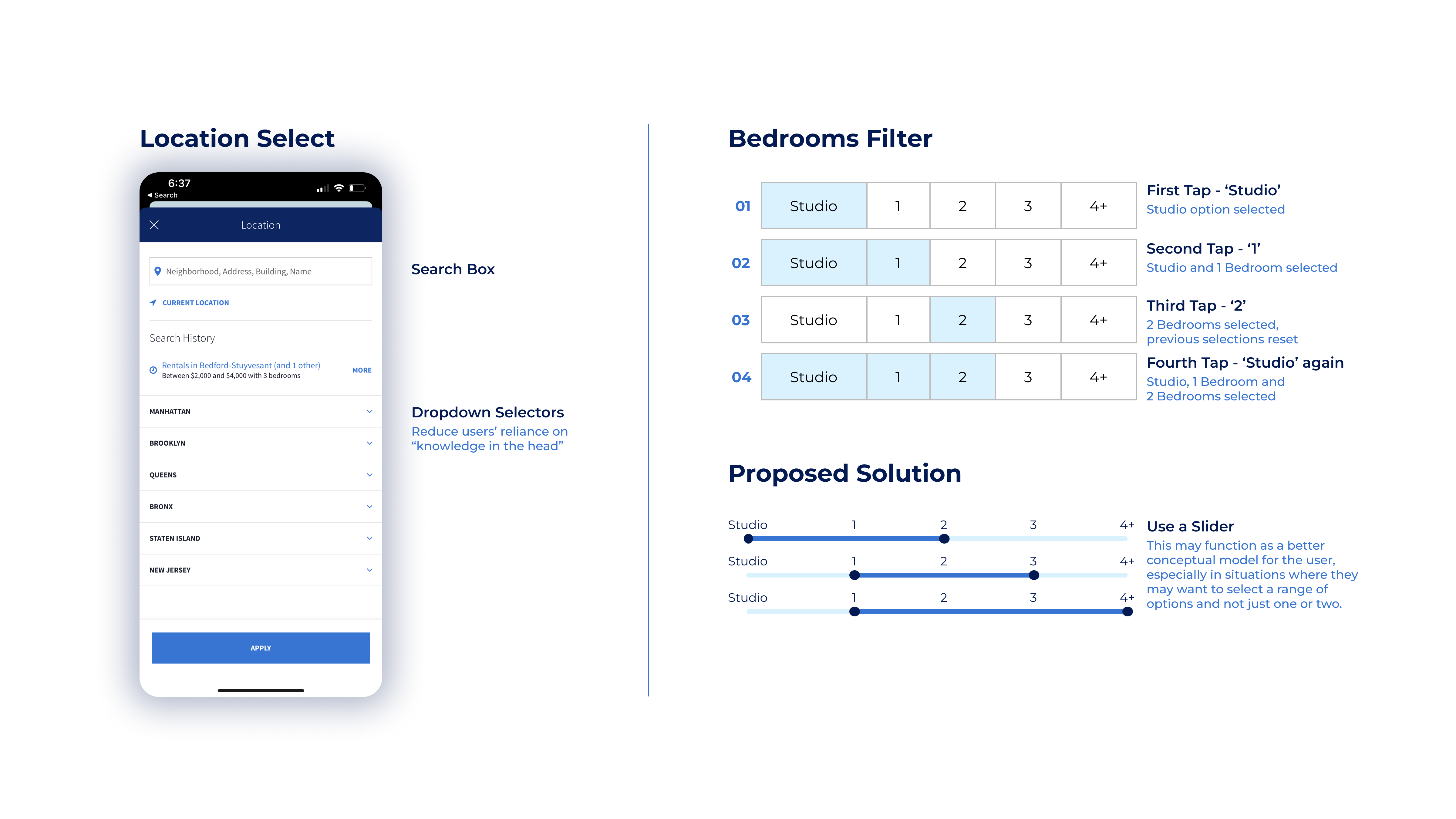
When looking for a rental property, the user must first select a location. Tapping the location field brings up a secondary menu from which the user can either manually type in the name of a desired location(s), or use a stack of cascading dropdown selectors, signified by inverted chevrons, to narrow down their search. The provision of the dropdowns is a helpful addition, which can reduce the user’s reliance on “knowledge in the head”.
The next two fields to be entered are the maximum and minimum prices. By default, the user can scroll through and select prices which are in preselected increments. However, the option to manually enter exact figures is also available.
The final field requires the user to select the size of the properties they would be interested in. This is done through a simple touch selection of the different size options, starting from a studio apartment and going up to 4+ bedroom property. However, across the 5 options, the app does not allow the user to select a range of more than 3 at once. This constraint seems slightly arbitrary, and the system can be frustrating. A solution to this is provided in the following image:
The final step after applying these filters is to run the search by tapping on the search button, which conveniently displays the number of available properties for the users’ parameters even before loading the results. This number updates live depending on the filters selected, and does a good job of providing feedback to users as well as showing them how many options they will have to choose from.
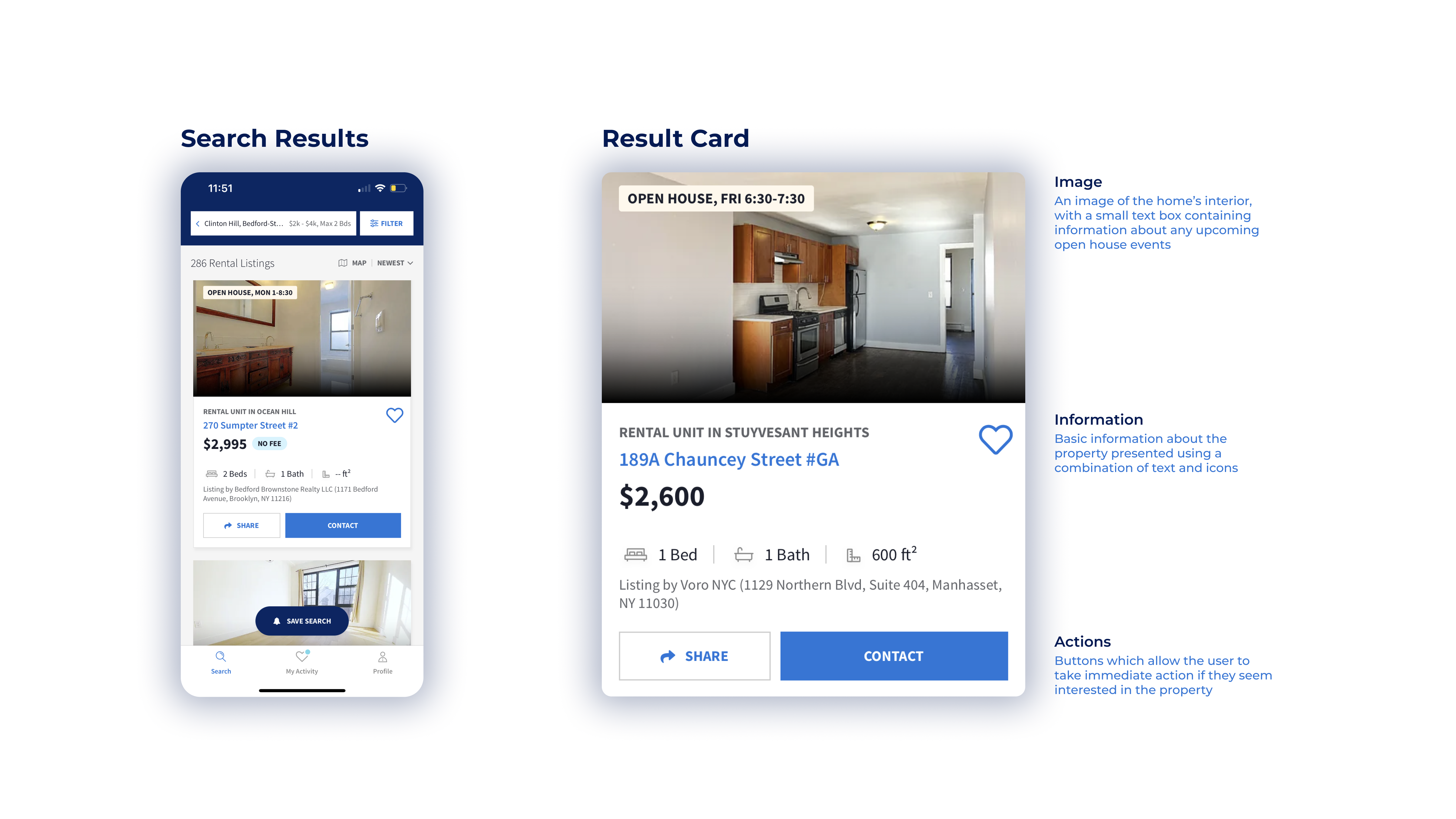
Search Results
The results page provides further filter parameters, as well as the option for the user to browse the results in either a list view or a map view. In the list view, each result is presented in the form of a card, which contains basic information about the property, as well as options for the user to favorite the result, share it, and contact the concerned party for further information. The card also contains an image of the property’s interior, upon which useful information is sometimes provided, such as the dates of an upcoming open house. The icons and text used on these cards is also highly understandable.
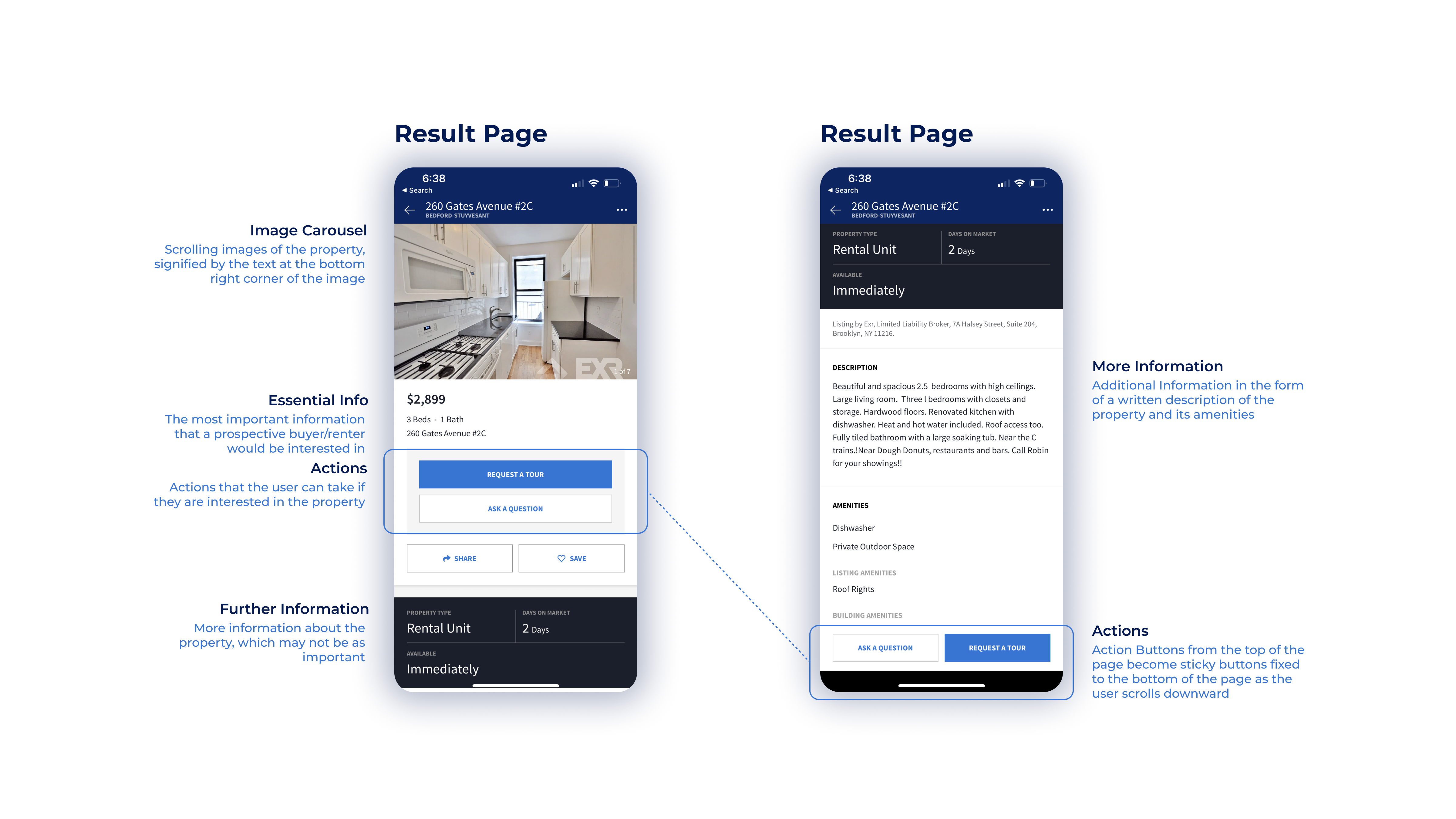
The page for individual results begins with the property photos presented in a carousel, signified by text denoting the current slide and the total number of images, eg. “1 of 11”. Immediately below the image carousel is some of the key information about the property like the rental price, number of rooms and address. This information is followed by large, easily discoverable buttons which allow the user to request a tour, ask a question, share or save the property.
Below this is a text description of the property, as well as other secondary information. The page ends with a carousel of similar listings that the viewer may be interested in. One convenient detail is that the ‘ask a question’ and ‘request a tour’ buttons become sticky items at the bottom of the screen once the user scrolls past them.
During every step of the process, the button which would allow the user to go back or to cancel an action is consistently placed at the top-left corner of the screen, which helps in minimizing errors.
Conclusion
The StreetEasy iOS app mostly succeeds as a database which users can leverage to find real estate in New York City to suit their individual needs. It does a good job of implementing principles of design and psychology to optimize the experience of users and make their search for real estate as efficient as possible.