For a smooth and effortless experience at Universal Orlando Resort, it’s essential to have the Universal mobile app loaded on your phone. This app offers a range of convenient features, including information on attractions, the ability to purchase tickets, real-time wait times, and more, making it an indispensable tool for any visit to the resort.
Navigate the Homepage
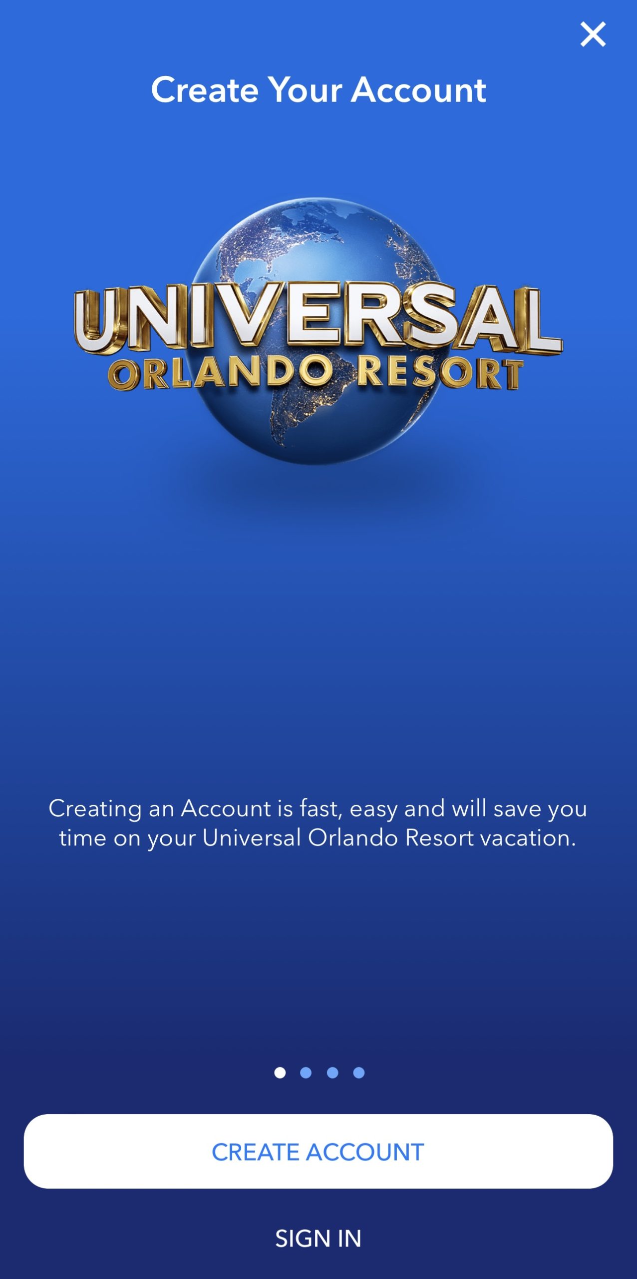
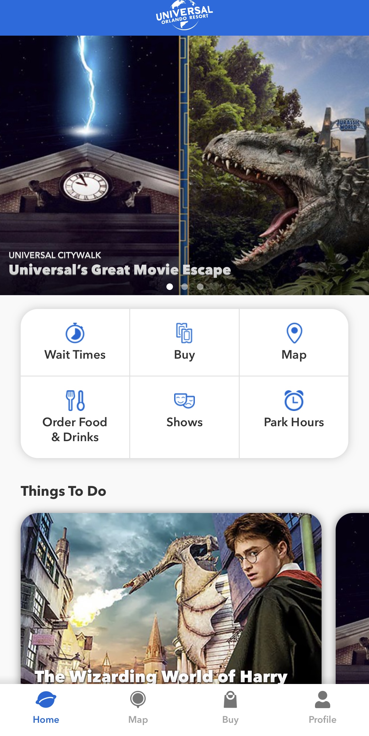
There are three options for users: create an account, sign in, and go to the homepage without logging in (Figure 1), catering to both goal-driven behavior (e.g. users planning a trip to Universal FL) and event-driven behavior (e.g. curious potential users). The homepage features an automatic carousel of Universal’s events, with signifiers such as dots indicating the current picture. The navigation bar provides feedback to the user by highlighting the current section with a blue color on both the icon and text. The bottom navigation bar and six buttons are an example of natural mapping, as users will know what to do based on the buttons. The texts below the icons utilize knowledge in the world as it minimizes the need for conscious guessing about which icon represents what.
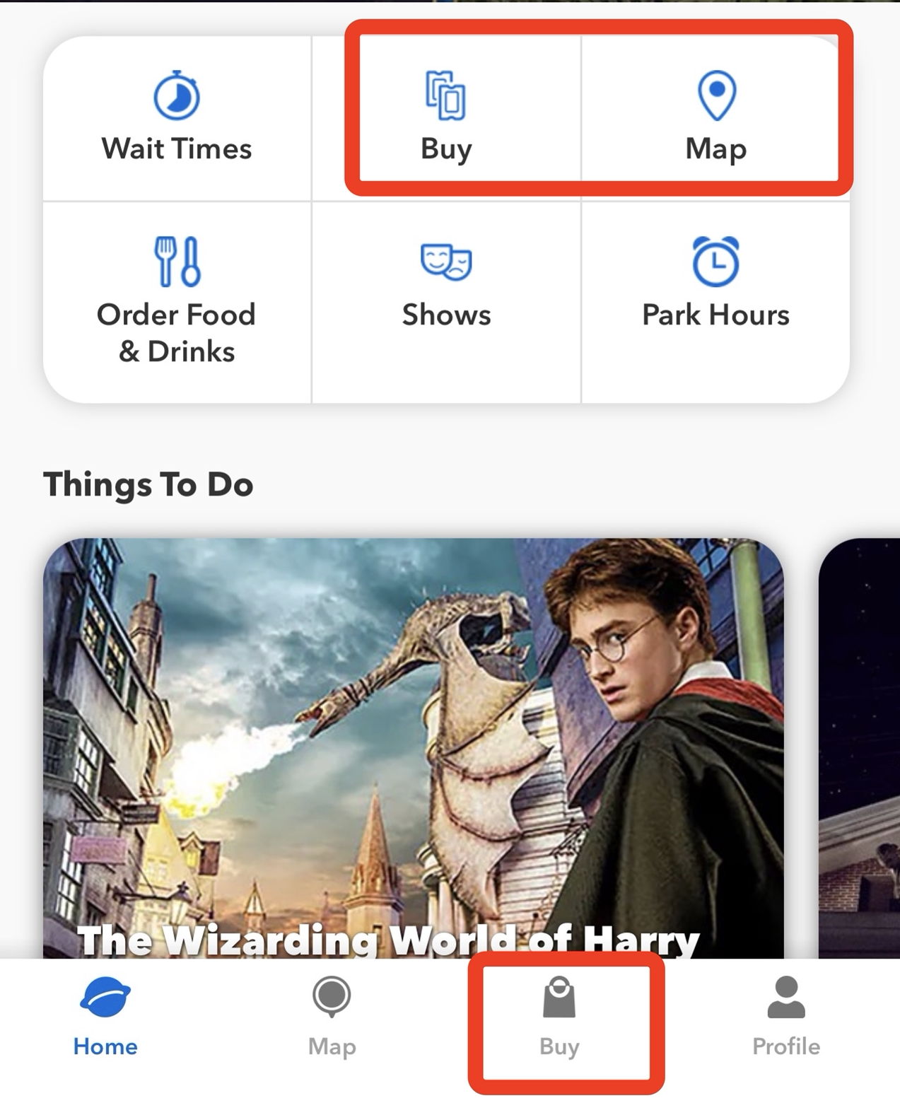
However, the “buy” button”, together with the shopping bag” icon” (Figure 3), is not understandable enough, as they refer to purchasing tickets, Express Passes, and separately ticketed events rather than shopping Universal souvenirs. It would be clearer if the button were relabeled as “tickets & more” and the icon replaced with a ticket icon. From the perspective of usability, the “buy,” and “map” buttons in the middle of the homepage can be removed as they are already in the bottom navigation bar.
Check Wait Time
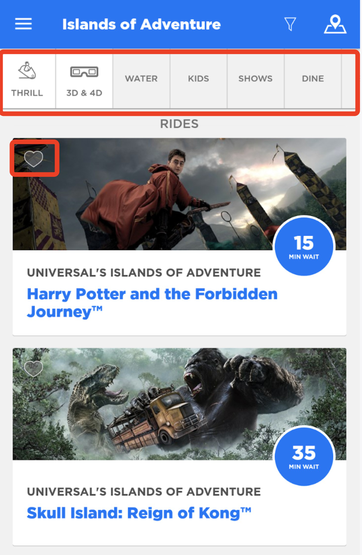
Once clicking “wait time” button, the user will see an event listing page (Figure 4). Each activity card affords liking, tapping, informing the location (which park it is), the event name, and the wait time. The “red heart” icon is a signifier suggesting where to tap.
The labels above are struggling with discoverability. Firstly, it’s difficult to figure out that they allow narrowing down events by tapping, as the feedback is inadequate with low-color-contrast background color change after tapping and a lack of signifier appearance. Moreover, when a label is clicked, the icon disappears, and the text moves to the center, making it hard to tell if the filter has been applied. This does not align with the user’s conceptual model, and they must continuously tap to figure out how the filters operate so as to resolve the gulf of execution.
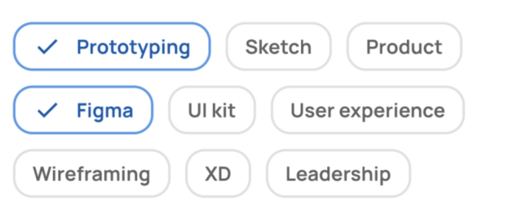
Therefore, the labels should look tappable, change to a visible color after tapping, and show the status of whether the filter has been applied or not. It suggests that the labels should be made more recognizable as tappable elements, with a visible change after tapping and a clear indication of the filter’s application status. Figure 5 is a similar approach.
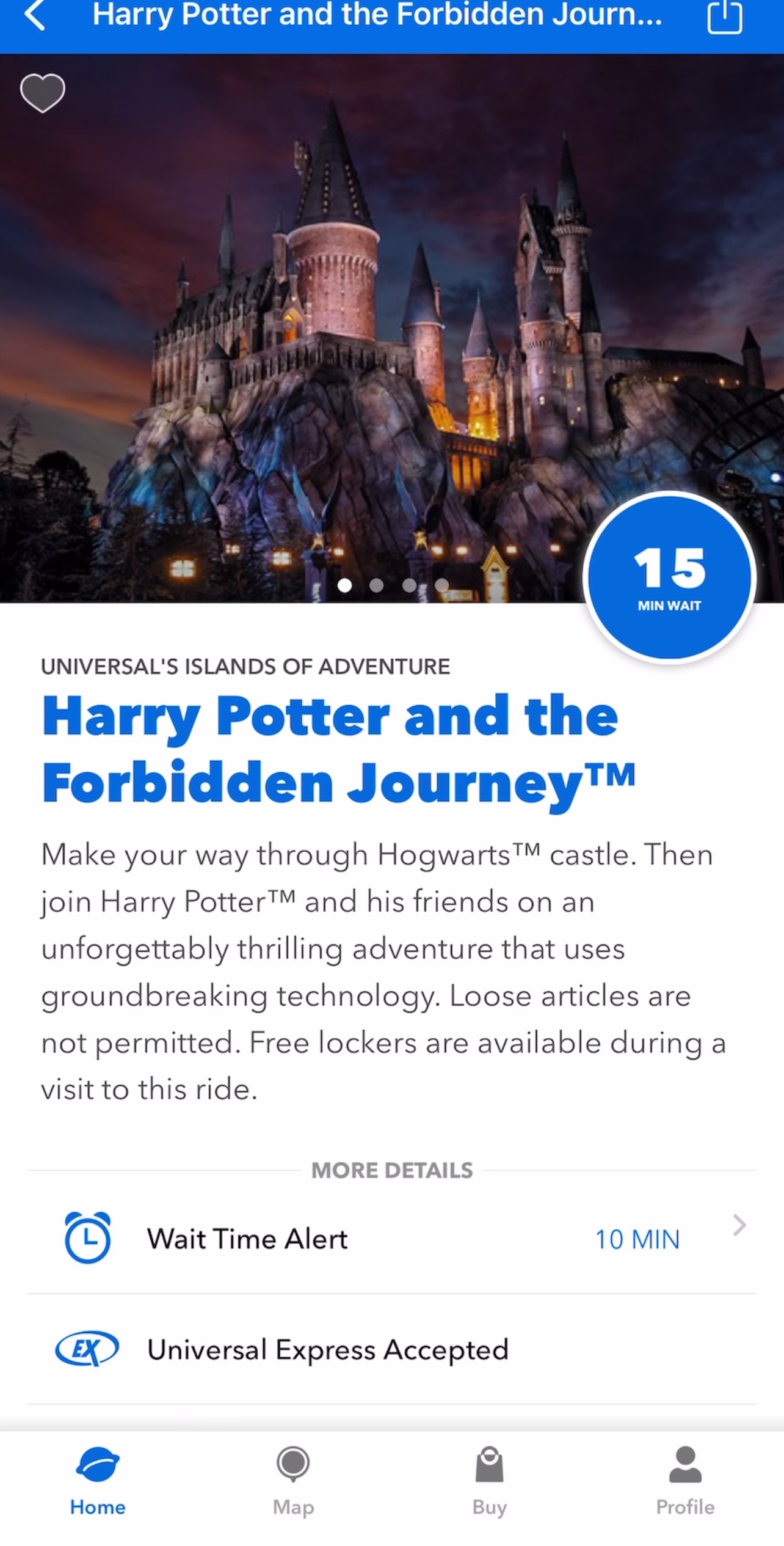
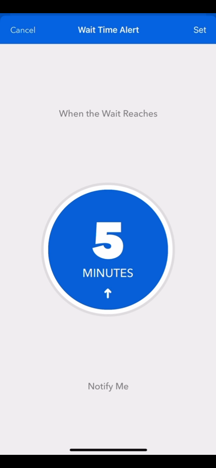
When a user taps into an event, they are taken to the detail page (Figure 6), where they can scroll through information about the event. As mentioned above, the red heart on the top left affords liking. If the user taps the “Wait Time Alert” button, they will be taken to a time alert setting page (Figure 7). On this page, they can adjust the wait time by swiping vertically within the circle. However, there are no text signifiers to indicate that this is the case. The small “up arrow” within the circle serves as the only signifier, which may not be noticeable to some users. The good news is that when the user swipes up, they receive instant feedback as the circle turns to the next page and displays a different time. This creates a logical constraint where swiping up adds time and swiping down subtracts time.
View Attractions on the Map
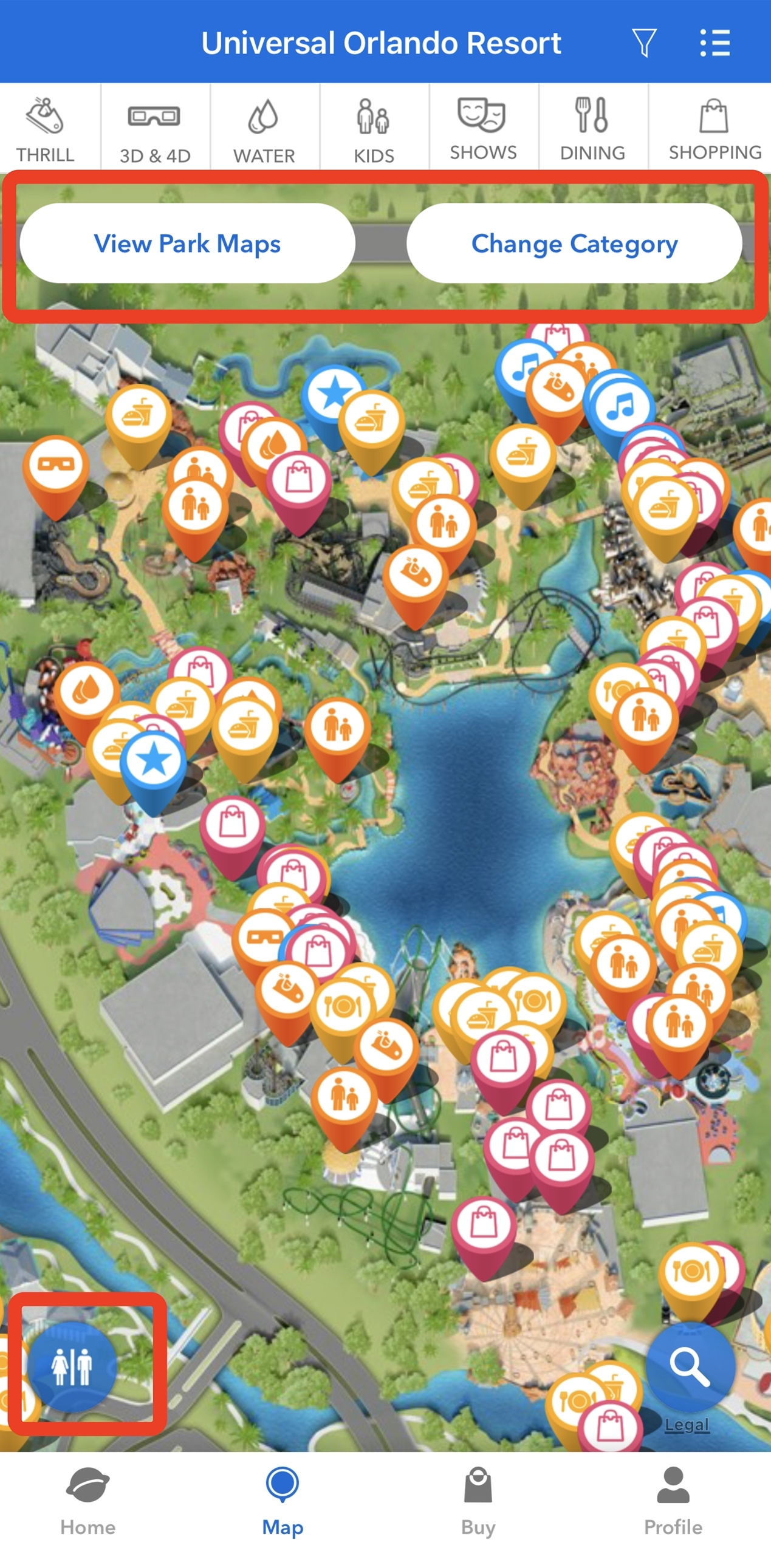
In Figure 8, the navigation bar’s “Map” button takes users to the 3D map. The button “View Park Maps” is a signifier that displays different park maps, and “Change Category” affords choosing attractions. A fixed small blue round button on the bottom left of the map shows good discoverability. Also, it acts as a great example of employing cultural constraint that it’s easily recognizable as a signifier of a restroom. The designer emphasizes with users, considers their needs, and helps bridge the gulf of execution and evaluation.
Conclusion
In conclusion, the Universal Orlando Resort mobile app offers a range of features to enhance the visitor experience. From navigating the homepage to checking wait times, viewing attractions on the map, and more, the app provides users with the information they need to have a smooth and effortless experience at the resort. While some areas of the app could benefit from improvements in discoverability and understandability, such as making the labels on the event listing page more recognizable as tappable elements, overall, the app is an indispensable tool for any visit to the resort.