VSCO is a photography mobile app, which offers in-app editing, image sharing, and community in one fully-functioning ecosystem. It allows users to capture photos and videos in the app and edit them, using preset filters and editing tools. VSCO is a place to find and share inspiration.
Editing a photo
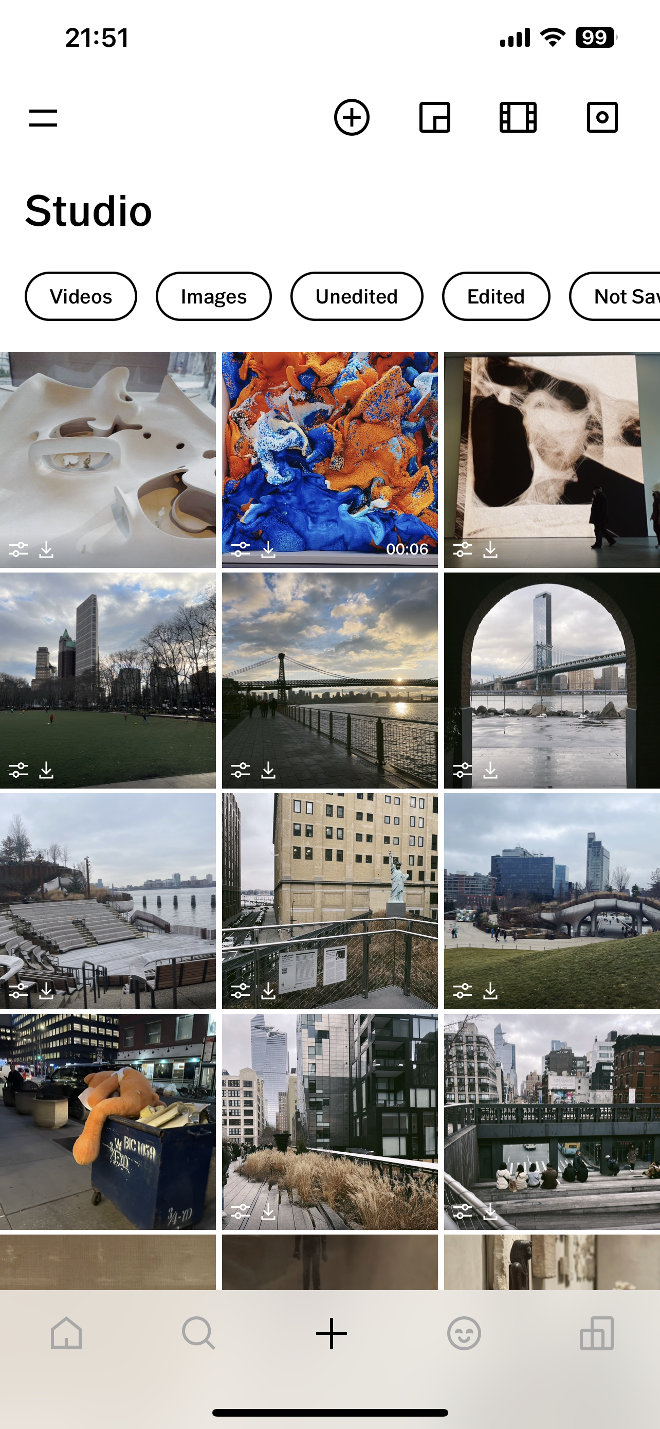

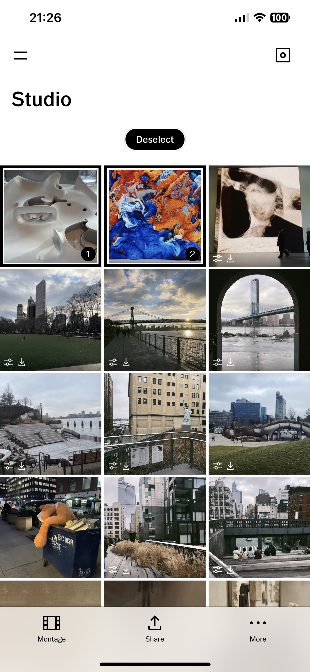
The main page has several key signifiers, giving the user easy clues to follow on how to proceed successfully to any task (Figure 1). The use of signifiers is effective, which ensures discoverability. Category buttons such as “Videos” “Images” with stroke and no filling provide visible affordance and strong clues to the operation of tapping to choose, which makes them good signifiers. The feedback mechanism of the bottom navigation bar tells the users what part of the application they’re exploring, by filling black into the corresponding icon.
The icons can well communicate where and what operation (tapping) should take place. However, they are not good signifiers, because they lack communication of the purpose and structure. VSCO has created a whole set of their unique icons, but users are unfamiliar with their meaning (Figure 2). These icons are not inconsistent with users’ Knowledge in the head and conceptual models.
My recommended solutions would be design its own icons more consistent with other systems, for example, make the camera icon more camera-liked; change the profile icon(the smile face at the bottom navi bar) more like a user. More effort is required to reach a balance though. Another way is to add text under icons.
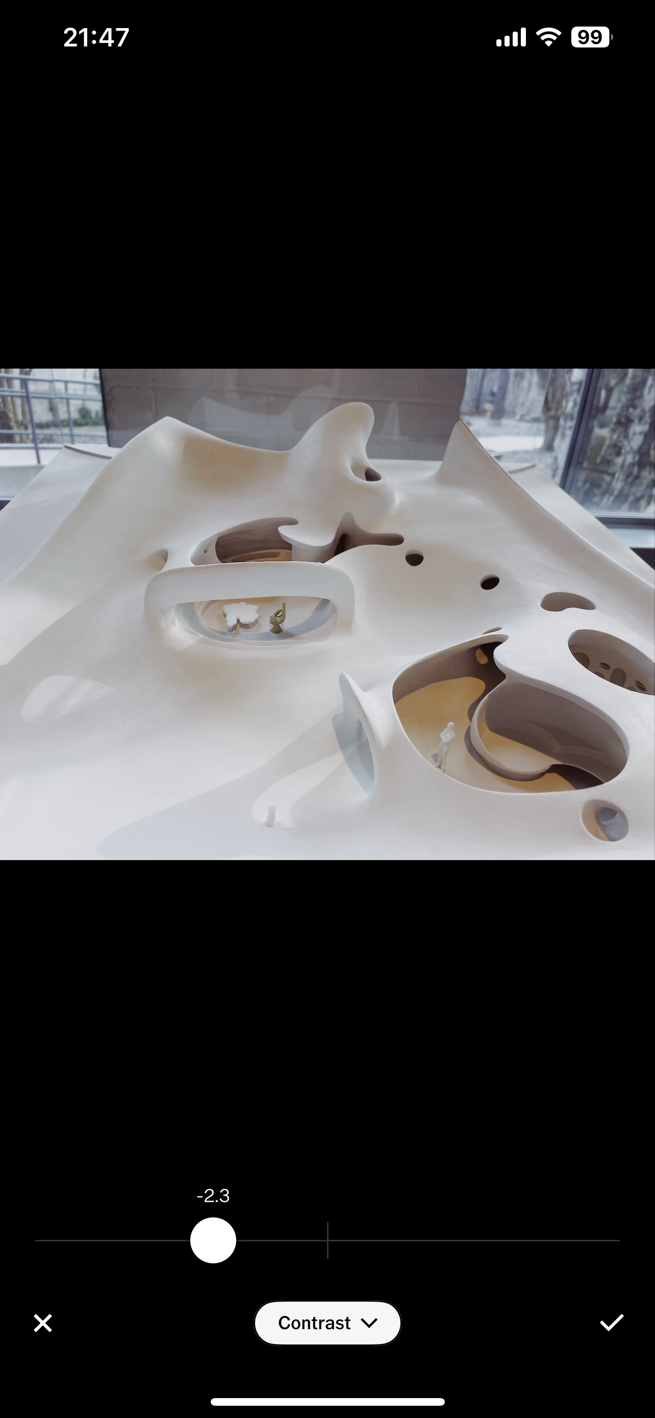
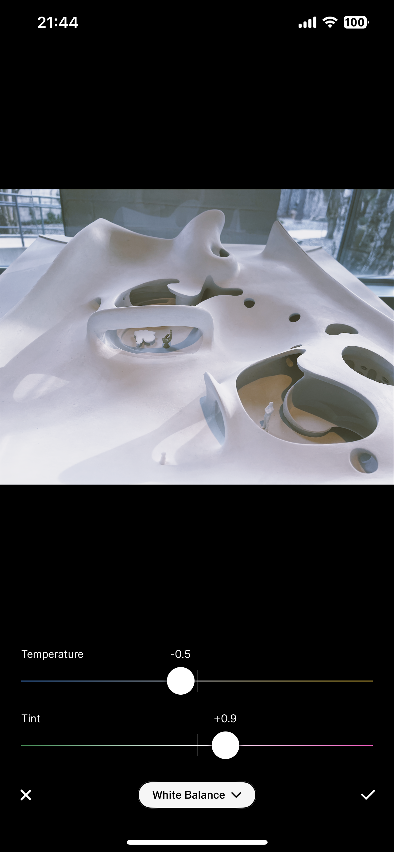
The adjust bar&slider is a good natural mapping. It employs spatial cues and universal standard – moving the slider right signifies more, moving it left signifies less (Figure 3). For White Balance adjustment, colors are added indicating the Temperature and Tint (figure 4). The relationship between the slider controls and the photo effect is obvious and real-time. The load on human memory is much reduced.
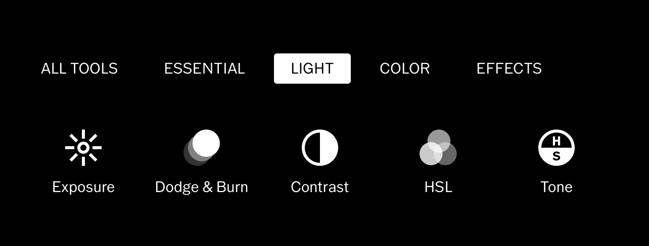
Another good natural mappings are Groupings and proximity following from Gestalt psychology , that are used to map controls to function (tools “LIGHT” “COLOR” “EFFECTS”). Related controls are grouped together.
Deleting Photos
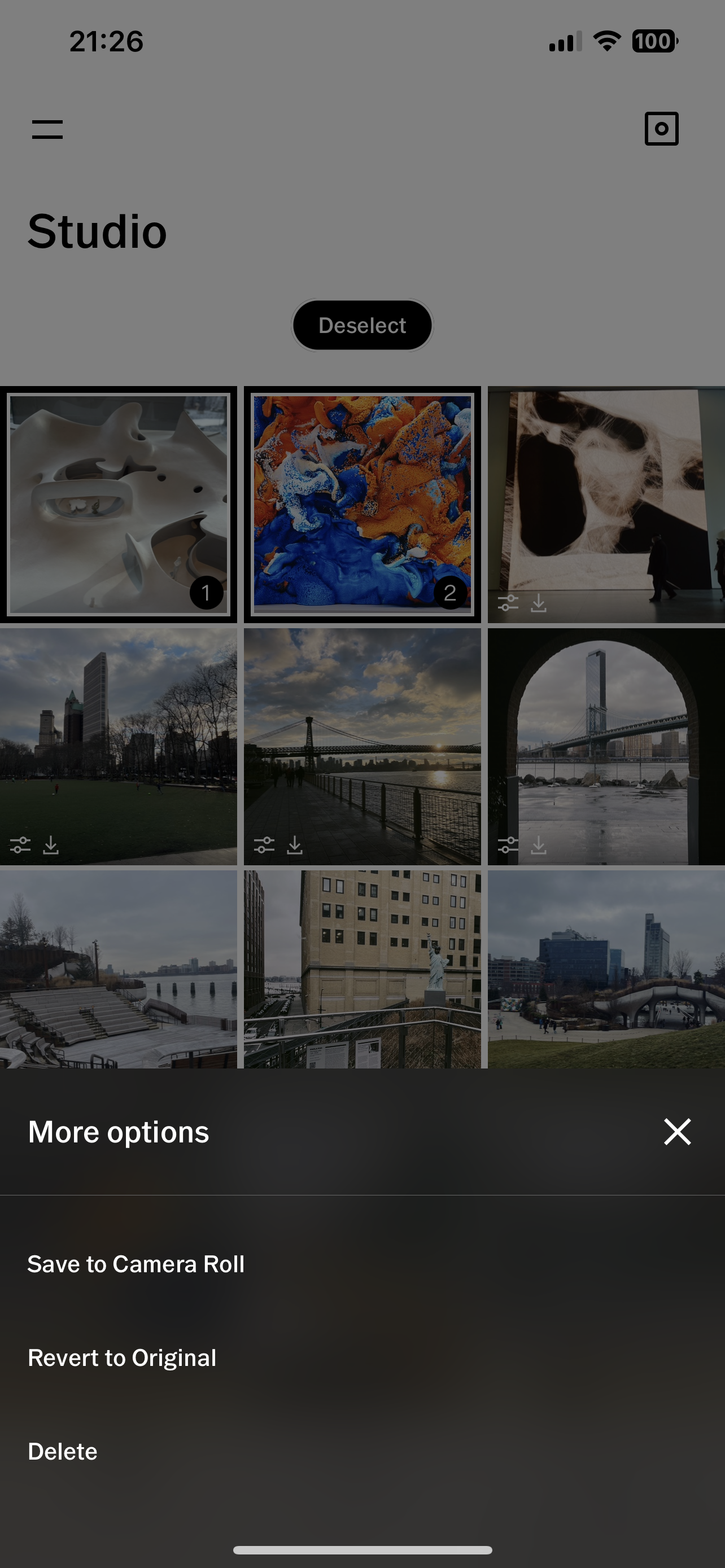
When a user (especially who used to long press to select pictures and tend to perform these task automatically, under subconscious control) tries to delete some images, a Gulf of Execution arises and the user makes an Action Slip. Then the Gulf of Evaluation is easily bridged, because when long pressing, the picture is zoomed in, which helps the user to rule out a wrong action. Then the user will find the only thing they can do is to tap, then look for “delete” from “more”.
In this process, instead of acting subconsciously to get expected result, people have to engage in conscious, reflective problem solving – from a behavioral level to a reflective level. The interactive feedback of choosing and deleting give users visceral pleasure. However, too much frustration, especially toward the ending stage of use, and users’ reflections about the experience might overlook the positive visceral qualities.
Taking a short video
Users come across the concept of natural mapping when recording the video. The natural mapping also provides logical constraints. When the progress bar comes to the end, it means that the maximum recording time has been reached.
React to the community
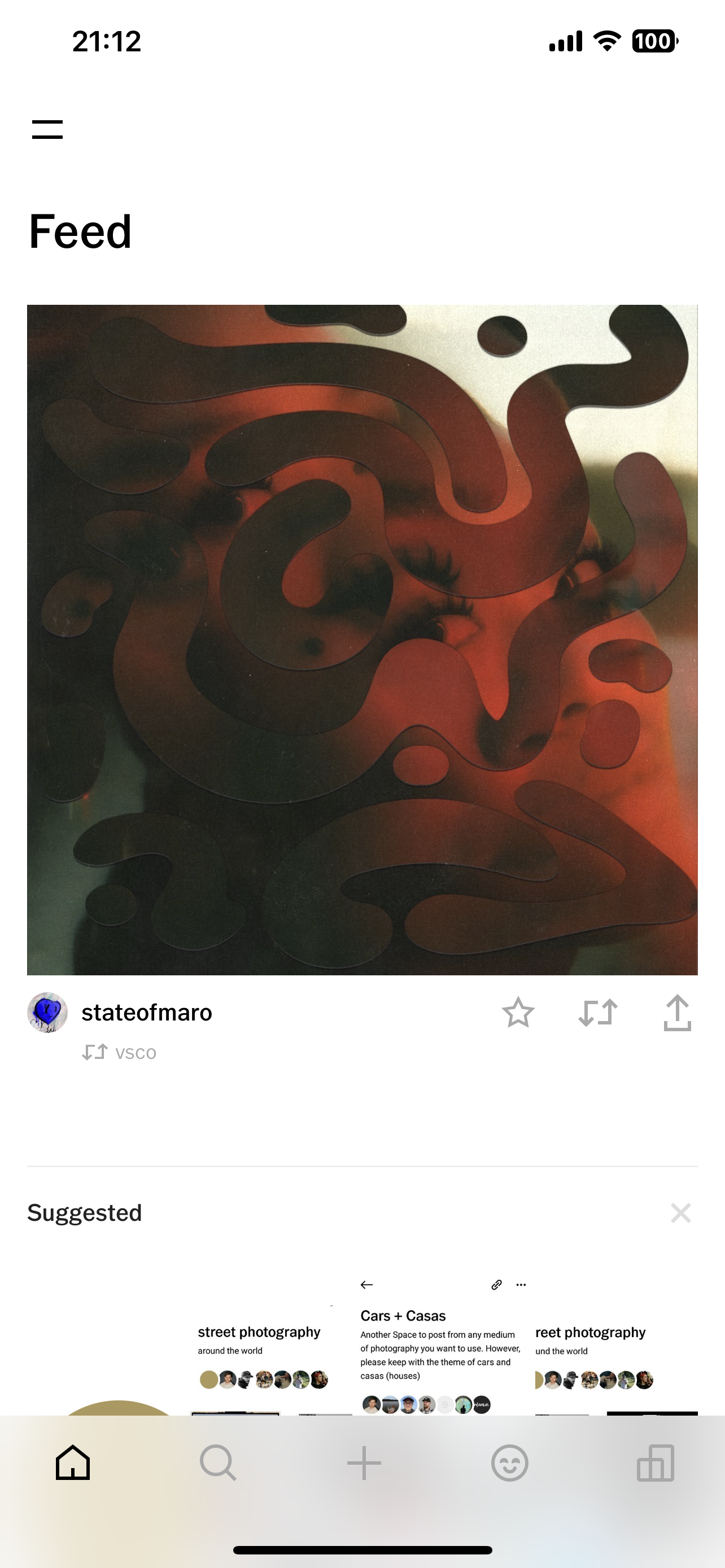
Tapping the house icon on the navi bar, users will land on “Feed” page (Figure 9). It is to “Discover original content from the VSCO community.” but it would cause confusion when users see the “Feed” and the content for the first time. This results in a detach between the conceptual model and the system image.
My recommendation to improve that is to add some subtitle or introduction under the header or add a beginner’s guide when users first land on this page.
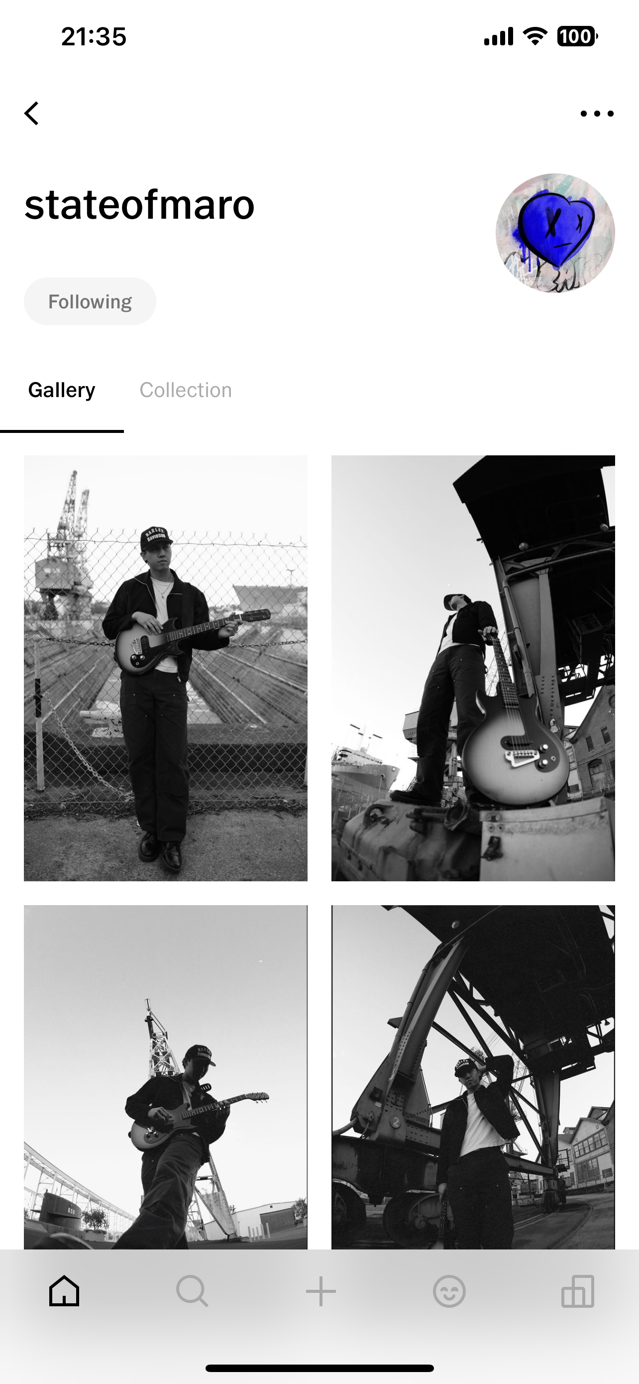
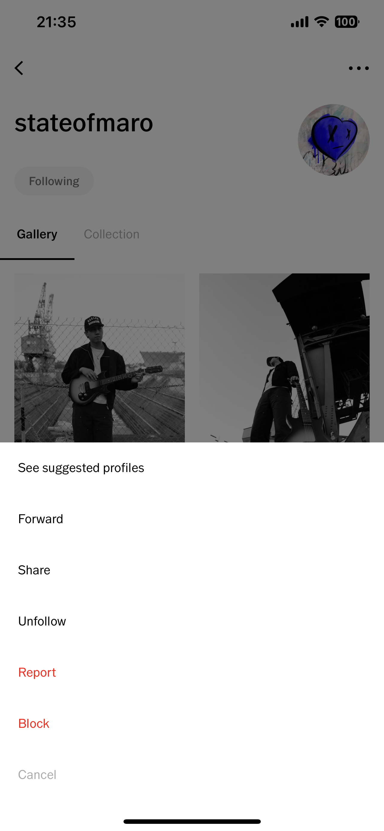
After following someone, users can not tap the greyed “following” again to unfollow them, which is contrary to their cognitive models. Instead, they have to click ellipsis to find the unfollow option. This shortcut for unfollow should be adopted.
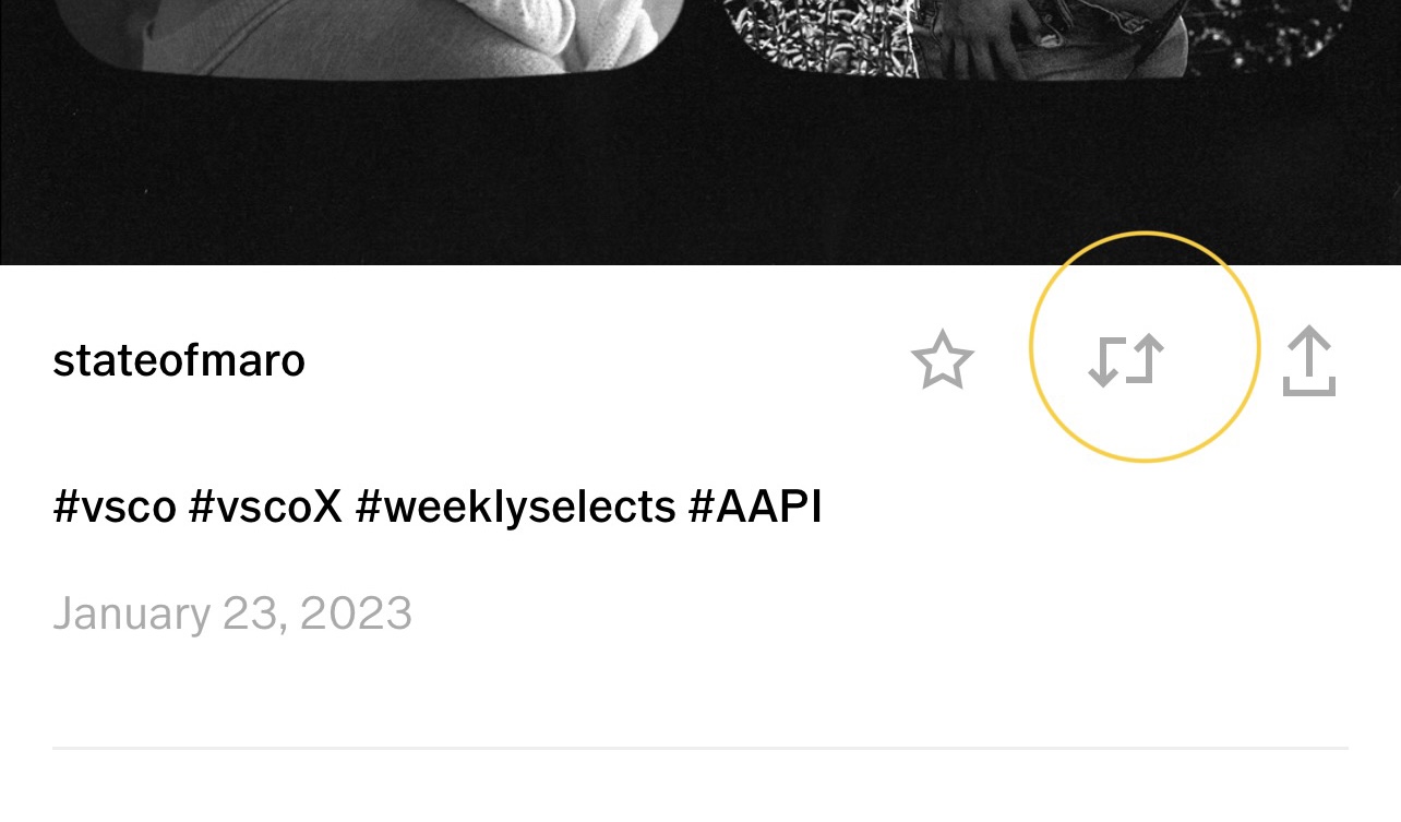
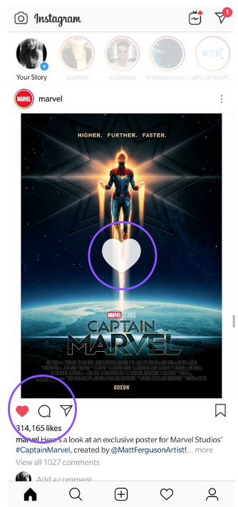
Among the three icons below a posted photo, the middle one doesn’t convey any information. There are interactions after tapping – the stroke turns black and a larger version of this logo flashes in the middle of the photo. Although it is nonsense itself.
This can be solved by removing this icon, or replace it with comment function & icon since VSCO has the intention to form a more active community.
Conclusion
VSCO is a powerful photo and video editing app, as well as a space for creators sharing and discovering their work. It has a lot of unique features, but going too far emphasizing originality may hurt usability to some extent. However, “Standards simplify life for everyone. At the same time, they tend to hinder future development.” I appreciate what have been created by VSCO and hope it would achieve further on usability.