Ask any well dressed person walking the Manhattan streets- they probably got part their ensemble from Zara. Zara is a e-commerce website that sells clothing, accessories, shoes, beauty products and perfumes.
This article attempts to critique the websites design decision using Don Norman’s book- “The Design of Everyday Things” and the 10 Usability Heuristics coined by Jacob Nielsen.
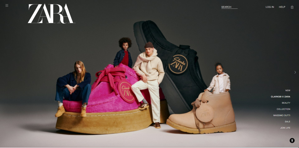
1. Navigating the Home Page
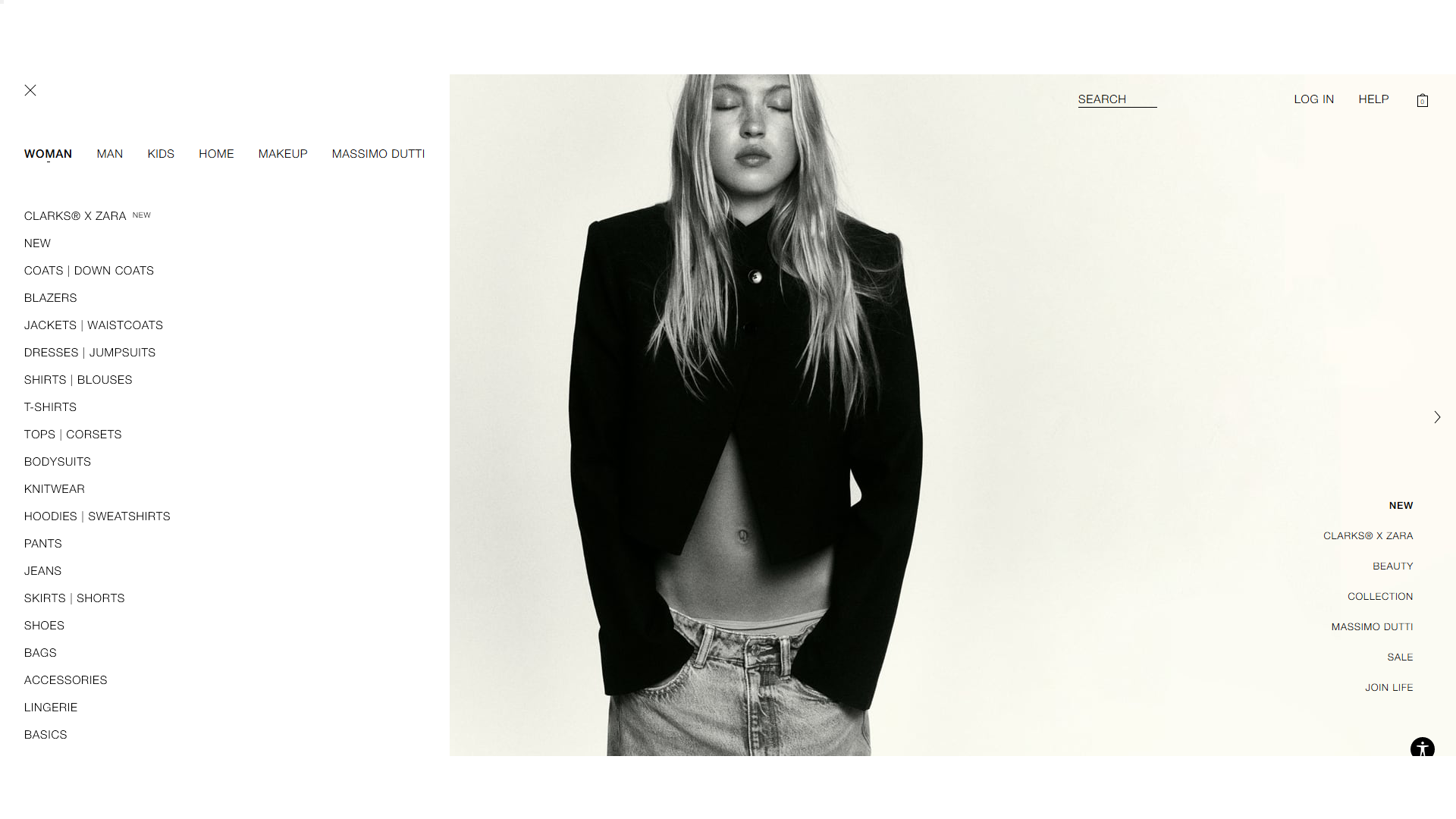
The crux of Zara’s user experience issues stems from failing the first of Nielsen’s usability heuristics: visibility of system status. For example, the hamburger menu in the upper left corner is a good indicator that I can navigate through different sections of the website. Clicking the hamburger menu gives the user a full list of navigation options. The problem lies in the affordability of the links in the navigation menu- while most links’ vocabulary are umbrella terms (“Women”, “Men”) and then get more specific (knitwear, tops, and corsets) pairing specific terms together like (“jackets|waistcoats”) might confuse the user to where they end up when they get to the next page. It would be better to go broad, then narrow down the clothing terms then have them select from a drop down menu for specific items if the user wants to shop for jackets ultimately, they would get taken to a page displaying jackets.
Additionally, unfamiliar jargon in links named “ClarksxZara”, and “Massimo Dutti” are links are unfamiliar both to novice users and experts alike, and although the user can infer these are clothing collections, there’s no specific feedback as to where the link’s status.
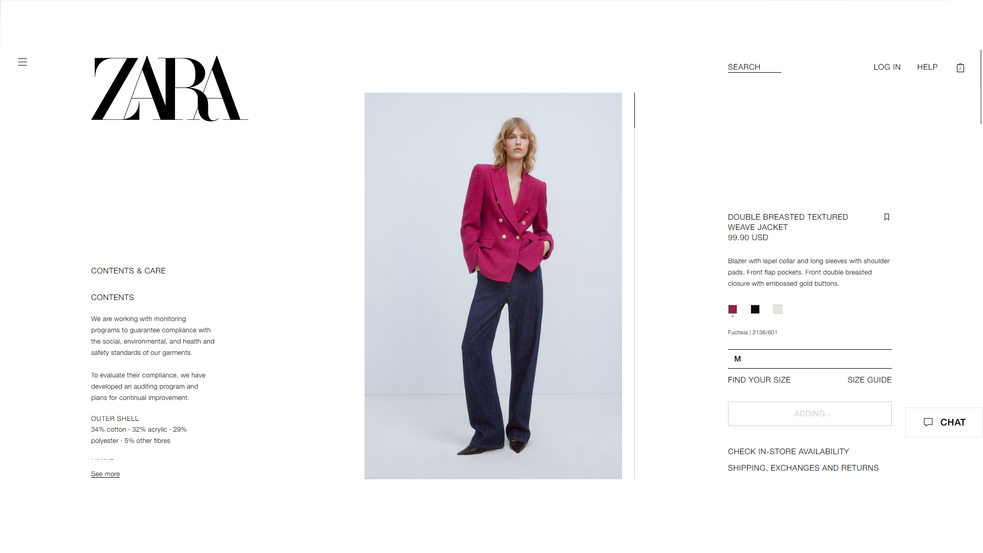
2. Shopping For A Pink Blazer
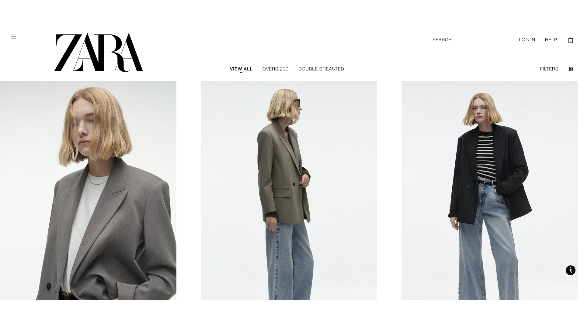
I tasked myself to shop for a pink blazer. That would mean I would have to utilize either the search bar and/or icon filters. I looked for any iconography that would signify that I could do either action- but there were none.
This is because Zara uses minimalist design, to the point where it eliminates traditional iconography that the user would viscerally look for. Nielsen’s eighth heuristic states that “Interfaces should not contain information that is irrelevant or rarely needed”. By marking important indicators such as the magnifying glass and the funnel as irrelevant, the design decision critically lowers discoverability– where the user could easily miss out on doing the most basic actions.
Ironically, there is still some visibility of status despite no discoverability of basic actions or iconography. For example, clicking the “filters” text gives the user instant feedback with a slide-out menu where you can apply more specific colors, sizes, etc. The user can see a loading circle, and “clicked” filters go bold- all great ways to show visibility of system status.
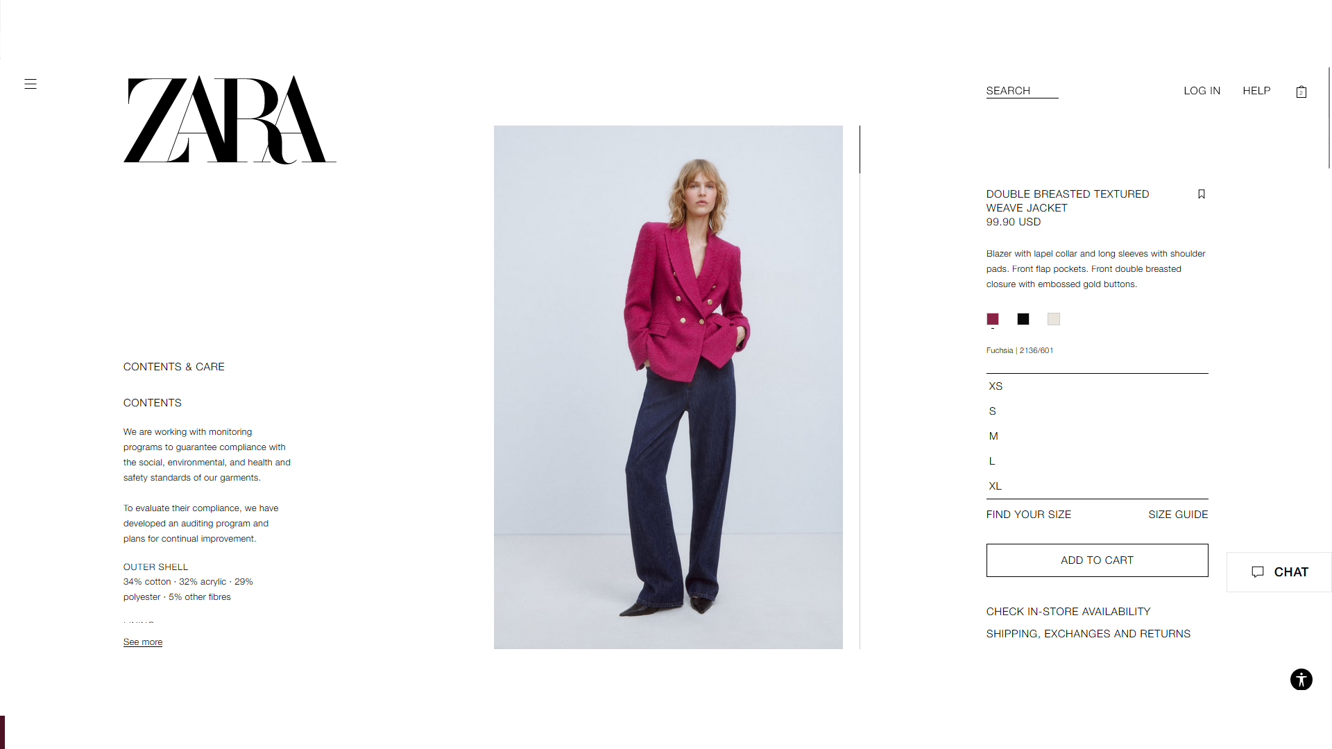
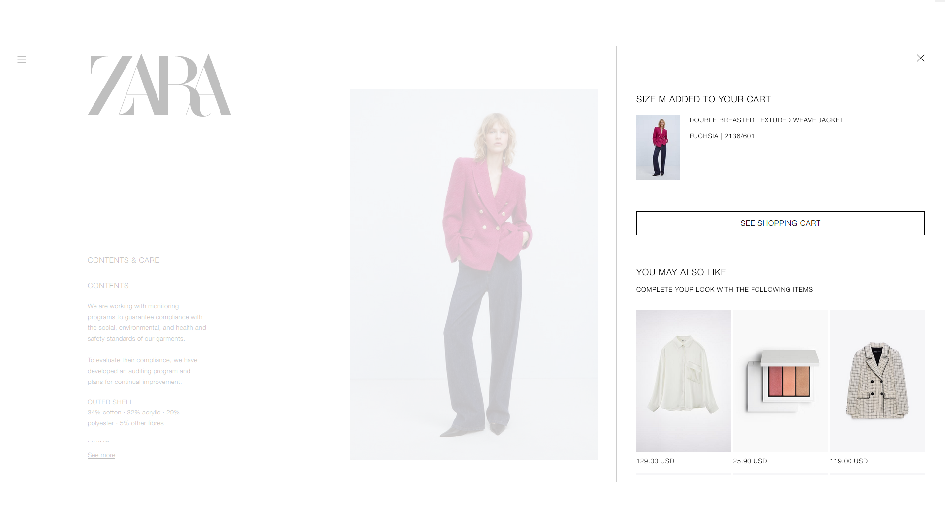
Because I was choosing between multiple pink blazers, it would have been a better design to implement Nielsen’s sixth heuristic of recognition vs recall so Zara keeps track of my shopping history.
For example, If I decided to go with another piece of clothing, I would have to recall what I previously looked for, rather than the website providing my shopping history for me so I can recognize it.
Zara displays no record of your shopping history- a recommendation would be to have your history towards the end of a webpage, keeping it in your cart. Keeping the shopping history proximity minimizes my cognitive load from one part of the interface to another.
3. Item Checkout
The last logical step would be checking out my items, of course. Moving from the cart to the checkout screen was difficult, mainly because of Nielsen’s third and eighth heuristics of user control and freedom and error prevention.
To summarize both heuristics, provide users with a confirmation option before they commit to the action, or give them an emergency exit without making them jump through hoops.
Zara seems to “finalize” items in the cart and not in checkout leaving little room for mistakes and errors. For example, if I slipped and clicked large instead of small, once I added that item to the cart there was no way of getting that item back to size small unless I took the item out, changed the size, and then put it back in the cart. Once I added that item to the cart, there was no way of getting that item back to size small unless I took the item out of the cart, changed the size, and then put it back.
A shortcut to this long-winded path would be to either give the user the option to change the details of the item while they are still in the cart or before moving to check out, or having a modal display all the items current status and have a confirmation button at the bottom of the modal.