8-minute read
Executive Summary
Our team conducted a thorough usability evaluation of the search experience on Medscape.com, with an emphasis on improving user interactions and optimizing the search results page. We selected and evaluated 10 participants using surveys to gain valuable insight into their search experiences. This evaluation’s deliverables include comprehensive usability test results and supporting mockups for recommended improvements. Based on our analysis, we have developed three critical recommendations that, if implemented, will significantly improve the search experience for medical professionals on Medscape.com.

Medscape.com
Mescape.com is an innovative hub for healthcare professionals to access and disseminate medical information. The platform lets doctors stay updated on the latest medical news and practices. The goal is to accelerate the transformation of medical practice by providing timely access to critical information. Mescape.com is a one-stop destination for healthcare professionals to access the latest research, studies, and guidelines. With a vision to promote efficiency, connectivity, and accurate information sharing in the medical community, their website provides an unparalleled user experience that helps clinicians stay abreast of the latest diagnostic and therapeutic tools. As a physician-centric organization, its critical mission is to eliminate ambiguity in the health crisis by providing the highly specialized information that healthcare professionals require at every crucial moment. Through its advanced technology and intuitive design, Mescape.com is helping to bridge the gap between theory and practice and is positioning itself as the future of medical education.
“They…are prominent and well known, but I can think they’ve got some cool features and functions.”
Methodology
Date: March – April 2023
Method: Remote Moderated Testing, Zoom
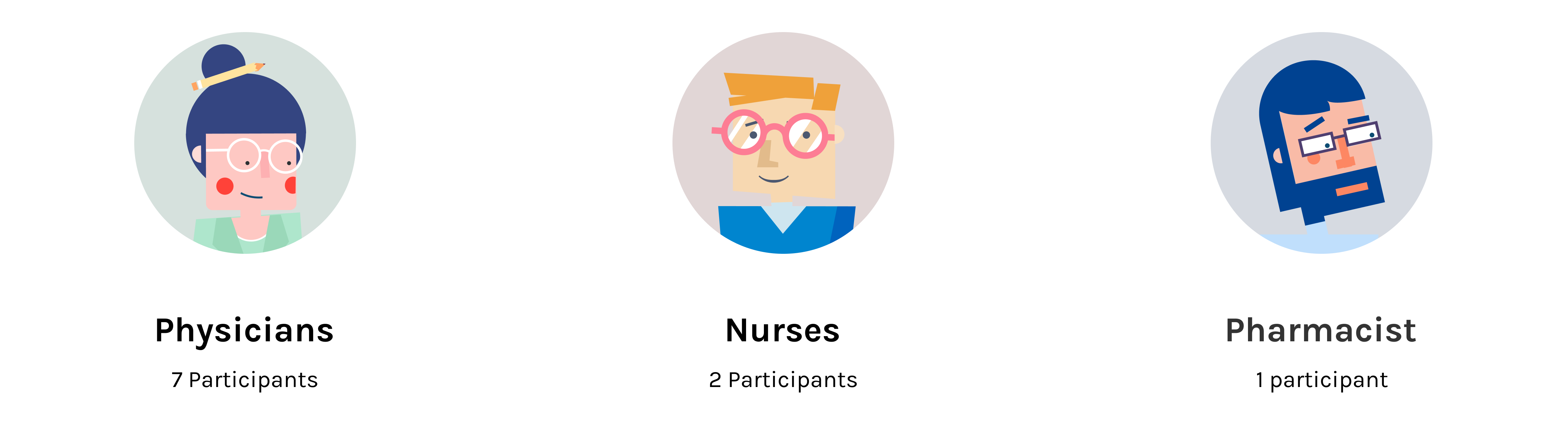
Participants: 10
Areas of Consideration: Search Functionality, Global and Local Search
Goals: Check the Usability of the Areas listed Above
Participants
Tasks
As part of the usability analysis, we developed three unique tasks tailored to the specific scenarios of interest. Each task was designed to evaluate the user’s performance and identify potential areas of improvement. We also incorporated a post-test survey to gather participant feedback on their experience, adding insight to our findings. To ensure that our data was comprehensive, we divided our test group between mobile and desktop devices, with five participants on each. By testing participants on one device only, we eliminated any potential overlap, and that would allow participants to know the location to complete the task from the previous device. The result was a successful and informative evaluation that provided valuable insights into user behavior on different platforms.
Task One
You have a patient with a complex drug regimen and want to review potential drug interactions to ensure their safety. Search for potential interactions between “Warfarin” and “Aspirin.”
Task Two
You are attending a medical conference next week and want to prepare by reviewing the latest news or research on a specific topic. Find recent articles or studies on “Immunotherapy in Cancer Treatment.”
Task Three
You are interested in finding a relevant CME (Continuing Medical Education) activity for gaining credits. You need to ensure that you are up to date with the most recent information in your field in the form of classes, articles, and other helpful content. Find a related CME activity that would help you meet the yearly credit requirements.
Data Collection Addition
87% of the participants had Medscape accounts. Expanding the scope of usability evaluation to include unauthenticated users can prove to be highly beneficial for enhancing the overall user experience of Medscape.com. While authenticated users are familiar with the site’s interface and are more likely to navigate it easily, unauthenticated users can offer fresh insights into its usability from the standpoint of a first-time visitor. With a new perspective, these users can identify potential pain points that may have gone unnoticed by those already familiar with the site. This way, Medscape can further identify areas that need improvement and create a more fluid and efficient user journey.
Findings
Through a comprehensive user testing analysis, the team identified three critical areas of improvement on the Medscape website. Our research determined that the global search bar, while easily recognizable, left some users wanting a more comprehensive search function to aid them in their search process. Additionally, participants commented on the formatting of the Search Results Page, suggesting a desire for a more intuitive filter function and streamlined design to enhance user experience. Finally, while users were happy with the drug interaction checker and its results, some frustration was expressed with the search inputs on the page. These findings guided our efforts to enhance the functionality of the Medscape website, making it even more user-friendly and efficient.
Recommendation 1: Increase the Search Bar’s prominence with filter integration
“The difficulty was finding the exact thing I was looking for, and maybe I didn’t look it the right way but I went through a pretty systematic process.”
Our usability evaluation revealed that while participants could quickly locate Medscape’s global search bar, they desired a more powerful search experience right from the get-go. Users craved the ability to narrow their search with precision from the onset rather than applying filters only after seeing initial results. By incorporating advanced search features and filters directly into the search bar, Medscape can cater to these savvy users’ preferences and streamline their search journey for a more efficient and satisfying experience.
The filters’ default setting uses the current search result page as a reference. “Any” is the default state for date, specialty, and content types.
The specialty section is organized alphabetically.
For content types, the most popular ones are shown upfront.
Recommendation 2: Streamline the Search Results page filter options
“The search Bar is pretty easy to find, [but] looking at some of these articles…I have to sift through these articles to get the information I want.”
Our analysis unveiled a strong desire for an enhanced, intuitive search results page among Medscape users. Participants sought a more streamlined design with improved filtering functionality for a seamless information retrieval experience. To address this, we suggest eliminating redundant headings and integrating them into the filter options, reducing clutter. Furthermore, we propose repositioning filters to be more prominent, employing drop-down menus to showcase all available options. This redesign will empower users to refine their search with ease and precision efficiently.
After inputting the search word and clicking the search button, the search bar will be cleared so that users can more conveniently search for other topics.
The search result is directly displayed and shows how many results there are for the search keyword.
The selected filter is consistent in color (the brand blue), and users can easily clear it.
Recommendation 3: Include intuitive language and signals on the Drug Interaction Checker.
“To me it would make a lot more sense to have it…right here where I can just literally click…interaction checker, and then type in the medicine.”
Our participants, though generally satisfied with Medscape’s drug interaction checker, identified room for improvement in the search input process. To elevate user experience, we propose introducing a plus sign that, when clicked, adds a drug to the list and clears the input box for easy entry of additional drugs. By moving the explanatory text inside the input box, we maintain a clean and minimalistic design while enhancing the interaction checker’s intuitiveness. This refined approach balances aesthetics with user-friendliness, ensuring a seamless search experience for healthcare professionals.
To minimize the modifications, placeholders are used instead of the original occupancy of the previous drug. The input will be cleared after being added.
Conclusion
By embracing our recommendations, Medscape.com can strengthen its position as a leading medical information hub. These enhancements go beyond aesthetics—they’re designed to elevate user experience and ensure healthcare professionals access the most up-to-date, accurate information. By incorporating these changes, we anticipate Medscape will not only flourish but also magnetize an ever-growing audience. Ultimately, we are confident these modifications will boost Medscape’s reputation as the premier destination for medical professionals and healthcare enthusiasts alike.