About the Project
Smithsonian Institute Traveling Exhibition Services (SITES) is a division of the Smithsonian Institution that creates and manages exhibitions that travel to museums and cultural institutions across the United States and around the world. For over 70 years, SITES has created exhibitions that bring knowledge, discovery, and experiences to people across America and beyond. Their exhibits cover a wide range of topics, from art and culture to science and history. Their goal is to bring the Smithsonian experience to communities around the globe and make the Institution’s vast collections and research accessible to all.
The primary goal of our user experience (UX) research is to help SITES improve their website and the experience for their target audience. We conducted several rounds of moderated user testing to identify areas of improvement in the current website and provide actionable recommendations for enhancing the UX. By making the website more intuitive and accessible, we aim to help SITES achieve their mission of bringing the Smithsonian experience to communities around the world.
My Role
There were 4 of us on the team. I was primarily responsible for or involved in brainstorming ideas for the user testing scenario, conducting the actual user tests, analyzing the data we collected, and ultimately coming up with one recommendation to improve the website. I also had a hand in designing the final report and presenting our findings to the client.
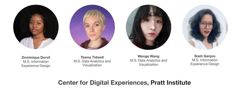
Team Members
Discipline
UX/UI design, User Research, Usability Testing
Design Tools
Figma, Notion, Google Sheet, Google Slides & Google Form
Challenge
During our first meeting, Carol Bossert, the Program Manager at SITES, outlined her research requirements:
- The client’s goal is to generate excitement about the exhibition and encourage people to opt-in to receive email blasts.
- The ultimate aim is to get people to book the show for the exhibition.
- To share or recommend more exhibitions, a login is required.
- Booking is only possible through a call for exhibition, but the museum industry is short-staffed, so the client wants to limit the number of calls.
Process
To approach the Usability study of the website the following steps were taken:
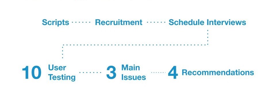
Moderated User Interview
Evaluation Method
We conducted a hybrid Moderated User Interview process, which involved 10 interviews scheduled based on the availability of the interviewees. Some interviews were conducted online, while others were in person. A moderator facilitated the user through tasks while they interacted with the website, encouraging them to give live feedback. This method helped us gain a broader understanding of the user’s thought process, which informed our recommendations for improving the website’s user experience.
User Persona
To achieve our research goals of making knowledge accessible across the country, improving the user experience for visitors, and increasing engagement, we selected interviewees who had previous working experience in museums and knowledge of traveling exhibits. We also looked for individuals who had some familiarity with SITES or were willing to learn more about it. To ensure consistency, we focused on desktop users.
Recruitment
We recruited a total of 10 participants for the research. To do this, we reached out to potential participants through email, and also with the help of our clients. However, I learned that it’s important to prepare for more than the required number of participants, as some scheduled user tests didn’t materialize. For my part, I scheduled 4 tests but only completed 2 due to no-shows.
User Tasks
In this part, I was responsible for writing the scenario. To prepare for writing the scenario, I first reviewed all the information gathered from the client about their needs and goals for the research. Then, I brainstormed different scenarios. I considered the needs of the user persona and tried to create a realistic and engaging scenario that would make the user feel comfortable and motivated to complete the tasks. Finally, during our team meetings, we reviewed and revised the tasks and scenario together. We discussed what worked and what didn’t, and also refined the language and structure of the scenario to ensure it was clear and easy to understand for the user. This is the final version:
You’re a museum curator who wants to bring a new exhibition to your venue. You heard about SITES and think it could be a good option for your museum. You’re at the very beginning stage of your research, so you’re looking for something that would interest your patrons while keeping the practical aspects of your space and budget in mind. You aren’t set on a date yet either.
Task 1
Explore the site homepage without clicking anything. Think aloud about what you are seeing. What information are you looking for while you’re exploring?
Task 2
Explore exhibits and decide to pick one exhibit that interests you. What interests you on the exhibit page? What kind of information would you need to bring this to your museum?
Task 3
You decide to explore the schedule of the exhibit further. Did you find all the information you needed to make the decision on the exhibit?
Task 4
Use these login credentials to check out the logged in experience. What do you notice?
RIC Score
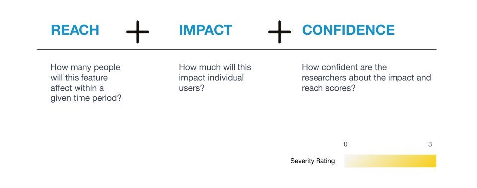
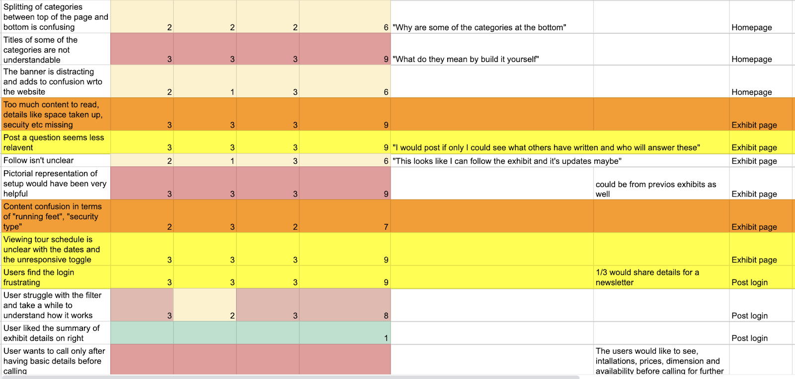
To prioritize user issues during our research, we used a method called RIC score. This helped us determine the severity of the issues identified during user testing, so we could focus on the most important ones first. I created an Google Sheet for everyone to document their discovered user issues, and calculated the RIC score. It was a useful tool for helping us improve efficiency to improve the overall user experience.
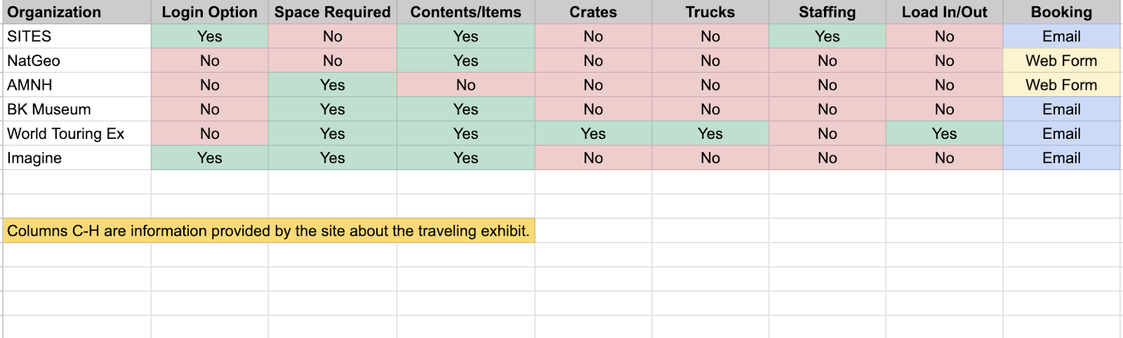
Competitive Analysis
We also included a competitive analysis to verify our findings and ensure that our recommendations were in line with industry best practices. We looked at other museums and programs to gain a better understanding of how they approach user experience and what features and functionalities they offer.
Findings & Recommendations
We identified three main issues and proposed four recommendations based on our research. When presenting our finding to our clients, we also included quotes from the interviewees to enhance credibility. We divided recommendation work for each team member. I revised the layout and content, Sneh removed the login, Dominique removed the call-to-action (CTA) buttons, and Tawny fixed the tour schedule issues.
Finding #1: Logging in is a high-friction ask for users
- Creating an account is too much to ask
- There is no clear benefit to the process
- Users want the information up front
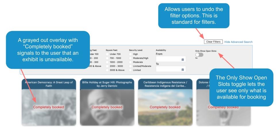
Finding #2: Navigating the site is difficult
- The content is not organized intuitively
- Filters are not usable without being logged in
- After log in, filters don’t always function
Finding #3: Certain content is hard to find
- The tour schedule requires 3 clicks to view
- Exhibit categories are unclear
- Content could be less complex overall
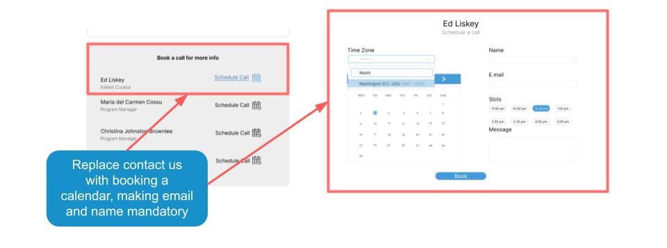
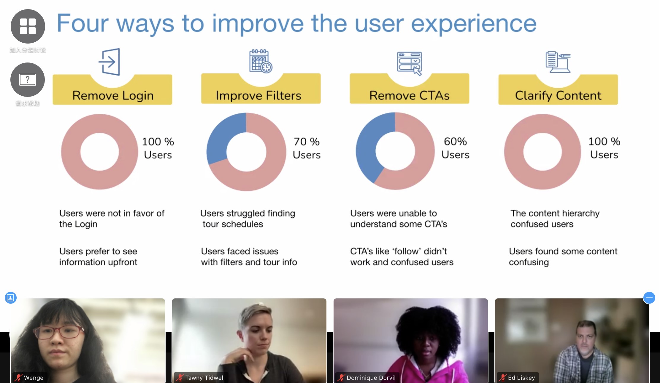
Recommendation#1: Remove Login
We decided to remove the login feature after considering user feedback. All of our interviews showed that users were not in favor of having to log in, and instead preferred to see information upfront without any barriers.
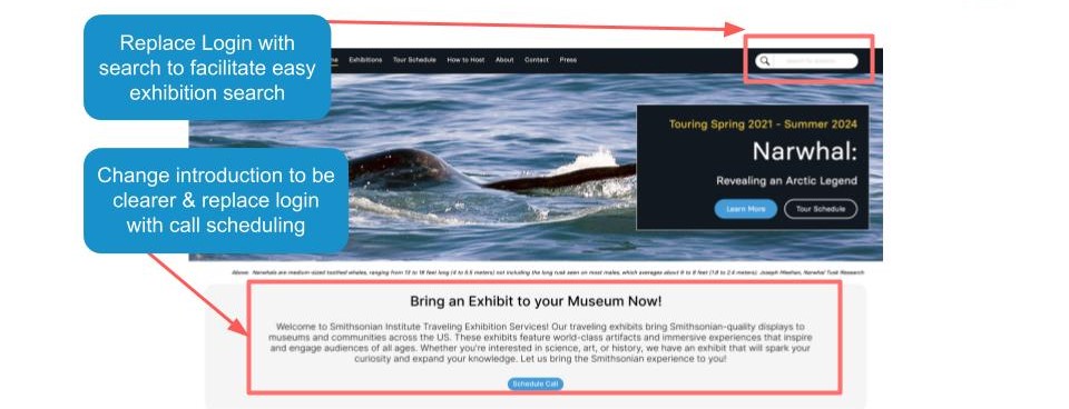
Instead, we decided to incorporate a booking calendar to ensure our clients can still gather users’ email and information for engagement purposes. A booking calendar can also enhance proficiency of the booking process.
Recommendation#2: Improve Filters
We decided to improve the filter functionality based on user feedback. During our research, we found that users struggled to find tour schedules and faced issues with filters and tour information. By improving the filter, we aimed to enhance the user experience and make it easier for visitors to find the information they need.
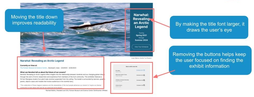
Recommendation#3: Clarify Content + Remove CTAs
We found that users were confused by the hierarchy of the content and the placement of certain CTA buttons like ‘follow’. Users were not sure what they were supposed to do with these buttons and it caused a lot of confusion. Therefore, we decided to refine the hierarchy of the content and remove these unnecessary CTA buttons to improve the user experience.
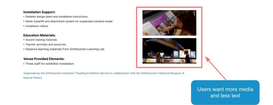
I was responsible for the navigation and the hierarchy of the content, and I chose to focus on the exhibit page to implement the recommendations. I improved the hierarchy by reorganizing the layout. I also removed the confusing CTAs which were previously located at the bottom right on this page. Therefore, we kept the consistency of different recommendations. Based on the feedback from the interviewees, I also decided to add media to the text to increase engagement. They thought that the original page looked unprofessional due to its layout and hierarchy, so I made sure to address these issues. Ultimately, the changes we made resulted in a much-improved exhibit page that was more user-friendly and visually appealing.
Final Presentation
Once we identified all the issues and recommendations, we proceeded to create the presentation. We divided the work among team members, with each of us taking responsibility for several slides. we kept using the same color palette with the SITES. I also added some animation to make it more interactive, based on the feedback we got from the practice presentation in class.
During the final presentation with the client, everything went smoothly. Carol and her colleagues were impressed with our work and appreciated the effort we put into solving the problems. They agreed with our recommendations and were excited to have concrete evidence from our research that could help her team make the necessary changes. They also mentioned sharing our findings with other team members. It was a great feeling to see our hard work pay off and make a real impact.
However, based on the feedback from Carol, there are a few things we need to improve:
- We didn’t have clear before and after images of the website and our recommendations, which made it difficult for Carol to visualize the changes.
- Some of the jargons we used, such as ‘CTA’ and ‘filter,’ were hard to understand for Carol and her colleagues.
Takeaway
Working on this project was an amazing opportunity for me to learn and grow as a researcher. It was a challenging journey, but one that helped me gain a deeper understanding of user experience. During this project, I conducted interviews and completed a full UX research process. This allowed me to learn how to create effective user tasks and scenarios, use RIC scores to prioritize issues, and create actionable recommendations based on my research findings. Not only did I learn technical skills, but I also learned the importance of effective communication and collaboration with team members. It was a great experience to work with the wonderful team.
Presenting our work to the client was a great learning opportunity as well. I learned how to present my work in a clear, concise, and engaging manner. Additionally, I learned how to handle questions and feedback from clients, which is a crucial skill for any researcher.
The feedback we received from Carol’s team and also from the class was incredibly helpful. It gave me insight into areas where I need to improve, such as using simpler language when presenting technical jargon and use the proper color palette, which will definitely help to improve my future presentations. Overall, this project was a wonderful learning experience that helped me to grow both as a researcher and as a team member.