Overview:
Our team sought to improve the usability of Pratt Institute’s Health Services webpages to make it easier for undergraduate students to access counseling and other mental health resources. The case study was conducted by a team of UX designers and involved 10 moderated usability tests. These tests helped the team understand the kind of difficulties students faced in accessing mental health resources and what kind of mental wellness services students expect from Pratt.
Process:
Our research process involved much planning and organization, especially when deciding our project goals and scope. We decided that our representative users were Pratt Undergraduate students, as health and wellness resources are catered to undergraduate students as a resource. We also determined that since there was a larger student body of undergraduate students, they would be the representative users for our moderated user testing.
Our Research Plan:
- Define research objectives and goals.
- Develop research questions and hypotheses.
- Choose appropriate research methods and tools.
- Recruit participants and schedule research sessions.
- Conduct research sessions and gather data.
- Analyze data and identify patterns and insights.
- Communicate findings and recommendations to stakeholders.
Scenarios and Tasks
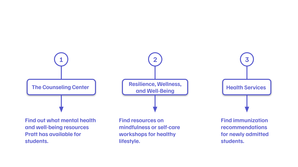
Our tasks were focused on improving the visibility of Pratt’s health and wellness resources. We provided our representative users with scenarios to provide them with context before we started tasks. Our tasks targeted three web pages, The Counseling Center, Resilience, Wellness, and Well-being, and the Health Services web page.
Concerns and Solutions:
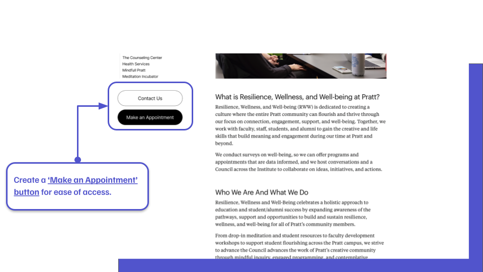
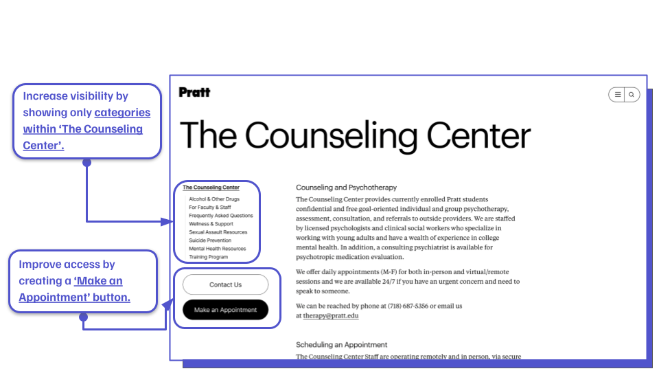
Concern 1: Create a “Make an Appointment” button for ease of access
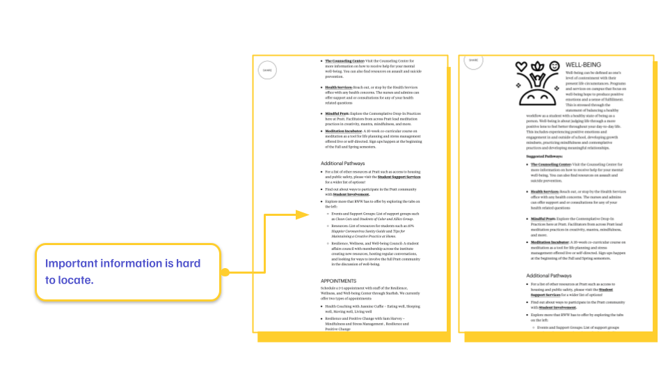
One of the main issues our team encountered during user testing is that our representative users (Pratt Institute Undergraduate Students) did not want to read through the web page to find contact information. Our team saw this as a pain point for accessing mental health resources, which are necessary resources that all students should have access to.
Our recommendation was to provide students with easy access to appointments with the counseling center, health services, and RWW workshops.
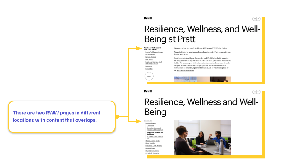
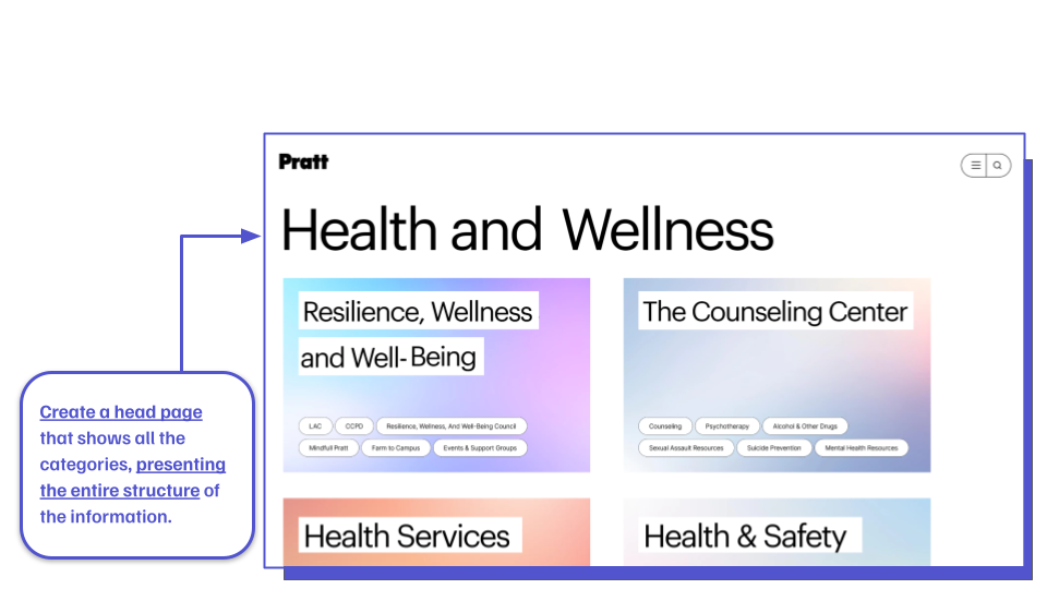
Concern 2: By putting the ‘Resilience,’ ‘Wellness,’ and ‘Well-Being’ categories on the parent page, unify the two pages.
Another key issue in identifying usability recommendations was the lack of hierarchy visually and regarding information architecture. Several pages with similar information on them were scattered across Pratt’s website. Our representative users had difficulty finding specific information because of this very reason. An example of this issue; there are two separate RWW webpages in two different locations on Pratt’s website, each with overlapping information and resources.
Our recommendation came easily regarding organizing information architecture. The solution is to combine all the information into one head page. The prototype below exemplifies how Pratt could organize information into one place. By adding “tags” (similar to the shape of other tabs on Pratt’s site), students will know exactly what content is within each box.
Comparative Analysis: Information Architecture
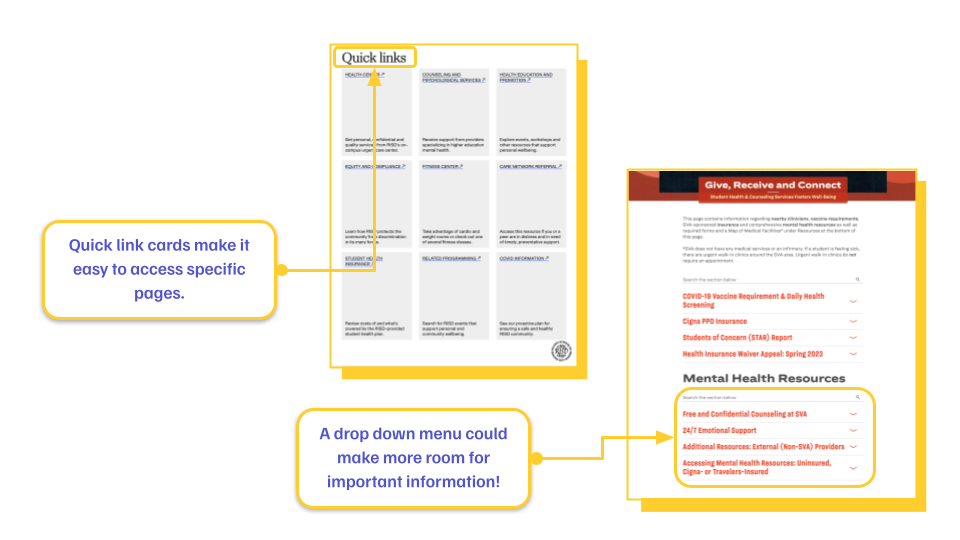
During our research, we decided that it would be best to provide a comparative analysis and recommendations to support our decision-making process.
Our team’s research looked at other design institutions, such as the Rhode Island School of Design (RISD) and the School of Visual Arts (SVA). Our research determined that other design institutions organize their page structure as quick links (almost like cards of specified content) and drop-down menus. We recommended putting all health and wellness information on a head page because it aligns with standards seen on other institutions’ websites.
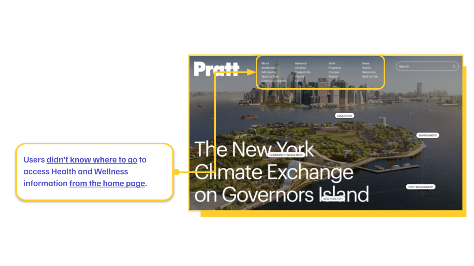
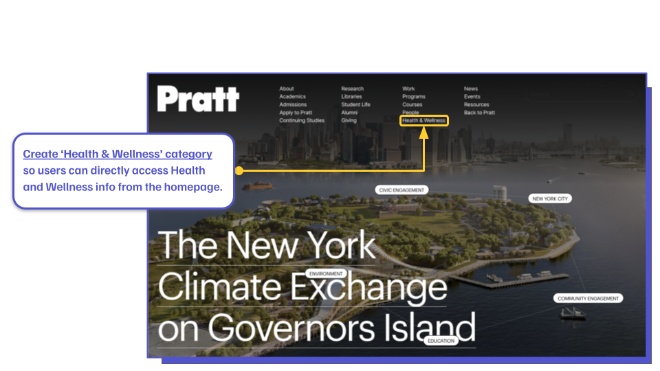
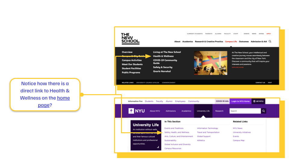
Concern 3: Create a ‘Health & Wellness’ Category On Pratt’s Homepage
One of the first problems we identified in our moderated user tests was that representative users did not know where to access health resources in the first place. Around 7/10 of our representative users clicked on the ‘resources’ tab when prompted to find one of the three tested web pages. Students expressed that they wished there was a separate tab for health and wellness resources, so we recommended creating one.
In collaboration with our clients, we decided since the main concern around the health and wellness resources was to improve visability, what other than putting a tab on the homepage with all Pratt’s health and wellness resources?
Comparative Analysis: Homepage Navigation
In our decision-making process, our team decided it best to do a comparative analysis for our homepage navigation recommendation. Based upon our research of other Design Intitutions and Universities in New York City, we were able to determine that the design choices and terminology used across several different intitutions was standardized to “Health & Wellness.”
We determined that in order to improve visibility on Pratt’s current interface, adding a separate tab with health and wellness resources was the only solution.
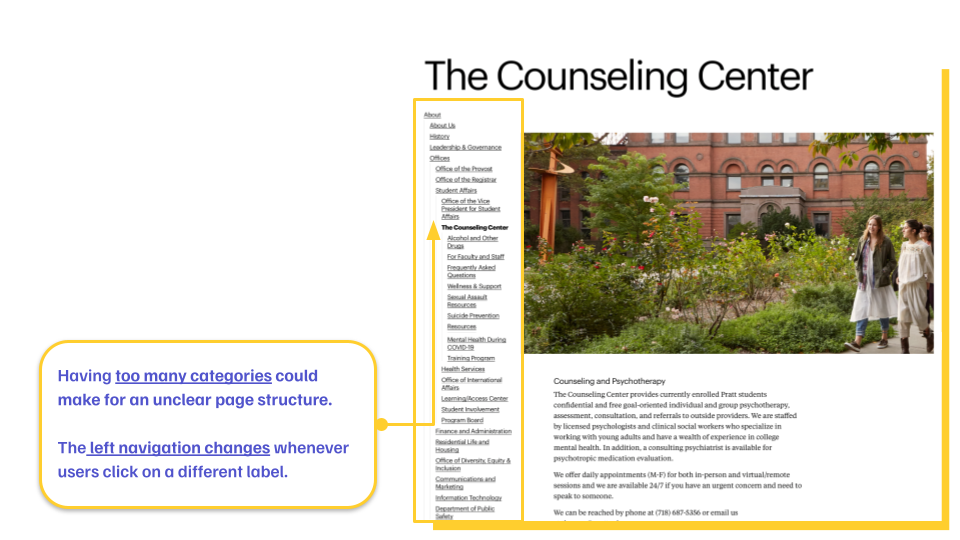
Concern 4: Organize Side Navigation by Showing Information Exclusive to ‘The Counseling Center’ Web Page
Finally, our last concern was regarding the visual hierarchy of the side navigation bar. Our representative users were completely confused by the side navigation; some even thought it was page content, but most just felt as if it hindered their ability to find information on the page.
In addition to adding ‘Contact Us’ and ‘Make an Appointment’ buttons, our solution was to create a side navigation bar with tabs exclusive to page content on the counseling center web page. Not only would this recommendation create a visual hierarchy, but it would provide Pratt with the opportunity to organize information architecture on each web page.
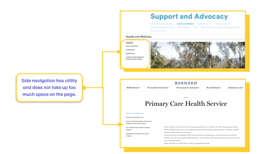
Comparative Analysis: Side Navigation
Similarly to our previous recommendations, our team determined that a comparative analysis would best support our decision-making process. Our team researched other design institutions and universities in New York, and we determined that there seems to be a design standard regarding side navigation.
We determined that creating a side navigation bar with utility would be the best solution to improving visual hierarchy and organizing information architecture.
Conclusion
Overall, the team found Pratt’s website beautiful and unique but frustrating and confusing. By implementing the recommended changes, the team hopes to make it easier for students to access counseling and other mental health resources.
I am honored to have worked on a project that would provide Pratt students with easier access to mental health resources. Much of our decision-making was based solely on providing easy access to appointments with a variety of different health resources Pratt offers.