Client: Museum of Modern Art
Discipline: UI/UX Design, User Research
Design Tools: Google Forms, Miro, Figma
Research Methods: Moderate Remote User Testing, Affinity Diagram, Heuristic Analysis
My Role: Recruited participants; Moderated user tests; Wrote and designed user test reports; Developed Methodology; analyzed and synthesized data
Duration: Late March to Early May (6 weeks)
Team: Yeatasmin, Divyansha, Becky
Final Presentation
Overview
Even today, we are all looking to reconnect to what we loved to do in the wake of the Covid-19 pandemic.
Thankfully, the Museum of Modern Art tried to fix the issues caused by the pandemic by creating online content and educational programs for its users. To do this, however, improving user engagement was essential; therefore, addressing the usability issues on its web pages became crucial.
To gain insights into the current state of the organization and its intended audience, we had a client meeting with Madhav Tankav, the Assistant Director of User Experience, and Stephanie Schapowal, the Product Designer.
What’s the problem?
The Museum of Modern Art invested in digital content and learning offerings to provide an educational benefit to its target users.
Additionally, the museum faced user drop-off due to usability issues on its web pages.
My team’s problem was simple;
How might we improve user engagement by understanding how users interact with the website and defining success metrics of repeat engagement, longer engagement, and more page views?
Initial Client Meeting
Madhav and Stephanie were worried about the user drop-off on their site and asked themselves and us several questions to address the problem. They were particularly concerned about how users learn and acquire information about art terms while navigating the website, what steps users prefer to take to learn about art on the website and what their user journey is like, how to improve the browsing experience, and lastly create better navigation cues and mapping, and guide users to streamline related content to enhance learning.
Madhav and Stephanies’ concerns allowed my team to form three high-level goals:
- One issue is that MOMA’s website has yet to update its content since 2018. How could we update the website to reflect its most current users?
- How might we encourage users to keep learning from the Moma website to prevent user drop-off?
- How might we make the website experience more engaging?
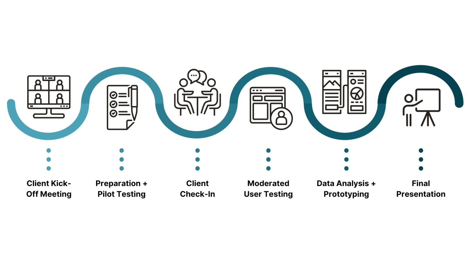
The Process
As Moma had already conducted user testing, we decided to concentrate on the design issues rather than immediately conducting our user research. We aligned our findings with a heuristic evaluation, which would help us identify any design flaws on the website.
Conducting the heuristic evaluation helped my team empathize with Madhav and Stephanie’s concerns and allowed us to conduct research and generate ideas according to the success metrics.
What did we find during the heuristic evaluation?
My team unanimously agreed that the MOMA website had design issues centered around jargon (h2) and consistency and standards (h4), meaning the website’s content structure and organization needed to meet users’ needs and expectations, resulting in difficulties in finding and understanding information, which lead to a feeling of being overwhelmed when browsing the website.
Surprisingly my team was in agreement about the issues found on the site, so much so that we decided on the following hypothesis:
The Moma website needs improvement. The web pages need to be updated, and moving from one page to the next takes too much thinking. Focus on the hierarchy to fix the overwhelming inconsistency of the pages.
Initially, we hesitated to share our hypothesis with the client due to potential confirmation bias. We thought the wireframes would amplify the bias, mainly because we decided to conduct user testing to validate our assumptions and solidify our idea. So, to prepare for the second client meeting, we had two options.
Plan A was to adopt a more experimental approach and “test” the wireframes without user research with permission from Stephanies and Madhav to conduct moderated user testing, or we could take “Plan B,” the “conventional” method of just presenting the scenario and tasks.
Surprisingly, this was the only thing we couldn’t agree on, and a day before the second client meeting, we threw caution to the wind and did both!
We decided to take the risk of presenting these potentially biased wireframes because of the possibilities given by moderated user testing (although this wasn’t given Stephanie and Madhav’s blessing). We ultimately did not use the wireframes in our user testing because they wanted us to go the traditional route.
Moderated User Testing
To prepare for our user testing, we created a detailed description of the users and developed scenarios and tasks based on our hypothesis. Our clients prioritize the ability of their website’s users to learn from its content, so we assumed that their target audience would have the same goal.
We decided that a target user would have most of these qualities:
- 15+ year old with basic art knowledge who enjoys visiting museums and exploring various mediums. You prefer interactive online resources over reading and seek access to all types of art.
This description helped us develop our screening questions to find 8 participants for our moderated remote user testing for two weeks.
Our approach to gathering participant feedback was not strict. Instead, we went for a more open-ended approach, allowing users to explore the website while guiding them to the necessary pages. We also asked them about their initial impressions, expectations, and thoughts on where they were going. We focused on ensuring the participants’ comfort and experience rather than solely getting their answers.”
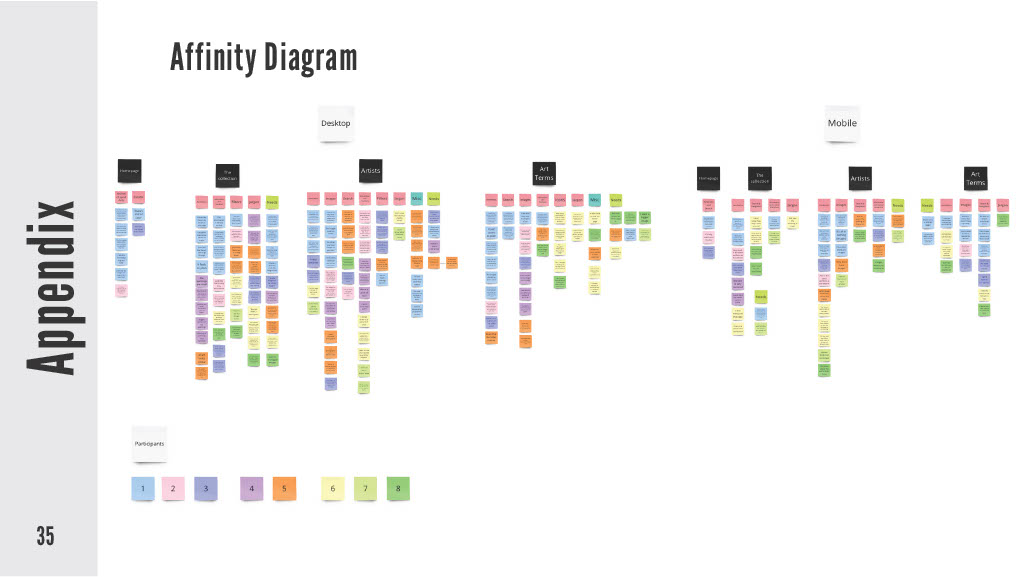
Methodology
We had much, much more data to sift through than we had initially thought. We were shocked but pleasantly surprised that so many users were willing to give such constructive criticism!
At first, we needed to figure out the best way to organize the info so we could tackle our users’ questions in the most efficient way possible.
Ultimately using the affinity diagram to synthesize our user quotes allowed us to capture a more comprehensive view of the user feedback.
The Domino Effect
In our research, it took a lot of work to think about how to honor what our users said without making it seem like what they said was less important. We knew that we had to prioritize what was necessary but not downplay what our users said or how our users felt.
The question now becomes, “How can we make sure to get all user feedback or insights so we can focus on addressing the most critical themes first”?
The answer to the question was a methodology that I called the domino effect.
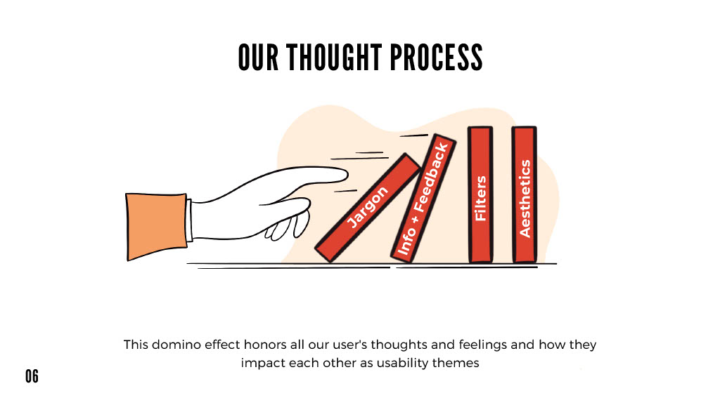
We used severity and frequency scales to gain a deeper understanding of how a theme impacted a user based on their ability to discuss it in greater detail.
For example, the first domino is “Jargon” because it had the highest frequency and severity among user feedback, then “Info and Feedback” because it was equal in severity and frequency.
- If more people encounter an issue can speak more about the issue at length: higher severity, higher frequency
- If more people can experience the same problem but talk less: with higher frequency, lower severity
- If fewer people encounter an issue and talk less about it: lower frequency, lower severity
- If fewer people face a problem and talk more about it, higher frequency, lower severity
Doing this allowed me to get some data-driven insights about our users quickly and to see what affected our users the most while capturing the full scope and depth of our user issues.
Results from User Testing
Admittedly, In our initial hypothesis, we took a very surface-level look at the usability issues that the Moma faced. Through the domino effect, we better understood our users’ preferences, dislikes, and necessities. Using this methodology also let us recognize that multiple issues were affecting various users across all pages, rather than the heuristic evaluation which let us pick one or two issues on one specific page.
Initially, we believed that the H2 and H4 heuristics were hindering usability. However, after conducting user testing, we realized we needed to catch several significant issues that made our research appear superficial and naive. This experience taught me the value of user testing as it enabled us to identify these issues’ profound impacts on our users.
After synthesizing themes from the affinity diagram and applying the domino effects, my team came up with these key statistics and insights:
- All (100%) users reported needing clarification on the usage of jargon and limitations with the filter’s usability.
- All (100%) users expressed that the website taught them about art in a disengaging way.
- Users responded positively to the art and imagery on all pages, so when images were missing, 75% of users found the images and layout inconsistent.
- 50% of interviewees needed guidance when searching and navigating web pages.
My team also noted that users felt overwhelmed, confused, and disconnected. But by taking a step back and looking at the bigger picture, we were able to connect the dots and come up with some genuinely impactful insights. These insights helped us develop some excellent recommendations that will make a real difference not only for our users but for Stephanie and Madhav as well.
My team has suggested the following recommendations:
- Recommendation 1: Make filters easier to understand
- Recommendation 2: Implement Auto-Suggestion and breadcrumbs
- Recommendation 3: Follow a consistent Grid View
- Recommendation 4: Create a Dynamic Page layout and presentation
What Did I Learn?
Madhav and Stephanie were impressed with the overall attention to detail and depth we took in writing these recommendations. Although they warned us to be more mindful of the museums’ adherence to their website standards, we hit all of their success metrics, and this project was a huge success!
Working on this project was a really rewarding experience, and I couldn’t have asked for a better team to complete this project with!
Preparing for the worst is not always bad; preparing for the worst can help you better understand where you are in a project, assess your team member’s strengths, and move on to the next steps more effectively. Rather than being negative, preparing for the worst can be a valuable tool for improving your project management skills.