The MoMA (Museum of Modern Art) is one of the largest and renowned museums in the world known for its modern and contemporary art collection. MoMA currently wants to invest in digital learning due to the spike of website traffic from casual learners during the pandemic. However, there is a concern that the pages explored by learners (The Collection, Artists, & Art Terms) have not been updated since 2018, are not mobile friendly, and the general UX patterns may be confusing. Our team at Pratt was approached to work on this project, and we were presented with three goals: repeat engagement, longer engagement, and more page exploration. This was our opportunity to bring a “Modern Vision” to life within a modern learning experience. Through eight moderated user tests, we came up with the following recommendations exhibited in our prototypes:
Overview
Client
The Museum of Modern Art
Discipline
UX Design, UX Research
Tools
Figma, Miro, Google Forms, Zoom, Canva
Research Methodology
Moderated User Testing
Duration
March – May 2023
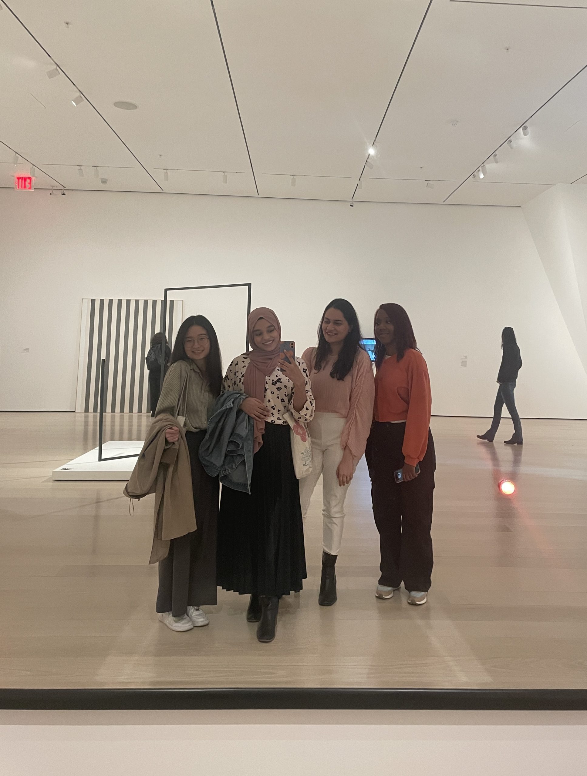
The team from left to right: Becky Su, Yeatasmin Shiropa (me), Divyansha Arora, Monet Hicks
My responsibilities included…
- Recruiting participants and conducting three moderated user tests
- Analyzing and synthesizing data into major themes and insights
- Identifying proposed recommendations
- Contributing design ideas for prototypes
- Finalizing slides and presenting recommendations to client
- Coordinating team’s communication with MoMA & with each other for planning/meetings
Getting Started
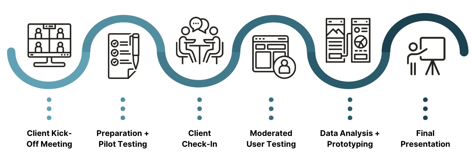
Client Kick-Off Meeting
Our team met with MoMA researchers Stephanie Schapowal (Product Designer) and Madhav Tankha (Assistant Director of User Experience) to discuss the project. They took us through The Collection, Artists, and Art Terms pages, and identified their user as “Casual Learners”. The goals of repeat engagement, longer engagement, and more page exploration are responses to our question of how they define success for the website, which we kept in mind throughout the entire research process. Overall, we were encouraged to think big!
Preparation + Pilot Testing
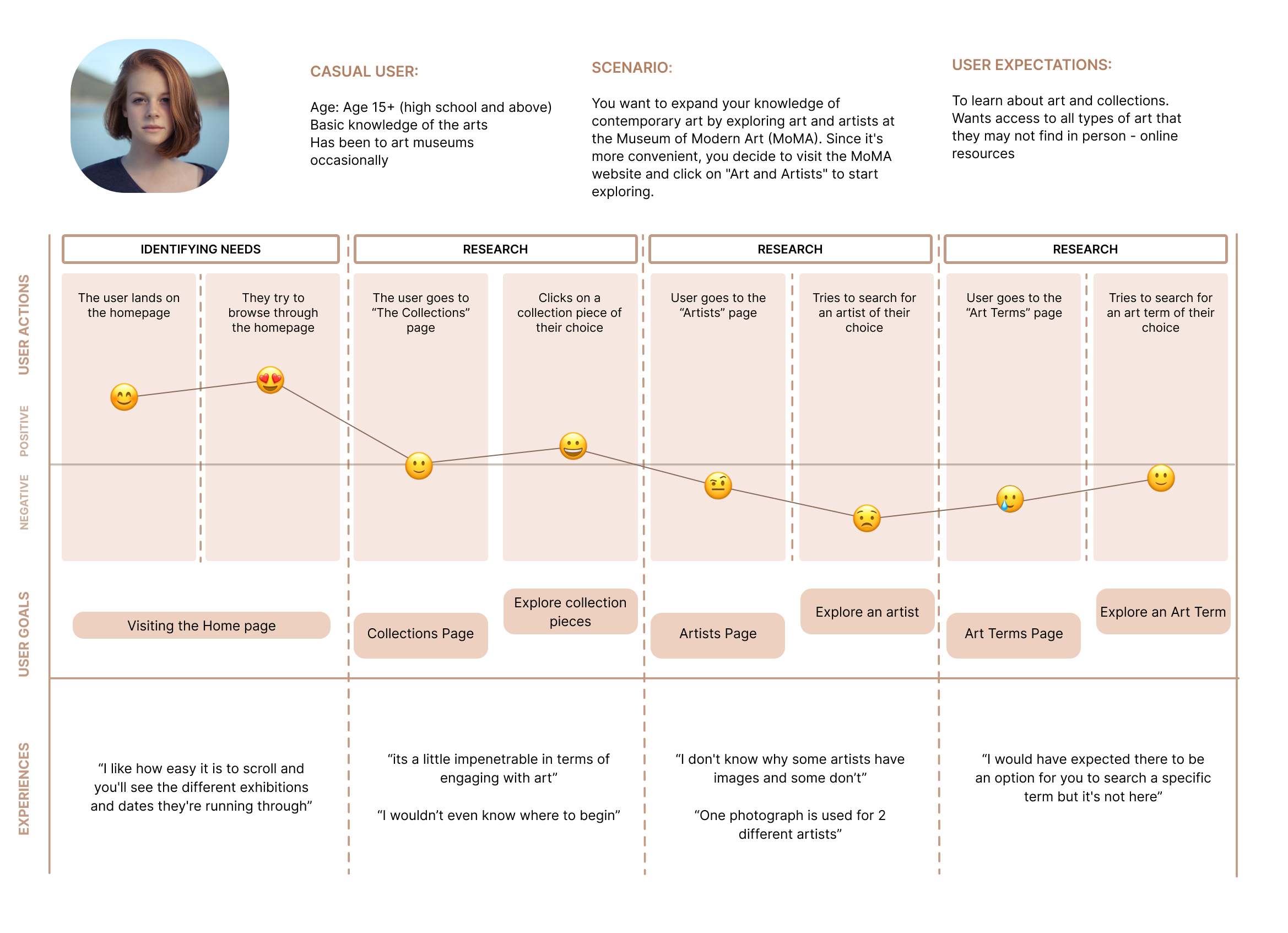
We first started chipping away at the problem by exploring the website ourselves. We identified the “Casual Learner” as 15+ years old who has an interest and basic knowledge of the arts, and been to museums occasionally. Our hypotheses of what users may face during testing: an outdated UI, inconsistent hierarchy, and lack of interaction between the pages. The research helped us create our scenario for our pilot/user tests: You want to expand your knowledge of contemporary art by exploring art and artists at the Museum of Modern Art (MoMA). Since it’s more convenient, you decide to visit the MoMA website and click on “Art and Artists” to start exploring.
In thinking big and with the suggestion from our professor Taylor, we created some wireframes as a proposed addition to our user testing, based on our research and hypotheses.
Client Check-In
The team was invited to the MoMA offices for our check-in, which further solidified our relationship and communication with the clients. In the check-in, we updated them on our status where they found our findings relevant, approved of the scenario, and advised us to let the user explore instead of following strict tasks. They liked our wireframes, but mostly wanted us to have users navigate the current website. They also made recruitment easier for us by offering us their participants from previous testing for recruitment.
The Participants
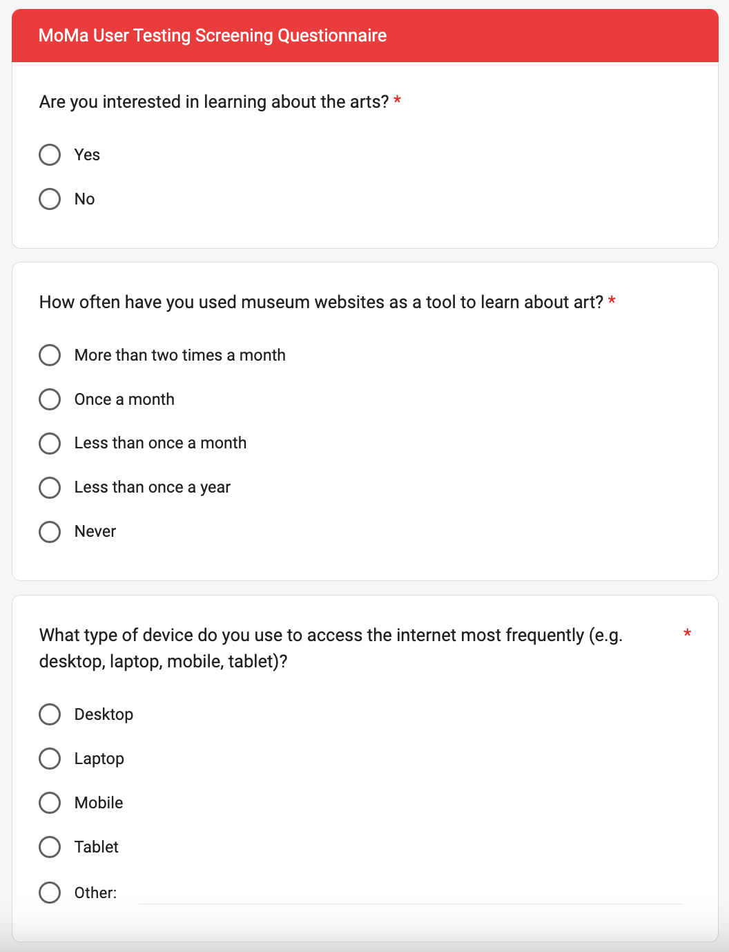
Both MoMA and our team sent out recruitment emails with a screening questionnaire to their pool of participants, to peers at Pratt, and anyone else who expressed interest in the arts. We narrowed our participants down to eight who represented people who were interested, visited museum websites to learn at least once a year if not more, and knew how to use at least one technological device for the internet.
Learning about Learners
Moderated User Testing
The moderated user tests for all three participants I conducted were over Zoom, with the participants logged into desktops and mobile devices so they could share their screen as they navigate the website. I guided the users to the necessary pages, while letting the users explore as they wished. I asked guiding questions like “What is your first impression/thoughts on this page?”; “Is this what you expected when you clicked there?”; “Is there anything positive or negative that stands out on this page?”
Results + Data Analysis
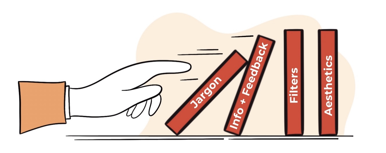
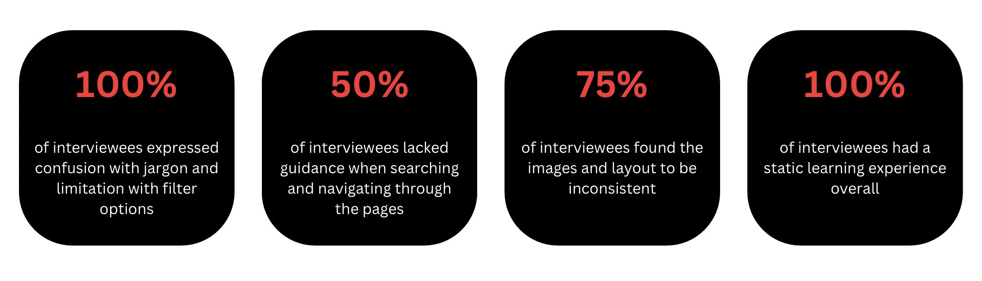
Our team used affinity diagrams and severity ratings to garner both qualitative and quantitative data from the moderated user tests. We synthesized our data into four major usability themes: Jargon, Information + Feedback, Filters, and Aesthetics. We noticed that there was a domino effect through the themes that helped us understand how they go hand in hand, while honoring our user’s thoughts and feelings. We then compiled the experiences of the moderated user tests to represent the journey of an average casual user: The stats above are representative of the frequency of users expressing these themes in some form.
The stats below are representative of the frequency of users expressing these themes in some form.
Our Solutions
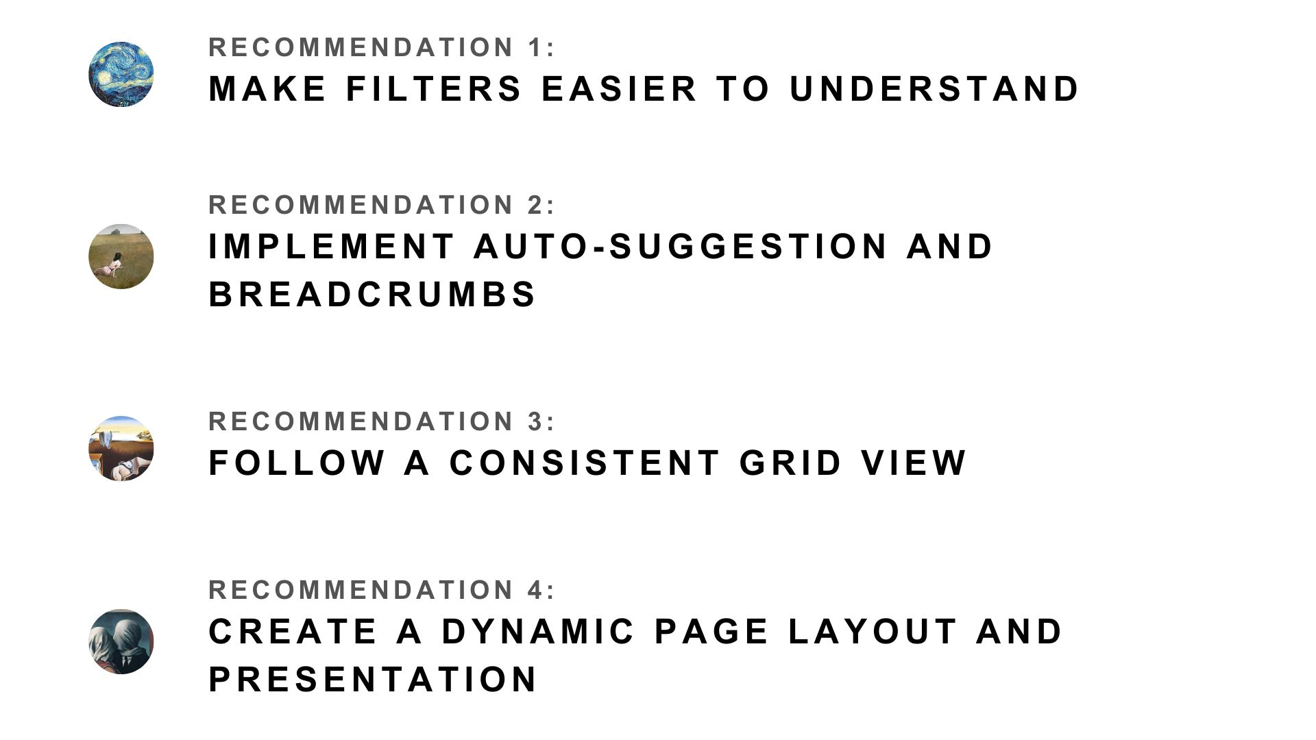
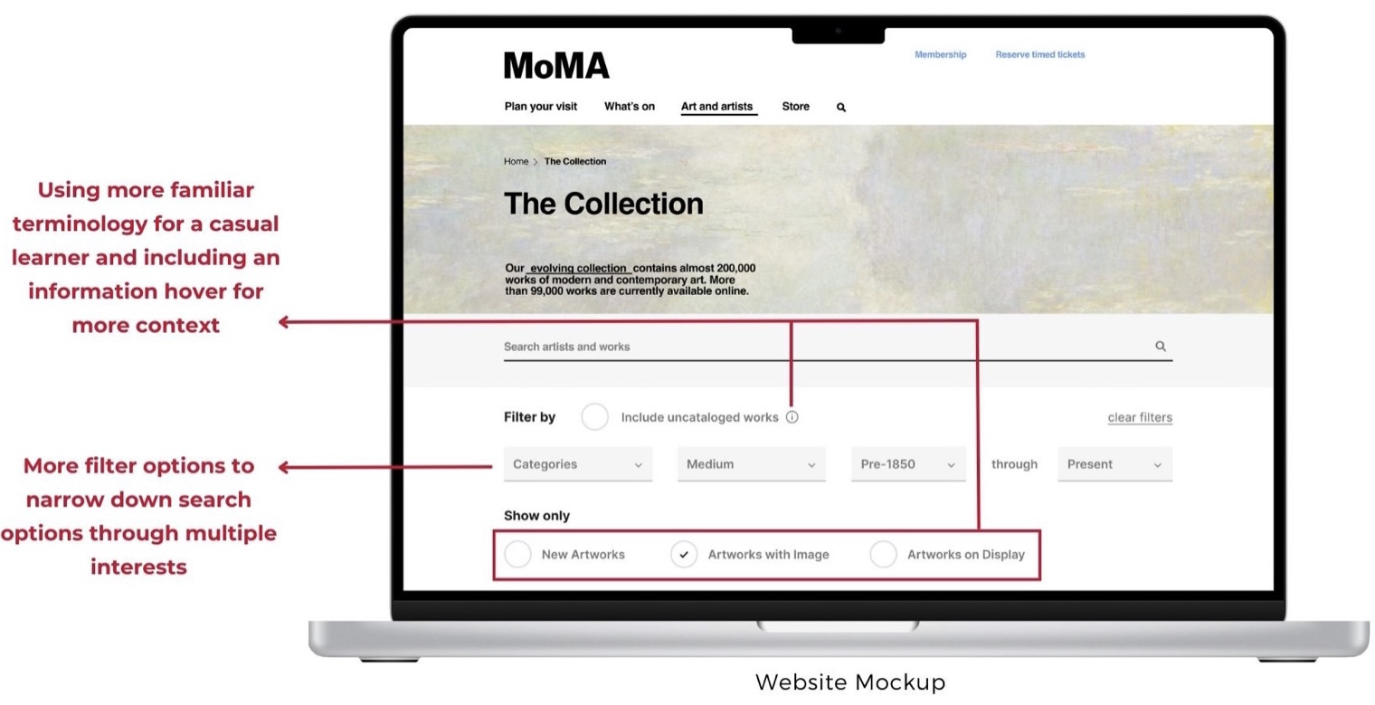
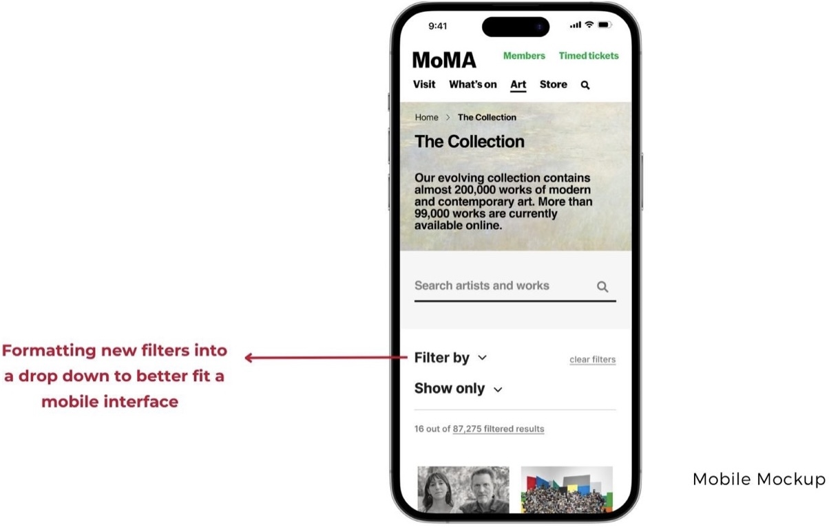
Recommendation 1: Make filters easier to understand
“What do they mean by uncatalogued works?”
“I hope there are more options for me to filter artworks.”
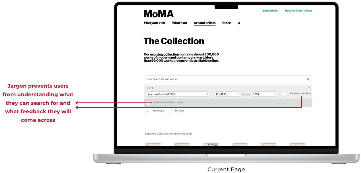
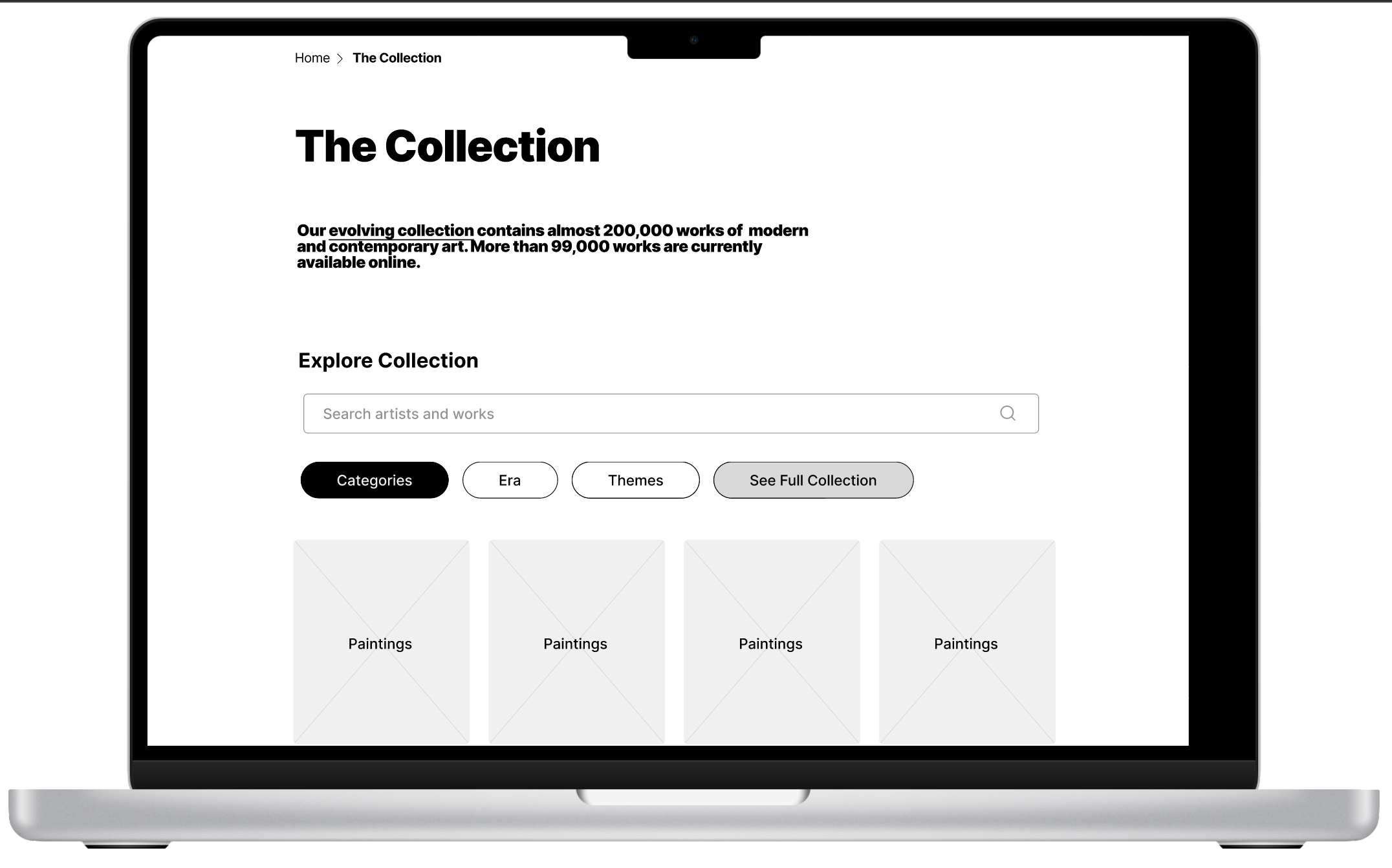
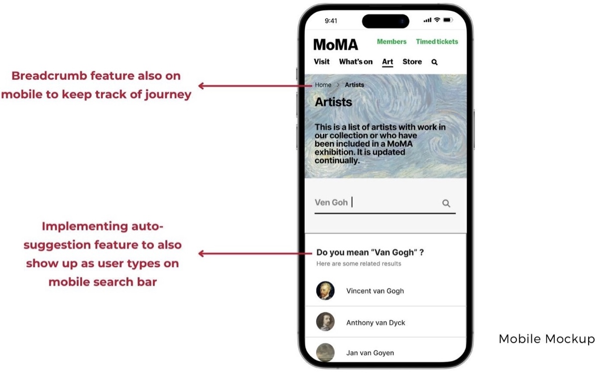
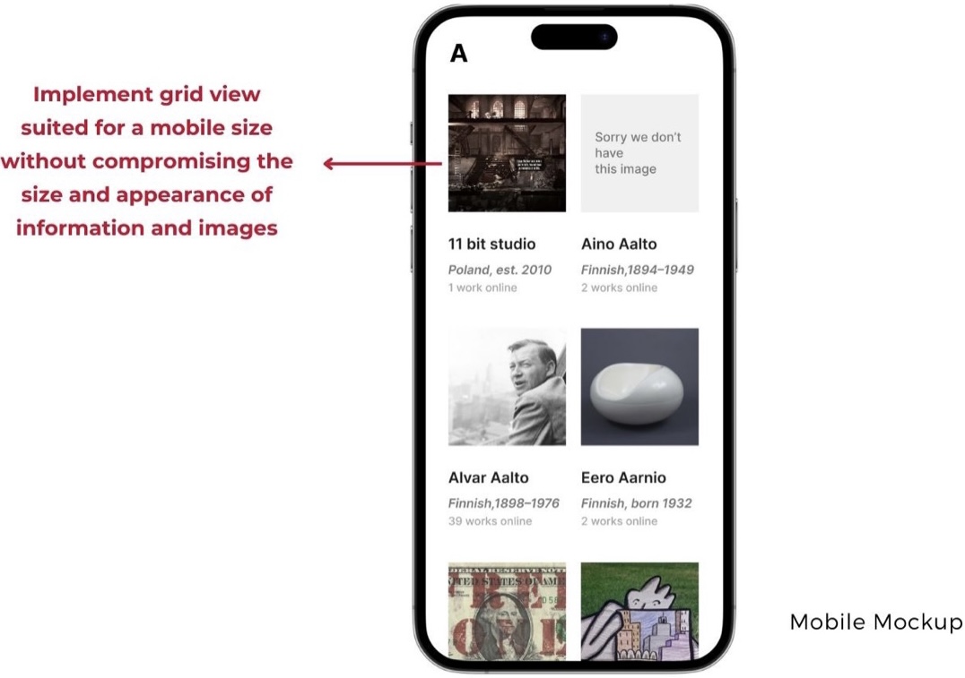
All our recommendations feature a more modern and visual look because our users often gravitated towards visual content while on the page. To fix the jargon and filter issue, we added icons, changed terminology better suited for a casual learner, and expanded on filter options. For all recommendations, we made mobile iterations that suit the design changes.
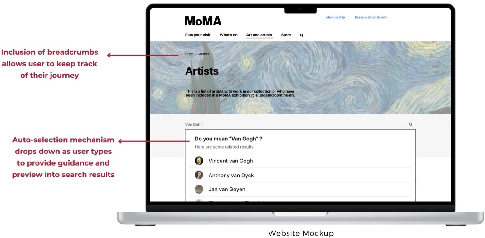
Recommendation 2: Implement auto-suggestion and breadcrumbs
“I had to leave the website to find the correct name of the artist!”
“There are no breadcrumbs so I don’t know where I am.”
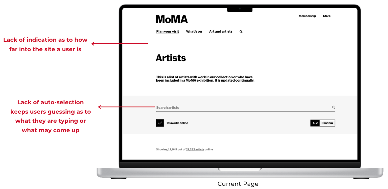
One of our users actually left the website to look up an artist’s name and spelling elsewhere! Auto-suggestion keeps users from guessing or experiencing memory loads, and breadcrumbs helps users retain how deep they are in the website, both contributing to longer engagement.
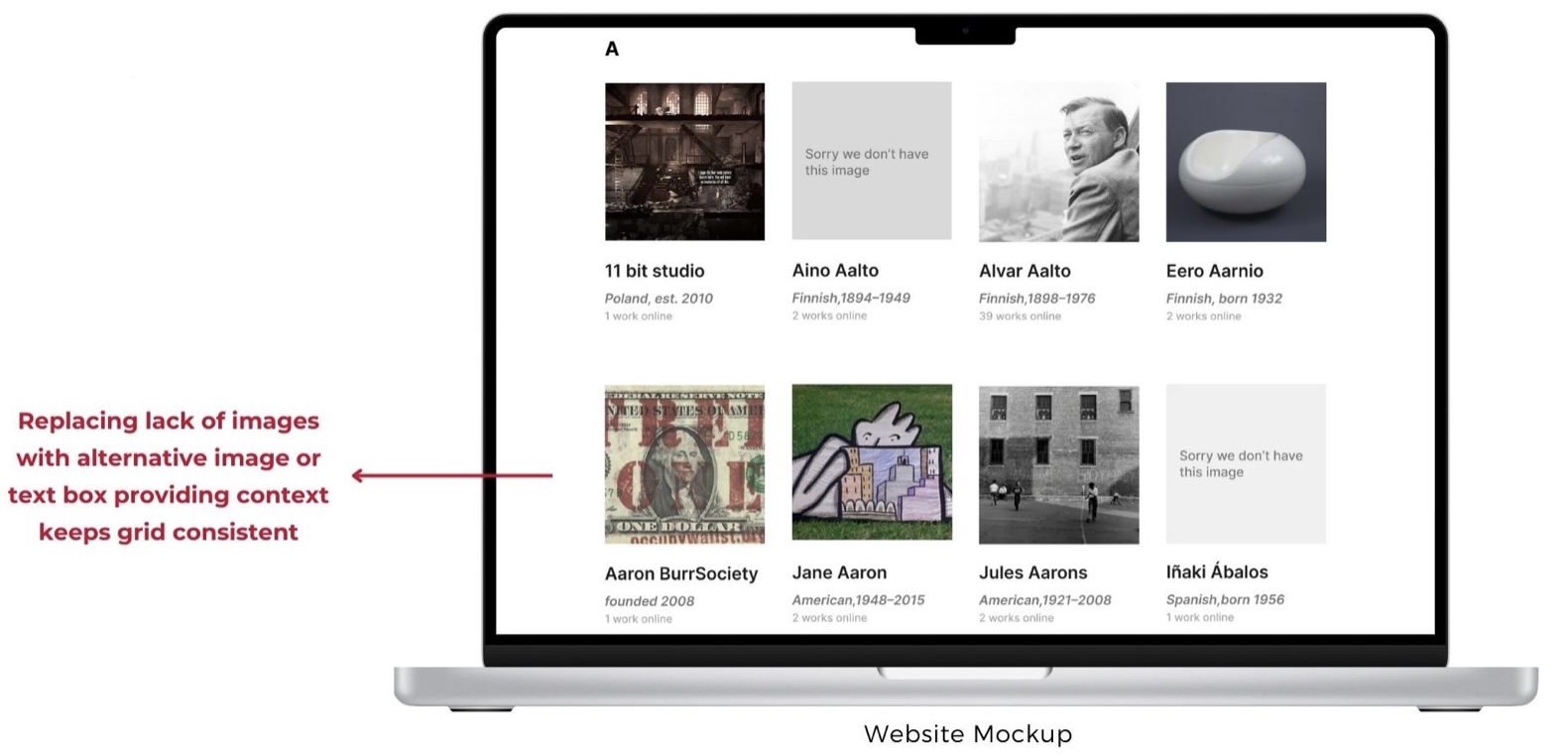
Recommendation 3: Follow a consistent grid view
“Some have photos, some not, it’s weird.“
“Artists should be available in a proper grid.”
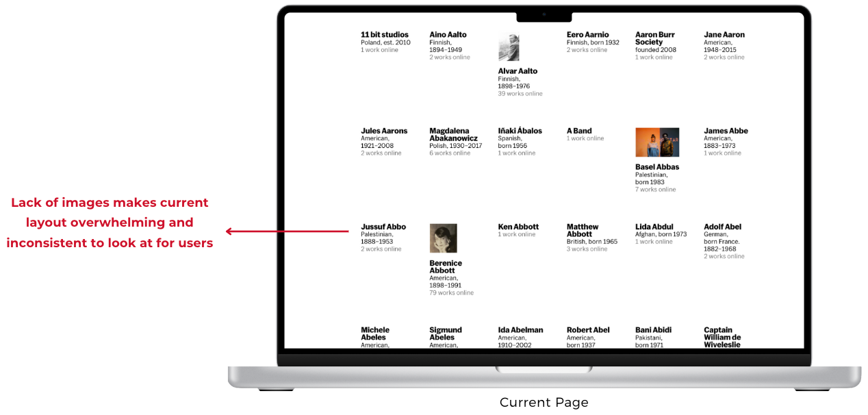
Because some artists and terms have images and some don’t, the text automatically moves up, which causes misalignment and overall appearing hectic. Keeping things in a grid view by using substitute images or stating there are no images creates an honest approach to the lack of imagery while keeping the layout consistent.
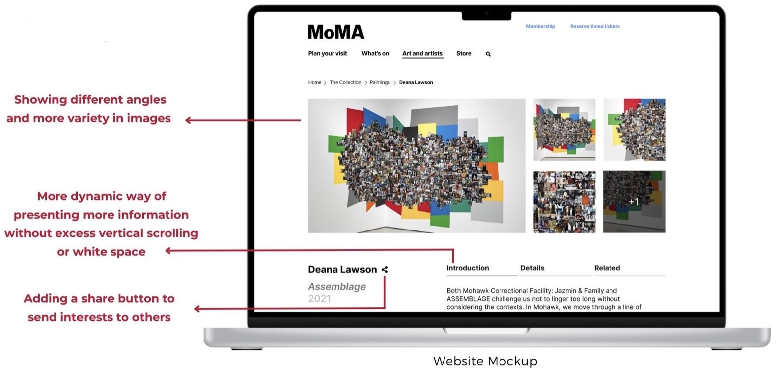
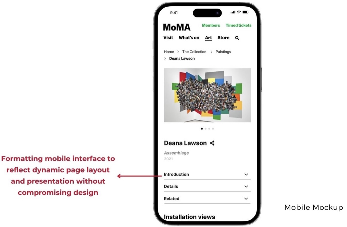
Recommendation 4: Create a dynamic page layout and presentation
“I want to see different angles.“
“There is not enough going on in some of the pages.“
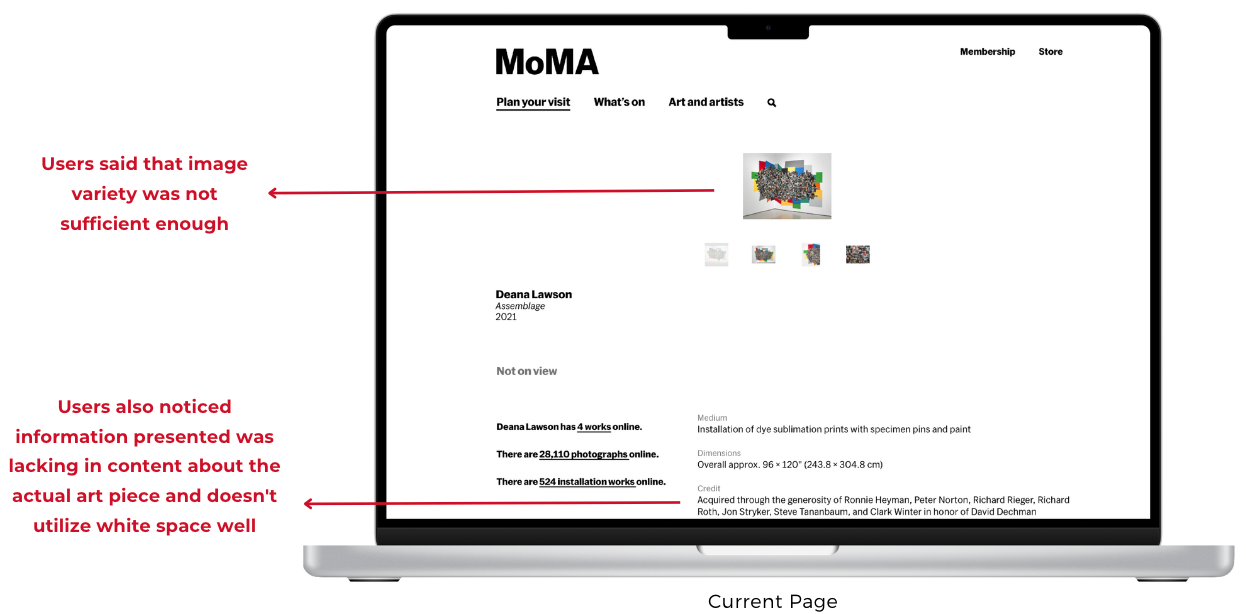
The immense amount of white space combined with small images and consistent vertical scrolling for information creates a static experience for our users. Implementing UI that removes vertical scrolling and utilizes more screen space in an intentional way, while adding information and showing different perspectives of images offers a more dynamic learning experience, thus bringing the “Modern Vision” to life.
Conclusion
We brought forth our vision to Stephanie and Madhav by taking them through our prototypes during our presentation for a more immersive understanding of our recommendations. They found great value in our suggestions and were really inspired and intrigued by the user feedback and data that influenced our decisions.
The clients did mention how our last recommendation is a little more difficult to implement because of legal restraints on what information they can host on their website, but they still understood the recommendation because the user insights are valuable and good to keep in mind. They also really appreciated our user insights and being able to bring in a fresh perspective. I believe that the approach of a “Modern Vision” really helped in elevating that and bringing something new for their users.
“We really find the user research interesting and it brings in a fresh perspective to something that hasn’t been touched in a while!”
Stephanie Schapowal (Product Designer)
“Your prototypes are really well done, and we’ll definitely be taking a good look at the research you’ve brought to us!”
Madhav Tankha (Assistant Director of User Experience)
If I were to keep working on this project, I’d test the prototypes out to see how users approach this new version of MoMA, and implement that into a more elevated prototype. This was a project that required thorough communication on all ends and I was glad to have a team that helped bring the vision that we were all only thinking of in the beginning to an actual product.
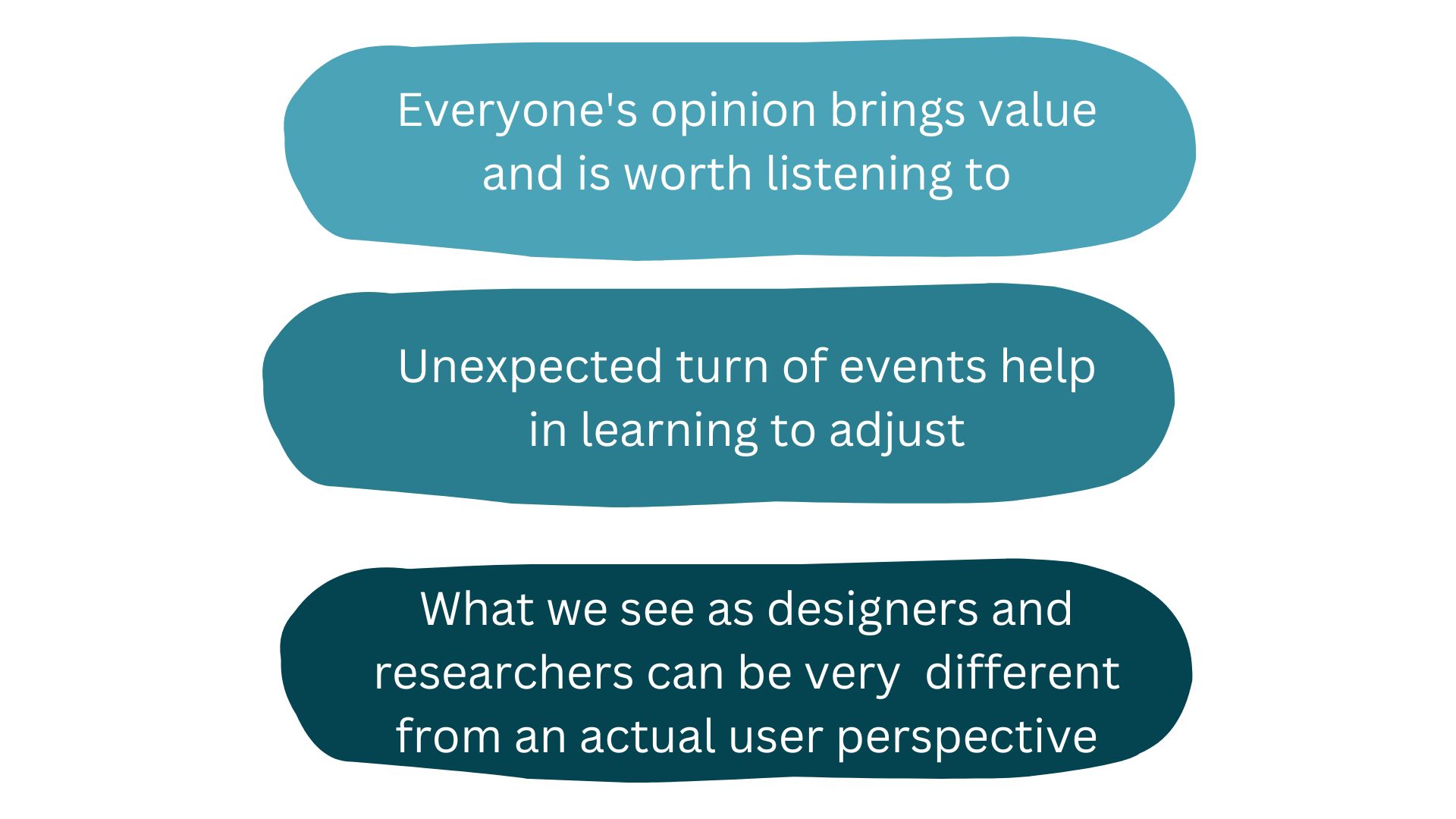
Key Insights