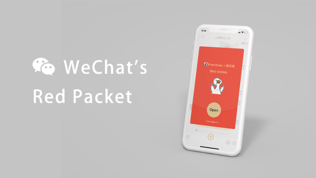
Design Critique: Red Packet by WeChat (iOS App)
WeChat, a super app developed by Tencent, eventually became China’s app for everything in the last decade. Not only can users chat with others through texts and videos, but they can also share posts, subscribe blogs, hail taxis, pay utilities, order food deliveries, make medical appointments, shop online, transfer payments, etc. Among all those features, …