Design Critiques

What makes some designs good and others bad? Why do some designs work while others don’t? Posts in this category offer thoughtful design critiques of modern digital interfaces, with commentary inspired by Don Norman’s “The Design of Everyday Things.”

Otter_Feature Image

Design Critique: Otter.ai (iOS App)

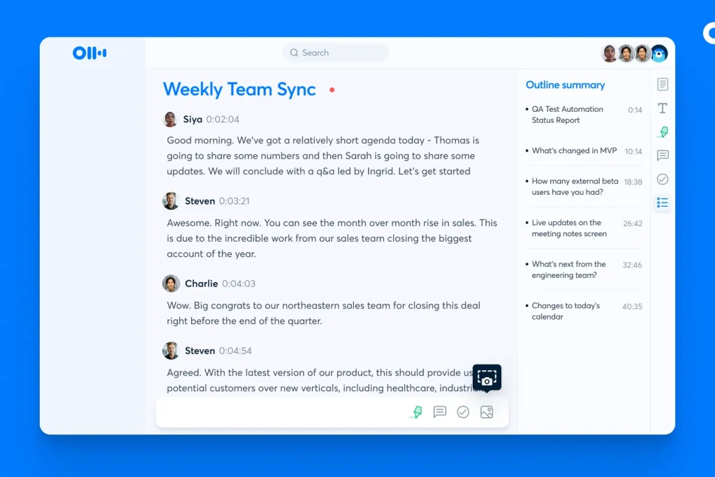
Introduction Otter.ai is an AI-powered productivity tool that assists in real-time speech-to-text transcription across various scenarios, such as lectures, meetings, interviews, and everyday voice conversations. It accommodates the user needs of reading live transcriptions, generating key points summaries, or synching team meeting notes. Usability Issues No.1 1.1 Task: Add photo to the note 1.2 Problem …

Design Critique: Otter.ai (iOS App) Read More »

Design Critique: Instacart (iOS App)

Introduction Instacart is an online platform for convenient delivery or pickup from local retailers, offering a diverse range of fresh groceries and household items. The platform provides a time-saving solution for online ordering. In this case study, I focus on the experience within the Instacart iOS App by analyzing the experience of browsing and selecting …

Design Critique: Instacart (iOS App) Read More »

Design Critique : Zomato : Food Delivery App and Dining (Android App)

Introduction Zomato is an Indian multinational restaurant aggregator and food delivery company. It was founded in 2008. Zomato provides food delivery options from partner restaurants in more than 1,000 Indian cities and towns, as well as menus and user-reviews of restaurants, dining and sponsored events suggestions. “From swanky upscale restaurants to the coziest hidden gems …

Design Critique : Zomato : Food Delivery App and Dining (Android App) Read More »

Design Critique: The Amtrak App (IOS)

Introduction: Amtrak is an application that mainly serves for customers looking to purchase tickets, check train statuses, and manage users’ travel plans with America’s national railroad service. This critique focuses on the application’s user experience based on Don Norman’s design principles as outlined in his book “The Design of Everyday Things”. As a frequent user …

Design Critique: The Amtrak App (IOS) Read More »

Design Critique: Weee! (iOS APP)

Introduction “Weee!” is an online Asian and Hispanic supermarket, offering from daily necessities such as milk, eggs, and bread, to cuisine-specific items such as dumpling wraps, kimchi, and udon. Customers can purchase products from the company’s website, and the app is available for both Apple and Android users. Deliveries are typically made within the next …

Design Critique: Weee! (iOS APP) Read More »

Design Critique: Amazon Prime Video (iOS App)

Amazon Prime Video, a multifaceted streaming service offering diverse content in various languages, spanning movies, TV shows, documentaries, and original programming, delivers a rich digital experience. However, certain usability issues have been identified through personal use and observed challenges during group viewings, and addressing these can be informed by design principles from Don Norman’s “The Design of Everyday Things.”

Design Critique: Todoist (iOS App)

Todoist claims to be “the world’s #1 task manager and to-do list app”.  To explore that strong statement, let’s examine basic task creation and task ordering through the lens of Don Norman’s principles and concepts as laid out in his book The Design of Everyday Things.  For this critique we’ll focus on the native app experience in iOS.

Design Critique: Google Search Engine

The Google Search Engine is a sophisticated platform designed for searching and retrieving information across the internet. It provides quick, relevant results to user queries, offering features like predictive text, voice search, and image search, all within a user-friendly and minimalist interface. This tool has become essential for navigating the vast digital landscape of information.