In order to propose a redesign for the Voorheesville Public Library’s website, we conducted a user-centered review, test, and analysis of the information architecture and interactive design of the site. It appeared to be clogged with duplicated content in an overly complex structure, and was not adapted for mobile. Our goals were to conduct research and design a more effective user experience for desktop and mobile platforms, in interactive prototypes.
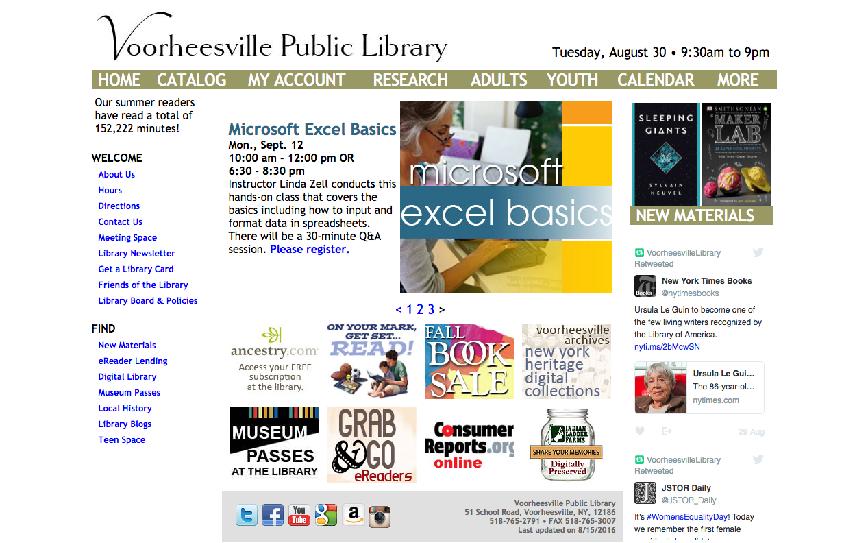
The current website appears crowded and overly complex.
Understanding Our Users
Our first step was to identify our users and test their expectations regarding public library websites. In a series of unstructured interviews, observations and surveys, we asked users what they expected to find on such a site, and to give us feedback on their experience using the site of a major public library system. We collected our respondents’ answers and synthesized the results:
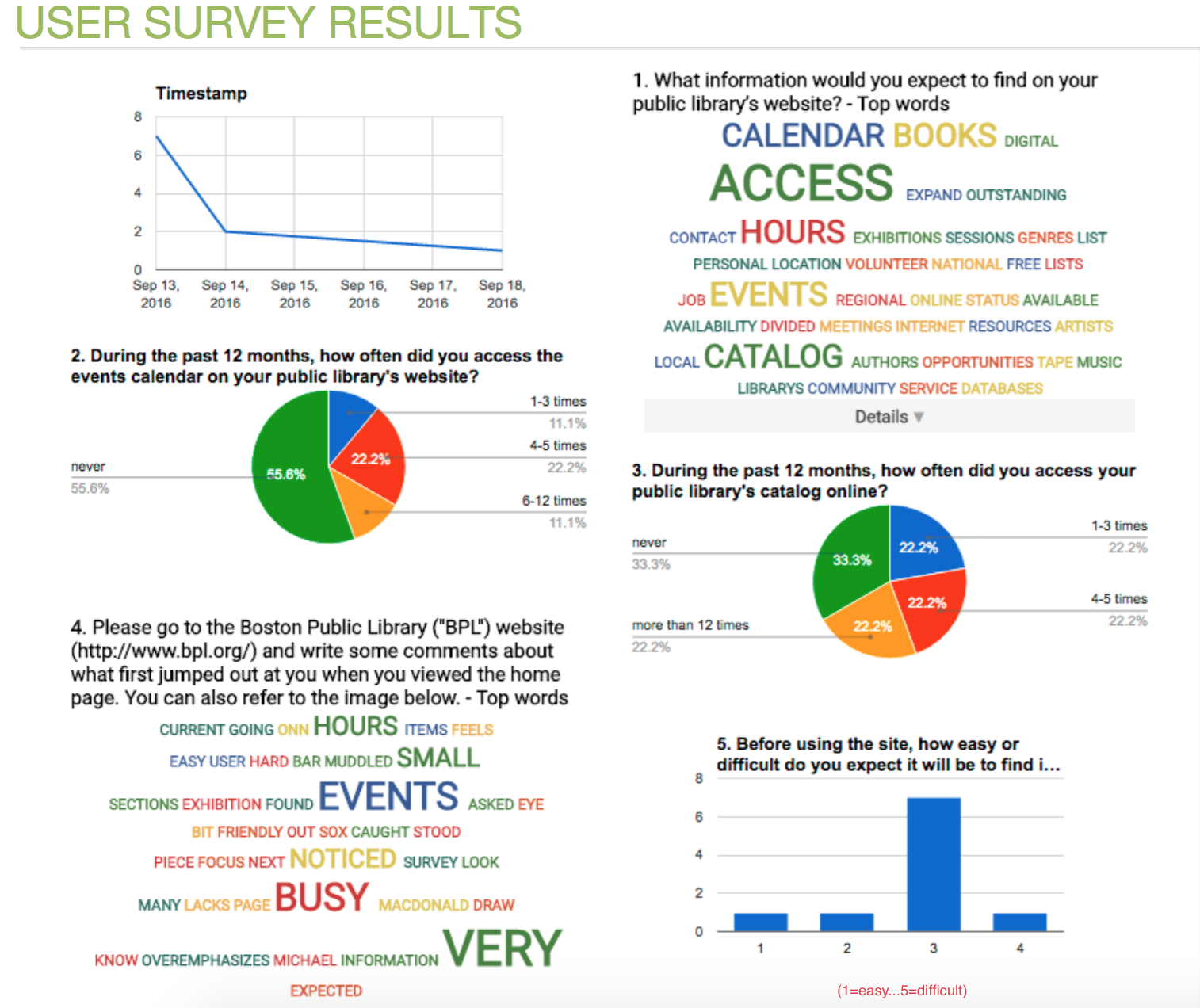
Key insights:
- A public library’s home page should be simple and clear.
- It should be easy to find books, so headings and labels must be good signposts.
- Users expect public libraries to create a sense of community and offer public events and support services.
Once we had determined user goals, we created personas to represent the variety of users whom we would need to keep in mind throughout the research and testing process. To further our sense of empathy with these users, we also imagined plausible scenarios in which each persona would come to the Voorheesville Public Library (VPL) website.
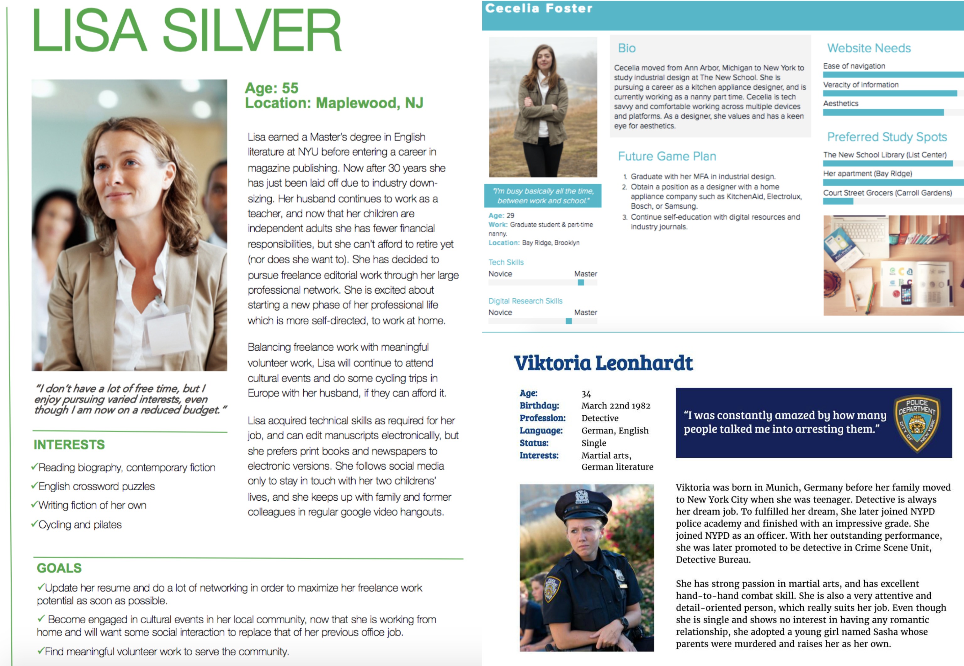
We created personas and user scenarios.
Structuring the Content
The next step in our redesign process was to create a new information architecture for the VPL site by testing our assumptions through card sorts, tree tests, and competitive analyses of similar websites.
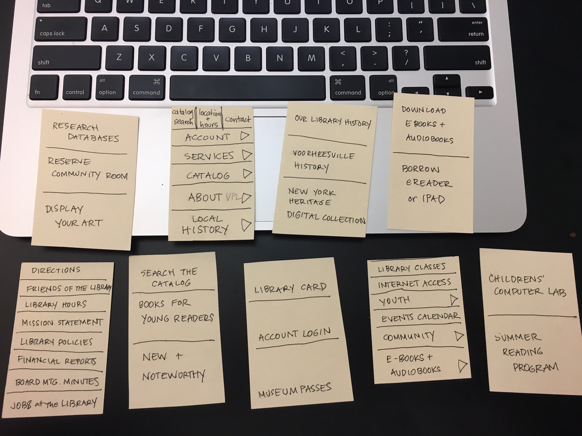
After performing a top-level content inventory of the current VPL website, we narrowed the key topics down to 32 for the card sort. Our users organized the topics under headings of their own making and delivered results we could analyze, enabling us to map key groupings and relationships.
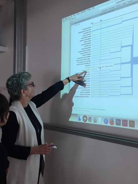 Analyzing the card sort test results.
From this map we were able to create a new information architecture, which we tested with users by asking them to perform five different tasks in a tree test.
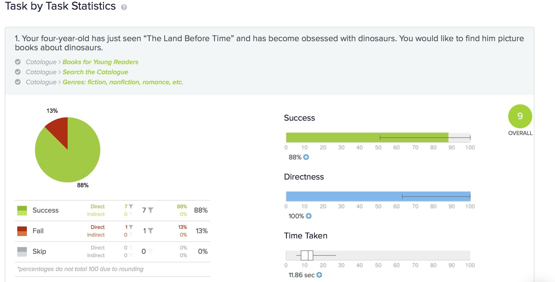 Tree test results for one of the five tasks we tested.
Key insights:
- User results were remarkably consistent, giving us clear direction.
- Some categorizations caused confusion in navigation, which directed us to make changes to the information architecture.
- Some labels were unclear and misdirected our users; these required honing.
We had to make judgment calls about the placement of certain topics which had not been included in the card sort.
Building a site map
Next, we were ready to propose a site map. Instead of the eight navigation tabs in the current VPL site we opted for four, plus a “social media” section intended for the footer.
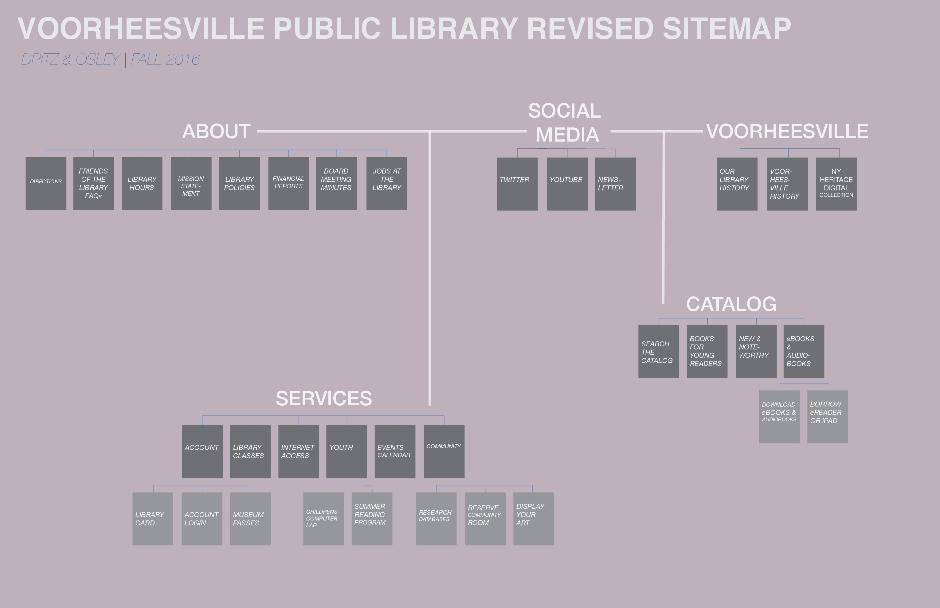
Feedback at this stage challenged us to make several revisions to our information architecture once again, before the next phase of testing.
Key insights:
- We decided to move the “Account” tab up to the top level in the next iteration, instead of keeping it under “Services,” to give users more immediate access to their personal information and to create a more comprehensible five-tab navigation structure.
- Our “Voorheesville” header was not engaging, as we had intended, so we changed it to “Local History.”
- Users indicated that the eBooks and Audiobooks information should be under the “Services” tab.
Understanding the Competition
We conducted a valuable analysis of competitor sites before moving into the prototyping stage. We chose to examine the designs of five public library websites from around the country, evaluating the following dimensions:
- Homepage and navigation
- Connect (social media, about, contact us)
- Accessing catalogs and searching the site
- Events, services and exhibits
- Appearance (typography, color choices, overall aesthetics)
Key insights:
- We decided to design a prominent search box with options for searching both the site and the catalog.
- An interactive calendar interface is optimal.
- We would use a graphic design with a minimal number of fonts, stock images and colors.
- We learned a lot about the conventions of library websites, which might have been even more useful earlier in our research process.
Concepting and Testing Prototypes
Our final goal was to create usable prototypes, based on specified user tasks. The process of creating a first prototype started with a task flow. We chose several potential scenarios, and sketched decision points and click processes.
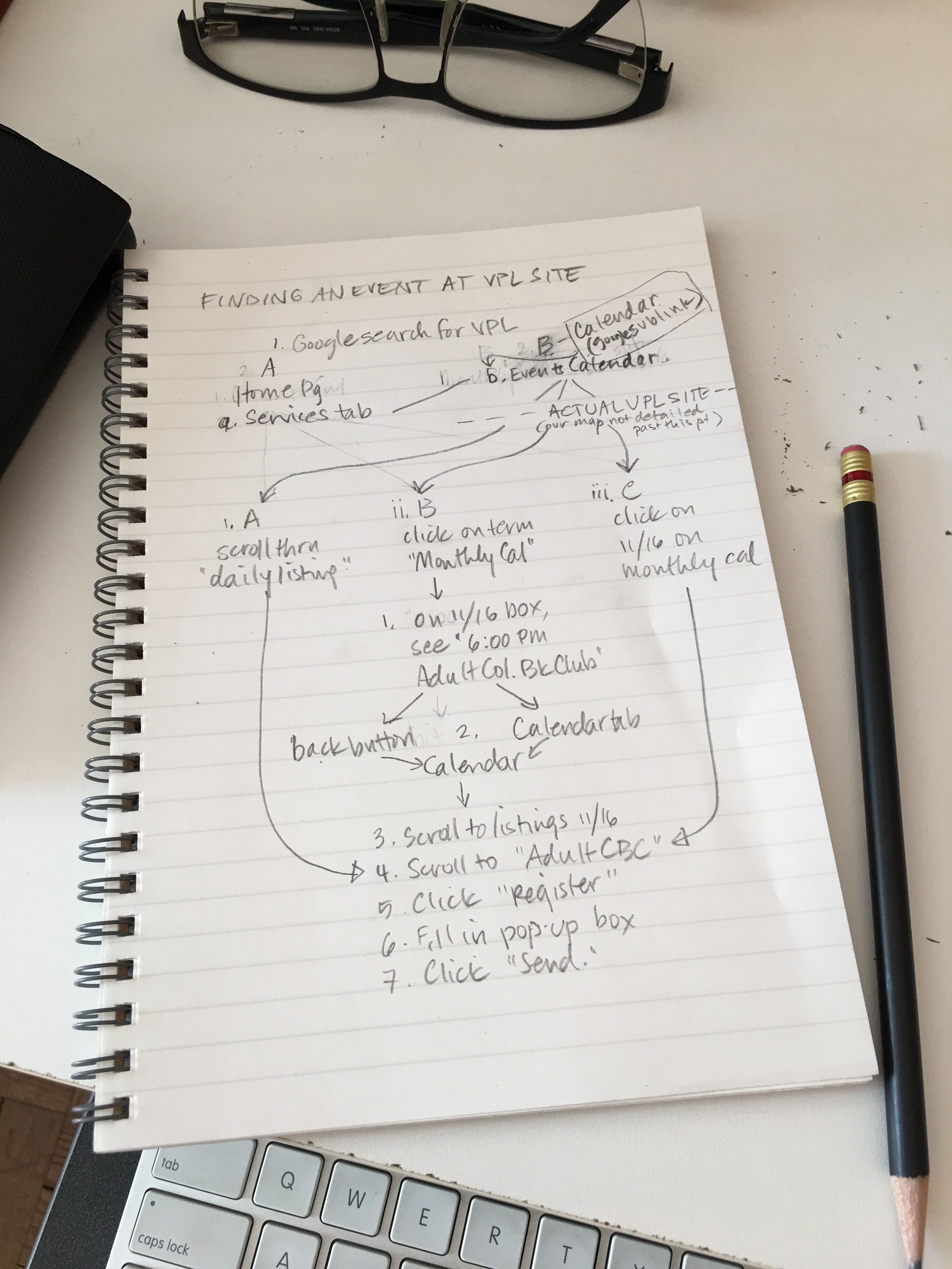
In this example of a task flow sketch, the user scenario was to find entertainment options on the VPL website. The user accesses the calendar to register for an event at the library.
We then conducted usability testing of two task flow scenarios, on both desktop and mobile sites, using paper prototypes.
By testing our task flows, we learned that the overall navigation structure was clear, but some revisions were needed to improve the user experience:
- In the desktop version, our search box functions were not visible enough, so we decided to enlarge the box in our prototype versions.
- In the mobile version, top-level navigation was not found easily via the slide-over “hamburger” menu, so a three-tab navigation bar would be added to the top of the screen in the final prototype.
Key insights:
- Sketching task flows forced us to think carefully about each step a user takes to progress through a site to meet a specific need.
- Prototypes, intended to test functionality only, should be sketched in black and white so as not to distract users with graphic design elements.
The Final Product:
An Interactive Digital Prototype
Our final task was to create interactive prototypes for both desktop and mobile designs, with one task flow required on each platform. We chose to represent a scenario in which the user is required to register a child for the library’s summer reading program.
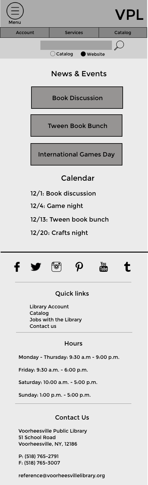
Desktop Wireframes
 Desktop homepage
Mobile Wireframes
 Mobile homepage
Our final digital prototypes can be viewed and clicked through below:
Desktop version
Mobile version
The many stages of our research, structuring, and prototyping process gave us powerful insights into the conventions and best practices of web design, and a viable proposal for the Voorheesville Public Library.
About Us
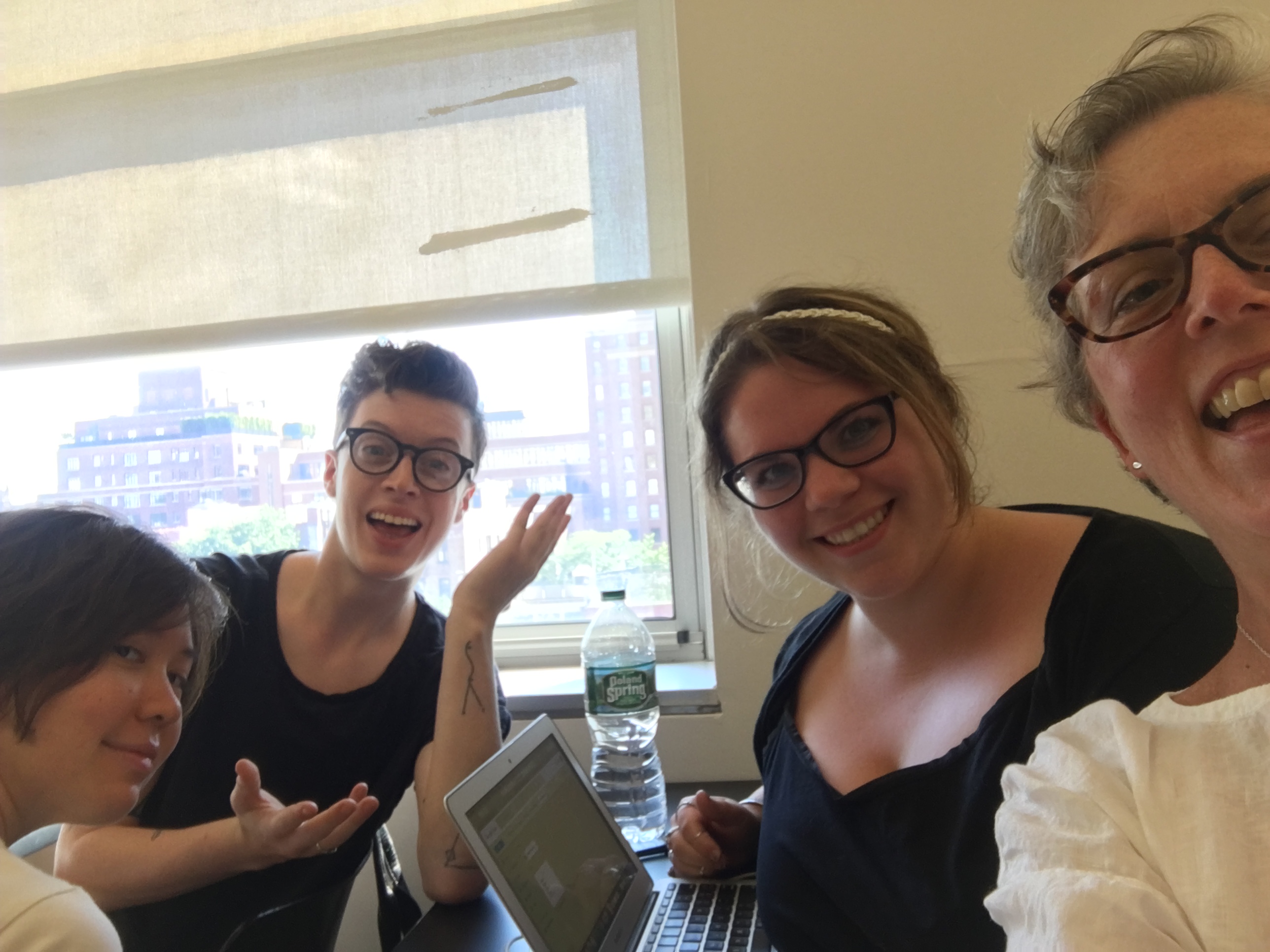
The Dritz & Osley team: we are (left to right) Ratirat (Rey) Osiri, Cormac Fitzgerald, Kristen Droesch, and Mary Ellen Curley.