![]()
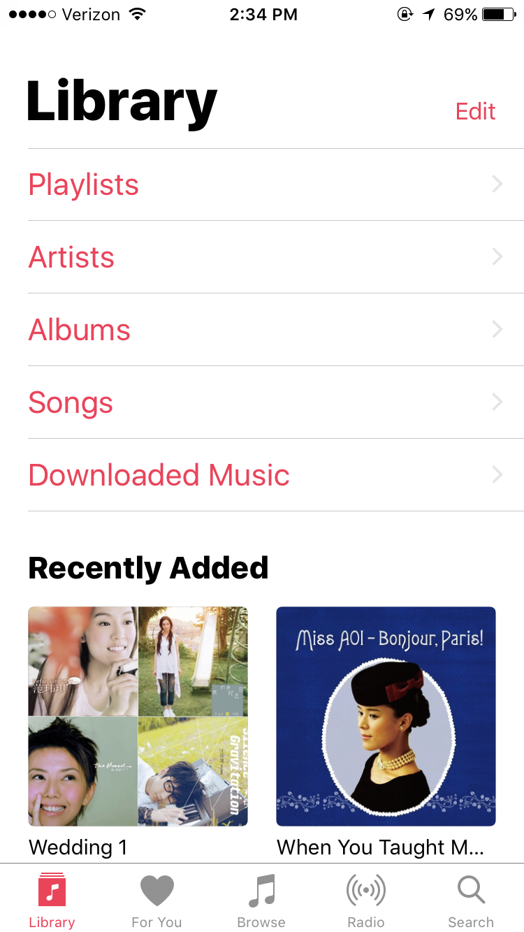
Apple Music is a built-in app in the iOS system, which serves to play downloaded music and videos, listen to broadcast radio, or stream music online with paid account. With downloaded or purchased items, users are allowed to manage and organize their collection in the app by creating playlists. Contents stored in the app are categorized into artists, albums, songs, etc.
Constraints
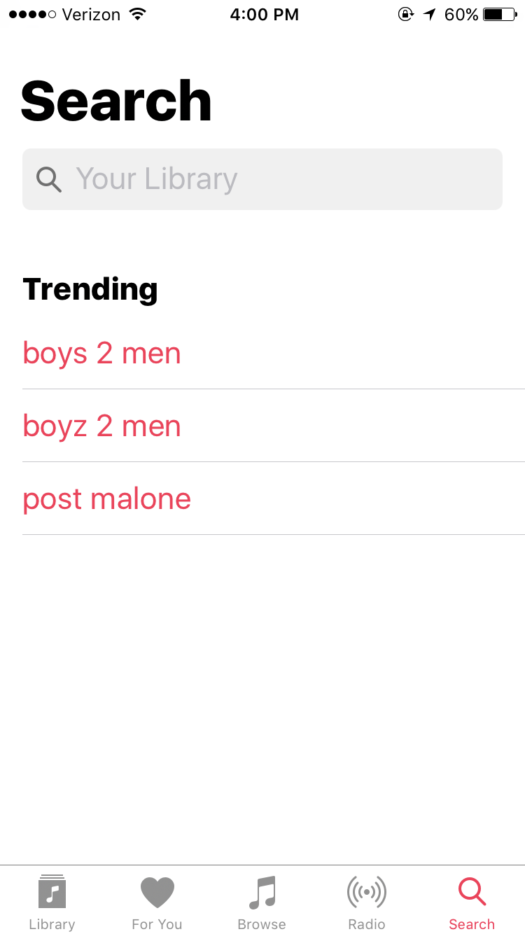
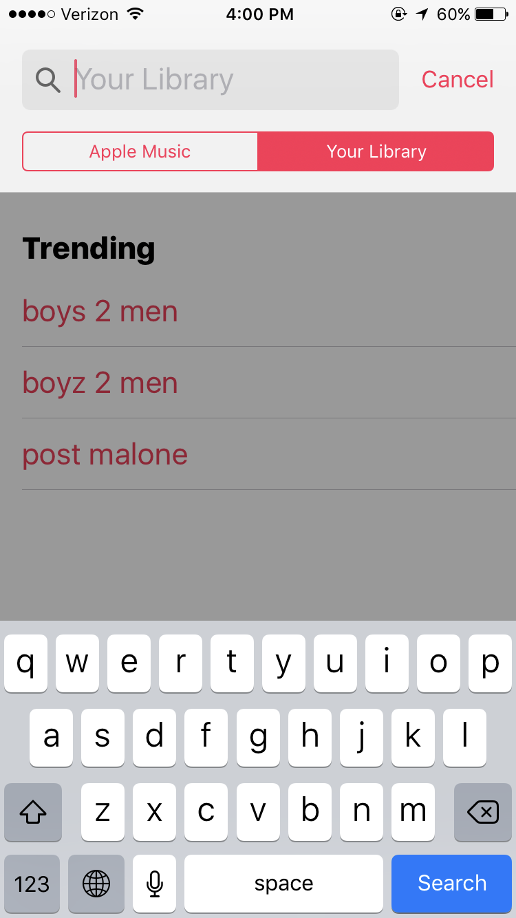
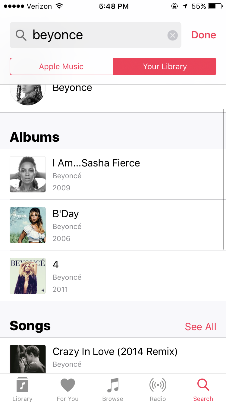
The app does a good job on using constraints on the search page. Under the search bar, users can search for items only from the personal library or from Apple Music. This is helpful as it prevents the users from searching under an inappropriate category and will save a lot of efforts and time. After the user has typed in a keyword and before the search button is clicked, possible answers will show up to help users select the best options. This is a good example of giving feedback.
Feedback
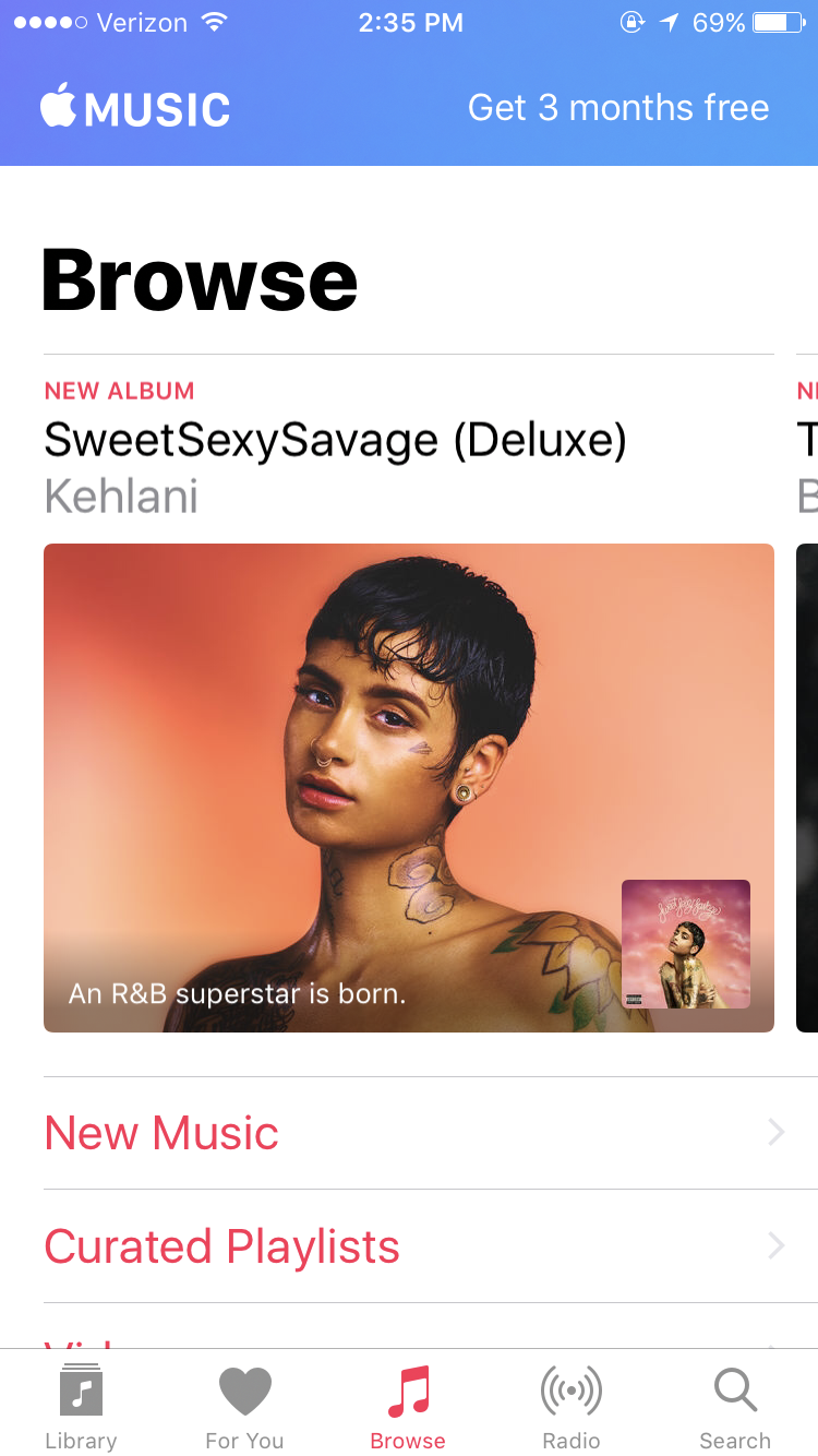
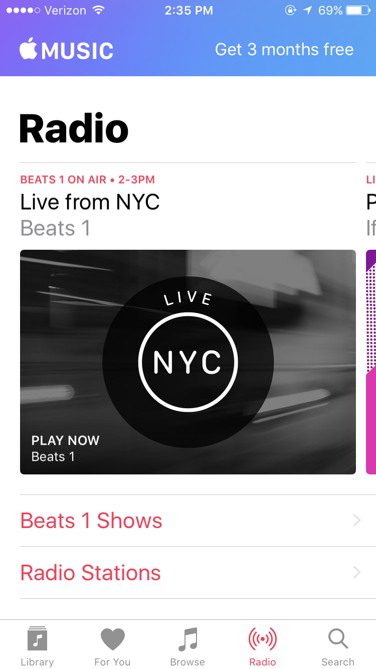
The app provides users strong feedback when they send any request to the app. After launching the app, the navigation bar is located at the bottom of the page, which is easy for users to identify and discover. The color of the five clickable options is designed as gray by default. But once the user clicks on any of the five options, the icon color will change to red, which provides the user a strong feedback that the system has received the request. Same as when the user clicks on any of the options on the upper half of the interface, the background color also changes to red to indicate the feedback from the system.
Signifiers
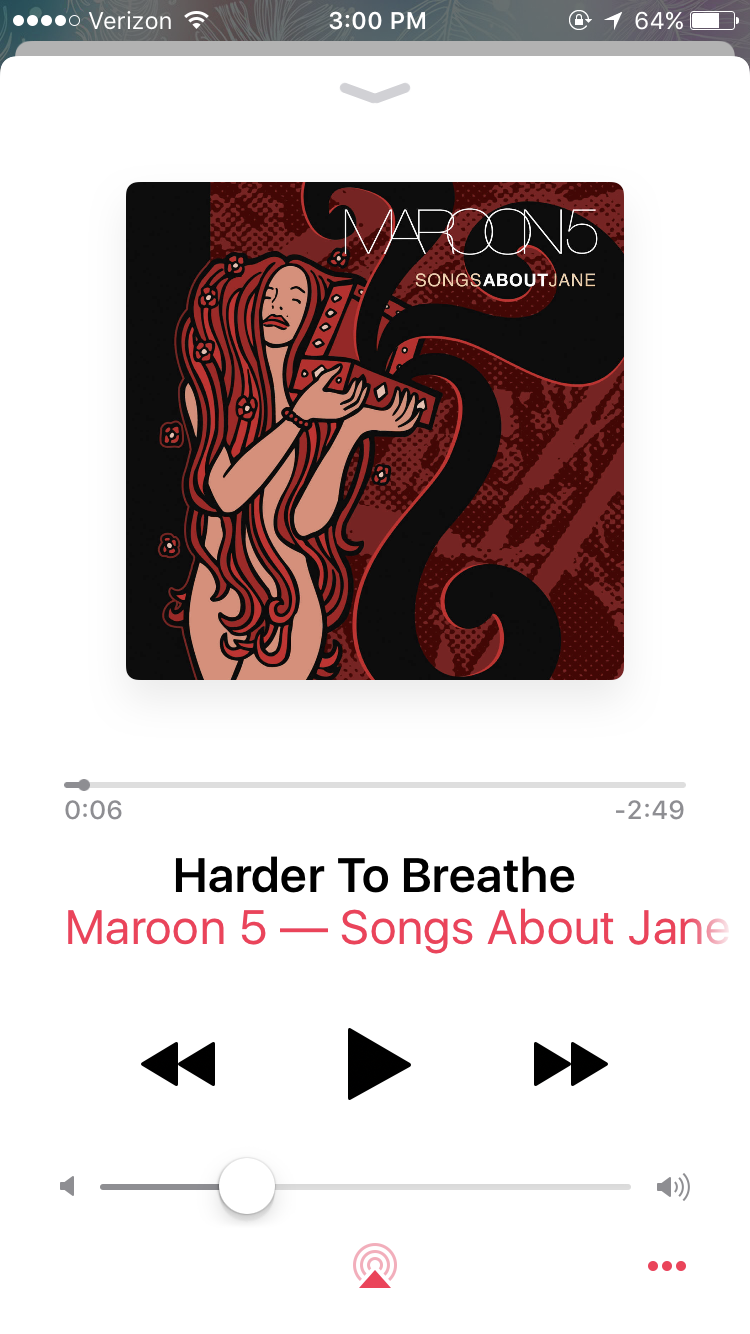
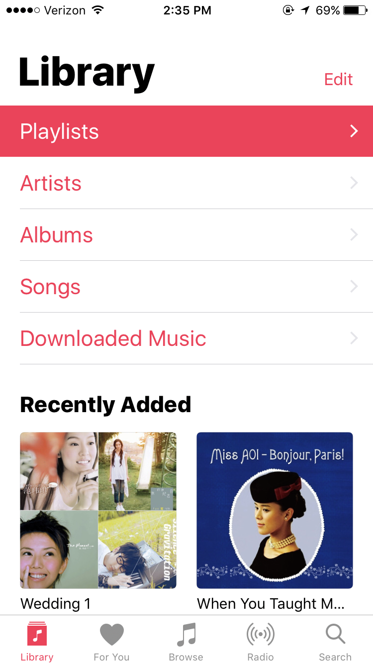
The app uses signifiers appropriately to provide users with an intuitive user experience. Signifiers can be found on many pages of the app. On the Library and the Playlists page, arrows next to each category afford clicking and signify contents under the corresponding category. On the music playing page, signifiers, such as the play button, pause button, forward and backward button, are strong signals to guide users for further actions. Along with the signifiers on both ends, the music progress bar and the volume bar provides natural mapping. Users can understand immediately that they are able to adjust the progress or volume of the current song by sliding their fingers to the left or to the right.
Issues
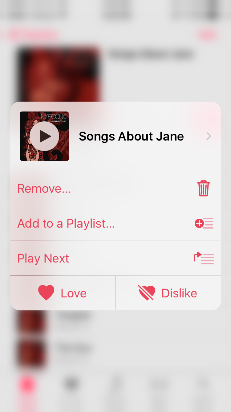
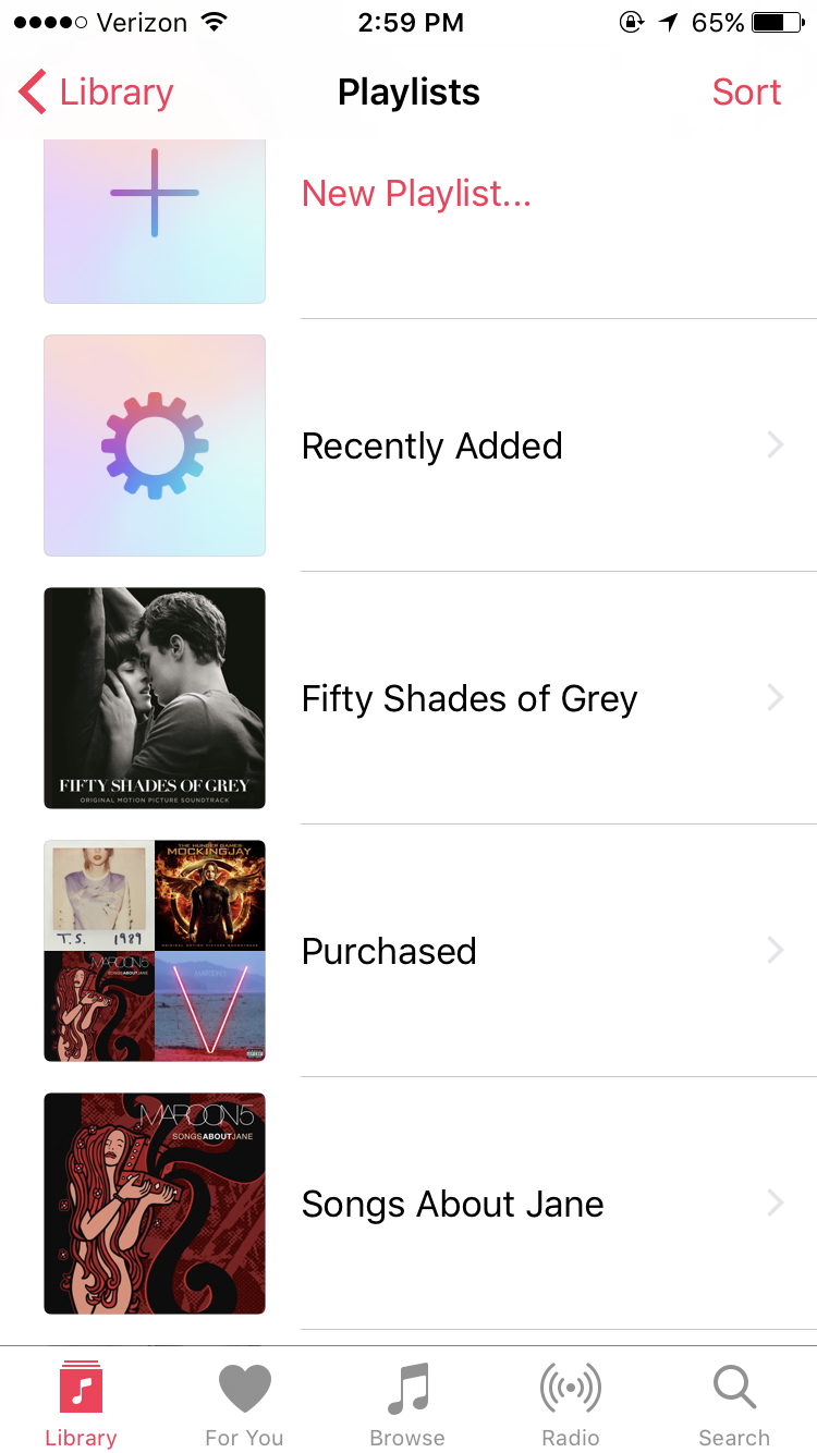
Although the app makes good use of signifiers, there are still signifiers considered to be missing at some places. From the Playlists page, holding and pressing on a specific playlist will create an overlaid window that leads to further actions that can be conducted. However, there is no signifier for this possible action. It is extremely hard for users to discover this feature unless they accidentally hold and press the playlist. Therefore, this overlaid window should either be removed, or signifier needs to be added on the Playlist page, such as a three-dot icon that indicates a meaning of “more”.

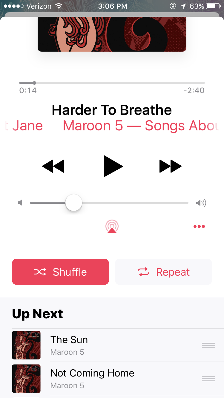
On the Music playing page, the signifier of minimizing the window, a down arrow, is clearly presented on the top. However, this page provides no signifier as users can also swipe up the screen to view more features and Up Next songs underneath. Similar to the overlaid window from the Playlist page, this bottom section is extremely hard to discover, as there is no signs at all. My recommendation for this issue is to add a down arrow to prompt users to swipe up the screen.
In conclusion, the built-in Apple Music app is a useful and powerful tool for users to manage their music collection. It has many strong signifiers, good mappings and useful constraints that create an intuitive experience for the users. As there are a lot of features in the app, signifiers of certain features could be improved to bring better discoverability and usability.