In the final chapter of his book The Design of Everyday Things, Don Norman says, “Fundamental needs will also stay the same, even if they get satisfied in radically different ways.” A dictionary has been a staple reference tool for learning in the modern age and its use today is a fascinating case study in converting traditional analog objects into engaging digital experiences. Dictionary.com does a wonderful job at delivering users the primary purpose of a dictionary in their mobile app through a use of strong signifiers and appropriate feedback, but would benefit from refining edge cases in order to strengthen a user’s conceptual model and reduce the need for knowledge in the head.
Signifier: Strong Call-to-Action (CTA) for Primary Use Case
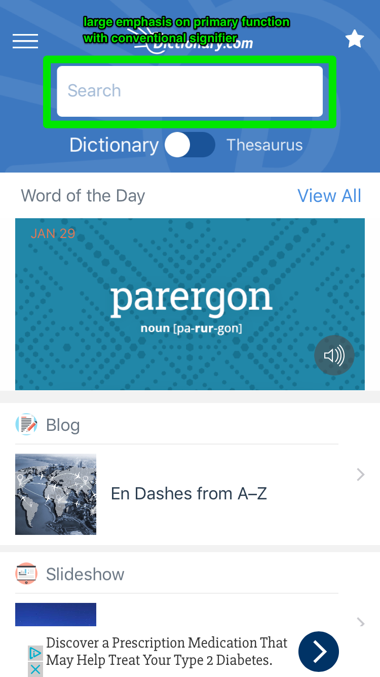
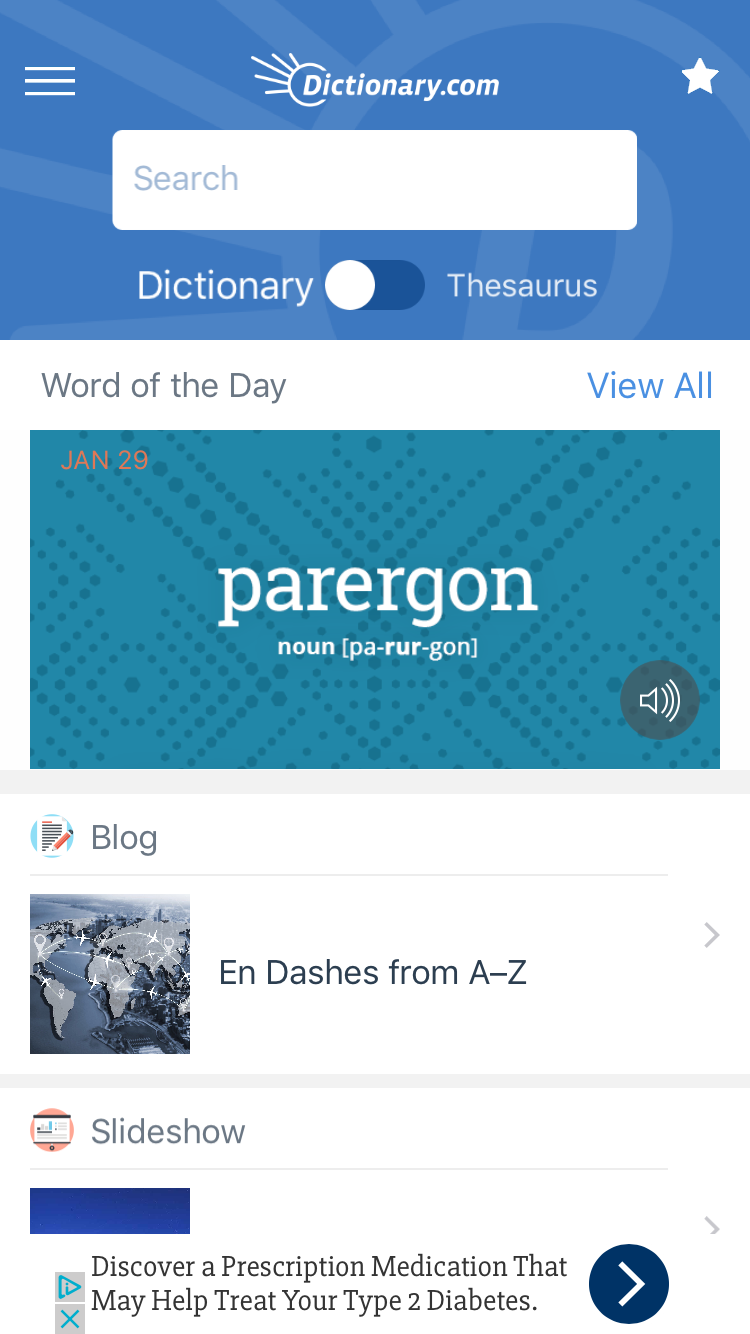
When users launch the Dictionary.com app, they are presented with a home screen that contains a menu hamburger button, a favorites/star section, a search bar, and blog content. Appropriate hierarchy places emphasis on the search bar. Inside the search bar is the helper or hint text that reads “Search”. This is a strong signifier that prompts users to take full advantage of the app’s search capabilities. Given that defining words through search is one of the more likely reasons someone would use dictionary.com‘s mobile app, the design decision to place visual importance on this action is a sound one.
Constraints: Unnecessary Bifurcation
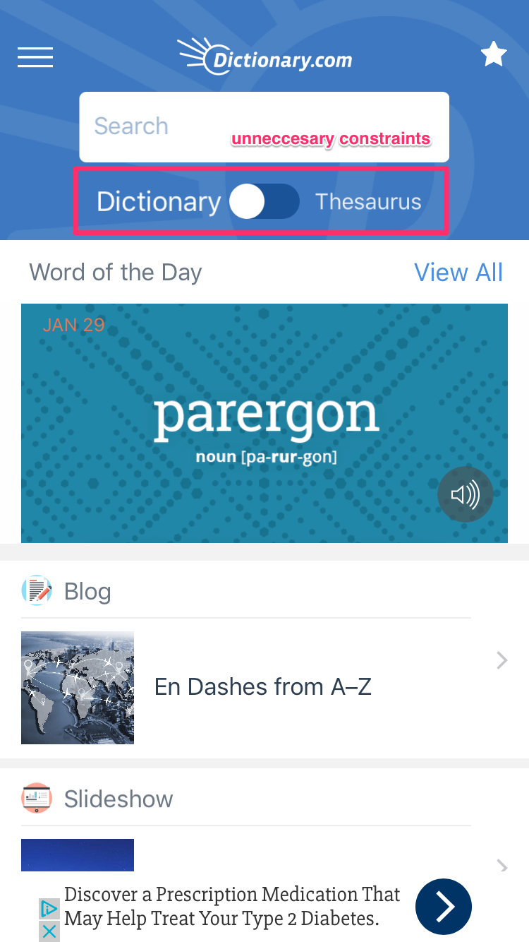
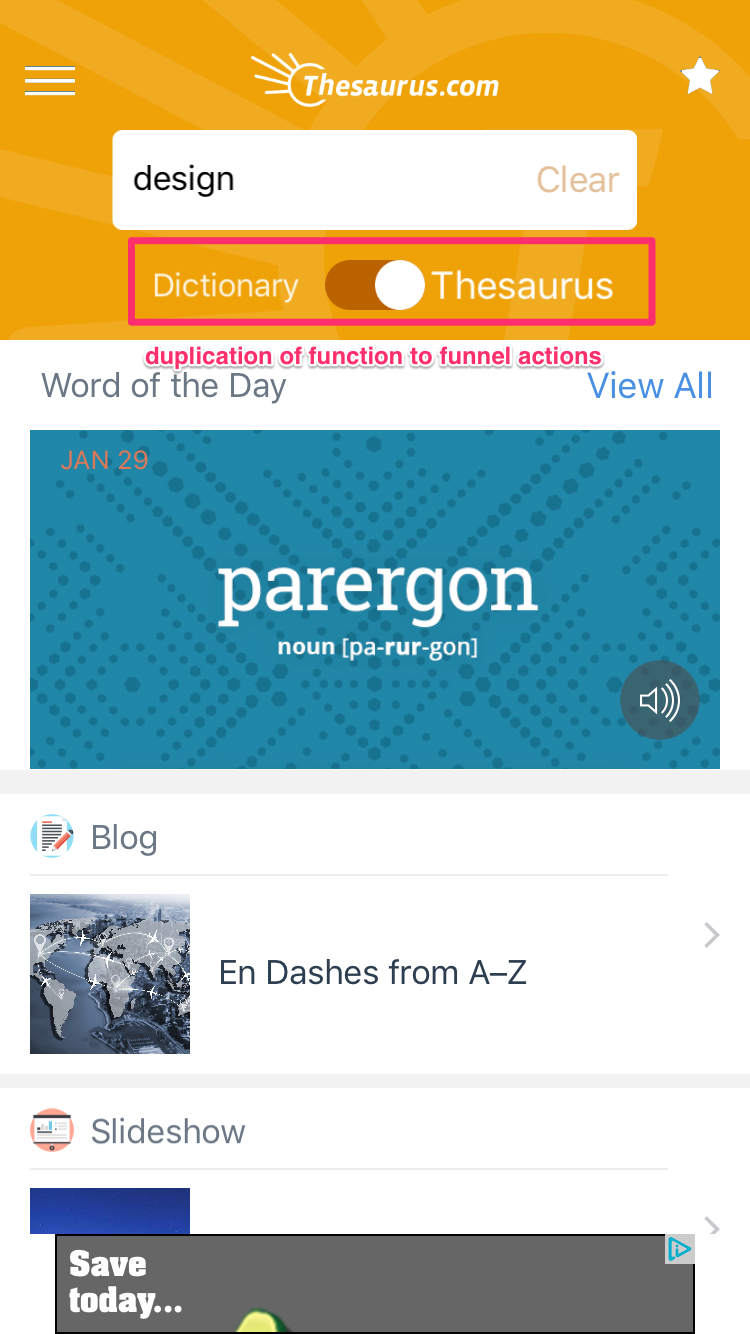
Below the search bar there is an iOS toggle that allows users to switch from a dictionary search to a thesaurus search. Toggles act as a physical constraint in the digital world because it forces a user to select one option in a binary set of choices. While the intent of surfacing the two distinct reference types makes sense, the value of this distinction is somewhat lost by the app’s execution. The functionality of the dictionary and thesaurus searches are actually the same. If you search for a word, the app takes you to the same word page regardless of the toggle, but with a different tab selected. Once a search is completed, the toggle is removed and it becomes one tab among many on the word’s page. This constraint doesn’t accurately depict a difference in functionality. It becomes a superfluous step for users to obtain the information they are seeking. This toggle could be removed.
Feedback: Aiding Users on Search and Error
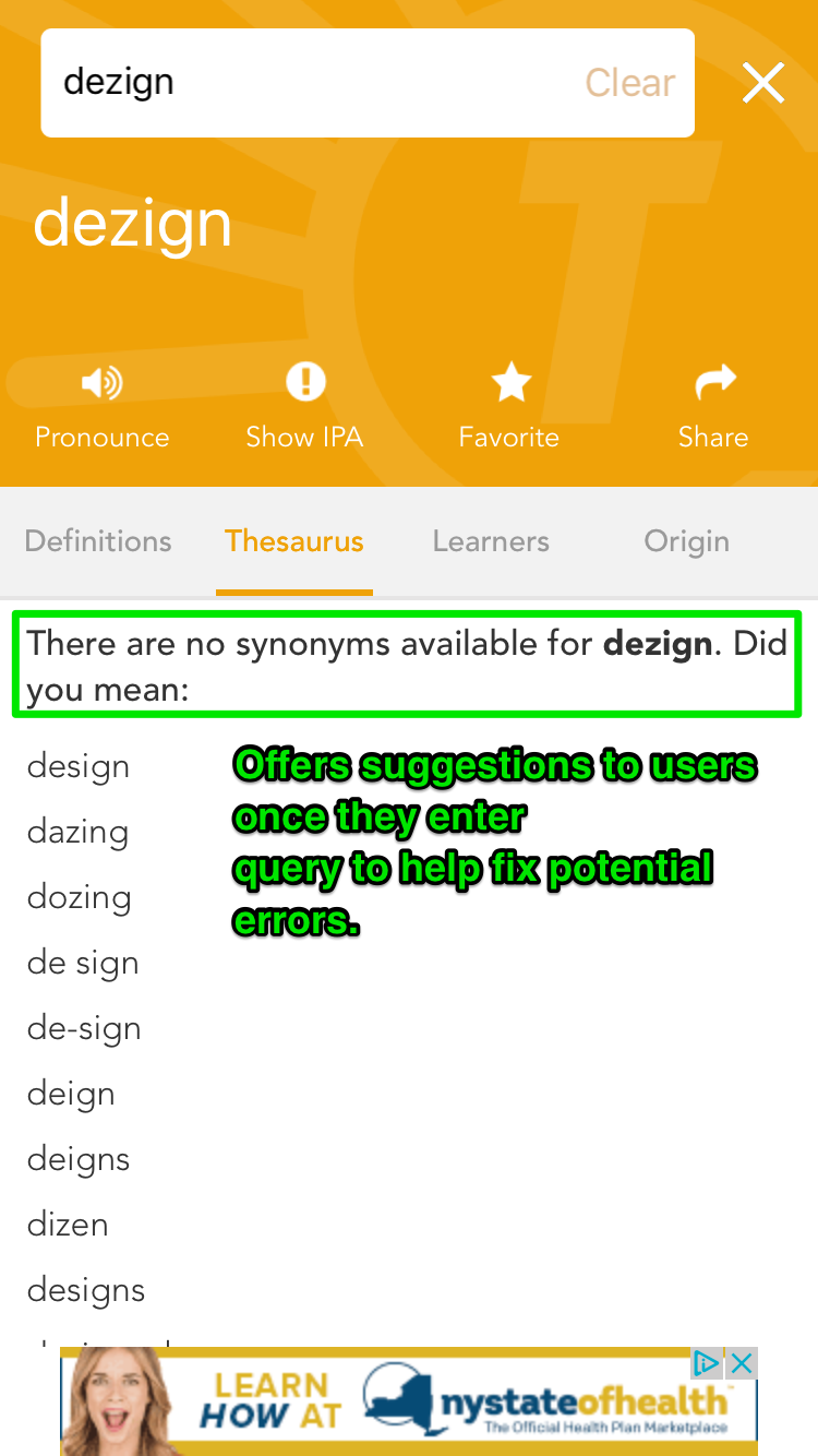
If a user spells a word incorrectly or searches for something not found in dictionary.com’s database, the user is presented with a list of alternative words that the user may have been looking to define. This is a great way to provide feedback for users if they make an error or the system fails to produce expected results. Another aid in the form of feedback occurs when a user is typing a word into the search bar. The app attempts to predict what the user is searching for and presents the user with auto-populated terms that could be what the user is hoping to define. The value in this feedback is two-fold: 1) it helps users execute an action more quickly and 2) it shows the user that the system is working.
Need for Knowledge in the Head
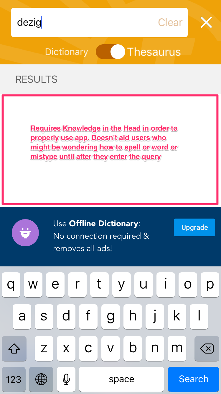
The auto-population of a search term mentioned above is great, but it only works if a user is typing in the term correctly. If a misspelling occurs, the list vanishes and the user is not presented with any indication that the result will error out. If Dictionary.com combines the error handling of the search query with the auto-population of potential search terms, it would create a more efficient experience. At the moment that a user is typing in a query, they are required to know how a word is spelled in order to find it.
Weak Conceptual Model to Traditional Printed Dictionary
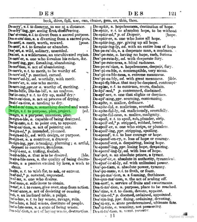
Requiring a user to know how to spell a word presents a weak link between a traditional printed dictionary and the digital app. With a printed dictionary, a term is placed in the context of other words. A person using a dictionary can browse other words around the one they are looking for in order to help with spelling as well as discovery. If dictionary.com brought in next and previous words or allowed users to access entire sections based on the first letter of a word, it would aid in strengthening a user’s conceptual model of a dictionary.