Etsy is an online marketplace where people can set up digital shops and sell custom and self-made items. This critique is based on the customer’s perspective of purchasing an item through Etsy and is based on the online website and will not take into consideration the mobile app. This critique will review specifically the search page, item page, and shop page.
Etsy Critiques
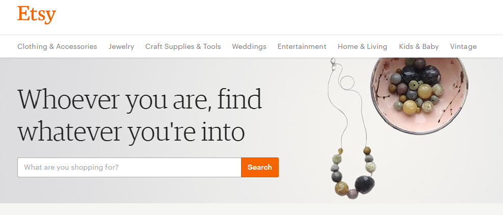
Search Page: Easy to use search system with a good range of refinement tools but could benefit from moving recommend shops higher on the page for better discoverability.
Item Page: Good signifiers that inform the shopper that their item is within the cart. Also uses good mapping to avoid confusion with their multiple range of options. Would be improved with displaying only the featured item in the review section.
Shop Page: Good discoverability of shop options and seller information but could benefit from moving the custom order button higher up with the contact seller button.
First, the discoverability of the search engine is easy and requires no though or searching since it is the first thing that customers see when accessing the website. Here customers can search for keywords, items, and shop names. Searching for something as simple and vague as “love” can yield a variety of results which Etsy allows the customer to break down further to find the item they want. Customers can narrow their searches with recommended categories at the top of the page refine their searches through an easy to see and easy to use bar on the left which are clearly labeled and are a good signifier of their uses. Refining allows the customer to find items based on price range, color, shop location, item type, ordering options, and shipping options. The search refinements are all placed together on one side next to the displayed items which is good mapping since that is where customers would expect to see it. When selecting the refinement option, such as color, only the items within the color range are shown which is good feedback. 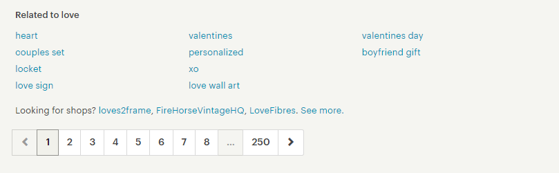 One thing that might be a problem is the discoverability of recommended shops which is listed all the way at the end of the page in small blue print that matches the color of the related items. This might cause customers to skip over shops that they might enjoy and the recommended shops should be moved to the top of the page where customers can see it. Customers who have already used Etsy and have this knowledge, knowledge in the head, would know to look down there but new customers might miss it.
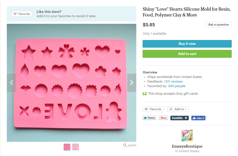 Once customers have selected an item they can look over the item description, reviews, store policy, and purchasing options. As well as favorite the item, like it to social media, or visit the shop page. All options are well displayed and easy to discover and well labeled to signify their use. This page also has good mapping where all related information is placed together and where customers would expect to find them. All information related to purchasing the item, such as price, gift card acceptation, number or items being shipped (which is useful in cases where items come with multiple parts), and shipping options are all located in one place at the top right next to the item. All information related to the description of the item, reviews of the item, or store policies are located together under the item.
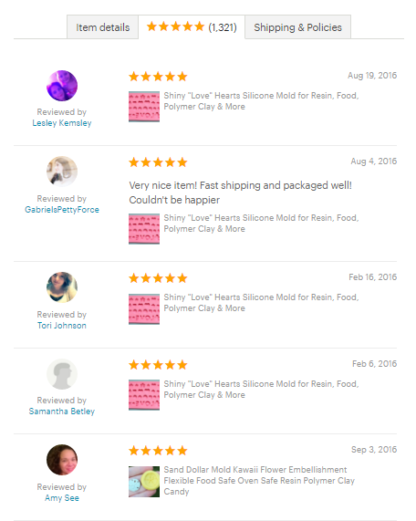 This page also has good constraints where a customer cannot leave a review for items they haven’t purchased. If the customer chooses to add the item to their cart the cart icon immediately displays the new number of items in the cart which sends good feedback to the customer that their request has been confirmed. One problem with the item page is the review section. This section not only gives reviews for the item featured on the page but also of other items that the seller has made. Although it includes a picture in the review this can still be confusing if the seller has many items that look alike. The solution would be to feature only the reviews for the item item displayed on the page.
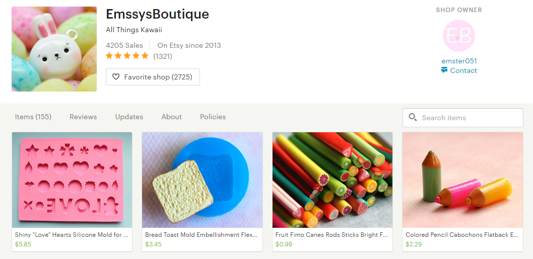 On the shop page customers can view other items made by the seller, see reviews, look at updates, learn about the shop, and view store policies. They can also search specific categories within the shop, contact the seller, ask a question, request a custom order, or report the shop to Etsy if there is a problem. The discoverability of the options are clear, options are organized and signify their purpose well.
 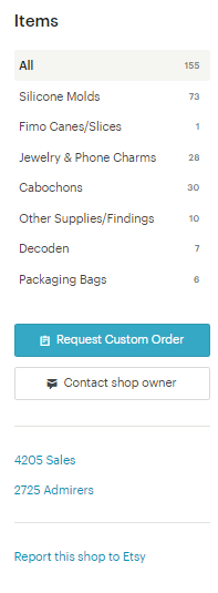 The mapping on this page could be better enhanced by moving the request custom order button to the top right of the screen with the contact seller button.Although the custom order button is next to a second contact seller button lower on the page, new customers wanting a custom order may click the first contact seller button without scrolling further down. This may create a problem with the feedback that customers receive. There is nothing that stops a customer for requesting a custom order within the question box so moving it also solves the problem of bad constraints and bad affordances. Overall Etsy is a good website that allows creative people to display their talents and allows customers to support artist and small businesses. When it comes to design and business one aspect, as explained by author Don Norman in his book The Design of Everyday Things is that people grow tired or item quickly even if they are designed well. He states “The problem is that after the product has been available for a while, a number of factors inevitably appear, pushing the company toward the addition of new features— toward creeping featurism.” Etsy avoids this by giving power to the sellers where they can post new products and items on a conveniently located update page. It also allows them to receive reviews for their items and create better items, taking much of the pressure improve off of the website and placing it onto the shop owners. In terms of the website design Etsy has come very far and can make use of these small listed improvements.