Fresh Direct is an online retailer that allows customers to order food (meat, vegetables, fish), party platters, and household items (trash bags, dish soap, and so on) for next day delivery to their residence or business in the New York metropolitan area.
The website is the primary (for purposes of this critique) interface for the retailer. Mobile app versions exist for Android and IOS platforms, but are not addressed here.
Plus: Discoverability and Natural Mapping
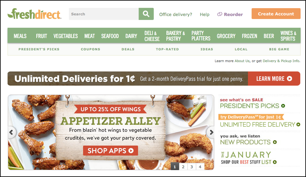
At first glance, the site’s discoverability makes it relatively simple to understand what one can do – select and purchase food/other things for next day delivery. The menu at the top displays various categories of food and other items, grouped by category, making it easier for customers to find their desired product(s). The top-level menu layout generally mirrors the layout of a physical grocery store. Sub-menus for categories aid in locating certain types of items, such as apples or citrus fruit. This structure is followed for other areas, such as meat and seafood.
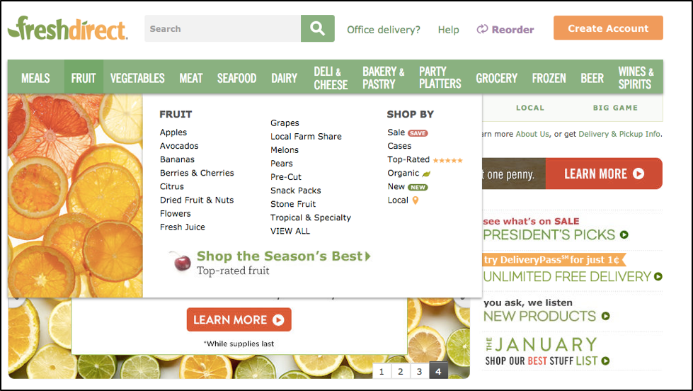
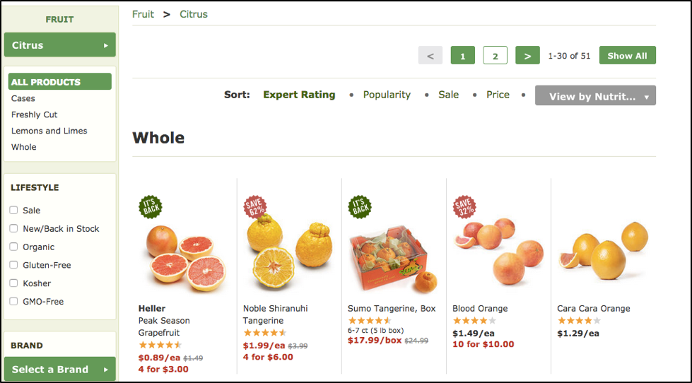
The site’s menu acts as a natural mapping, by connecting an action to its result. Selecting the top level category, then selecting the specific type of fruit (action) from the drop-down menu displays the various types of citrus available for sale (result). Most categories follow this mapping consistently.
Minus: Sub-Menus and A Mental Model Disconnect
However, the ‘grocery’ category requires two additional steps, requiring users to select a sub-category (pantry, beverages…), a sub-sub category (‘snacks’), then the desired product(s) from the selected category. Additional clicking and menus add complexity to the process, and may slow down the completion of the tasks forming the basis of the activity.

Also, the menu of items under ‘pantry’ may not correlate with the customer’s mental model of a physical grocery store. Cereal will most likely be in an aisle different than where one would find the oil and vinegar, and so on. A possible solution would be to add a second level of categories that more closely align with a traditional grocery store aisle format under the first level categories (meat, fruit, and so on). For example, ‘snacks’ could be renamed ‘Chips/Condiments’, with spices and baking needs in a ‘Baking/Spices/Oil’ category.
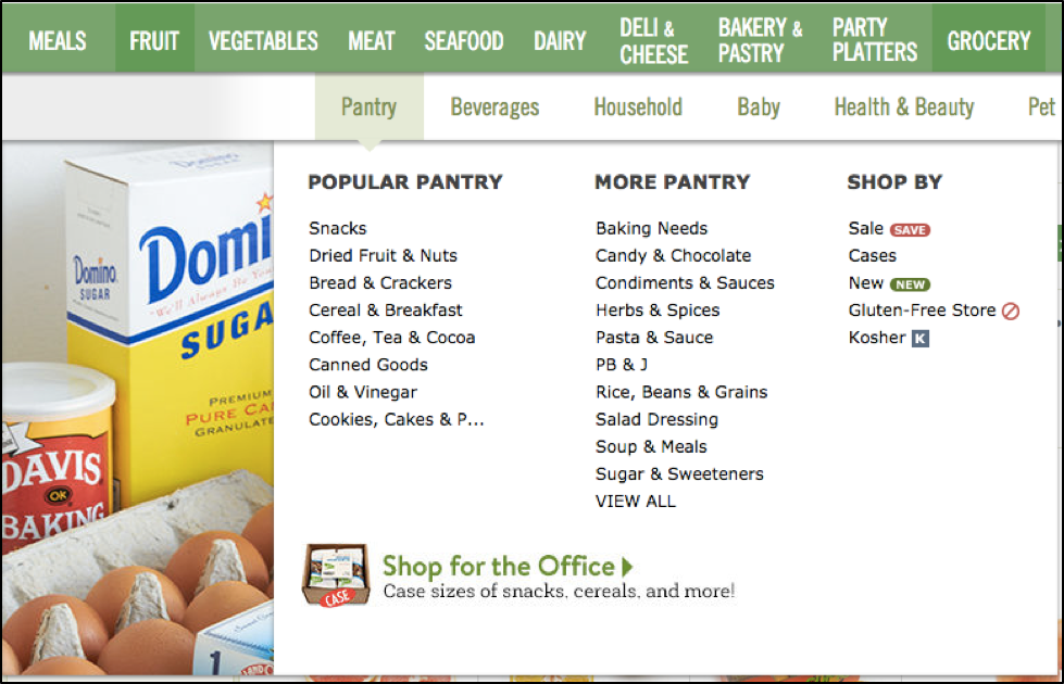
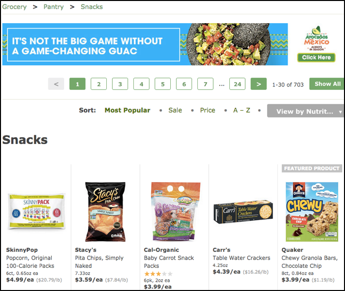 Snacks selection, as presented on FreshDirect site.
Positive: Clear Feedback
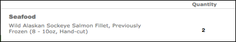
The site provides feedback when an action is taken, such as placing an item in the cart, assuming it is in stock. The quantity of the selected item will be displayed in the cart, ready for purchase, along with other items.
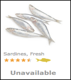
If the selected item is not available, it will be grayed out, and marked ‘unavailable’. The item then cannot be selected, or placed in the cart, making use of a logical constraint. Fresh Direct cannot sell something it does not have. The customer may then choose a similar product, abandon the idea of buying fresh sardines, or look elsewhere for the desired product.
Positive: Use of Activity Centered Design and Focus on Task Completion
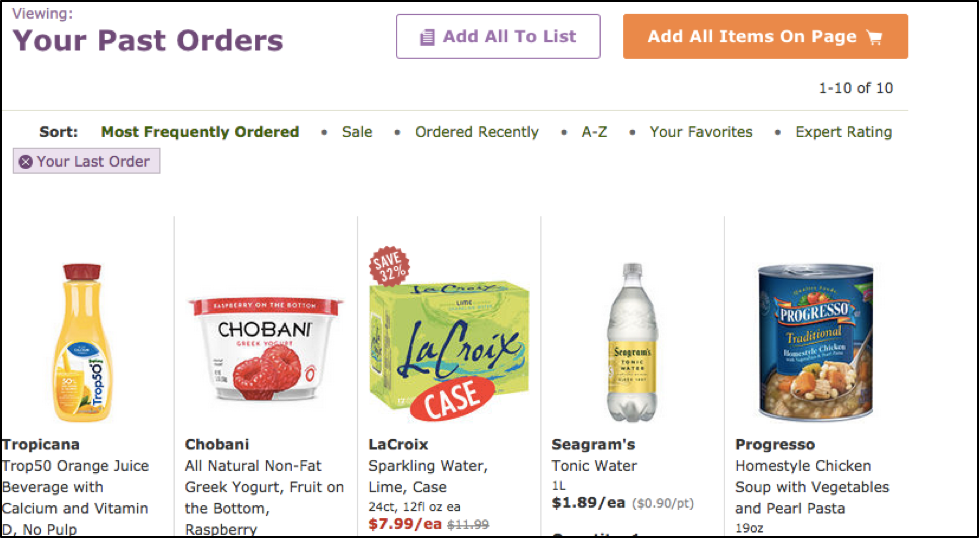
The site makes also makes use of activity-centered design by decomposing the activity of shopping into discrete tasks: determining availability of items, selecting the items, placing them in the cart, keeping a running total, and selecting a convenient time for delivery, albeit from a computer. Additionally, repetition of the tasks shortens the time to complete them, as the customer is familiar with checkout procedures and can easily access past orders to purchase the same items again, without having to look for a specific thing.
Overall, Fresh Direct does a very good job of getting the activity and associated tasks of grocery shopping done. By using natural mapping, discoverability, and providing clear, immediate feedback, the site is successful in providing a positive shopping experience. The sub-menus for harder-to-categorize areas, such as ‘grocery’ provide an opportunity for refinement, with the goal of more closely aligning with the grocery store mental model.