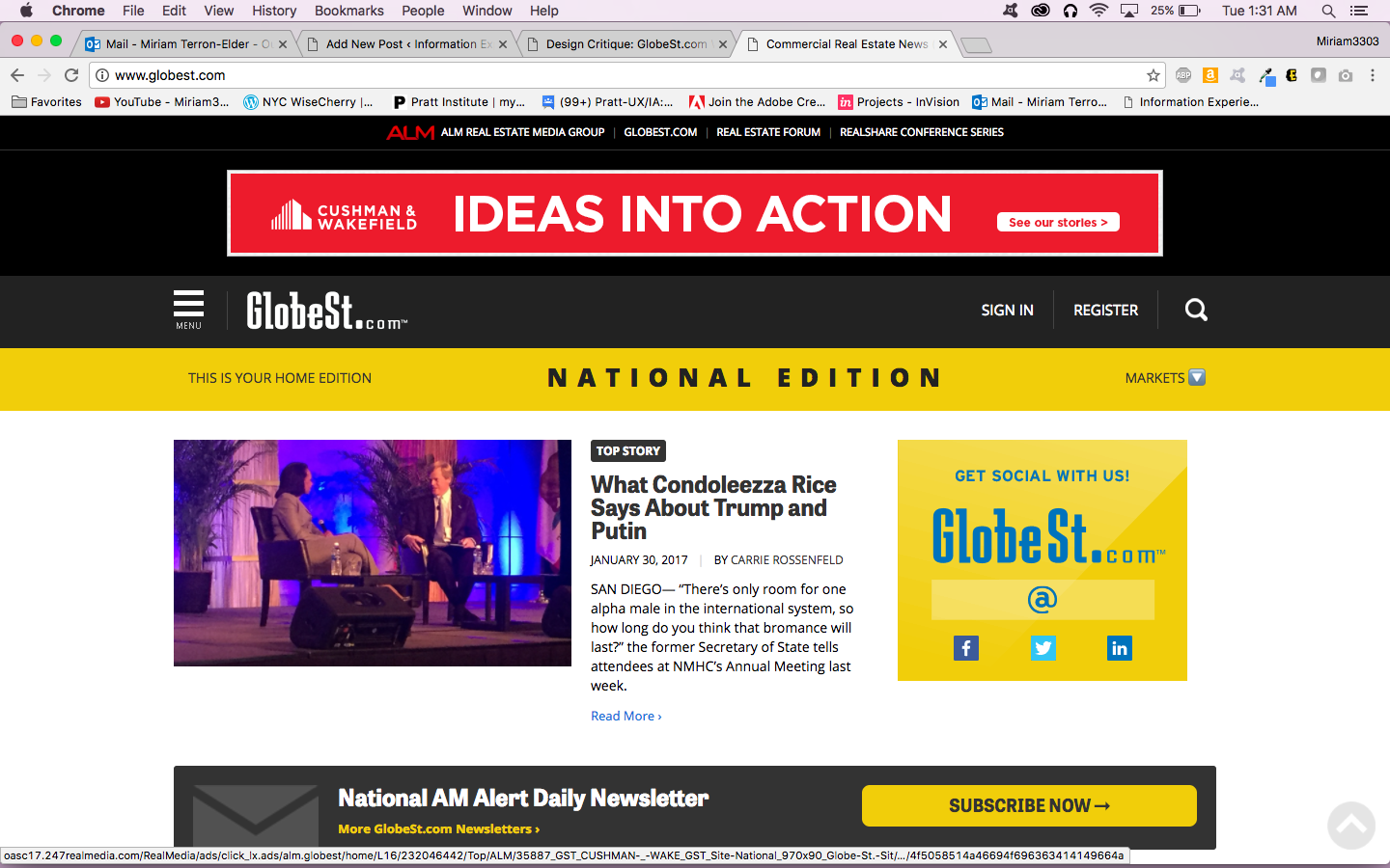
GlobeSt.com provides the commercial real estate community with top stories, analysis, and industry trends. The majority of site users hold a title of CEO, CFO, or SVP. For the purposes of this critique, I am focusing on the responsive website, including specific features like menu, account sign in, and newsletter sign up.
Discoverability & Feedback
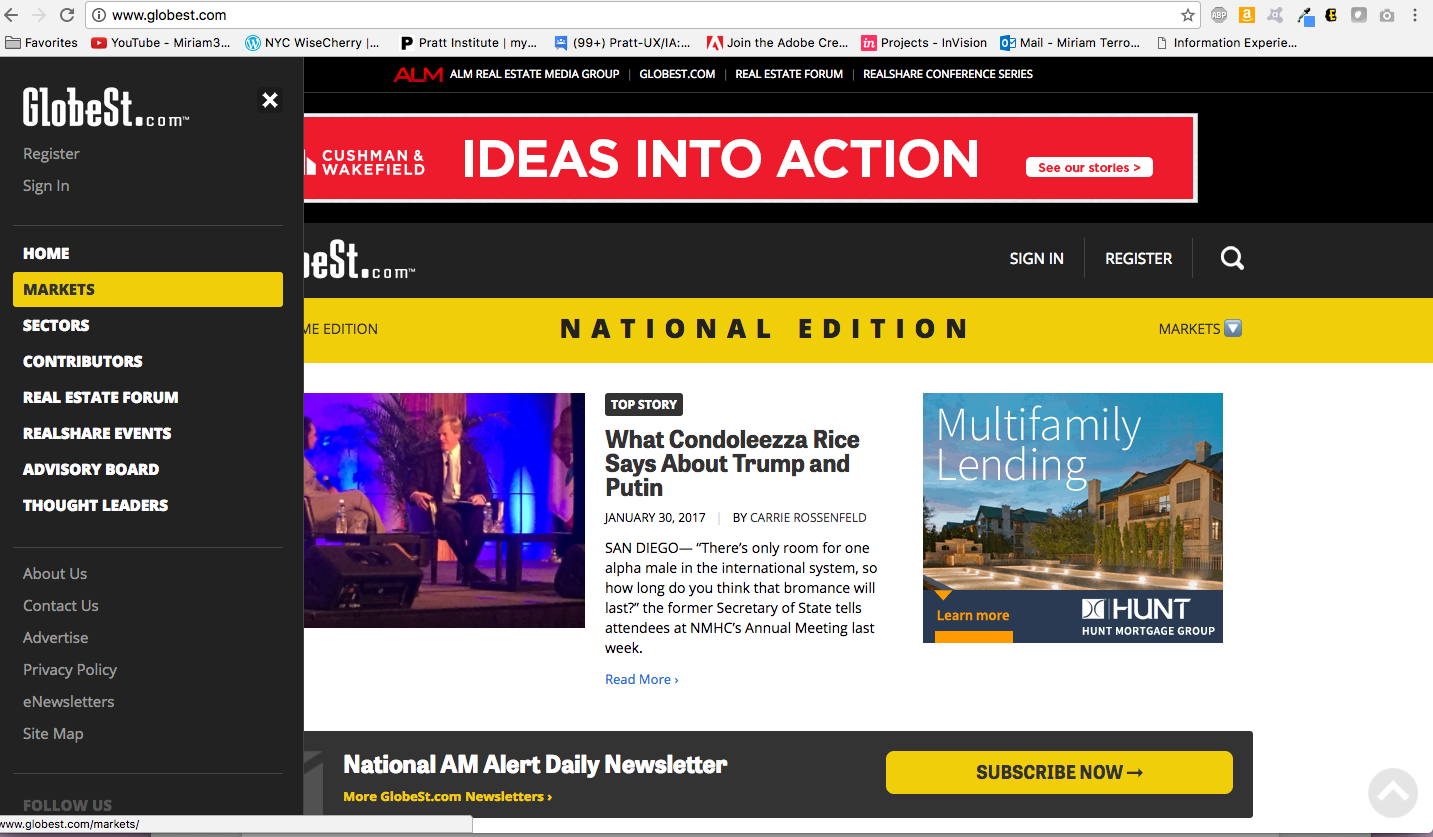
The top portion of the site places the hamburger menu to the left of the logo. Along the same line to the right, the sign in, register, and search button can be accessed. When the menu icon is tapped, the menu and categories slide out from the left and selections are highlighted in yellow when the mouse hovers over each of them. Communicating the results of the hover state helps the user to find the section they want and avoid slips like landing someplace else.
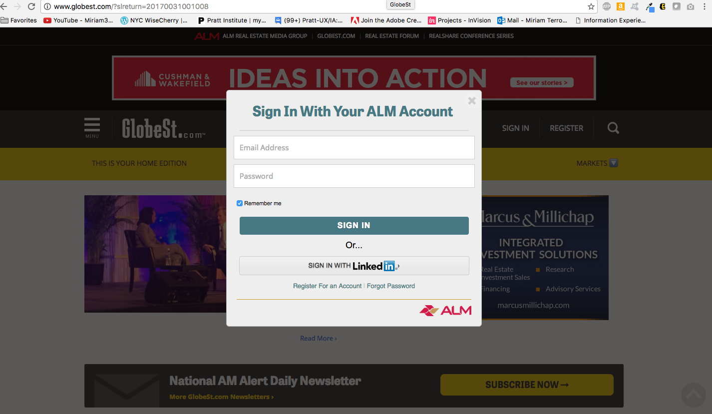
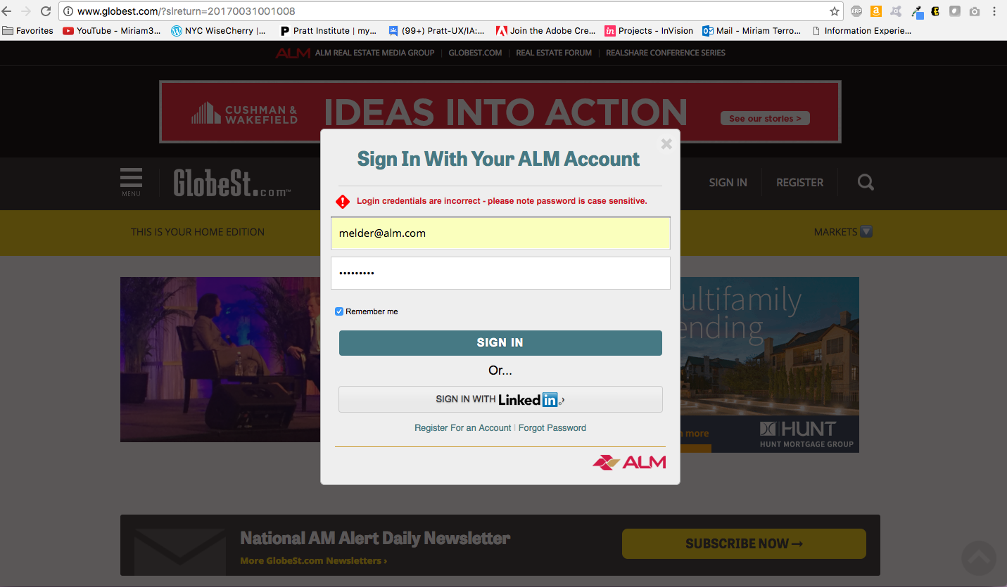
Account sign in is easy to access along the top bar and does not navigate user away from the content page by opening in a second tab. Error feedback is communicated quickly and it is easy to determine what state the system is in at this point.
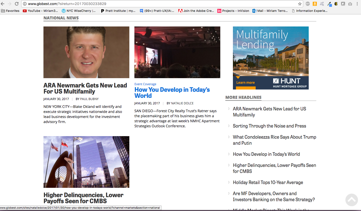
Another strong and consistent use of feedback on the site is that all article headlines turn a blue shade as to indicate they can be clicked on.
Where we can do better:
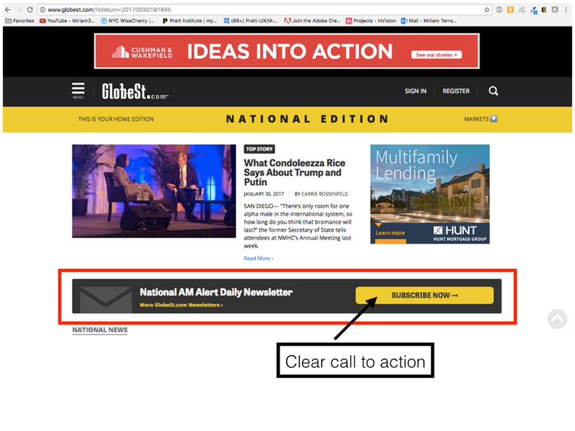
The feedback the user receives when highlighting a selection is missing from the social media buttons at the bottom of menu bar. In the screen shot below, the cursor is hovering over the Facebook icon, but the user can’t really see that. Bolding the words or icon sharply would serve the purpose of communicating selection.
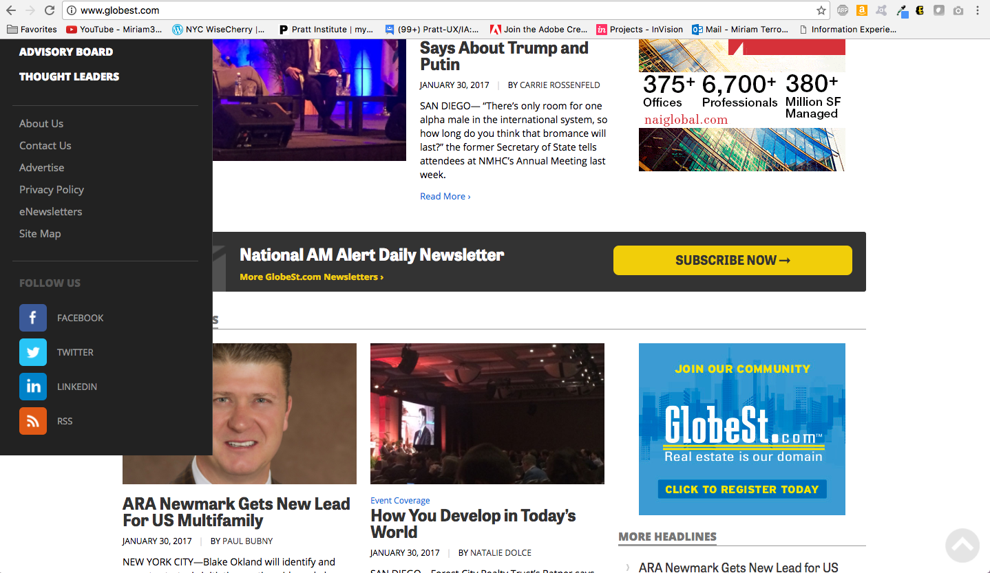
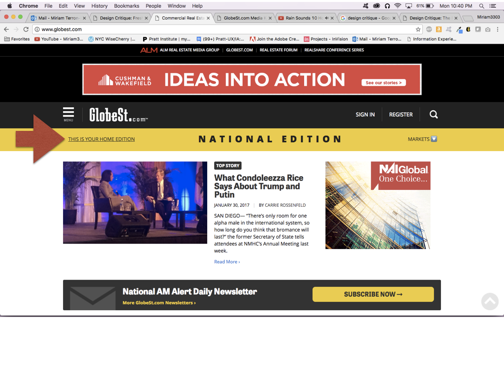
Also pictured below is the cursor on the words: “This is Your Home Edition”. The underline gives the suggested feedback that this is a selection that is linked to something; however, that is not the case. Removing the underline would remove the possibility of confusion for the user.
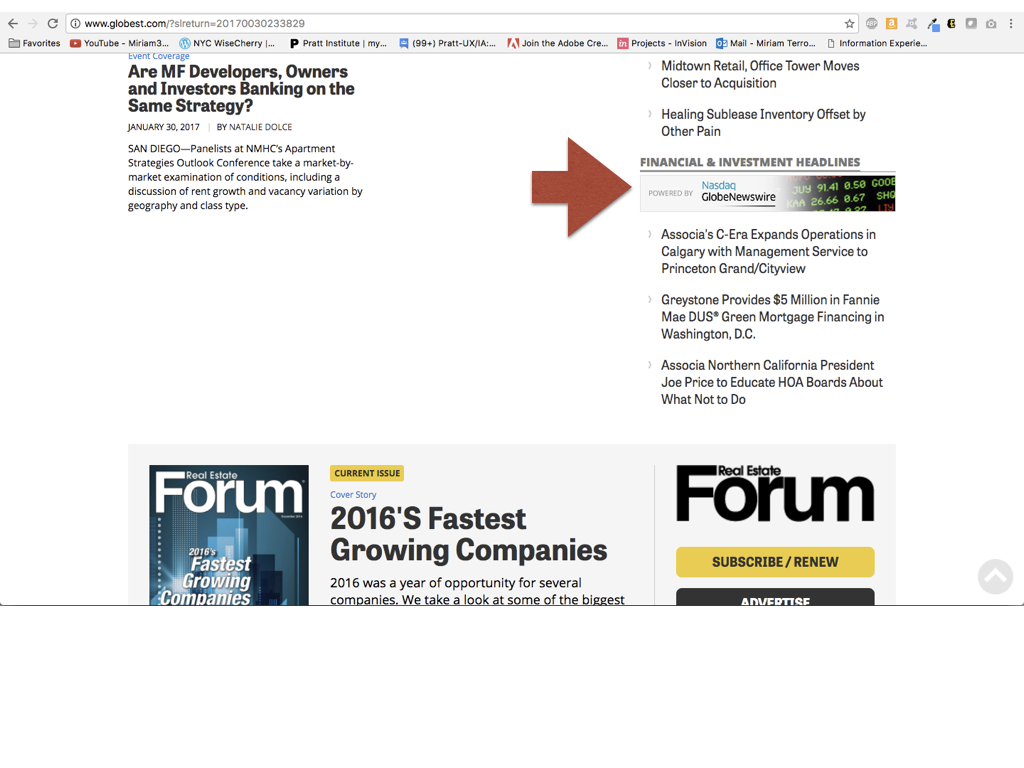
Due to its positioning within the right-hand side and appearance, the heading for NASDAQ Newswire not being linked may confuse users whose mental model already suggests that elements in that area would be linked.
Strong Use of Signifiers
Signifiers, like the section for subscribing to the National newsletter with its strong call-to-action, communicate directly with the user about what action they can take and where they can click. The position of this section also adds visual separation from the top story to the rest of the page.
Where we can do better:
Once the “subscribe” button is clicked, the subscription landing page is a generic list of the newsletters available with no pre-set for the national newsletter as advertised on the homepage. Providing the national newsletter as pre-set, connects the action of subscribing from the homepage in a useful and expected way, while still allowing for the addition of other newsletters.
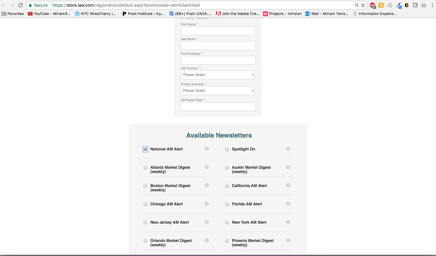
The registration form is the same form used for account set up (including the list of newsletters). This appears redundant and could lead users to receiving duplicate newsletter or 3rd party emails. Consideration should be given to having the list of newsletters show up once either at the registration point for newsletter or at the account set up level, not in both places.