![]()
Google Hangout is a powerful communication platform that combines instant messaging, video chat, SMS and VOIP into one application. Google Hangout, coupled with its companion VOIP application, Hangout Dialer, is the most frequently used application on my smartphone. For those who are unfamiliar, VOIP stands for voice over internet protocol. Hangout integrates Google Voice, a former voicemail application, also developed by Google, to give its user a telephone number. With this telephone number, users can make or receive phone call as long as he or she is connected to the internet. Because the call is delivered through the internet, no cellular service is required.
Like many Google applications, Hangout has adopted the flat minimalist aesthetic that has been gaining popularity in the recent years. Upon the opening of the application, there are two separate tabs that lead to Hangout’s main features: messaging and voice call. Users can immediately locate the features using proper signifiers as shown below.
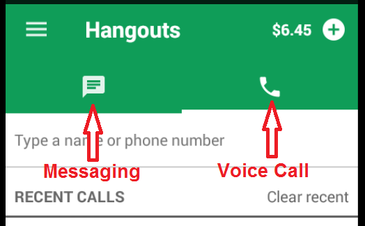
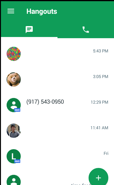
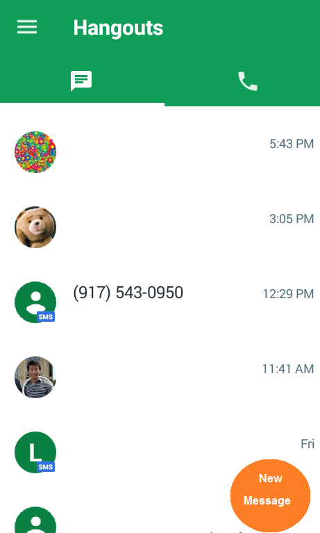
| In messaging, all ongoing conversations are listed chronologically in which the most recent conversation will always appear first.
|
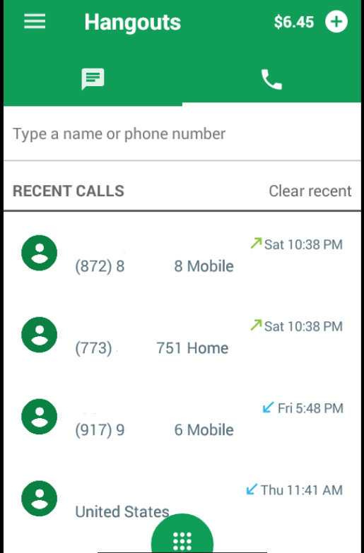
In voice call, phone calls are listed chronologically with most recent phone calls listed at the top.
|
At first glance, the interface looks clean with minimal clutter. The controls seem straightforward. However, the simplistic interface is not without its flaws.
Discoverability for Instant Messaging
According to Norman, two of the most important characteristics of good design are discoverability and understanding. With proper signifiers, discoverability allows us to figure out possible actions and how to perform them.
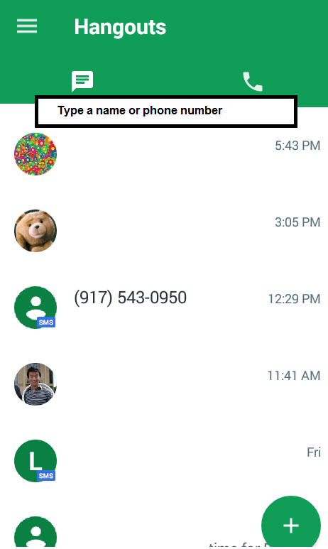
Despite the many features that are built into Hangout, the discoverability of these features can be concealed by the minimalist interface. For example, while it is easy to resume an ongoing conversation by choosing from a list of existing conversation, it is hard for novice users to figure out how to initiate a new conversation. To start a new conversation, the users must touch on the small circular button that is located at bottom right corner as shown below.
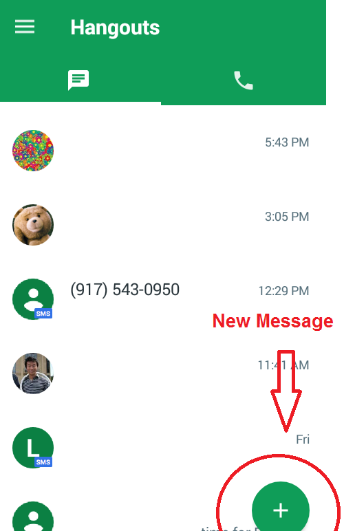
While the design of the “new message” button fits well into the minimalist theme of the interface design. The discoverability is limited because the color and shape of the button is the same as the conversation icons in the same screen. In addition, the “plus” used to signify the button function says very little of what it does.
Recommendation
To help improve discoverability, the “new message” button should be in different color. The “plus” signifier should also be changed to something more consistent with the signifier used to indicate messaging or replaced simply with explicit instruction like “New Message” as shown below.
Affordance for SMS
According to Norman, An affordance is a relationship between the properties of an object and the capabilities of the agent that determine just how the object could possibly be used. The usage of affordance appears inconsistent throughout Hangout’s interface.
| In voice call, there is box for entering the numbers you wish to dial.
|
In messaging, there is no box for entering numbers for a new SMS.
|
The messaging feature on Hangout is highly versatile as it combines both instant messaging and SMS. However, just by looking at the messaging interface, it is hard for new user to see that SMS with phone numbers is also supported.
Recommendation
Similar to the voice call interface, I believe adding a box that gives explicit instruction to the messaging interface would improve affordance for this feature as shown below.
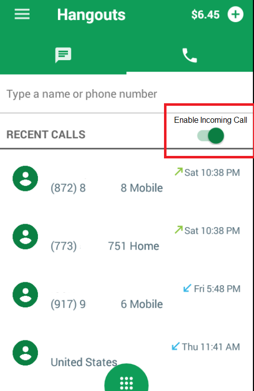
Affordance and Discoverability for Incoming Call
In addition to making voice call, Hangout also allows the user to receive incoming call over the internet like a regular phone. However, as powerful as this feature is, the lack of affordance and discoverability is preventing novice users from accessing this useful feature.
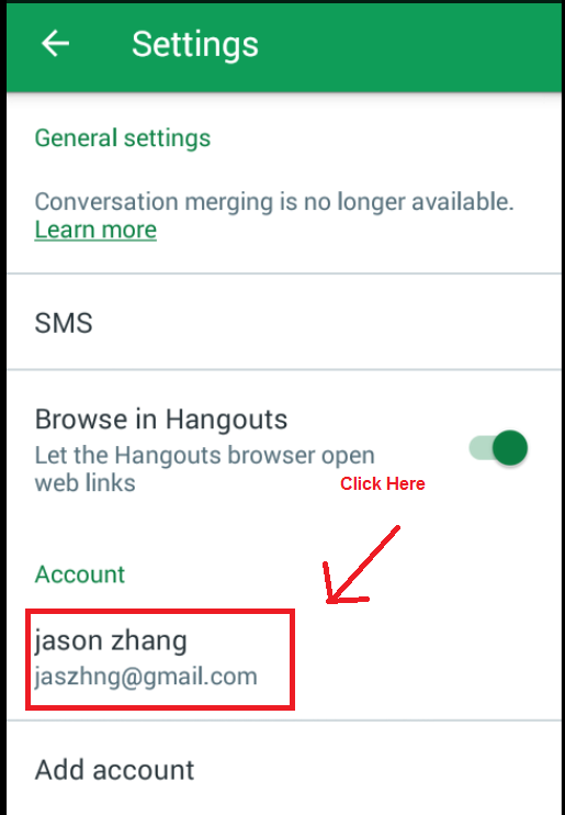
To enable incoming call, the users have to go through Hangout’s elegant, minimalist, but hard to understand interface. The setting menu is located on the top left corner.

After clicking on the setting menu, the user needs to click through two additional screens to locate the setting menu for enabling incoming phone call as shown below.
| Step 1
|
Step 2
|
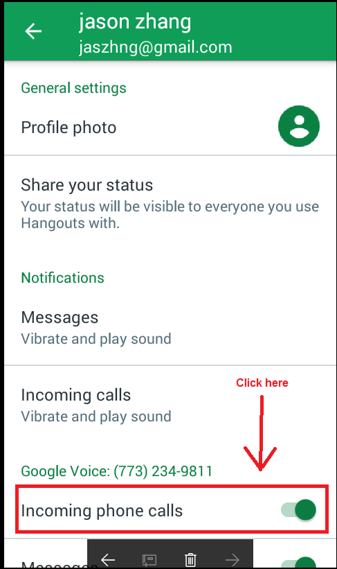
In addition to a setting menu that is hard to find, there is also a lack of physical constraints used in settings menu. There are many other settings in the same menu as the setting for enabling incoming phone calls. The switch for turning on a setting is too small for touch screen and there is no prompt or button to confirm or discard changes. The users can accidentally mute notifications in the setting menu without knowing.
Recommendation
In order to make incoming call accessible and minimize the chance of users making unwanted changes in the settings menu. The switch for enabling incoming call should be placed in the voice call interface to improve discoverability as shown below.
Summary
All in all, despite the many powerful features that Hangouts offers, its interface is faced with the paradox of technology that is discussed in Design of Everyday Things: the added features enabled by technology also complicates life by making them harder to learn, harder to use. To succumb to this challenge, I think the designers of Hangout have sacrificed affordances and discoverability for elegance and cleanliness, leaving the users to explore the features on their own.