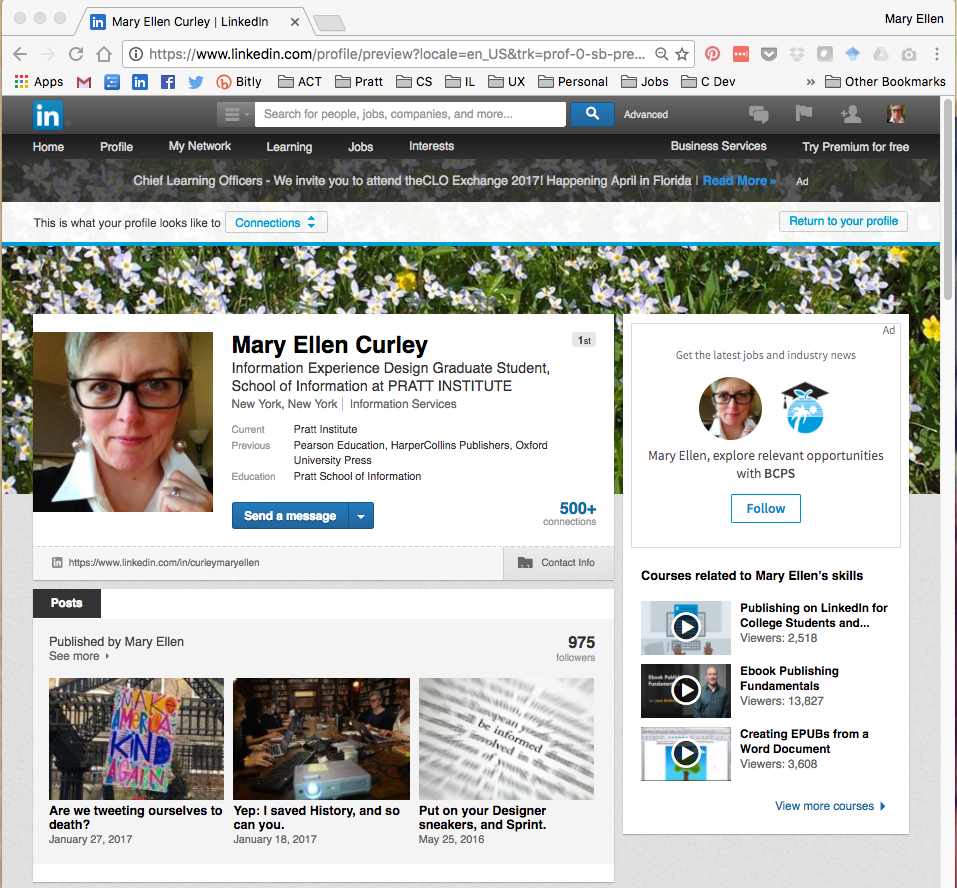
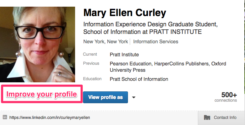
LinkedIn is a powerful professional networking tool, and the LinkedIn profile is a commonly-used, linkable online alternative for the traditional resume. The goal is to create and edit a “strong” profile that will generate interest in the user as a candidate for employers.
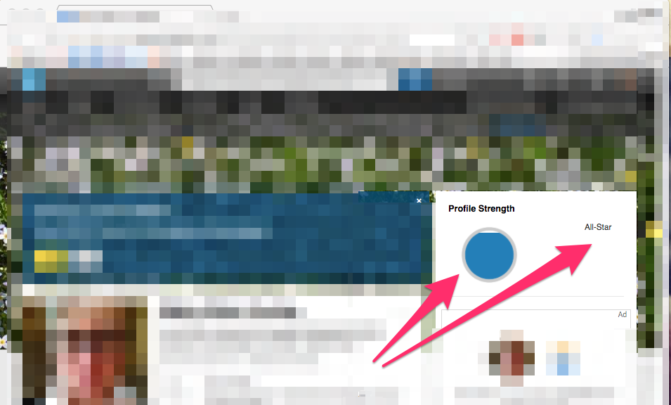
“Profile Strength” panel provides a good conceptual model
Navigation signifiers are inconsistent
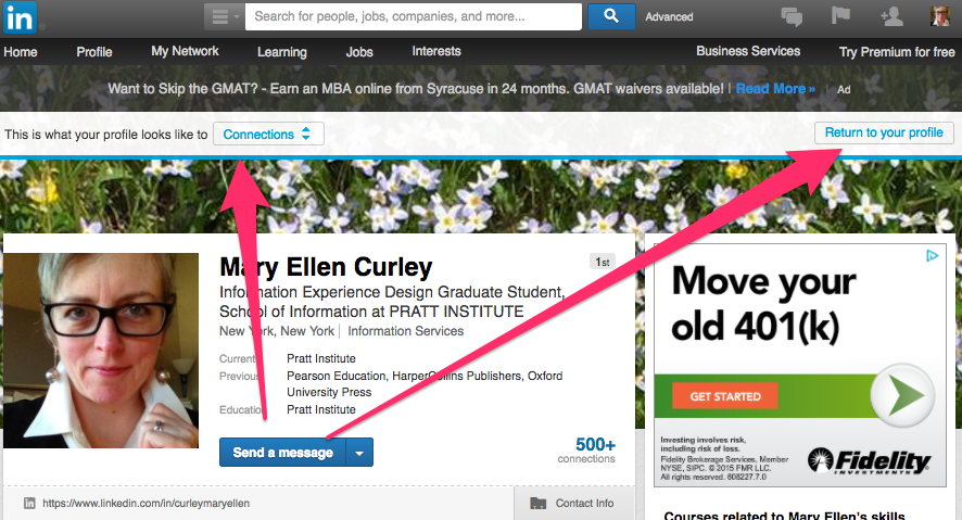
Discoverability, mapping and signifier issues in “view” mode
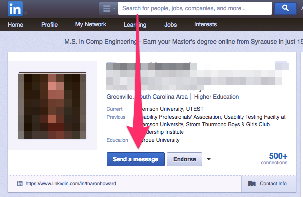
When the user views others’ profiles in LinkedIn, the blue “Send a message” button establishes a logical constraint, i.e. to connect with another person on the site.
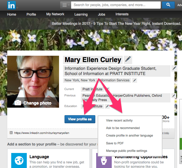
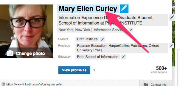
In profile “edit” mode (below), this same blue button is labelled “View profile as” — breaking that logical constraint by linking to a “view” mode of the user’s profile instead. This confuses the user model (it is also accompanied by a misplaced dropdown menu).
In “view” mode, discoverability is therefore weakened, causing a gulf of execution: a minimally-visible banner labeled “This is what your profile looks like to Connections” on the left, with a “Return to profile” button in the upper right, changes the conceptual model yet again. Understandability is poor, causing rule-based mistakes: users might try to return to “edit” mode using the blue button rather than the banner button.
View-mode status would be signified more successfully if mousing over the “view” screen generated an overlay ghosting out the screen details, causing the banner instructions to pop out more (and preferably, the banner and buttons would be in blue, to signify that the user is still drafting their profile):
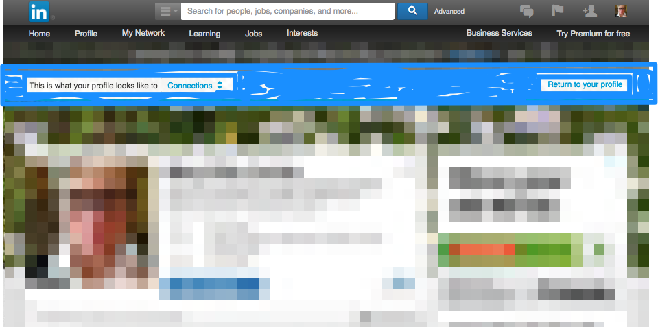
In return, adding this banner and ghosted overlay technique to the original edit-mode screen and changing the “Return to your profile” button to a “View your profile” button would more successfully map the navigation to “view” mode. It would essentially work as a toggle switch between modes.
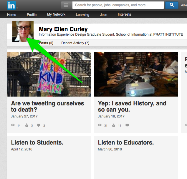
A gulf of execution occurs on the “Posts” page
When the user tries to return to their profile “home” from the “Posts” page, a logical constraint applied everywhere else — i.e. to return “home” by clicking on the head-shot photo — is not available here. Knowledge in the head is required to find the “Profile > Edit Profile” navigation in the dropdown menu.
LinkedIn adds constraints to encourage users to improve their profile
The blue box asking “Is this your current position?” (above the user image) and the two white boxes “Language” and “Volunteering Opportunities” (below) are helpful signifiers to edit further in order to create a “stronger” profile. However these signifiers often reappear after the user exits and re-enters the LinkedIn site anew, even when these points had been addressed. This adds an unnecessary constraint, and if the user has already performed these tasks, a gulf of evaluation is also created.
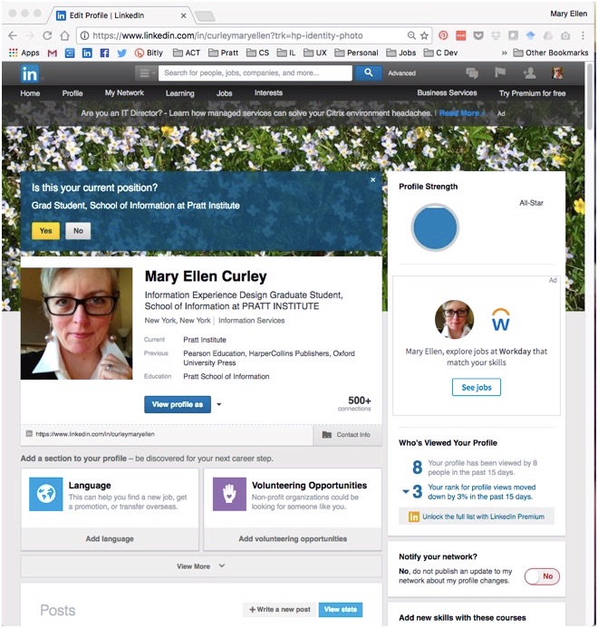
These panels also limit the visibility of other profile content, especially on smaller screens, and would be better designed as a clickable “Improve Your Profile” button.
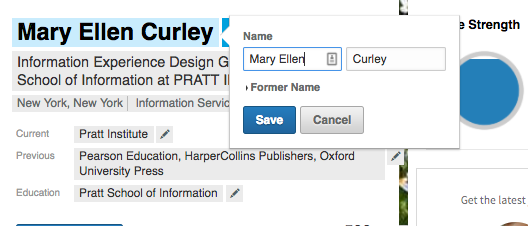
Discoverability and signifiers for editing text are strong
In “edit” mode, editable text is highlighted in blue when moused over. The pencil icon that appears is an effective signifier suggesting editing. This example provides useful feedback: a pop-up box appears with clear signifiers (“Save” and “Cancel”), as seen in the second image below. Also a “Change photo” instruction appears with an understandable camera signifier.
All things considered, LinkedIn provides strong understandability with robust editing options in the profile “edit” mode. However some improvements would increase discoverability and minimize mistakes.