
Mint is a personal financial program in which users can easily manage money and make their budgets. Users can link all of their accounts like different banks’ accounts and credit cards into this one program. It is a free money manager and financial tracker system. Mint has desktop, tablet and mobile versions The mobile iOS app has some positive and negative features..
Overview Page : Good discoverability and understandability


Mint gives users a very good discoverability and experience. When they turn on the app, they can see main functions on the overview pages. They can check their status of bank accounts immediately. Moreover, the overview page is also understandable. By intuitively scrolling down, users can see clear sections such as their credit scores, cash flow and a chart of spending. It is extremely simple and quick to check about users’ financial status. However, there is one small concern. Mint does not show the decimal point on the summary of accounts. From Norman’s suggestion, the signifiers for a financial system are significant and the summary of accounts should be very clear and exact even though the cents are a small amount.
Budget Setting : Good feedback & Poor discoverability


To set the budget, users can get immediate feedback when they move a pointer up and down to increase or decrease the budget. They can see the number of the budget is changing while they are moving the blue label. They also can click the pointer and the green chart ,and then a pop up screen will show up to set up the budget. However, the function of moving the blue pointer to change budget is not discoverable. If users do not try to move it, they will not find the function to change budget.
Spending Categories

Users do not need to record their spending or input their financial transaction by themselves. Furthermore, it has a very good feedback. People can check every transaction immediately. It also automatically distributes your expenses into different categories. Users can check their different spending in a simple way. Mint successfully offloading the users’ tasks.
Spending Chart : Good understandability and bed signifiers

The spending chart is understandability. By clicking different color parts of pie chart, users know how much they spend on different categories. They can see the details of each transaction. Nevertheless, here it also has the same signifiers issue, the amount of spending do not show the cents and it might make people misunderstand. This spending chart contains a semantic constraint, it only show the current month of spending pie chart. Users cannot see others month.
Budget : Recognition
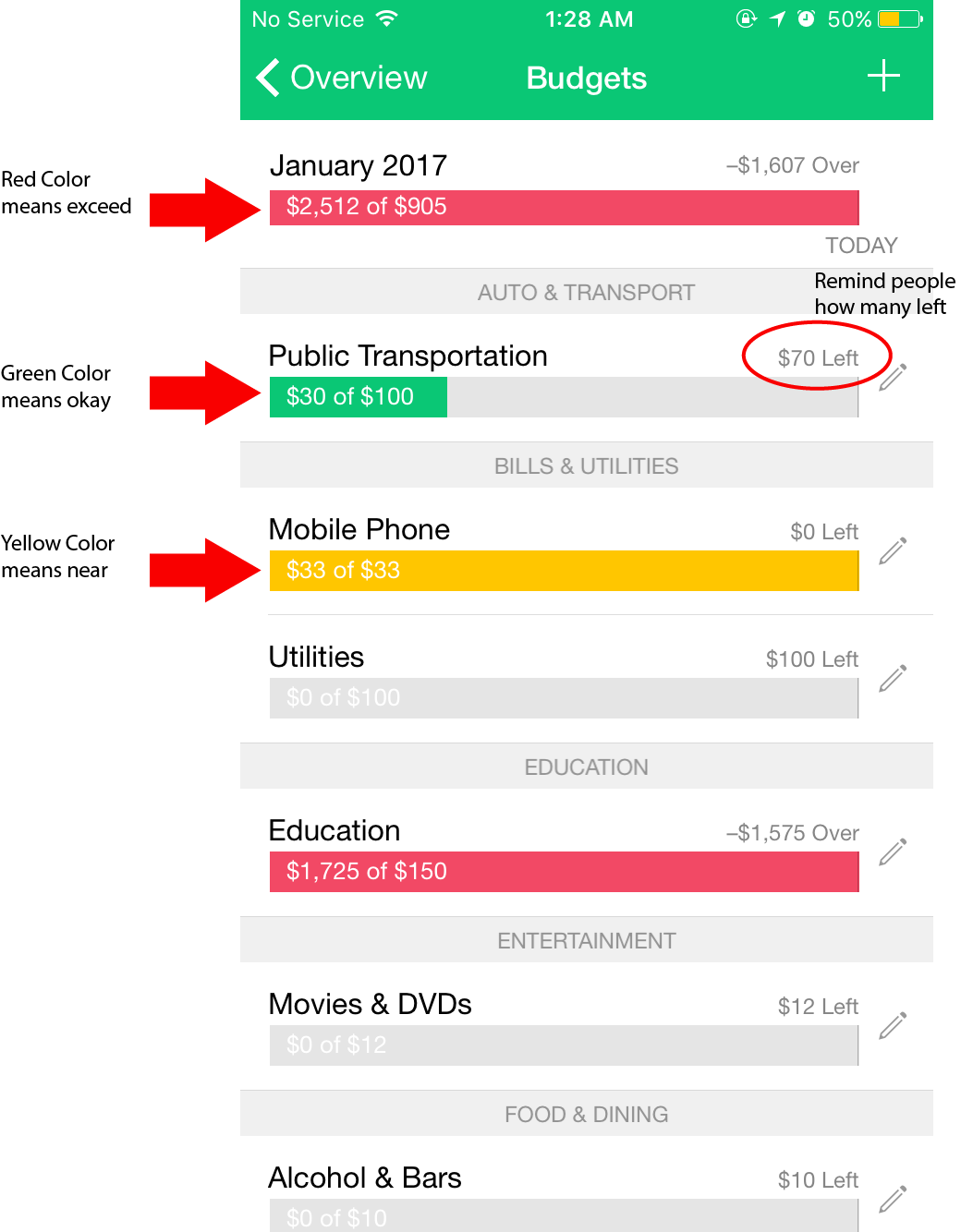
The color of each categories budget char is recognition. Mint uses red, yellow and green to remind users their different level of spending. Also, users can have idea about how much they left on each categories. However, the signifiers of setting budget is not really good since users can not set budget in different month. Users may have different income and have different finance status each month. Therefore, if they can make users to set up budget every month, it will be more user centered design.
Recommendation:
Mint do not have an export records function. The summary of chart spending is good. If it is possible to generate a CSV file or backup to cloud system, it may help user have a better manage money experience.
Overall, Mint program is a user friendly design app. Its design is cleanliness and elegance. The conceptual model is consistent and easy to navigate. It is an ideal personal financial management system for users who do not like to record their expense or have a table to manage their money.